- 项目名称:方物
- 设计单位:南京尔我空间设计研究室
- 主案设计:丁鹏文
- 参与设计:Zora,贾翔
- 建筑面积:200平方米
- 设计时间:2017.07
- 完工时间:2018.06
- 摄影:ing丛林
- 主要材料:艺术涂料,钢板,混凝土
我们建造任何的物体都需要尊重秩序虔诚且正直,这点我们不想去打破。而从事着设计工作的我们,更需要突破技法,打破常规,寻求差异化,去做创造性的表达。
We build anything with respect to order and piety and integrity, which we don’t want to break. While we are engaged in design work, we need to break through techniques, break through conventions, seek for differentiation, and make creative expression.
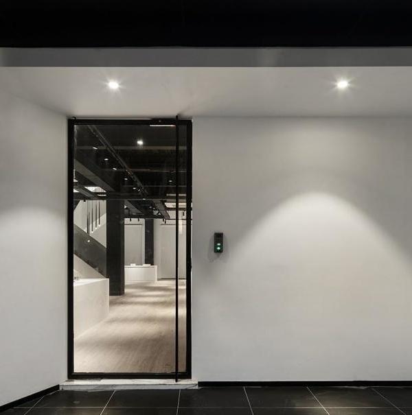
▼展厅入口,entrance
去年6月收到甲方设计邀请的时候是有一点无从下手,这是尔我第一次接到门窗系统展厅的项目,对于梳理这类项目的设计逻辑,我们显得没那么自信。 我们用了很长的时间来归纳产品的属性,来挖掘我们对于这类空间独特的视角。 在着手平面之前,我们需要有很清楚的思维脉络,才能顺延整个布局,而找到那个原点,花费了我们比制图更多的精力。
Last June received party a’s design is a bit do not know how to start, this is the first time, I received a hall doors and Windows system project, comb for logic design of this kind of project, we look less confident. We spent a long time summarizing the attributes of the product to explore our unique perspective on such Spaces. Before we get to the plane, we need to have a very clear thought process to extend the entire layout, and finding that origin takes more effort than mapping.
▼入口细节,detail of the entrance
尔我不想去做泛产品化的设计,更多的是想把产品的属性换化物质形式应用到空间中去,不拘泥于触碰的行为来感受产品,以空间的气质来呼应产品的特性,二者相融而不孤立。
I don’t want to do the design of the transition, more is to want to product attributes in the physical form into use in the space, not constrained by the behavior of touching to feel the product, the temperament of space to echo characteristics of the products, compatibility and incompatibility between isolated.
▼大面积的空间留白,leaving blank the space
门窗系统是整个住宅体系中尤为重要的一个环节,他承载了建筑空间的坚固性,安全性和延展性。我们把方形的空间体块作为设计语言来阐述,它似形同性,方正而坚固。也好似一个延展的内空间,向内而筑,向外而生,而门窗的产品体系恰好就是这样一个可开合的屏障,联通着空间内外。从尔我的设计角度来说,空间中部的方物更好比象形的住宅,地面材质的区别划分给了它更强的形式感,结合产品体系,模拟现实环境。
The door and window system is a particularly important link in the whole residential system, which carries the firmness, safety and malleability of the building space. We take the square space block as the design language to expound, it is similar in shape, square and solid. Also like an extension of the inner space, to the inside and build, to the outside and live, and the product system of the door and window is exactly such an open and close barrier, connecting the space inside and outside. From the point of view of my design, the square object in the middle of the space is better than the house in the shape of an image. The difference of the ground material gives it a stronger sense of form.
▼将门窗系统融入空间之中,the door and window system are blending in the space
而大面积的白色是给予空间呼吸的媒介,它留有了余地去尽可能的展示,以隐匿的存在感作为背景去和产品构筑空间的比例和美感。
And the white of large area is the medium that gives a space to breathe, it left the space to show as far as possible, take concealed existence feeling as the background to go with the scale that product builds a space and aesthetic feeling.
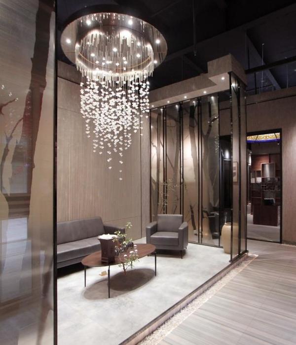
▼空间细节,detail of the space
▼平面方案,plan
项目名称:方物 设计单位:南京尔我空间设计研究室 主案设计:丁鹏文 参与设计:Zora 贾翔 建筑面积:200平方米 设计时间:2017.07 完工时间:2018.06 摄影:ing丛林 主要材料:艺术涂料 钢板 混凝土 Project: Square sapce / Gaosi window system Architecture Design: AW DESIGN Master case Designer:PENGWEN DING . Assistant Designer:Zora . JIA XIANG. Built Area: 200 Square meters Completion: 2017.07 Photographer : CONG LIN Main material:Art paint,steel plate,concrete
{{item.text_origin}}

