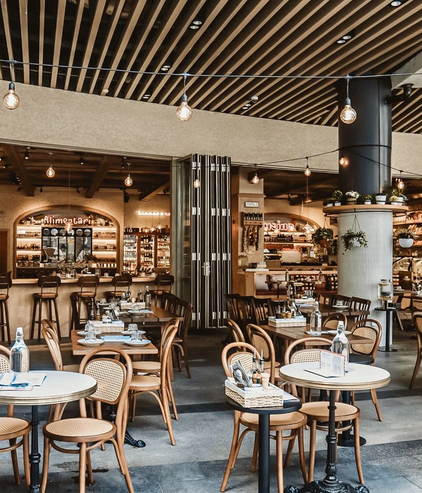
COMMUNE,意为亲密交谈,同时也是“社区”的意思,我们愿提供一个心灵绿洲、栖息之地,供人们谈心、交流,拉近彼此之间的距离。这一概念我们从2014年开始构思,希望能为都市人找到了一个放松自我的第三空间。COMMUNE公社打破常规的经营模式,定位做一家区别于传统酒吧和清吧的餐酒吧,没有太多华丽的装饰,提供高性价比的餐酒,让人感到轻松舒适,同时又带来超强体验感。而上世纪70年代的美式工业风,非常符合需求。
“选我所爱”,COMMUNE公社的品牌口号,我们希望提供给客人更多选择性及体验感。自助式就餐,是COMMUNE公社特有的体验模式。上千款全球各地酒水,五十多款美式餐品,以丰富的的产品类型及数量,为大家提供多种选择性,以及倡导大家选择健康品质的休闲方式。
在设计初期,COMMUNE首先考虑到需要一个足够开敞的空间氛围,在原有的空间基础上,尊重建筑自身特点,经过再设计,重新赋予它新的生命。
对于主体建筑,COMMUNE修旧如旧,保留其屋顶及砖墙质地,还原建筑空间原本的样子。
地面用水泥铺垫,屋顶的架构应用的是黑钢的材质,桌椅、吧台和酒水自助选购区都选用木质,通过黑钢与木头的质感对比,散发出美式工业风的硬朗。让人仿佛看到19世纪美式餐吧的影子。
屋顶上空悬吊铁质吊扇与吊灯,还有采用一些金属集合物,焊接点、铆钉等公然暴露在外的结构组件,让空间的工业感更加突出。
同时重新油刷红砖墙,柔和灯光与复古红墙的融合,使空间氛围更加柔和,也带了一丝乡村风的随意,舒展都市人疲惫的神经。
采用未经打磨的木质餐桌和餐椅,符合人体工程学的特性,累了可以靠着歇一歇,给予脚部足够的支撑,不会因为悬空而发麻。
为了营造开放宽敞的视野氛围,就必须要达到最大面积利用好自然光。窗户的选择不容小觑,COMMUNE采用的是德国进口的旭格门窗,抽拉式开启,让室内外融为一体。
还有就是酒水自助选购区的商品陈列,长达12米的货架和冰柜相对,留出1米5的距离让客人自由走动选购啤酒。让人有种走进酒吧中便利店的感觉。
除了以上功能性的陈设,COMMUNE考虑到公社氛围的营造,以及当下年青人喜欢自拍的特性,加入更多非功能性陈设。比如小黑板、形象墙、墙壁上挂的有历史感的公社插画,部分门店正门还放置酿啤酒的大酒桶,既中和工业风的硬朗,又彰显出对生活的追求和质感。客人除了可以在店内享受美食和美酒,还能享受自拍带来的乐趣。
整个设计因为是一个改造并重建的项目,首先是尊重了环境,然后对建筑形态作了有控制的加与减,在修旧如旧的基础之上,以及世纪风行的美式工业风语言的置入,完成功能的设置,并创造出自由、开放、轻松的就餐氛围。
这是一个朴实且有质感的设计,让COMMUNE成为许多年青人心目中休闲娱乐之选。
———————中英文说明分割(Chinese and English description segmentation)———————
COMMUNE,meaning of communication intimately and community. We are willing to provide an oasis for relaxation, which shortens the distance of people. In the beginning of 2014, we had a thought about setting up a bar , which can help urbanites relaxed themselves from work. COMMUNE hoped to break normal management model of original bars, aimed at providing our customers with quality, large-quantity, cost-effective food and drinks, less grand decorations . Moreover, staying in our bar, people would feel free and comfortable, get superb feeling of experience. Considering this, our design tended to be American industrial style, which would meet the demand of our customers.
CHOOSE MY LOVE, slogan of COMMUNE, which express our good wishes of providing more choices and experiences to customers. Self service for meals is our unique experience pattern in COMMUNE. Thousands of wine from all over the world, more than 50 American style meals, provide you with a variety of choices, as well as advocate the choice of healthy leisure way.
In the very beginning of design, the first thing that come to our mind for COMMUNE is a space that is large enough. So we take a lot of time in searching wasted plants and warehouses, giving them new lives by redesign based on the original space and feature.
As for the main part of the construction, we distressed and reserved the roof and brick wall, to show the original face to people.
When came to the materials indoors, we used cement bedding the floor, black irons applicating on the structure of roof, wooden chairs, tables, bar counter and alcohol self-service area. With the contrast of black iron and wood, people would smell a hard American industrial style, seemed like returning back the bars in the 19th century.
On one hand, in order to strengthen industrial feeling, besides of hanging the iron fans and pendent, we adopted exposed assembly such as medals, bonding points and rivets.
On the other hand, by the way of softening the space atmosphere, we painted the brick wall into red. In that way, combined with light and antique brick wall, customers would ease themselves from stress in our environment.
Meanwhile, we insisted using unpolished wooden chairs and tables that were ergonomically correct. If our customers were tired, the legs of chair gave the enough brace to them and avoid getting numb.
For the sake of the macroscopic vision-scope, we tried our best to make good use of natural light. So we used German schueco windows, which could be pulled-out fully to the outside.
Also, the display of commodity on alcohol self-service area was important. Opposite the fridges are our shelves, they are 13 meters long and 1.2 meters wide, which provided a space for customers to walk and choose beer, seemed like walking into the store of bar.
In addition to the functional display mentioned above, considering young customers who keen on selfie, we added many non-function displays such as little blackboards, image wall, historical artistic illustrations and so on. More than this, at some stores, we even placed a large wine bucket outdoors in order to strengthen the sense of life.
In general, the whole COMMUNE design was a project included reform and rebuilt. In the beginning, we respected the original construction, and then we added elements of American industrial style. At last, we improved the functional configuration, and created a kind of free, open, easy atmosphere.
This was an unadorned and textured design, which became a popular space for young people to kill time with their friends , get relax dinner and drinks.
门面外观
室内环境
吧台设计
灯光设计——铁艺大环灯
室内环境
自选区环境
自选区酒架
就餐区设计
卡座就餐区
LOGO墙设计
COMMUNE公社红坊里店立面图
COMMUNE公社红坊里店立面图
COMMUNE公社红坊里店立面图
COMMUNE公社红坊里店立面图
COMMUNE公社红坊里店平面图
{{item.text_origin}}



![jQuery(document).ready(function() {
jQuery("a[rel^='prettyPhoto']").prettyPhoto({
social_tools : false,
show_title : false
});
});
jQuery(document).ready(function() {
jQuery("a[rel^='prettyPhoto']").prettyPhoto({
social_tools : false,
show_title : false
});
});](https://public.ff.cn/Uploads/Case/Img/2024-06-19/fwYQEcqmPBqPqetJeNgLEvJUq.jpg-ff_s_1_600_700)
