Where the trend label Blutsgeschwister used to have its headquarters, today real estate is bought, split up and sold on three floors over an area of around 650 sqm. The corporate culture of the main company, which is housed as a tenant in the historic building next to several other companies belonging to the group, is described by the client himself with adjectives such as “exquisite”, “far-sighted” and “solid” and “safe”, but also wants to be seen as forward-looking and modern. For SOMAA, this description was the starting point of a design concept that implements the company’s canon of values with a collage of prestigious furniture and exciting offensive-looking space-forming elements. e careful renovation of the landmarked four-storey building on a preferred hillside location of Stuttgart provided a solid setting, while the custom-built fixtures and the high-quality furnishings open up the tension between old and new.
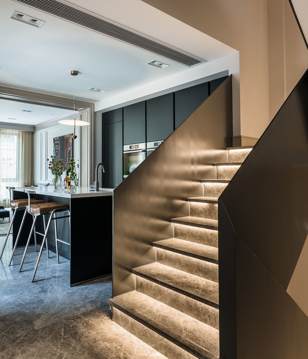
By combining a large number of individual workplaces into communication-promoting and work flow-optimized island solutions, the offices of the company headquarters have been made convenient for the needs of the user, while keeping the historical ground plan as much as possible. Thus, to the ground floor were dedicated the most public features such as the reception, the lobby, the administration and the conference rooms as well as the sales department.
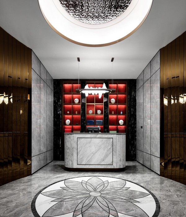
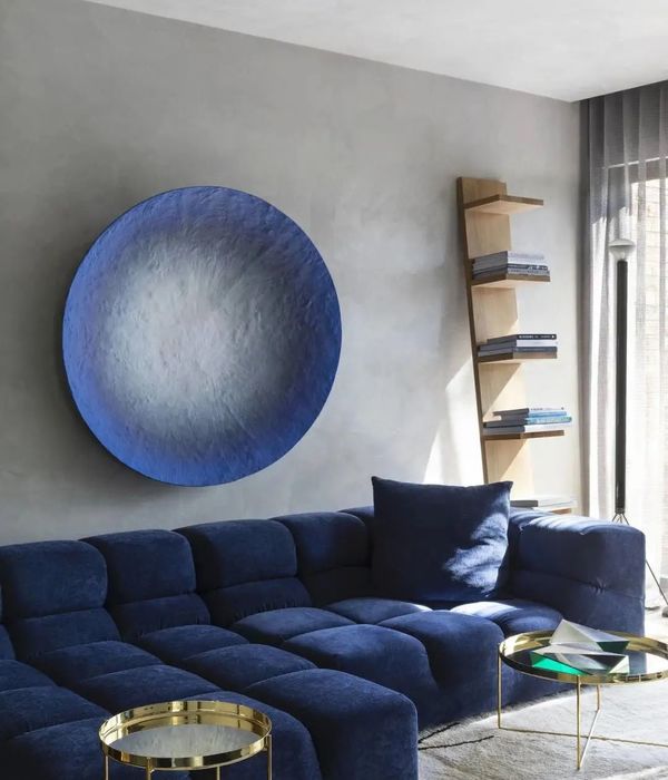
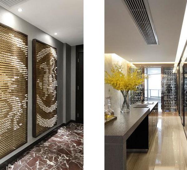
The spacious lobby welcomes the visitor with an inviting gesture: a deep black entity locates the reception in a concise and dominant way. The idiosyncratic geometry of the ceiling-high furniture element defies the given spatial geometry and is invitingly oriented towards the visitor. Meandering, it naturally zones the room into visitor area and secretariat. In brushed brass incisions are breaks, niches and accents, they house parts of the collection of historical computing machines which the father of one of the managing directors collected. A discreet milling in a brass plate shows the company logo. Separated only by a glass partition wall, the conference and meeting rooms are located directly adjacent to the foyer. The lightweight, translucent curtains behind the glass partition wall are covered in warm tones and provide the desired intimacy or openness, support the room acoustics and give the conference rooms an unusually individual character. Their hue contrasts with the blue accent walls, which used unobtrusively sparingly over all stories and spatially communicate the corporate identity of the company. An automatic sliding partition between the two conference rooms, also held in a blue tone, makes it possible to combine both rooms into a generous event hall.
Year 2017
Work started in 2016
Work finished in 2017
Client LC Liegenschaften GmbH
Status Completed works
Type Office Buildings / Corporate Headquarters / Offices/studios / Interior Design / Recovery/Restoration of Historic Buildings
{{item.text_origin}}

