柚木质感家居 | 舒适至上的设计哲学
- 项目名称:一个人的态度
- 项目地点:中国·重庆
- 设计总监:文超
- 设计团队:jsd . 简璞
- 全案统筹:JSD
- 建筑面积:50平方米
- 空间摄影:边界人-文超
- 简璞设计创始人:文超
- 设计主张:自由实用主义

居所
The Residence
作为居所而言,一个建筑(室内)究竟要带给我们什么样的反馈,其实没有标准答案。
There is no standard answer as to what kind of feedback a building should bring to us as a residence.
但因其建筑形式的不同,以及使用者诉求的不同,我们则可能帮助使用者尽可能的去找到一个更为合适的呈现方式。所以,该项目也不例外,甚至因其诉求的独特性,而具备一定的思考价值。
But because of the different forms of architecture and the different demands of the owner, we will help them to find a more suitable way of presentation as much as possible. Therefore, this project is also in the same way, and even has a certain value of consideration due to its uniqueness.
The Posture
我们都需要一所房子,或大或小,去安放自己的肉体与灵魂。但大多数时候,能满足其身体的舒适性(物质诉求),已然不易。而精神诉求的表达,则与使用者的意识态度息息相关。他们究竟需要一个怎样的精神场域,又或者说她们愿意付出怎样的成本代价去获得这一可能性,至关重要。这,便是使用者的生活态度。
We all need a house, no matter how big or small, to house our body and soul. But most of the time, it can satisfy the comfort of the body. The expression of spiritual aspirations, on the other hand, is actually closely related to the conscious attitude of the owner. What kind of spiritual field they need, or what cost they are willing to pay to obtain this possibility, is crucial. This is the owners attitude to life.
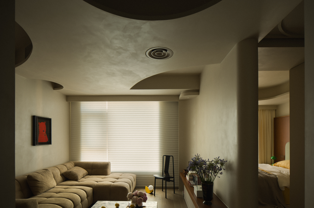
但一个优秀空间的落成,并非一己之力便可达成的。除开业主的意识态度和落地支持以外。设计师的态度也尤为重要。作为设计师,我们怎么看待使用者的真实诉求,真正去尊重使用者的意图,是其中的关键。并且,事无巨细,也并非大的空间尺度和高投入,才能做出好设计。于是,在面对这个50多平米的一人居时,设计的价值,反而被放大到了一定的程度。
But the completion of a great space is not something that can be achieved by myself personally. In addition to the owners conscious attitude and support, the designers attitude is also important. As a designer, how we look at the owners real demand, really respect the owners intention, it is a point. Moreover, it is not a matter of large space scale and high investment to make a good design. Thus, when facing this 50 square metres of one person living in a house, the value of design is instead magnified to a certain extent.

诉求
The Requirement
极致的舒适,是业主“唯一”的诉求。但看似简单的诉求之下,又饱含着颇多的细节。
The ultimate in comfort is the owners only demand. But underneath the seemingly simple demands, there are many details.
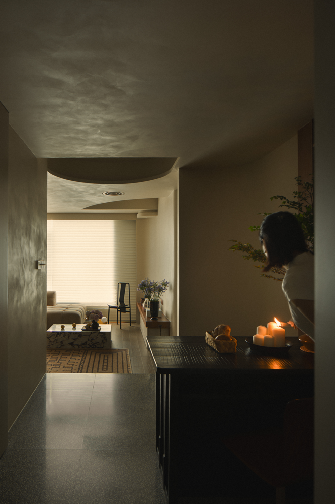
首先,舒适可被细分为:身体的舒适、精神的舒适、灯光的舒适、色调的舒适、交通动线的舒适、功能便利性和完整性的舒适、以及空间尺度的舒适等等。
Firstly, comfort can be subdivided into: physical comfort, mental comfort, lighting comfort, tonal comfort, circulation comfort, functional convenience and integrity comfort, and spatial scale comfort, to name a few.
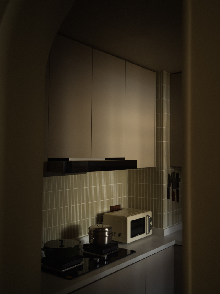
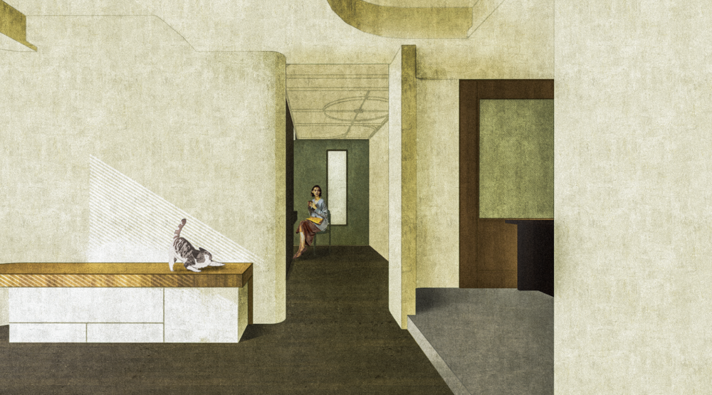
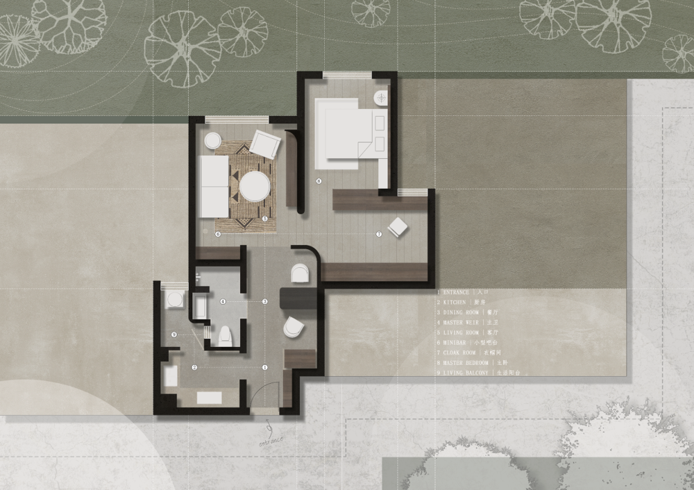
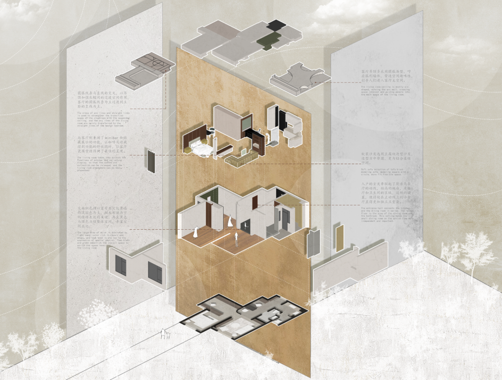
但在一个50多平米的空间里如何装下这么多的细节,是我们的主要设计任务。于是,设计从最基本的功能细节入手。让每一个区域都得到了最好的分配和利用。入户的玄关串联起了厨房与餐厅的动线,厨房则联动了生活阳台;同时,鞋帽柜与餐厅的冰箱柜也进行了联动,而从弱化了区域的界限。抬高的地台,是餐厅和卫生间的区域,这样的设置,使得处在主动线上的小餐厅显得更加独立且重要。
But, how to fit so many details in a space of more than 50 square metres was our main design task. So, we started our design with the most basic details. So that every area space can be utilised in the best possible way. The entrance doorway connects the kitchen with the dining kitchen and the living balcony on the side, reflecting the circulation of the space. At the same time, the shoe and hat cabinet and the refrigerator cabinet in the dining room are also designed, while from the finishing touches to the boundaries of the area. The raised floor, is the area of the dining room and bathroom, in such a way that makes the dining room seems more independent and important.

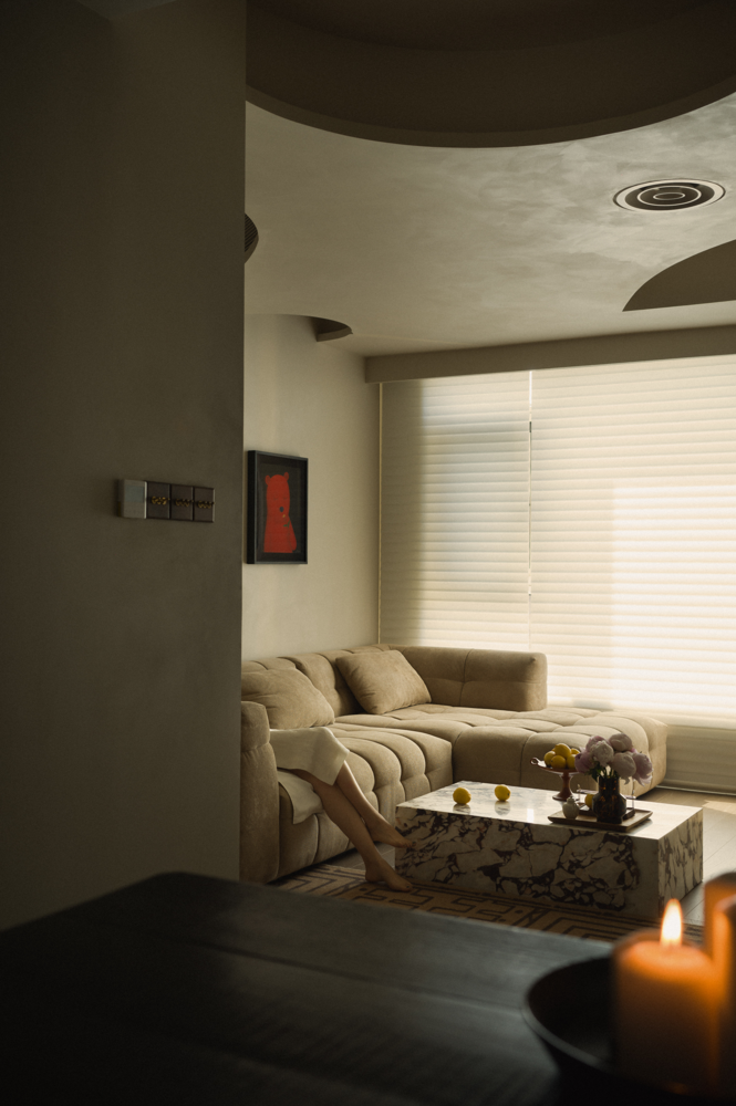
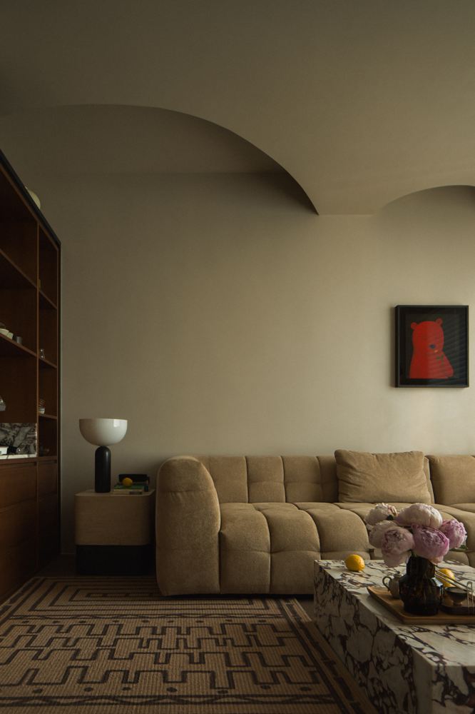
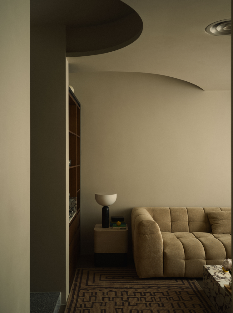
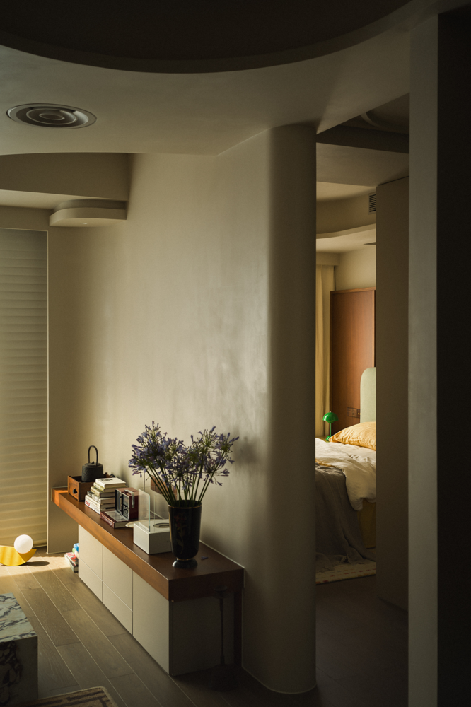
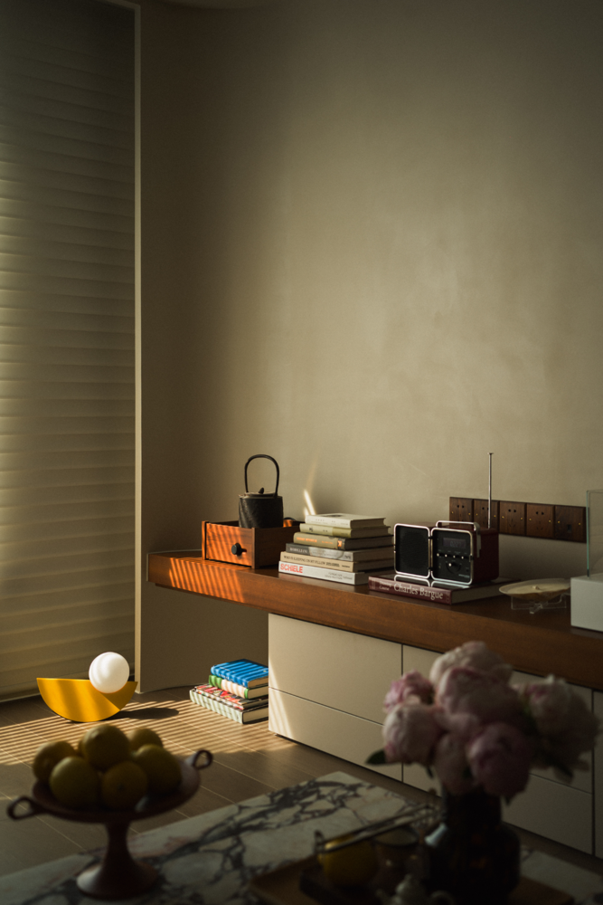
而客厅则兼顾了minibar和收藏展示的功能,让咖啡及收藏得到功能的释放同时,让客厅氛围营造得到了最佳的呈现。同时,为了更好的解决空调设备等问题,我们利用现有梁网关系,对顶面进行了重组,在尽可能保证层高的前提下,解决了设备的安放与装饰。
And the living room contains the function of minibar and collection display, at the same time let the coffee and collection items get space release also let the living room atmosphere create the best presentation. Secondly, in order to better solve the problem of air-conditioning equipment, we made use of the existing space and reorganised the top, solving the problem of placing and decorating the equipment under the premise of guaranteeing the height of the floor as much as possible.
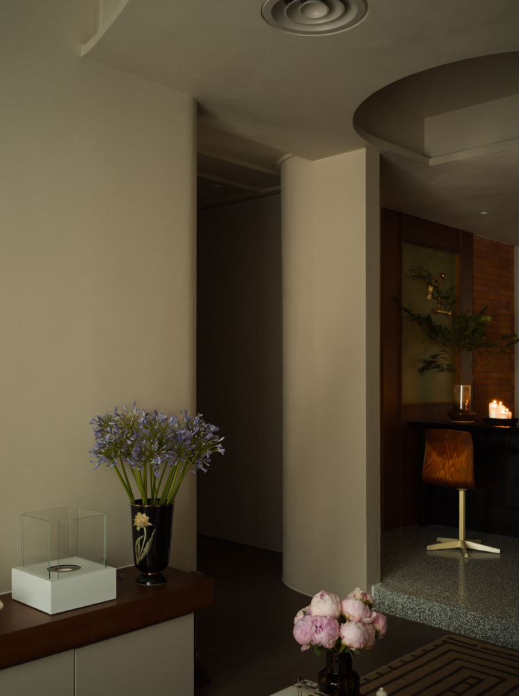
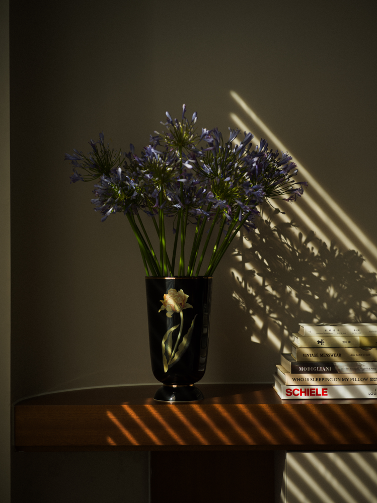
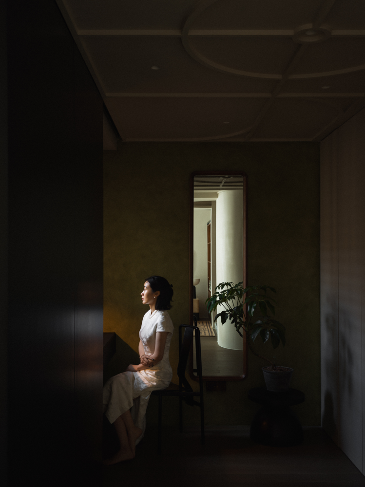
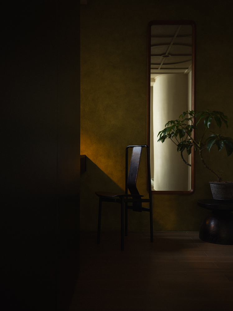
再往里走是与卧室联动的衣帽间,衣帽柜的柜门则充当了衣柜与房门的双重作用,开窗的位置则留给了化妆台。为了获得更大的空间尺度,卧室与衣帽间之间也取消了传统的隔墙关系,而是利用衣柜的功能,分断了两者之间的关系,床头背景的木作也与衣柜联动,形成了视觉上的统一,弱化了相对狭小的物理空间关系。至此,整个空间,一气呵成。
Further inside is the cloakroom linked to the bedroom, where the doors of the cloakroom are converted into a boundary between the wardrobe and the door of the room, and the position of the window is reserved for the dressing table. In order to obtain a greater spatial vision, between the bedroom and the cloakroom also cancelled the traditional partition wall relationship, we use the function of the wardrobe, divided the relationship between the two, the bedside background of the woods stuff is also presented with the wardrobe, forming a visual unity, weakened the relatively small physical space relationship. Making the whole space, forming a unity.
感受
The Feeling
除开功能空间的动线舒适性,使用者的感知感受也是舒适性的重要评判标准。所以无论在材质关系和色调搭配上,我们都做了相对深度的思考。
In addition to the circulation comfort of the functional space, the owners feeling is also the judgement standard of comfort. Therefore, we have done relatively in-depth thinking in terms of material relationship and colour matching.
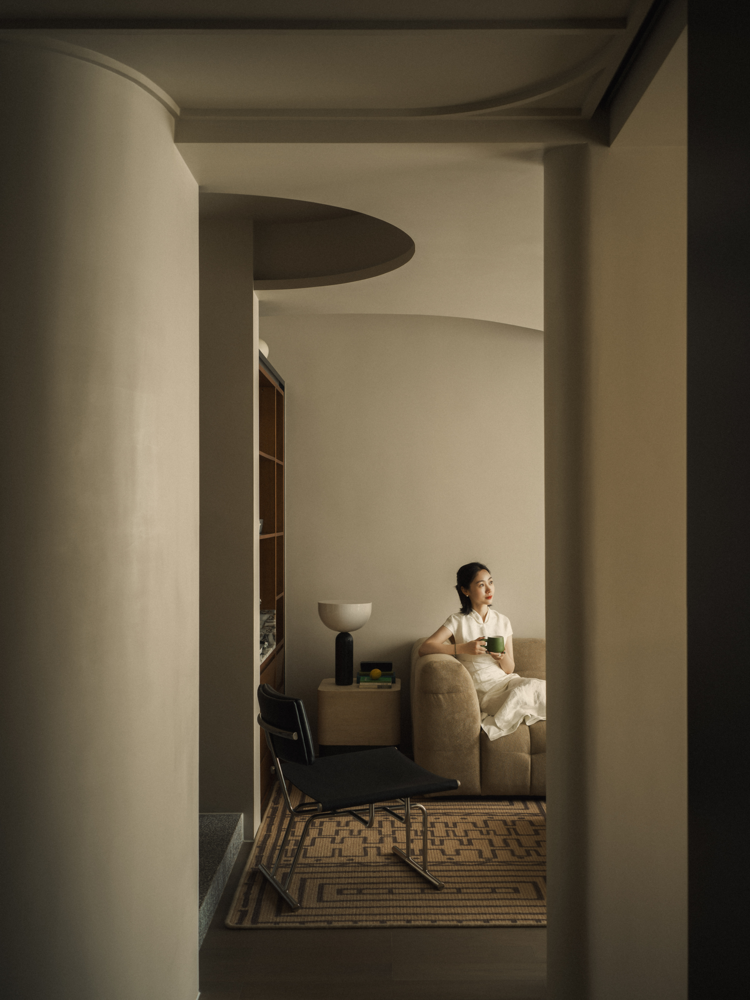
但在小空间里,层次细节往往比大空间更为重要。如果按照常规的做法,大面积统一的材质、颜色关系,势必让这样的小尺度空间显得既单薄又空洞,所以怎么让其层次丰富,又不凌乱,是其设计规划的宗旨。
But in small spaces, the level details are often more important than large spaces. If in accordance with conventional practice, large areas of uniform material and colour relationships, will make such small-scale space appears both thin and boring, so how to make its level rich, but not messy, is the goal of its design and planning.

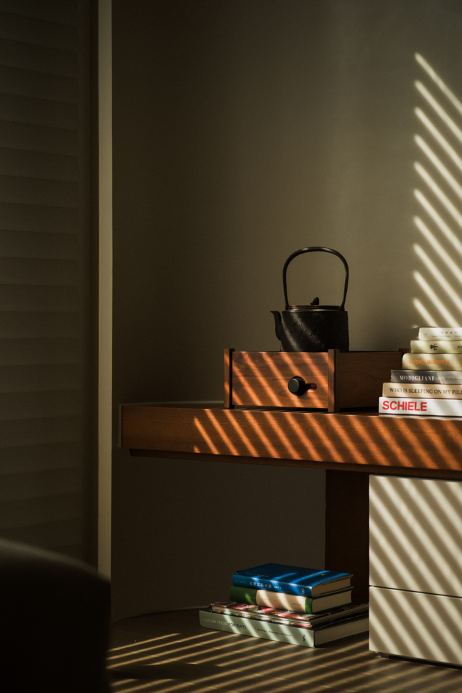
于是,大面积色调以富有层次包裹感的浅驼色为主,并通过技术手段,保障了基础木作与墙体大面积涂料在视觉上的统一性,并延伸至顶面。而柚木的材质则作为了空间关系里,情绪表达的关键。温暖且干净的柚木,让小小的空间里有了温度,但又不显得笨重和粗糙。
Thus, the large colour palette is dominated by a layered light camel colour, and the visual unity of the basic woodwork and the large paint on the walls is guaranteed by technical means and extended to the top surface. And the material of teak is the key to the emotional expression in the spatial relationship. Warm and clean teak wood gives temperature to the small space without being bulky and rough.
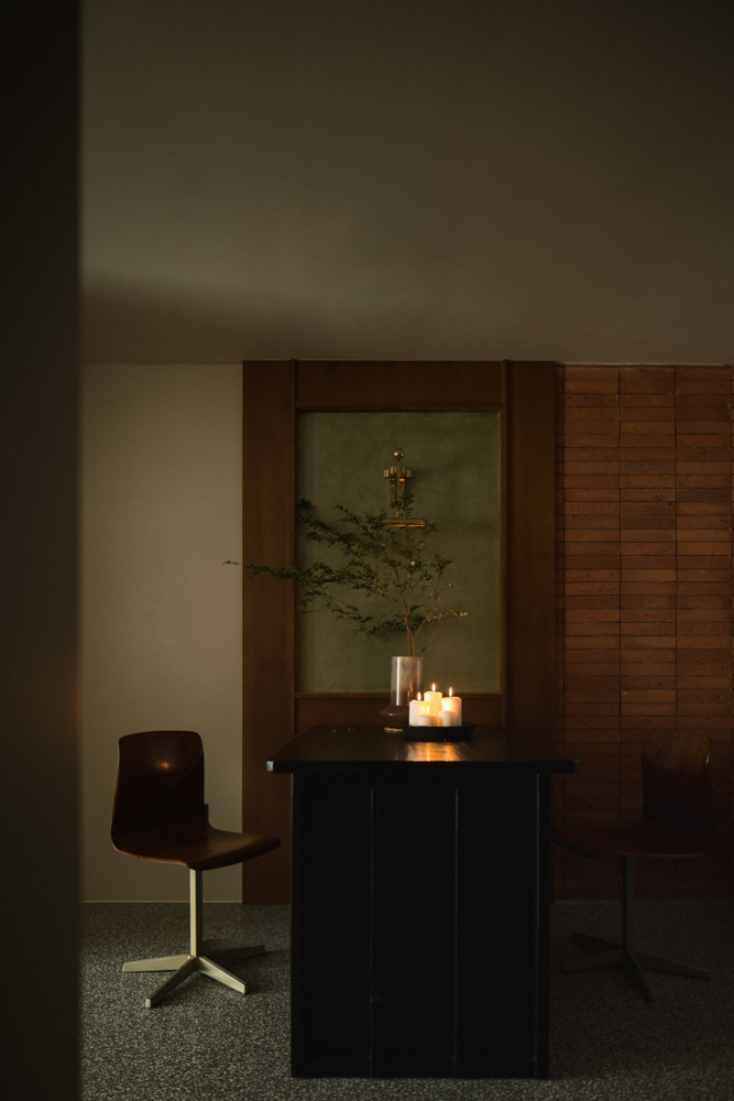
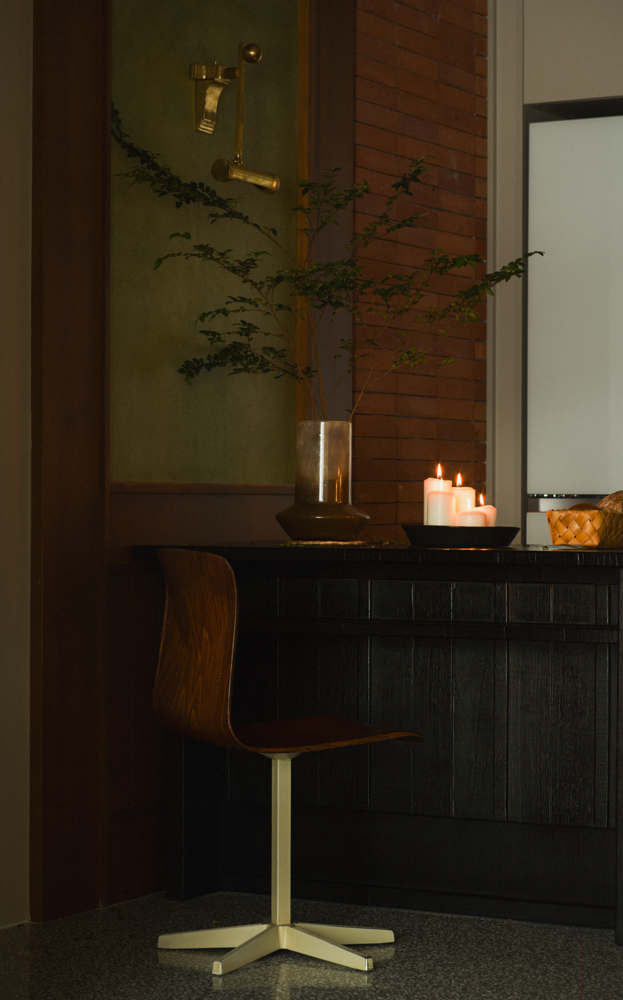
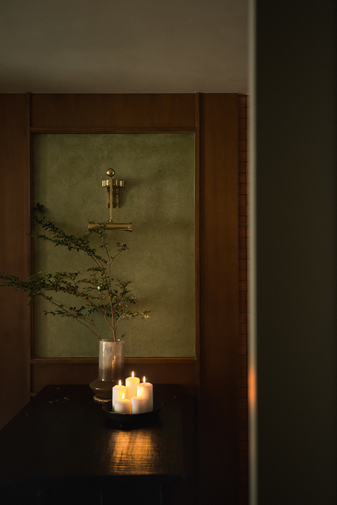
而黑色(包含深灰色)跟绿色的材质,则是起到了空间点缀的作用,让空间层次更为丰富的同时,进一步丰富了空间情绪,延展是视觉景深关系,从而减小了因物理尺度而带来的空间压迫感。再配合恰到好处且层次丰满的灯光,让小小的空间里,趣味横生。
The black and green materials are for embellishment, making the space more rich, further enriching the spatial mood, extending the visual depth of field relationship, thus reducing the physical scale of the space brought about by the sense of oppression. Combined with the lighting, the small space is full of fun.
使用
Usage
作为一人居的空间,业主的实际使用感受,是最后论证空间设计好坏的终极标准。
As a space for human habitation, the owners feeling of actual use is the ultimate criterion to prove that the space design is good or not.
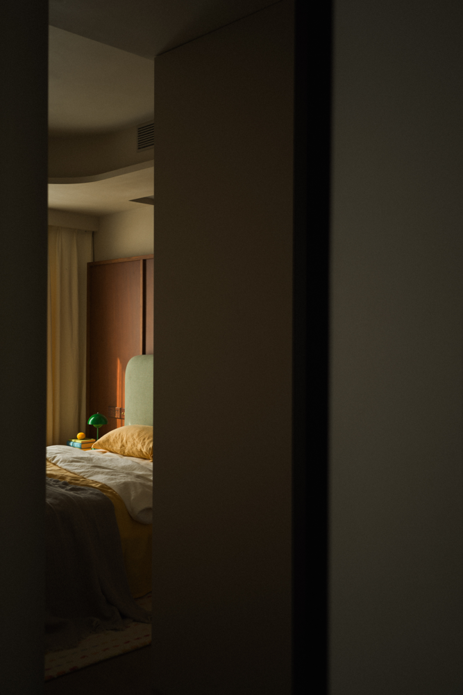
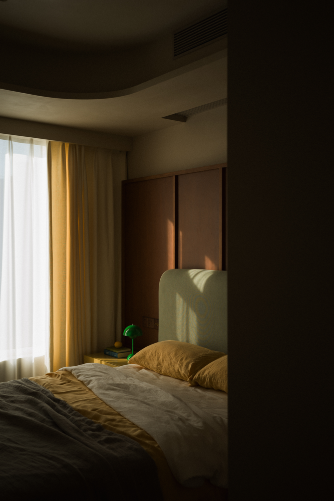
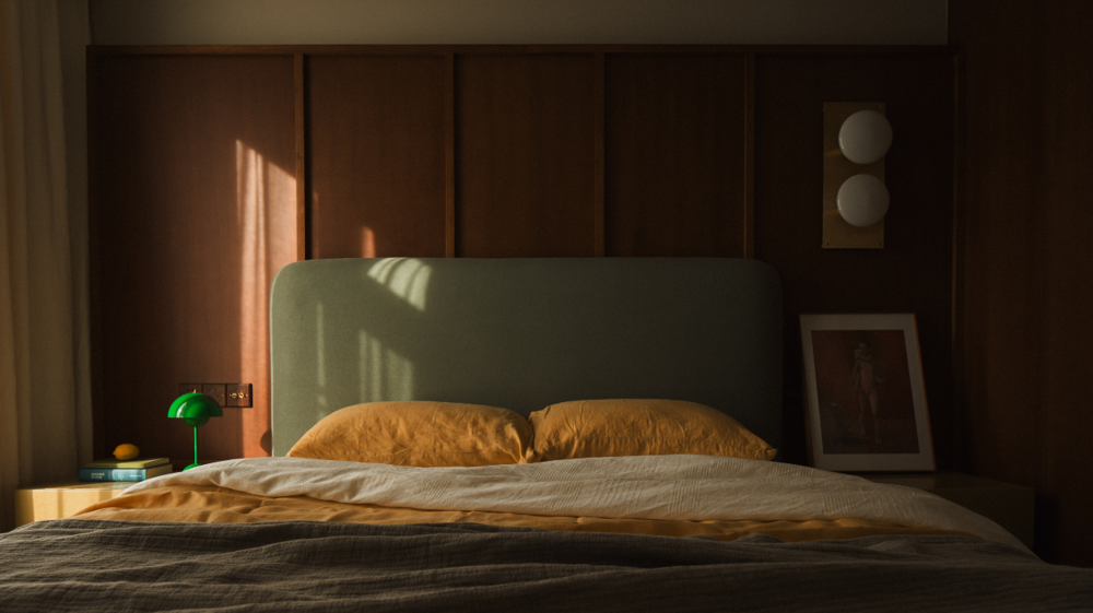
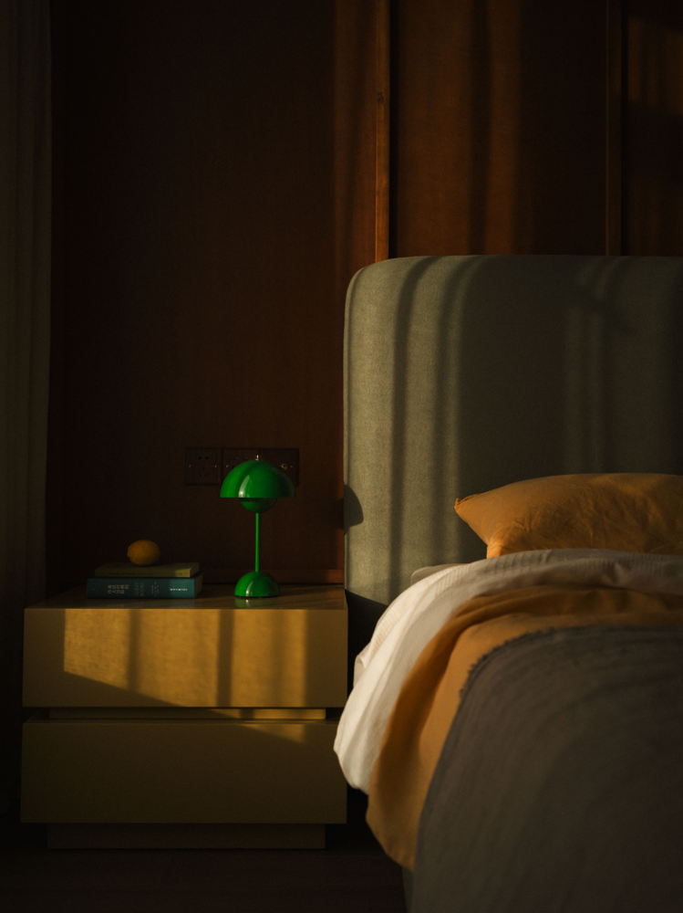
动线的完整、功能的全面与便捷、使用的趣味性、以及空间的情绪感都在这一空间中得到了释放。与其说,我们在设计一个家,不如把它理解为业主的欢乐窝。
Instead of designing a home, it is better to understand it as the owners nest of joy.
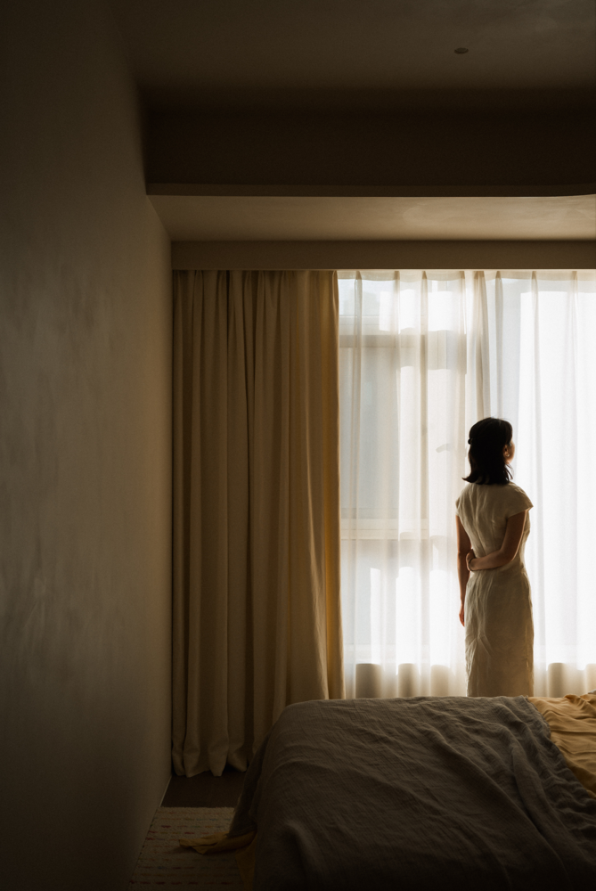
而这,本身就是一种生活的态度,面对未来的积极态度。
This, in itself, is an attitude towards life, a positive attitude towards the future.
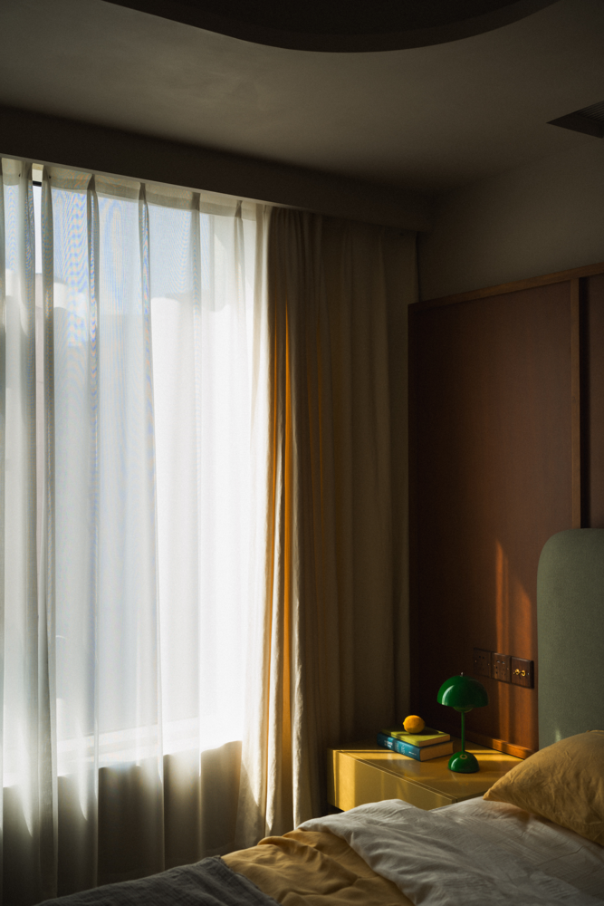
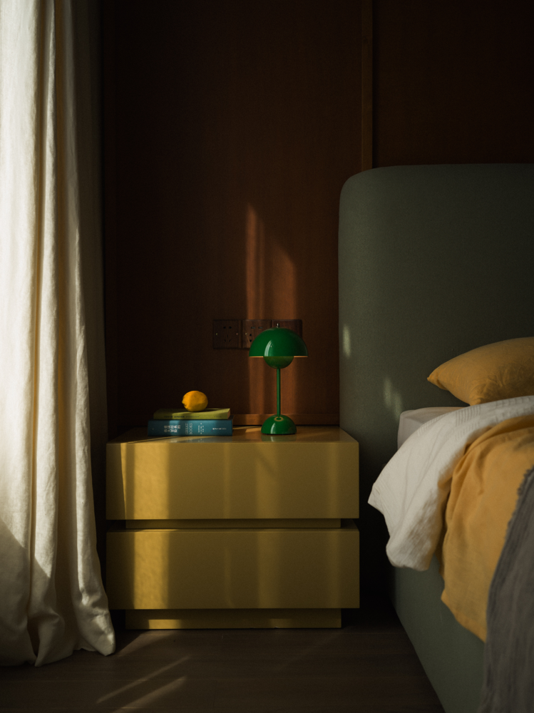
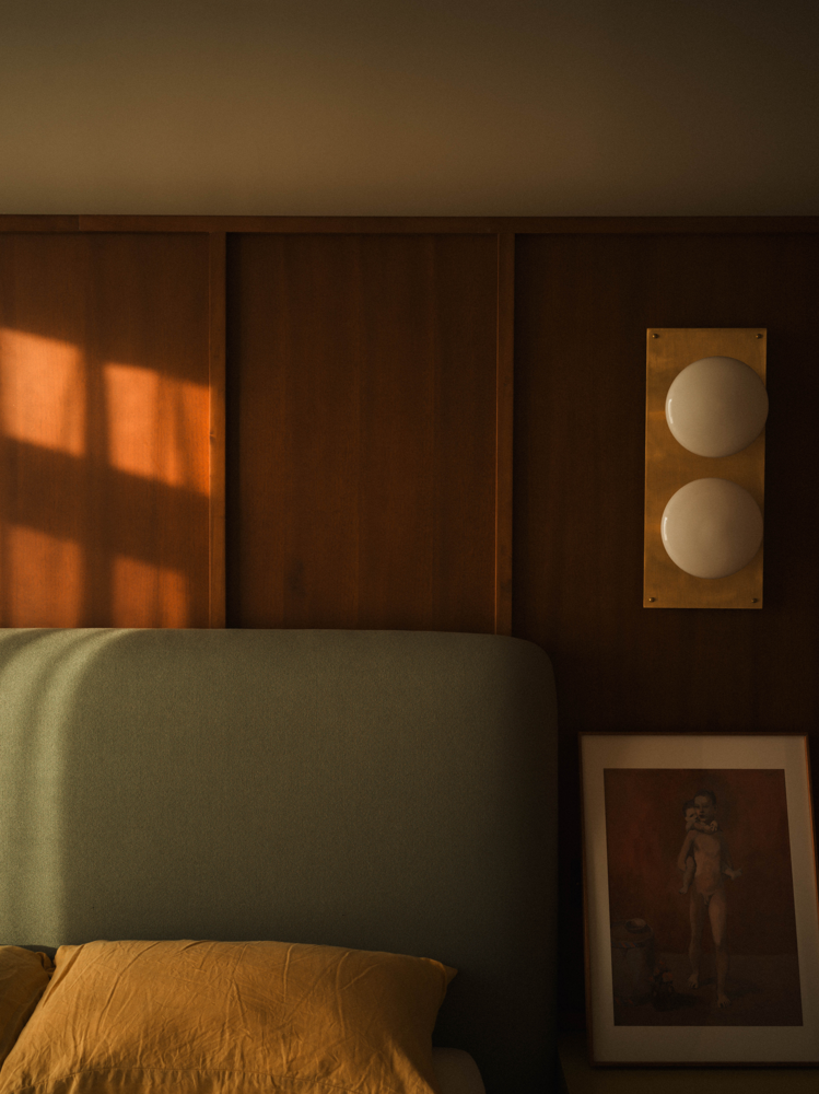
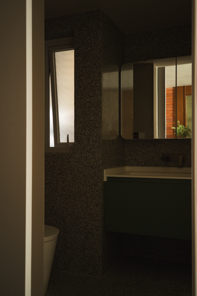
所以,作为设计师,我们有幸去实现一个真实的理想,营造属于她自己的一个小小“世界”,也是我们对于生活的期许,以及面对设计工作的真实态度。
Therefore, as a designer, we have the honour to realise a true ideal, to create a small "world" of her own, which is also our expectation of life, and the true attitude towards design work.

项目信息
Information
项目名称:
一个人的态度
A persons attitude
项目地点:
中国 · 重庆
Project Location:Chongqing, China
设计总监:
文超
Steven
设计团队:
jsd . 简璞
JSD
全案统筹:
jsd . 简璞
Overall Project Coordinator:JSD
建筑面积:
50平方米
空间摄影:
边界人-文超
Borderman - Steven
物料支持:
立邦魔术漆、遇光照明、玫瑰岛、龟一水磨石、书香门地、若集安室、帝豪木作定制、方太玥影、
叕木
(排名不分先后)
ZHUOMU
文超
简璞设计创始人
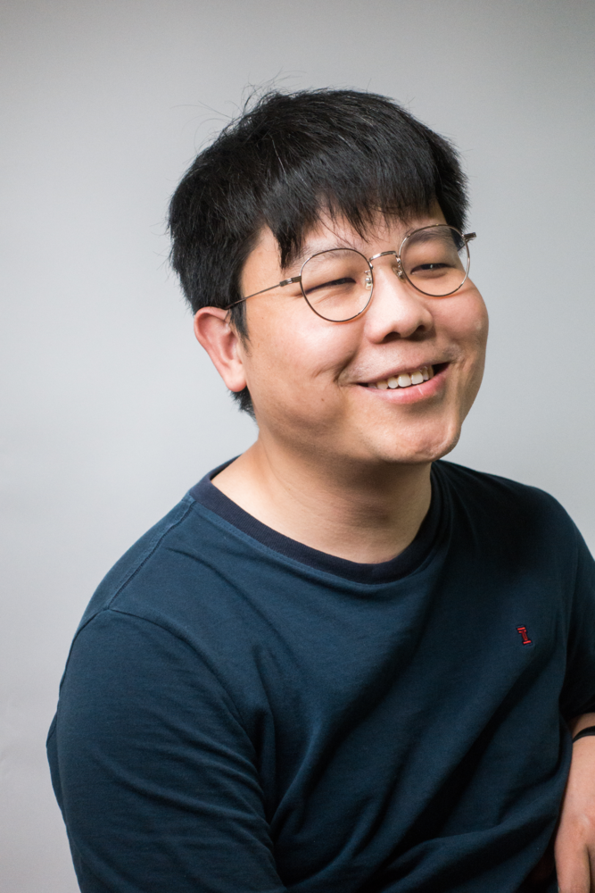
文超,创意设计工作者。于2015年成立了自己的设计品牌JSD简璞设计,并逐步确定了其不受风格、业态限制的创意型设计机构的专业方向。亦在不断的发展过程中,积累并提炼出了具有简璞内核的“自由实用主义”的设计主张。
Wen Chao, Creative design workers. In 2015, the design brand Jade Simple Design(JSD)was established and gradually determined the professional direction is a creative design agency that is not restricted by style and format. In the process of continuous development, it has accumulated and refined the design proposition of Free-pragmatism with the core of JSD.
简璞设计是一家深根于重庆 - 上海,年轻、有趣、且不局限于某种业态内的开放型创意设计机构。简璞设计一直秉承着 “自由实用主义” 的创作设计理念,并将人与空间、器物间最真实的诉求关系作为设计思考的根基,以此创作出更加实用且有趣的空间与器物作品。团队设计板块涵盖:建筑、景观、室内、家具等多个领域。
JSD is rooted in Chongqing and Shanghai. It is a young, interesting, and open creative design agency that is not limited to a certain form. JSD has always been adhering to the creative design concept of Free-pragmatism and takes the most real appealing relationship between people and space and things as the foundation of design thinking to create more practical and interesting space and furniture works. The team design section covers architecture, landscape, interior, furniture, and other fields.

