项目名称:JOINER/营销总部
Project Name: JOINER/Marketing Headquarters
项目面积:400㎡
Project area: 400 square meters
项目地点:中国 . 淄博
Project location: China. Zibo
1F floor plan
空间不仅是承载的容器,更是对品牌定位、精神及产品体系精到梳理之后的表达。
2F floor plan
Space is not only a container for carrying, but also an expression of brand positioning, spirit and product system after being refined.
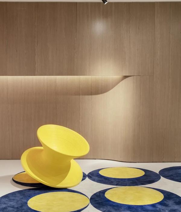
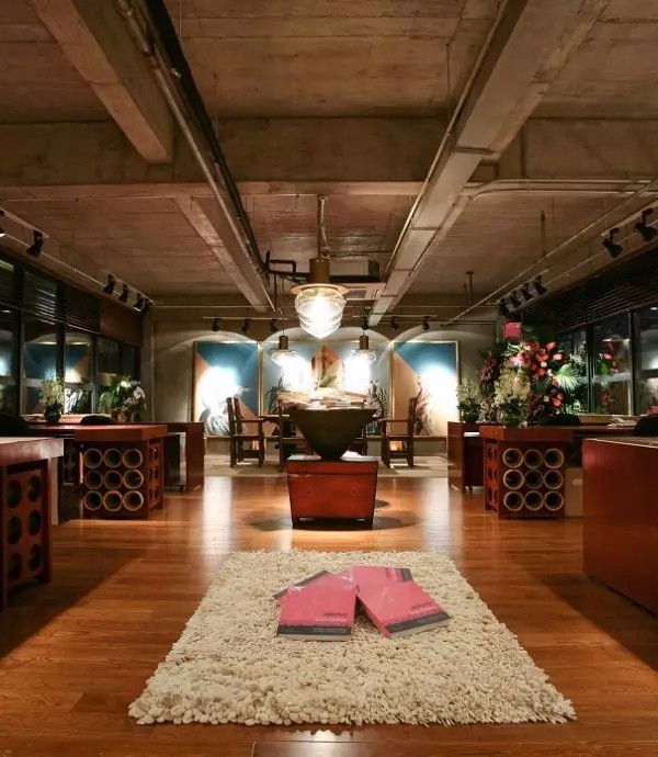
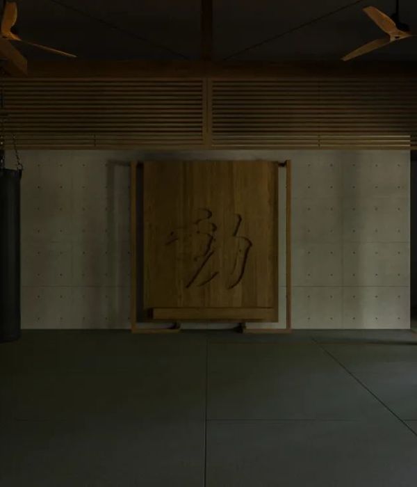
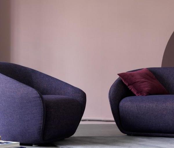
展厅设计参考中国美学“疏而不空,满而不溢”留有想象的空间以及无限的可能;计白当黑,纸笔落,留白三分,韵味悠长,以内敛空间凸显展陈效果。黑白灰的底调之下,产品更富有视觉冲击力,跳跃的色彩 ,创意的造型。
The design of the exhibition hall refers to Chinese aesthetics, "sparse but not empty, full but not overflowing", leaving imaginative space and infinite possibilities; the white is black, the pen and paper fall, and the white space is three points, the charm is long, and the introverted space highlights the exhibition effect . Under the black, white and gray background, the product is more visually impactful, with jumping colors and creative shapes.
{{item.text_origin}}

