Archview Gradinarska designed a space that embraces strength and modernity in Varna, Bulgaria.
STAT Ltd. needed a new office with a modern yet corporate vision, which embodies the brand’s vision to deliver high-class constructions and architecture.
By renovating one floor of an office building, our team created a monochromatic and clean minimalistic space that meets the needs of the STAT company and motivates their employees to take pride in their work.
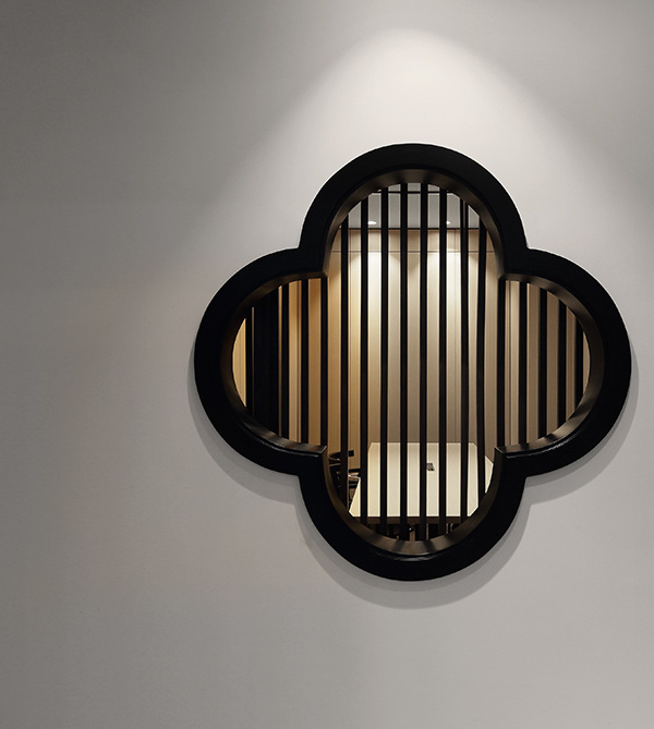
In order to achieve complete sync between the design and the brand’s profile, we implemented in the project the following – concrete, reinforcement, wood imitating plywood, and a colour palette corresponding to the company’s logo. The centre of the floor is designed as a common space, uniting the hallways towards conference rooms, employees’ and managers‘ offices, a kitchen, and a hidden toilet. At the same time, we integrated a work area for the employees in the field and on the sites most of the time. The oval shapes are the leading element in the whole concept, and they can be noticed sliding into each designated room.
The entrance reception is the highlight of the office. It sends a clear message and it fascinates with its cast-in-place concrete element, and the additional formwork and reinforcement, as details.
The materials used, such as LVT flooring with a concrete look; HPL cladding with a steel and sheet metal look; wood and the colour palette in black and white, achieve a modern, clean, and monochrome design. The contrast is enhanced by the smooth oval shapes and the corridor connected with the sleek, cold feeling of the concrete floor. The acoustic ceilings, with integrated blue acoustic wallpaper, create a cosy working environment.
The offices are designed entirely in white tones, highlighting the brand’s colour palette and identity. Opposite common concept, we created the managers’ offices mainly with black walls and dark furniture, aiming to achieve an area only for the elite. In this room, we used a tile carpet, which we combined with the iridescent shades of grey, and the brand’s main colour – blue. In the conference hall, we decided to choose the same carpet configuration, to strengthen the acoustics and the corporate appearance. The meeting room is with 16 people capacity, but it can hold up to 20 so it can be used both for staff meetings, as well as corporate presentations with potential clients. It also has a small meeting spot, conceived in a dark hue, hidden behind the oval shapes of the common space. The kitchen and toilets are behind two wallpaper doors. The leisure area is combined with a dining area, an equipped kitchen, as well as a coffee spot. The toilet is hidden behind an oval wall, where we installed a specially designed for STAT wallpaper. Behind the toilets, we used LVT slabs for easier maintenance.
The lighting in the offices is created by individually ordered linear lighting fixtures that are integrated into the ceilings. The combination of directional magnetic rails and hidden spotlights contributes to the overall minimalistic and monochrome finish of the offices.
Design: Archview Gradinarska
Photography: Tsanislav Hristov
11 Images | expand for additional detail
{{item.text_origin}}

