- 项目名称:美国棒约翰披萨连锁餐厅设计
- 项目地点:金边BKK1 ST51,352
- 项目面积:700平米
- 设计时间:2020.08
- 完成时间:2021.03
- 主创设计:胡俊峰
- 参与设计:詹旺 吴越 章玉琴
- 设计公司:艾获尔室内设计
- 照明公司:石客照明
- 家具公司:KIAN(中国)家具制造
- 摄影团队:bdv_photo(英国)
- 项目性质:老建筑改造
- 主要材质:水磨石地砖,艺术手工砖,实木板,金属铁板,氟碳漆
- 园林景观绿化:绿植,水景
- 品牌灯光:石客照明
- 家具:KIAN(中国)家具制造
设计说明
3楼露台
项目名称:美国棒约翰披萨连锁餐厅设计
项目地点:金边BKK1 ST51/352
项目面积:700平米
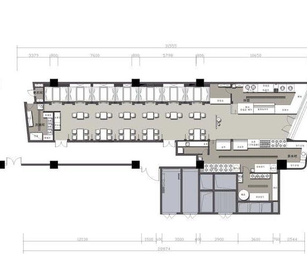
1F平面图
项目性质:老建筑改造
设计时间:2020.08
2F平面图
完成时间:2021.03
主创设计:胡俊峰
3F平面图
参与设计:詹旺 吴越 章玉琴
主要材质:水磨石地砖、艺术手工砖,实木板、金属铁板、氟碳漆
4F平面图
设计公司:艾获尔室内设计
照明公司:石客照明
家具公司:KIAN(中国)家具制造
摄影团队:bdv_photo(英国)
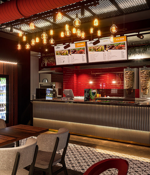
这是美国棒约翰披萨连锁餐厅在金边开设的第一家旗舰店,位于BKK1核心商圈的51街, 它是由一座有着数十年历史的独栋老别墅改造而成, 餐厅占地500平米,共三层, 有独立的庭院,改造中拆除了一些不必要的室内墙体,保留了老房子的主体结构及外形轮廓,并用钢结构进行了加固, 并通过添加不同区域的楼梯,重新梳理了交通动线,让空间每个角落都流动起来,改造后呈现出来破旧的墙壁、风化的木梁、陈旧的瓦片,让人感受到岁月的痕迹、高低错落的建筑结构层次分明,视野开阔,让人产生了探索的欲望。 设计师大胆采用LOGO主题色中的红与绿进行穿插应用,通过合理的比例,将高纯度色彩的材质与破旧环境形成鲜明对比,并在局部场景应用一些企业VI元素,将品牌与空间很好的融为一体,相互衬托,强化客人对餐饮品牌的认知和辨识度。 园林景观绿化是一种在东南亚创造环境的独特方式, 设计师也不遗余力地将绿植、水景穿插应用,打破室内外的界限,将阳光和景观互相融合,打造出了一个自然生态的就餐环境,品牌灯光公司的介入,让空间夜晚的照明更有质感和层次,硬朗而地道的国际大师家具应用于此,提升了餐厅的品质,也恰到好处地传达出这里快速休闲的用餐氛围。
Design Notes
Project Name: Design of American Papa John’s Pizza Chain Restaurant
Project location: BKK1 ST51/352, Phnom Penh
Project area: 700 square meters
Project nature: old building renovation
Design time: 2020.08
Completion time: 2021.03
Main creative design: Hu Junfeng
Participating in the design: Zhan Wang, Wu Yue, Zhang Yuqin
Main materials: terrazzo floor tiles, artistic handmade tiles, solid wood boards, metal iron plates, fluorocarbon paint
Design company: Aigel Interior Design
Lighting company: Shike Lighting
Furniture company: KIAN (China) Furniture Manufacturing
Photography team: bdv_photo (UK)
This is the first flagship store opened by the American Papa John’s Pizza restaurant chain in Phnom Penh. It is located at 51st Street in the core business district of BKK1. It was transformed from a single-family old villa with decades of history. The restaurant covers an area of 500 square meters. A total of three floors, with independent courtyards, some unnecessary indoor walls were removed during the renovation, the main structure and outline of the old house were retained, and steel structure was used for reinforcement, and it was reorganized by adding stairs in different areas. The traffic flow allows every corner of the space to flow. After the renovation, it presents dilapidated walls, weathered wooden beams, and old tiles, which make people feel the traces of the years, the high and low building structures are distinct, and the vision is broad. People have a desire to explore. The designer boldly uses red and green in the LOGO theme color for interspersed application, and through reasonable proportions, the high-purity color material is in sharp contrast with the dilapidated environment, and some corporate VI elements are applied in some scenes to make the brand and the space very good. The integration of the food and beverage brands, complementing each other, strengthen the customers’ cognition and recognition of the catering brand. Landscape greening is a unique way to create an environment in Southeast Asia. The designer has spared no effort to intersperse and apply green plants and water features, breaking the boundaries between indoor and outdoor, and integrating sunlight and landscape to create a natural and ecological dining environment. The intervention of the brand lighting company makes the night lighting of the space more textured and layered. The tough and authentic international master furniture is used here, which improves the quality of the restaurant and conveys the fast and casual dining atmosphere here.
1楼就餐区
1楼就餐区
户外楼梯
1楼就餐区
3楼露台
3楼就餐区
2楼包间
1楼就餐区
4楼就餐区
{{item.text_origin}}

