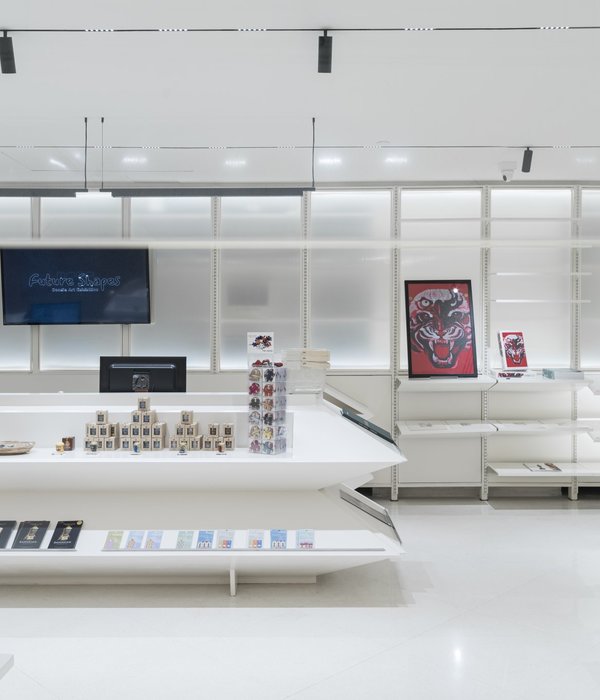
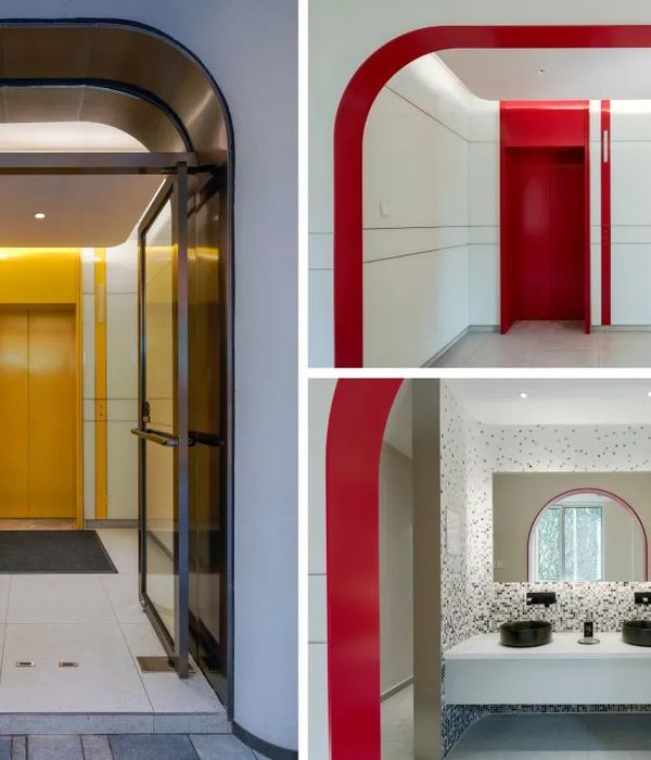
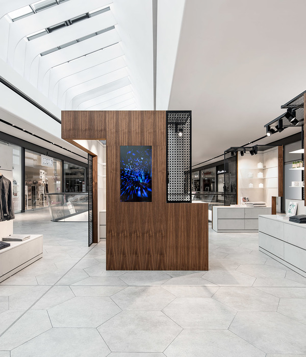
Oskar Kohnen设计的主要理念是创造一个类似博物馆的白色盒子,其中包含大量的建筑元素,以发挥游客的想象力。楼梯不知通向何处,拱门成为货架的入口。
Oskar Kohnen principal idea behind this design was to create a museum-like white box containing a multitude of architectural elements to play with the visitor’s imagination. Stairs lead to nowhere, arches become entrances to shelves.
这个空间是关于幻想的。不是传统零售业对转型商品的幻想,而是在参观者和里面的作品之间建立起一种完全意想不到的未知关系。楼梯、曲线、拱门和角落的基本形状,一旦包含在白色的盒子里,就会变成博物馆的收藏品,每个参观者都会把它们与自己的记忆配对,创造出一种独特的体验。
The space is about fantasy. Not the traditional retail fantasy of transformative commodities, rather a totally unexpected and unknown relationship opens up between the visitor and the pieces within. The basic shapes of stairs, curves, arches, and nooks, once contained in the white box, transform into a museum collection, a collection of memories that each visitor will pair with their own to create a singular experience.
故意不对称的布局鼓励探索,一种未知的感觉,这是对复制的商店中令人不快的统一性的反击。上面的网格状天花板将这些碎片统一成一个整体环境。其发光的光线给商店带来了一种合成的气氛,强调了它与其他空间的不同。与建筑的对比碎片一样,不同的美学结合起来产生了生动的效果。
The deliberately unsymmetrical layout encourages exploration, a sense of the unknown; a riposte to the uninspiring uniformity of replicated stores.A gridded ceiling above unifies the fragments into a total environment. Its’glowing light casts a synthetic atmosphere to the store,emphasising the sense of it being a space apart from others. As with the contrasting fragments of architecture, differing aesthetics combine to enlivening effect.
Interiors:OskarKohnenStudio
Photos:MicheleYong
Words:倩倩
{{item.text_origin}}

