全案设计•铸造价值•商业核心
CASTING VALUE OF WHOLE DESIGN
VALUE IS THE CORE OF BUSINESS
BACKGROUND
项目背景京腔调,大众点评兰州肉夹馍排行榜NO.1。5年的沉淀,从超级肉夹馍到西北国粹小吃的蜕变。2020年初品牌全新升级,紧接着空间升级,目前和政路店和广场店都已升级完成,这两家店作为我们与京腔调战略合作的样板店面,现已成型。
Jing Qiangdiao, the public commented on Lanzhou Chinese hamburger ranking No.1. The precipitation of 5 years, from super meat bun to northwest quintessence snacks transformation. In early 2020, the brand was upgraded completely, followed by the space upgrade. At present, the hotelier and square stores have been upgraded. These two stores are the model stores for our strategic cooperation with Beijing tune, and are now formed.
大多数市面上的肉夹馍品牌,在品牌意识上还比较薄弱,店面视觉不够规范,出品的标准化也有待加强,这导致了受众对品牌的好感度不一,品牌势能较弱。我们希望既能为京腔调打造自己的个性化识别系统,也能更利于连锁店的复制与传播。
Most of the Chinese hamburger brands on the market are still weak in brand awareness, the store vision is not standardized enough, and the standardization of products needs to be strengthened, which leads to different audiences’ preference for the brand and weak brand potential.
We hope that we can not only build our own personalized identification system for Jingqiang tune, but also be more conducive to the replication and dissemination of chain stores.
从品牌设计到两家店的空间设计,在反复推敲与不断打磨的过程中,我们对自己提出了更高的要求,最终也得到了本次项目客户与广大受众的认可。
From the brand design to the space design of the two stores, in the process of repeated deliberation and constant polishing, we put forward higher requirements for ourselves, and finally got the recognition of the project customers and the general audience.
BRAND DESIGN
品牌设计
首先在核心视觉元素LOGO的表现形式上,图形标志的元素,我们提取了一些比较传统的纹样贯穿于视觉符号本身,在品牌名称京腔调中以“京”字作为符号,融入了中国传统吉祥纹样“窗棂”的样式。
In the performance of the core visual element logo, we use the word "Jing" as the symbol in the brand name Beijing tune, and integrate the traditional Chinese auspicious pattern "window lattice" style.
(小贴士:窗棂又称窗格,指窗框内部的装饰图案,是中国传统木构建筑的框架结构。窗里面的细木条横、斜、竖交错的格子用于隔断、隔扇、遮羞、采光等)
(Tips: window lattice, also known as window pane, refers to the decorative pattern inside the window frame, which is the frame structure of traditional Chinese wooden architecture. The horizontal, oblique and vertical staggered lattice of thin wood bars inside the window is used for partition, partition, shading, lighting, etc.)
“京”字形态取故宫建筑房屋轮廓,图形整体外形又如辅首。铺首是含有驱邪意义的传统建筑门饰,门扉上的环形饰物,大多冶兽首衔环之状。我们希望能够唤起食客脑海中百姓家最常见的门和窗的记忆,感受到品牌的亲切。
The shape of "Jing" takes the outline of the buildings in the Forbidden City, and the overall shape of the figure is like the auxiliary head. Pu head is a kind of traditional door decoration with exorcism significance. The ring ornaments on the door leaf are mostly shaped like animal head holding ring. We hope to arouse the memory of the most common doors and windows in the minds of diners, and feel the kindness of the brand.
图形+文字横竖版组合
Graphic + text horizontal and vertical combination
中文字体保留之前已注册的字体,方正正大黑字体,客户已购买了商用的使用版权。
Chinese fonts retain previously registered fonts,Founder big black font,The customer has purchased the commercial copyright.
品牌标准色、辅助色
Brand standard color, auxiliary color
在辅助图形的塑造上,我们提取了中国传统文化的视觉元素如脸谱、灯笼等去塑造整个品牌的氛围感。
Auxiliary graphics, extracted elements of Chinese traditional culture, such as face, lantern, etc., to create the atmosphere of the whole brand.
除此之外,我们通过国潮风的插画去为品牌赋能,强化品牌“国潮”国粹“的调性,这样在品牌视觉延展上就更为丰富一些。
In addition, we use the illustration of Guochao style to empower the brand, strengthen the tonality of "Guochao" and "quintessence", and enrich the visual extension of the brand.
原创插画
Original illustration
APPLICATION SKETCH
应用示意
菜单设计
Menu design
海报设计
Poster Design
冷热饮杯
Hot and cold drink cup
外带包装设计
Packaging design of take out
T恤T-shirt
移动端宣传页面设计
Mobile page
(图片仅为提案交流展示,非商用)
(the picture is for proposal exchange only, not for commercial use)
应用实拍
Application real shot
SPACE DESIGN
空间设计
空间设计以宫廷国潮风为设计定调,提取传统文化元素,用设计手法将之与现代材料、工艺结合,打造出专属于京腔调品牌的空间文化属性。
The space design is based on the palace style, extracts the traditional cultural elements, and combines them with modern materials and techniques to create the space cultural attribute of Beijing tune brand.
素雅国风门头设计结合品牌插画背景独具腔调,下接落地玻璃、红柱、LOGO形态木质门把手,你已不觉间推门而入。
The simple and elegant Guofeng door head design combines with the background of brand illustration, with a unique tone. It is connected with the floor glass, red column and logo shaped wooden door handle, so you can push the door in unconsciously.
不同店面对应不同宫廷建筑元素,或宫墙,或斗拱、或藻井、栏板、梁柱等,通过现代手法融入空间结构。
Different storefronts correspond to different palace architectural elements, or palace walls, or brackets, or caissons, breast boards, beams and columns, etc., which are integrated into the spatial structure through modern techniques.
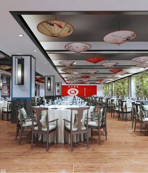
不锈钢顶面让空间不再局限于现有的层高之间,墙面白色组合装饰砖重点突出招牌产品加深顾客记忆。极现代的镜面顶中间一片瓦檐状造型向下揭开,露出古风纸伞,似时空就此穿越。水泥、不锈钢、线性灯、水磨石等当代流行装饰材料呼应宫墙、红柱、仿古砖,让传统国粹小吃与现代空间心手相应。
The stainless steel top surface makes the space no longer limited to the existing floor height. The white composite decorative brick on the wall highlights the signboard products and deepens the customers’ memory. In the middle of the very modern mirror top, a tile eaves shape is opened down to reveal the ancient style paper umbrella, which seems to pass through time and space. Cement, stainless steel, linear lamp, terrazzo and other contemporary popular decorative materials echo, palace walls, red columns, antique bricks, so that traditional Chinese snacks and modern space hand in hand.
HEZHENG STORE
和政路店
平面规划方案
Plane scheme
外观效果展示
Appearance effect display
(外观方案一)
(Appearance scheme 1)
(外观方案二)
(Appearance scheme 2)
内部效果展示
Internal effect display
实拍效果展示
Real effect display
PLAZA STORE
东方红广场店
平面规划方案
Plane scheme
总面积:56m² 后厨面积:19m² 座位系数:1.4
四人区:12人 六人区:18人 卡座区:10人
Total area: 56m²
Kitchen area: 19m²
Seating factor: 1.4
Four people area: 12 people
Six people area: 18 people
Card area: 10 people
外观效果展示
Appearance effect display
内部效果展示
Internal effect display
实拍效果展示
Real effect display
营业现场
Business site
实拍视频
Live video
餐饮项目的落地是检验好设计的标准,很多细节需要反复琢磨与探讨。本次项目落地经过多次现场勘察,对材质、工艺及平面物料等都做了详细的调整优化和把控,最终能受到广泛受众的认可,是翎栖莫大的荣幸。
The landing of catering project is the standard of good design, many details need to be pondered and discussed. After many on-site investigations, the material, process and plane materials of this project have been adjusted, optimized and controlled in detail. It is a great honor for Lingqi to be recognized by a wide audience.
希望通过设计,翎栖能带给你一份美好。
Hope that through the design, Ling SPACE will bring you a beautiful HOTSPOT.
「往期热点」
医疗空间 | 惠安齿科=技术+空间+服务的升级永不停息 | 翎栖设计
翎栖设计|酷!球鞋护理品牌“鞋技”全案设计实录
牙科医院 | 惠安齿科-让设计更关心你的感受 | 翎栖设计
幼儿园空间设计 | 不要用大人的视角磨灭孩子的灵性 | 翎栖设计
餐饮空间 | 建伟炸酱面店-快餐空间就是要轻快明亮 | 翎栖设计
江苏自习室二店 | IINA’Q学与休の交融空间 | 翎栖设计
{{item.text_origin}}

