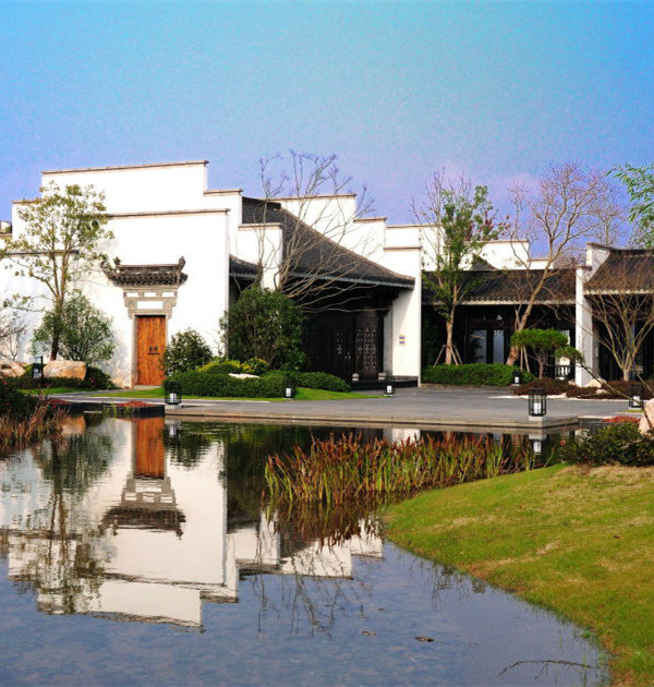
- 项目名称:北京中海甲叁号院
- 开发商:北京中海
- 设计团队:蔡翔,陈芸,胡琼燕,张蓉蓉,蔡迎迎等
- 施工单位:京林园林第二事业部
- 摄影:Holi河狸-景观摄影
HZS 滙张思:中海以 79.4 亿拿下西三环造甲村,作为顶级开发商必争之地,楼面地价 6.66 万/平,创 2019 年北京地王纪录。甲叁号院占据着城市繁华的塔尖地位,极致区位间的稀缺顶奢豪宅,从开发商到设计方施工方都对项目投入了足够的热情与诚意,最大化的珍惜开发这可贵的土地资源就是对社会的一种回馈。
HZS: China Overseas won this plot for 7.94 billion yuan as top developer, the land price is 66,600 yuan per square meter, setting a record for the king of Beijing in 2019. Onesino residence occupies the position of the prosperous spire of the city and the rare luxury mansions in the extreme location. From the developer to the designer and construction party have invested great enthusiasm and sincerity in the project, and cherish the development of this precious land to the greatest extent Resources are a kind of feedback to society.
▼项目位于西三环
而 2020 年疫情席卷全球,在特殊的黑天鹅背景下,项目从沟通到现场指导再到定材、选苗都经历了种种的阻碍。
In 2020, the epidemic has swept the world. Under the special background, the project has experienced various obstacles but finally achieve good results.
设计理念 Design Concept
景观的设计方案在平面与竖向中引入连贯的折线,开合搭配的空间使景观充满戏剧化张力和探索乐趣,最终呈现出独特的折叠绿洲景观。
The landscape design introduced coherent fold lines in the plan, it is full of dramatic tension and exploration pleasure. And display the scene as a folded oasis.
▼方案以折叠绿洲为设计主题 Space Introduction
如何将一个极简的弧面墙做出完美品质感?
How to enbody the quality of a minimalist look curved wall ?
弧面异形景墙的设计使内部空间有种消隐感,打造出豪宅的私属感。但极简的设计和曲面施工,让落地效果要想于极简中达到顶级豪宅入口的品质感,需要克服诸多细节问题。需要精确的曲率复原,和对饰面的细致处理。
The scheme of the curved scenery wall makes the internal space have a sense of hiding and create a sense of private ownership of the mansion courtyard. However, the curved wall caused a series of discussions and experiments over construction.
▼曲面景墙实景 Scenery Wall of the Entrance
首先是内部龙骨的结构,需要先按照现场实际情况进行三维虚拟模型的搭建,保证现场施工的可行性和整体还原度。
同时,我们与结构工程师数次沟通后,最终决定选择真石材干挂代替原本铝板/真石漆的做法,以保证石材纹理质感和拼贴韵律感。
We built a three-dimensional virtual model according to the actual situation of the site to ensure the feasibility and reductivity. After discussion, we finally decided to implement StoneDrySuspension instead of the Aluminum Sheet/ Lacquer to show the texture of the stone and the rhythm of collage.
施工现场结构深化调整 Detailed Design over Construction Process
石材选择上,以现场实景为基础,比对了二十多种相近石材,在中海的造价支持下最终以 528 块产自意大利进口白摩卡石材,经匠人六遍打磨,现场数次排版实验,最终实现了形成润玉触感、弧度精确的双曲面景墙。
We compared more than 20 kinds of similar stone. With the cost support of China Overseas, 528 pieces of imported White Mocha Stones from Italy were finally applied to this project. The stone were polished by the craftsman for six times to ensure the sense of quality.
▼材质对比 Comparison of Stone Texture
上百公里的风餐露宿只为打造藏品级林荫大道
Trekking for hundreds of miles is only for a treasure boulevard
大道两侧种植了 12 棵造型优雅,树冠形态丰满的元宝枫。元宝枫的寻找,始自 2019 年疫情到来的时候,为寻找适合调性和气质的苗木,日均驱车 200 多公里,跑遍了北京周边苗圃地。这些市面上稀有的元宝枫完美契合了项目高端气质。
Planted on both sides of the Guest-meeting Avenue is a selection of 12 Acer Truncatums. The tough search began in 2019 when the epidemic came. We drove over 200 kilometers a day and combed all over the nursery areas around Beijing.
▼元宝枫迎宾大道 Acer Truncatums Boulevard
由于现场实际空间较宽,植物设计在深化中考虑到现场空间体验,并根据管线排布对车位进行调整,最终决定以阵列感元宝枫林荫夹道的方式呈现空,营造豪宅归家仪式感。
The actual space on site is relatively wide. We adjusted the Parking space according to the pipeline layout, and finally decides to present the space in the form of Acer Truncatums boulevard. We hope to ensure the ritual feeling of welcome.
▼迎宾大道种植调整 Planting Adjustment Process
▼元宝枫迎宾大道 Acer Truncatums Boulevard
我们是如何实现落客区门廊的北京第一挑的?
How did we realize NO.1 overhanging eaves in Beijing?
落客区门廊为顶棚结构,高 6 米,单臂悬挑 17.8 米,悬挑跨度为“北京第一挑”。为了落实方案想要的效果,在实景中增强这种视觉震撼力,同时保证结构的可行性。我们通过相关工程软件进行受力计算,推敲出承重墙体的十几种可行位置。
The porch of drop-off area is 6 meters high and 17.8 meters overhanging, which is NO.1 in Beijing. In order to enhances the visual impact and ensure the feasibility of the structure. We calculate the force through the mechanical engineering software, and figure out feasible positions of the bearing wall.
▼落客区门廊 The Porch of Drop-off Area
▼落客区门廊灯光效果 Lighting Effect of Drop-off Area
▼方案还原度对比 Reductivity of the Scheme
最终选定三角形受力体系来保证门廊的悬挑结构,完美体现设计初衷。
Finally, the triangle force system is applied to the overhanging structure, which perfectly realized the reductivity of the design.
▼门廊结构深化设计 Detailed Design of Structure
落客区打造奢华酒店式的落客体验,深化设计借鉴了上海宝格丽酒店的品牌经营与视觉传达理念,为豪宅项目打造属于自己的品牌包装,因此落客区水景进行了标志化处理。古木纹大理石整石材打造圆盘水景,厚度达到 12 公分,上用纯铜条镶嵌“ONE·SINO ·RESIDENCE”LOGO。
The space of drop-off area brings luxury hotel experience. We were referring from the brand management of Shanghai Bvlgari Hotel, hoping to create its own brand image. The waterscape is made of a whole stone of Ancient Wood Grain Marble, with One Sino Residence logo inlaid with copper bars.
▼圆盘水景细节 Detailed Design of Disc Waterscape
▼落客区圆盘水景涌泉状态 Spring State of Disc Waterscape
如何使现代材质与东方含蓄完美地结合?
How to combine the modern and oriental beauty ?
从落客区进入前场,映入眼帘的是玻璃屏风,无形中营造了景观的朦胧美,隐约看见通过曲线打造的景墙和葱翠的植物组团,气氛归于宁静自然。在创造私属感的同时,打造出兼具现代精致做工与回归自然感受的顶级度假体验。
The glass wall creates the beauty of hazy, through which can vaguely see the curved walls and green plants. The atmosphere is quiet and natural. Create a sense of private ownership as well as top-level vacation experience.
▼玻璃屏风 Glass Wall
玻璃造就的朦胧感与建筑之美的互动关系 Interaction with the Beauty of Architecture
我们试图通过玻璃屏风的应用,打造一种特殊的景观效果,用现代化的材质和手法,打造东方古典美中常常追求的雨幕与烟雾感。
Through the application of glass wall, we try to create a special effect——create the Oriental classical beauty of rain and smoke feeling with modern materials and techniques.
概念意向 Intention of Material
当概念到落地,风,也是我们考虑的重要因素
Wind is also an important factor in consideration
为解决北方穿堂风的问题,通过咨询厂商与专业工程团队,进行抗风、防倾覆的实验,我们确定玻璃的极限高度 3 米。最终通过特殊的组装方式和固定卯件让一个三米高的玻璃屏风只需要一端固定,达到了一种最为轻盈的结构效果。
We need to determine the best way to assemble the glass wall. Through consulting with manufacturers and professional engineering team, the bottom reinforcement method of glass was determined. Through wind resistance test, we determined that the height of glass wall should under 3 meters to meet the safety requirements.
▼底部固定件 Bottom Retainer
每个人都拥有独属于自己的指纹,所以我们的玻璃也要有自己的肌理
Our glass has its own texture just like everyone has their own fingerprints
材质的选择上,我们通过十几种玻璃的比对,从透光性反射率、色号等方面考虑材质和水景植物的互动效果,最终敲定了最符合项目调性的肌理。不同于普通大批量生产的工业化产品,我们选用的艺术条纹玻璃,每一块都是职业匠人手工拉槽并打磨而成,由 3 毫米和 8 毫米拉槽组合重复,每块开槽 60 道,一共使用了 318 块超白艺术玻璃。我们结合场地空间感受考虑玻璃构件的规格,组合在一起具有极致的韵律感,加强了空间的协调感。
Each piece is made of Grooved Glass which is manually grooved and polished by professional craftsmen. Different from large-scale producted industrial products, each piece of glass is composed of 3 mm and 8 mm slots, with 60 grooves. A total of 318 pieces of glass are used in this project, creating ultimate sense of rhythm.
▼槽纹玻璃组件拼装与材质选型 Structure & Material of Glass Wall
▼玻璃肌理 Texture of the Glass
前场景观的提升是一个流水、石头与树的故事
The promotion of the landscape is a story of water flow, stone and tree
售楼处前场入口对景 Opposite Scenery of the entrance
根据现场空间的尺度,与甲方团队沟通后,用降低高度的弧形流水墙来代替概念方案。弧形景墙强调空间横向的流动的元素让场所流动感更强,和售楼处入口的折线元素更加契合。改变了三层跌水墙在这里造成的压迫感,一种柔美的东方植物造景方式突显场所的简洁现代,让建筑更有冲击力。
In the concept scheme, there is a three-layer waterscape wall with a height of 3 meters. After observing the scale of field and communicating with the team of Party A, we want to create a more open landscape rather than a space with cramped sense. Therefore, we designed the arc-shaped low wall which conforms to the architectural lines to replace the 3 meters wall.
▼概念方案与落地方案对比 Comparison of Opposite Scenery Schemes
▼流水墙细节 Details of Arc Water Wall
弧形景墙虽降低了概念方案中景墙的高度,但却在做工与材质选择上,提升了方案的品质感。为打造完美的弧度与整体感,我们选用整块石材打磨。石材的材质经过对比甄选,采用了 225 块产自巴西的“范思哲黑”,其特殊的纹理兼具自然美感与细腻质感,石材中的天然晶体会 在阳光下闪闪发亮,与流水形成波光粼粼的效果。
225 pieces of Versace Black Marble produced in Brazil are implemented in arc wall, creating a feeling of luxury. Natural texture of this stone can glitter in the sun and form a sparkling effect under water. The reduction of radian overcomes the construction difficulty. The walls are made of whole stones.
▼石材对比 Comparison of Stone Texture
▼流水墙细节 Details of Arc Water Wall
对景的特型丛生元宝枫,而常规苗圃的元宝枫树形不够舒展,树冠形态不够饱满。在疫情阻碍下,我们的负责人带领团队安排时间轮流在北京及周边苗圃逡巡,精挑细选出树冠饱满,树形优美的超大规格的特型丛生元宝枫,其价值近 30 万,生长了 4、50 年的时间,形成了刚劲和柔美并存的姿态。
The opposite scene at the entrance of the front-yard is a super size Acer Truncatum, with a value of nearly 300,000. It has been growing for 40 or 50 years. Under the hindrance of the epidemic situation, our responsible person led the team to to probedaround the nurseries in Beijing and surroundings to select the tree with full crown and most beautiful tree shape.
▼对景造型树挑选 Selection of Espalier
▼弧形流水墙 Arc Water Wall
▼星光水镜 Mirror Waterscape
深色镜面水景,打造宁静的高级感氛围。夜幕降临,水面上的星星灯亮起来,形成了天幕般的基底,烘托出会所的建筑美。
The black bottom mirror waterscape reflects the blue sky and whole building in the water. When night falls, the ’stars’ in the water light up, the whole building looks like floating over clouds and stars.
▼星光水镜方案还原度对比 Reductivity of Mirror Waterscape
▼LOGO
▼前场水景(回看视角)Front-yard (Look Back View)
打造一个诗意概念的后场——“折叠绿洲”
Create a poetic backyard —— "folded oasis"
后场希望以抽象的设计手法模拟自然山水的形态,通过几何雕塑化的设计语言进行了全新的诠释,形成以折线为设计语言的折叠绿洲。我们希望以变化丰富的空间和光影组织、细节刻画以及现场植物的设计加强了这一空间感受。
We hope to simulate the natural landscape with abstract design, and make a brand-new interpretation through geometric design to form folded oasis. The design of plants is supposed to enhance this space experience.
▼后场 Backyard
▼休憩谷 Leisure Valley
顶板覆土不足,前期概念的诗意想象给后期埋下一连串挑战。
Due to the depth of overburden, concept design buried challenges to the later stage.
概念方案设计了丰富的堆坡地形并用列阵式种植对空间进行了围合,但现场受后场顶板荷载的限制,覆土厚度远远不满足概念方案所需的条件。
Due to the deviation of the overburden depth between real condition and concept design, we have to make certain adjustments to ensure the feasibility of detailed scheme.
▼现场问题思维导图 Construction Difficulties
如何用微地形打造一个令人印象深刻的折叠流动空间?
How to create a folding space with micro-topography?
为保证落地,化大坡为小坡,以微地形的形式搭配几何折线元素,体现了折叠绿洲的概念。将较为单调的直壁挡土墙改为为斜壁挡土墙,并通过黑色光面大理石与黑砾石收边增强了不同界面间的对比,体现折叠感。模纹绿篱的几何折线元素,也在视觉上增强地形的起伏。
In order to ensure the feasibility, we turn the big slope into micro-topography. Folded line elements reflect the concept of folding oasis. We change retaining wall from straight into inclined and enhance the contrast between different interfaces through black marble and black gravel. The geometric line of the pattern hedge also visually enhances the folded feeling.
▼演变图 Formal Evolution
▼折叠绿洲 Folded Oasis
在覆土深度限制下,如何形成植物绿洲?
Planting design with limitation.
因为和现场、甲方沟通后,我们改用一种比较现代柔美的方式去做植物软景,来体现微缩的山川秀美、折叠流动的概念。于是根据人行游线和顶板荷载分布,结合微地形,确定了大乔的最佳种植点,将阵列式种植改为了散点式种植,通过植物进一步突显地形。并通过植物的造型、色彩强化空间划分关系,在植物减少的限制下使植物层次更加丰富分明。
We changed the matrix planting, because after communicating with the scene, Party A, we feel that this style is not suitable. According to the load distribution, combined with micro topography, the best planting point of tree was determined, and the array planting changed into scattered planting. Though planting amount reducing, the planting effect is better.
Planting Adjustment Strategy
后场的特色色叶树是加拿大红枫,这是从根系要求、树木规格、造价、树形、叶形、分枝性综合考虑的。后场空间有一定的游戏与童话色彩,同时具有现代时尚内敛的气质,加拿大红枫的形象符合这一需求。甲叁号院示范区后场种植的是从加拿大海运移栽至北京达 10 年的优选苗。
The characteristic color leaf tree in the backyard is Acer Rubrum L. The selection is according to specifications, cost, tree shape, leaf and branching. The back-yard design owns a feeling of fairy tale as well as modern fashion. Acer Rubrum L. in line with this temperament. Trees planted in the backyard have been transplanted from Canada to Beijing for 10 years.
▼深化方案与概念方案的种植设计与空间营造效果对比 Comparison of Conceptual Scheme and Detailed Scheme
水雾园——如何给现代风格景观一点山水画的朦胧美?
Water mist garden —— how to combine hazy beauty with modern style?
从折叠绿洲进入水雾园,两侧为 3 米高的玻璃屏风。意在搭配背后的绿植,打造一种山水画中雨雾行舟般的朦胧美。
Step into the Water Mist Garden from the Folding Oasis, there are three meters high glass walls on both sides.
▼玻璃屏风 Final Effect of Glass Wall
根据玻璃屏风的尺寸与纹理,进一步深化了水雾园的植物设计,最终选定了一定高度范围内的竹子,对品种进行比对后,确定了状态最好的植株。
According to the size and texture of the glass wall, the plant design of the water mist garden was further deepened, and finally the bamboo in a certain height range was selected. After comparing the varieties, the best plants were determined.
▼水雾园夜景灯光效果 Lighting Effect of Water Mist Garden
▼落地效果 Reductivity of Scheme
我们结合后场的加拿大红枫进行深化设计,将枫叶元素以地雕的形式运用到后场池底,作为一个趣味符号,真正的落叶与地雕呼应,成为后场景观的一个隐喻。
We combine the leaf of Acer Rubrum L. as an element of ground carving. As an interesting symbol, the real fallen leaves echo the ground carving and become a metaphor for the backcourt landscape.
▼落地枫叶地雕 Final Effect of Geoglyph
人工景观照明与雾喷创造了戏剧性的效果并强化特殊的功能节点。尽管所需的设计材料趋于极简、纯粹,但对光线、比例、反射、渐变等其他设计要素的运用巧妙。
Lighting and fog sprayer create dramatic effects and special function. Although the required materials tend to be minimalist and pure, the use of light, proportion, reflection, gradient and other design elements is ingenious.
▼水雾园水雾效果 Fogging State
化繁为简,打造一个无界空间
Simplify the complexity and create a boundless space
由于覆土不够,我们以地雕++ 灯光的全硬景来实现下沉庭院的景观。考虑到此处空间尺度很小,我们决定将这个空间以观赏功能为主,我们通过铺装的延续模糊了室内外的边界,将中庭景观作为室内的视觉延伸,达到室内外在视觉上无缝衔接的效果。并通过地雕和灯光来增强了这种镜面星空水景无边界的感觉。
The part of the sunken courtyard is in charge of the landscape, which a linkage with the interior profession. We finally design this area with all hard landscapes. We hope that this sunken courtyard will bring a sense of high quality in the simplest and direct way.
▼下沉庭院实景图(后场视角)Sunken Garden(View from the Back-yard)
▼下沉庭院实景图(会所内部视角)Sunken Garden(View from the Basement Level)
材料思考:项目想要塑造奢华度假感体验,是低调,内敛和历久弥新的。这一理念在材料中展示得尤为突出。整体材质的选择,从落地效果出发,参考建筑元素,选用了中性色调的白摩卡石材为基调,引入了槽纹玻璃,金属条等细致而有趣的材料来体现项目的创新和奢华格调。基于材料特性而设计的细节才是合理且极尽优雅的,我们通过材质细腻的肌理对比于简单的细节中尽可能体现豪宅景观的品质感,让人与空间与材质进行对话。
项目后记:设计界日新月异,甲方越来越注重原创与创新,豪宅项目更是在此基础上对落地效果有着超高要求。这次项目中,甲方希望从方案概念反馈到现场落地并达到足够高品质的效果,因此我们进行了现场深化提升和施工图设计。时间节点的限制、造价成本的严格控制以及 2020 年的这次疫情都是对我们整个项目生产链的挑战。项目最终的落地得益于甲方对设计的尊重和对整体工作的支持,让我们在概念方案基础上,保留亮点并依据对现场情况的了解,共同研讨进行钻研与创新,高还原度保留亮点的同时进行了合理的提升。
Material Thinking: Project wants to create is a luxury holiday experience, which is low-key, introverted. This concept is particularly prominent in the materials. The overall material selection is according to conceptual scheme and elements which used in the building. The details based on the material characteristics are reasonable and extremely elegant. We hope to show the high quality as much as possible by combining the fine texture of the material with the simple details, so that the work can have a dialogue with space, material and nature.
Project Reflection: With the rapid development of the design industry, Party A pays more attention to the originality and innovation. On this basis, the project has super high requirements on the final effect. In this project, we need to feed back the concept of the conceptual scheme. The limitation of time, the strict control of cost and the impact of the epidemic in 2020 are all challenges to the whole production chain of our project. The final effect also benefits from Party A’s respect for the design. On the basis of the conceptual scheme, it retains the highlights and controls the construction according to the site conditions, finally reach a high level as a detailed scheme.
方案设计:AECOM 旧金山办公室
设计团队:Blake Sanborn, Penny Wong, Glen Phillips, Wen Zhang, Hanting Xie
现场方案深化及施工图设计:HZS 滙张思景观_事业二部设计团队:蔡翔,陈芸,胡琼燕,张蓉蓉,蔡迎迎等建筑设计:HZS 滙张思建筑_北京第二事业部施工单位:京林园林第二事业部摄影:Holi 河狸-- 景观摄影开发商:北京中海甲方团队:尤蕊,王岩,黄莉,马小晶,杜潇,李行言
Programme Design: AECOM San Francisco Office
Design Team of AECOM: Blake Sanborn, Penny Wong, Glen Phillips, Wen Zhang, Hanting Xie
Deepen and Construction Design: HZS_No.2 department
Design Team: Cai Xiang, Chen Yun, Hu Qiongyan, Zhang Rongrong, Cai Yingying, etc
Architectural Design: HZS_Beijing No.2 department
Construction: Jinglin Garden_No.2 department
Photography: Holi Landscape Photography
Developer: China Overseas, Beijing
Developer Team: You Rui, Wang Yan, Huang Li, Ma Xiaojing, Du Xiao, Li Xingyan
{{item.text_origin}}

