KOKORO 咖啡店 | 空间视觉张力最大化的设计策略
KOKORO虽然不大,但却是2021年项目中非常体现“斗西设计商业思考” 的案例。一直以来,150-200平的咖啡店是设计师发挥才华的重地,往往可以在凸显设计师风格的前提下,同时实现让顾客打卡传播,和良好的生意营收,这种条件下是容易出「设计作品」的。而「小型档口」店,尽管在商业上是高坪效的优秀模型,但在设计师眼中却是「作品陷阱」。
Although Kokoro is not a big project, it is an iconic case of “Business Thinking of DAYLAB Design” in the year 2021. For a long time, coffee shops with a size of 150-200 square meters are ideal for designers to show their talents. Under the premise of highlighting the designer’s style, they can also achieve advertising by social media shots and good business revenue. Under such conditions, it is easy to produce “Design Works”. The “small stall” store, although it is an excellent model of high business efficiency, is a “trap” in the eyes of some designers.
▼项目概览 overview ©云眠工作室
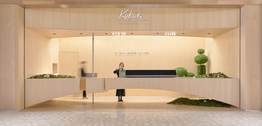
在「生意至上」的前提下,大量的广告展示,灯箱,logo,促销信息等使信息量膨胀;不能坐人,无沉浸感,让消费者主动分享成为奢望;又需要在不影响生意的情况下凸显高级感,几乎形成了一个不可能三角。
Under the premise of “business first”, a large number of advertisements, lightboxes, logos, promotional information, etc. are often used to expand the amount of information; without any sitting or immersive space, it would be a luxury goal to let consumers take the initiative to share on social media; and it needs to highlight a sense of high-end in a situation that does not affect the busy customer flow. All these almost form a “Triangle of Impossible”.
▼吧台空间 view of the bar ©云眠工作室
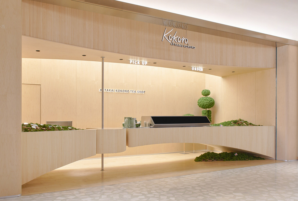
这一次,我们接受这个挑战,并且难上加难的是,KOKORO是一个全新的咖啡品牌,我们要在没有任何「品牌势能」的前提下,实现这个设计。 项目场地是一个接近于类正方形地块,面积不大但也不算特别小,这个体量下, 多数品牌往往会将店一分为二,一部分档口,一部分堂食座椅,兼顾多元的顾客需求。这种稳健策略看似“无风险”,但在竞争激烈的购物中心里可能并不是一个好选择,斗西设计给出的突围策略是:与其做一家看起来小气的「大店」,不如做一家看起来大气的「小店」。我们希望通过大胆的“减法” 让 “空间视觉张力”最大化,来实现对顾客心智的首次攻占。
This time, we accepted the challenge. But what made it even more difficult was that KOKORO was a bran-new coffee brand, and we had to realize this design without any aid from “brand effect”. The project site is a square-shaped parcel, with an area that is not large but not particularly small. Under this volume, most brands would divide the store into two sectors, stall and dine-in areas, to accommodate the diverse customer requests. This robust strategy seems “no risk”, but it may not be a good choice in a highly competitive shopping mall environment. The breakthrough strategy given by Douxi Design is: “ Instead of being a ‘big shop’ that looks stingy, it is better to be a “small shop” that looks grand.” We hope to maximize the “spatial-visual tension” through bold “subtraction” in design to capture customer’s minds at their first glance.
▼吧台局部 details ©云眠工作室
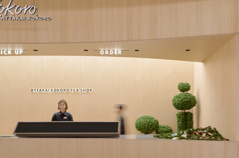
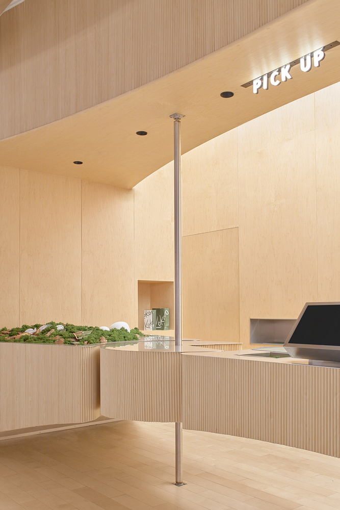
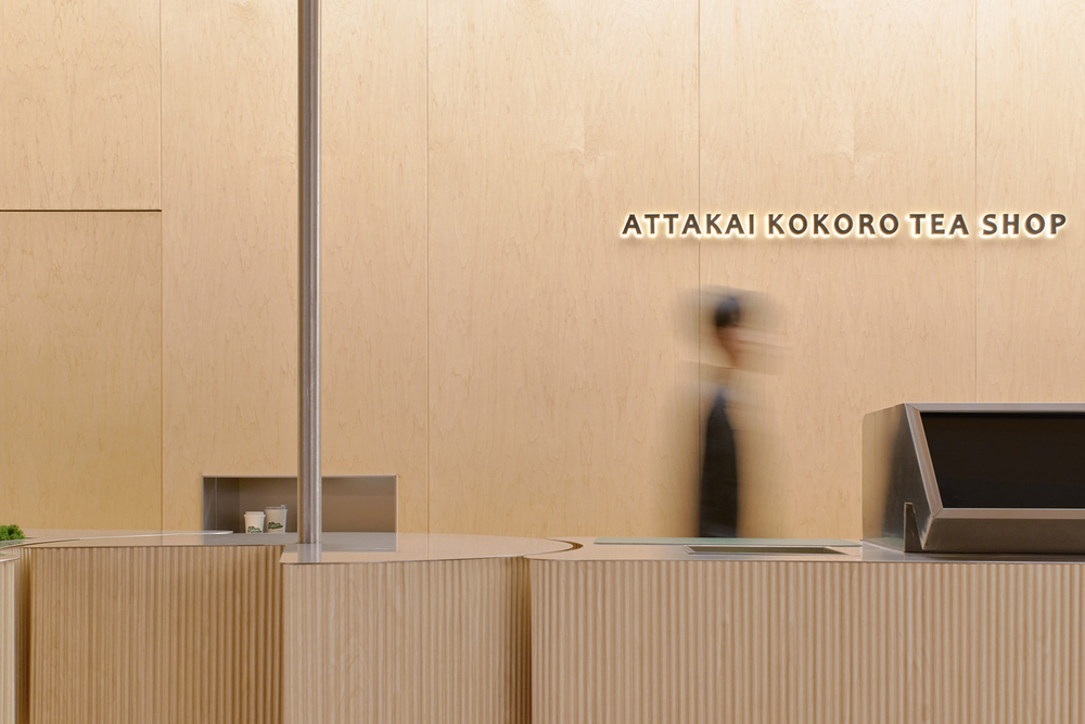
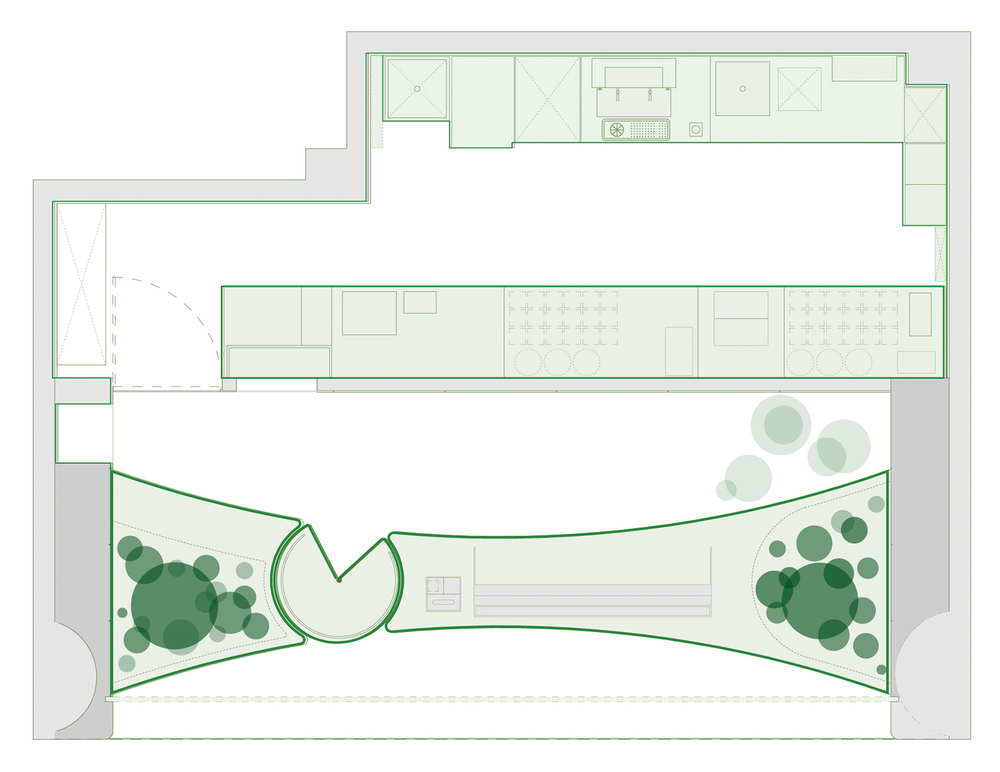
1. 减掉堂食功能,去掉座椅,这样可以有机会实现一个尽可能长且完整的迎客面,让是空间视觉张力最大化。 2. 吧台抬升,悬浮处理,这种给观众“担忧感” 的结构,会再次强化视觉张力。 3. 减掉后吧台。 既然繁忙的制作过程中,保持后吧台的整洁极其苦难。那索性去掉后吧台,可以让杂乱感降到最低,从而营造高级感。 4. 减少信息量。传统档口店,为了营造购物氛围会用大屏、促销、广告等沾满眼球。 减少信息量可以有效的保持空间视觉完整性。
1. Cut the dining function and remove the seat, so that we can have the opportunity to create a complete welcoming surface/facade as long as possible, and to maximize the visual impact of the space. 2. The bar is raised and suspended. This structure will reinforce the visual impact by giving the customers a sense of “trepidation” to a certain extent. 3. Cut the back bar counter. Since the production process is busy, it is extremely hard to keep the back bar clean and tidy. Simply removing the back bar can minimize the sense of clutter and create a sense of high-end luxury. 4. Reduce the amount of information. In traditional stall designs, to create an explosive shopping atmosphere, big screens, promotions, advertisements, etc. are full filled. Reducing the amount of information can effectively maintain spatial-visual integrity.
▼进店与排队 entering and queuing ©斗西设计
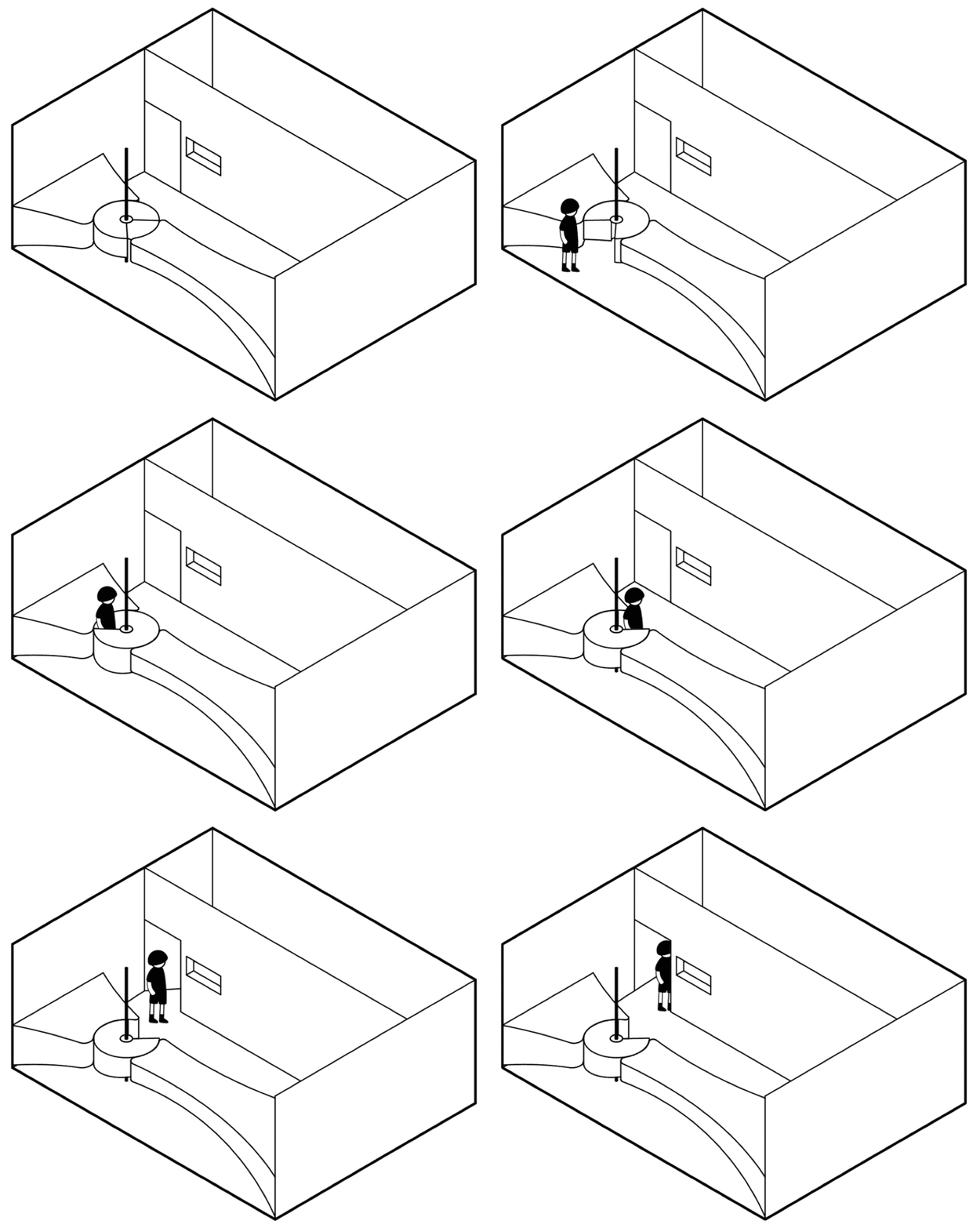
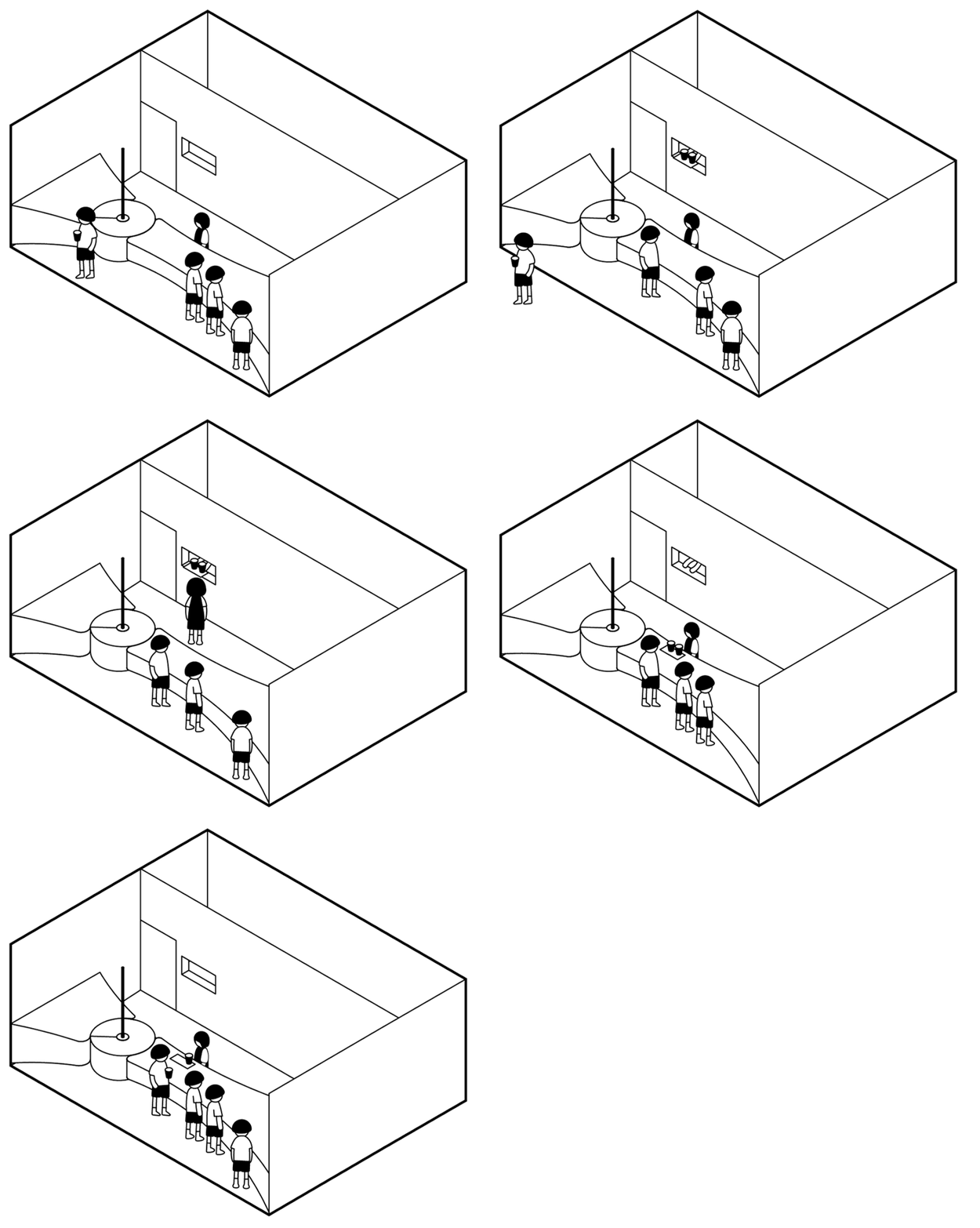
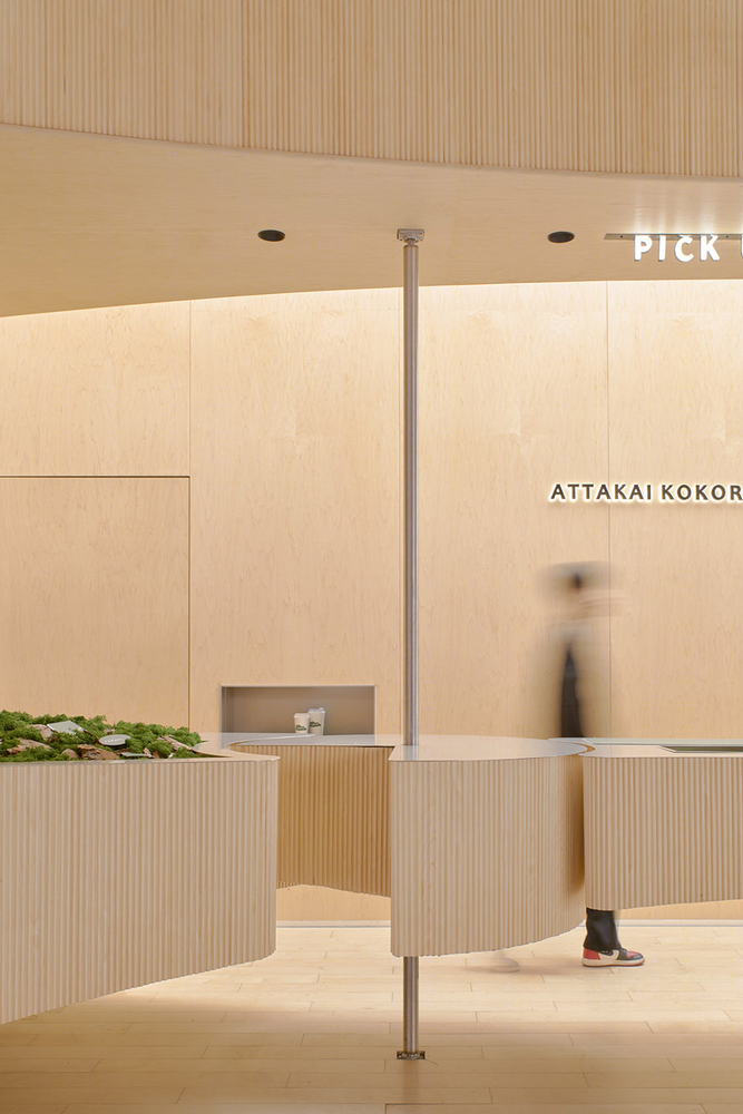
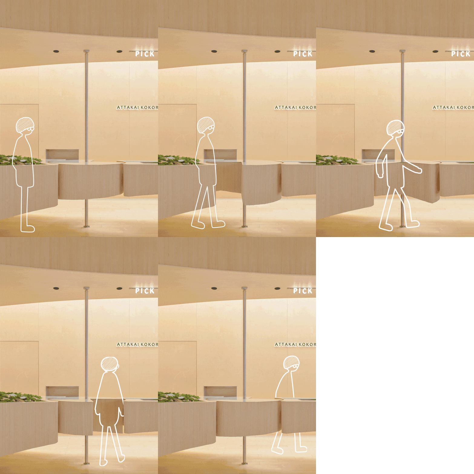
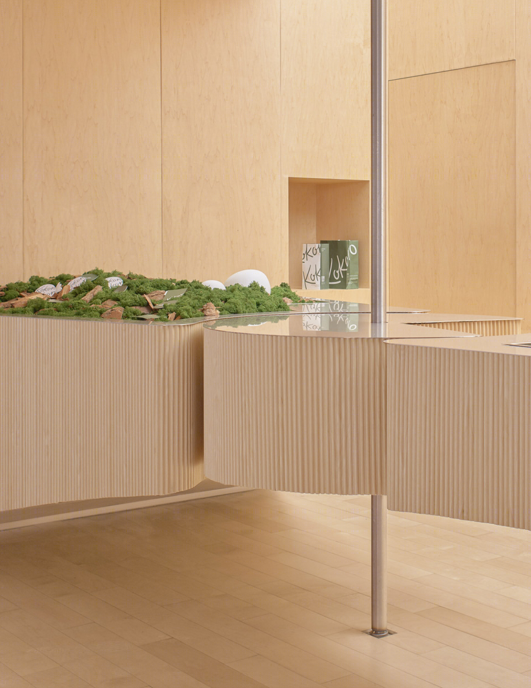
所有新的创意通常伴随着新的问题。问题1: 完整的迎客面虽然张力十足,但 —— 无法进出。 后厨没有独立后门,早晚的原材料与垃圾进出必须从正面通过,是必须要解决的问题。对此,我们用一个四分之三圆,加一根金属转轴,实现了这个“让吧台永不中断 ” 的入口,在保证了视觉连贯统一的同时,又增加了设计的趣味性。
All innovations are usually accompanied by new problems. Issue 1-Although the long welcome surface is full of impact, it is impossible to get staff in and out. The back kitchen does not have an independent service door, which means the raw materials and garbage must be transported through the front in the morning and evening, which lays a problem to be solved first. Correspondingly, we used a three-quarter circle and a metal shaft to create an entrance that “never let the bar be interrupted”. While ensuring visual coherence and integration, it also increased the fun of the design.
▼“让吧台永不中断 ” 的入口 “never let the bar be interrupted” ©云眠工作室
▼动态演示 the moving scene ©云眠工作室
▼入口细部 details ©云眠工作室
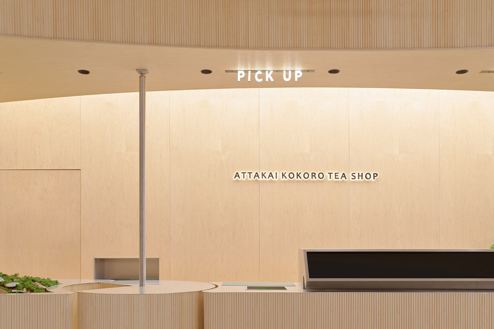
问题2:没有后操作台,那如何便利快速的出餐,也是新的问题。对此,我们设计了一个带有屏幕交互的出餐口,不但实现了便利的出餐,还多了一层神秘感。
Issue 2-Without a back bar counter, it raised another question: how to deliver food conveniently and quickly? In this regard, we designed a food-delivering system with screen interaction, which not only facilitates the food delivery/picking-up but also adds a sense of mystery.
▼屏幕交互的出餐口 a food-delivering system with screen interaction ©云眠工作室
商场的环境太消费主义了,琳琅满目橱窗,日已更新的品牌,让需要生存的商家只能选择“争奇斗艳”的经营方式,而小店无“沉浸感”的天然劣势,也让其失去“灵魂点”,在这种不利情况下,如何仍然赋予小店一些灵魂呢?
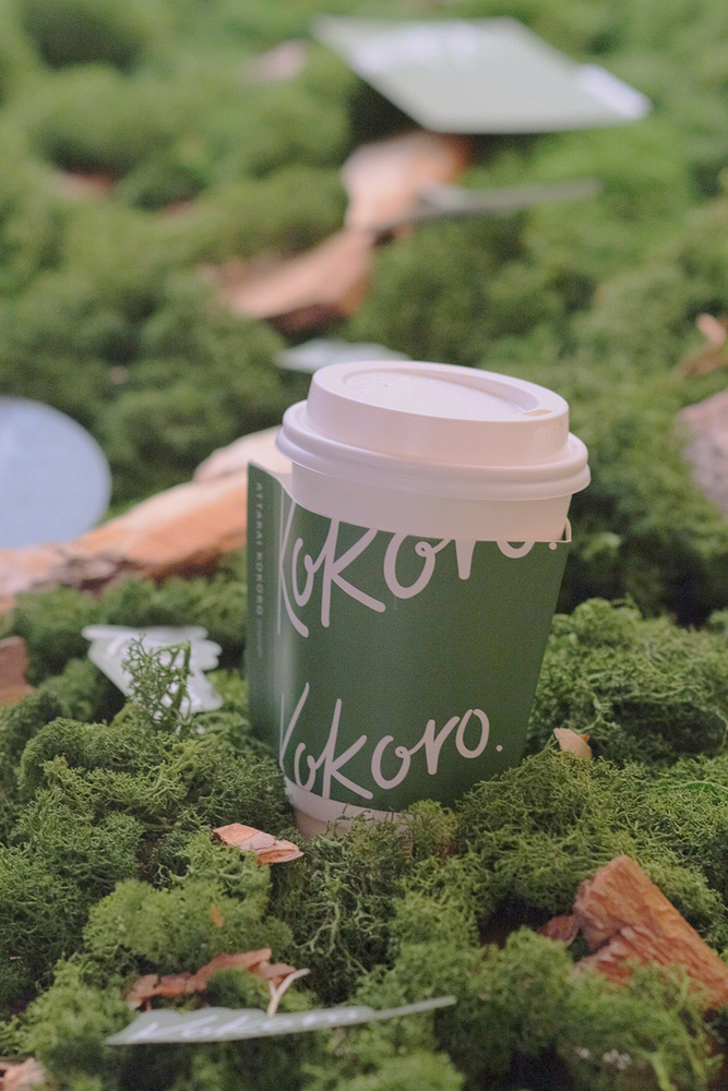
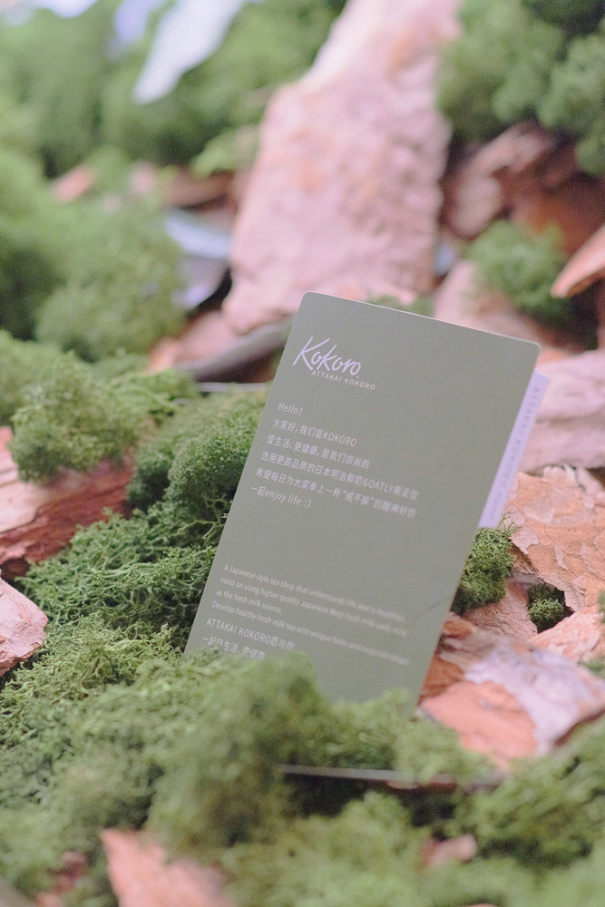
我们想到了 “ 生命力 ” ,选择了一种低调且富有生命力的植物—— “ 苔藓 ”。我们将吧台两端的区域重新利用,让这个角落布满了苔藓、树皮。事实证明,苔藓的设计是成功的,让整个店有了生机的同时,也成为了用户们等候时拍摄传播的标志物。
Issue 3-The shopping mall environment is too consumerist, with an array of dazzling windows and brands updated every day, which forces the stores to compete and involute to survive. This small store which has a natural disadvantage of “no-immersive space” might lose its “Soul”. How to keep the “soul” under this unfavorable situation?
We thought of “vitality” and chose a modest plant full of vitality-“moss.” We reused the areas at both ends of the bar, and let the corners be covered by moss and bark. It is proved that the design of moss is very successful. While bringing vitality to the whole store, it has also become a landmark for users to take photos and post on social media when they are waiting.
▼吧台两端的“ 苔藓 ” moss at both ends of the bar ©云眠工作室

设计完成,回到最初我们要解决的问题,一家商场里的档口小店,需要具有“传播属性”,风格要“低调且高级”,生意又要火爆, 这个不可能三角,在设计的加持下貌似真的可能了。在没有任何推广的情况下,开业第一天就排起了长队。
After the design is completed, back to the initial problems we wanted to solve. A small stall shop in a shopping mall needs to have “propagation attributes” with a style of being “low-key and high-end” while soaring in business. This “triangle of impossible” seems to be possible now with the aid of innovative design. Without any promotion, there was a long queue in front of the store on the first day of opening.
▼细部 details ©云眠工作室
▼平面图 plan ©斗西设计
▼项目更多图片
