- 项目名称:周笙笙全案设计
- 建筑面积:200
- 设计风格:现代极简
- 主要材料:涂料,水磨石瓷砖,线性灯,植物造景等
点击上方“
周笙笙全案设计工作室
”可以
订阅哦!
▲[ 1F平面方案 ]
First Floor plan
此项目是都市里的高端建材卖场,各种品牌专卖店争奇斗艳,展示着各自的独特、格调、新颖与不凡,符号化的世界遮蔽了产品本身的物性。作为传统的空调展厅,试图去除概念,在大环境中保持纯朴,摒弃一切符号性的指向与形式,让光、材质、空间以其本真的属性显现,营造独特的感官体验。
The project is a high-end air conditioning store in the city, where all kinds of brand stores are fighting for their uniqueness, style, novelty and extraordinary. The symbolic world covers the physical nature of the product itself. As a traditional air conditioning exhibition hall, it tries to get rid of the concept, keep the simplicity in the big environment, abandon all symbolic direction and form, let light, material and space appear with their true attributes, and create a unique sensory experience.
▲[ 2F平面方案 ]
Second floor plan
好的空间应该有清晰的动线,给予来客明确的指引,使他们自由游览而不至于迷惑,也应有适当的分区,使人快乐体验并沉浸于其间,不受打扰。
A good space should have a clear moving line, give visitors clear guidance, so that they can freely visit without confusion, and there should be appropriate partition, so that people can experience and immerse in it happily, without being disturbed.
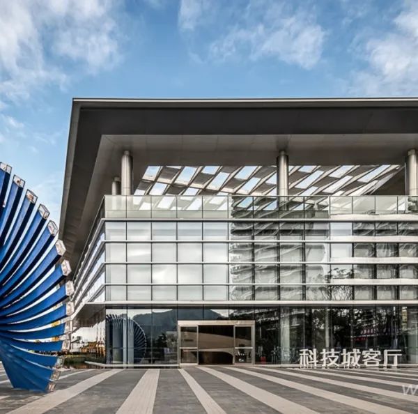
▲[ 门头设计 ]
The door head design
▲[产品展示区1]
Product Display Area 1
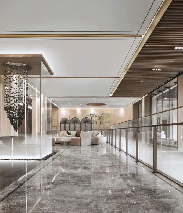
空间是包容着物体的边界,是静止的容器。当我们需要一个展示空调的空间的时候,我们营造的是一种氛围。前台,电梯以及空调展示以植物造景形式呈现,并有一定的结构关系,增加空间的趣味,使人在体验电梯的时候,同时被周边环境熏陶。
Space is a boundary containing objects, a container of rest. When we need a space to display air conditioning, we create an atmosphere. The front desk, elevator and air conditioning display are presented in the form of plant landscaping, and have a certain structural relationship, increase the interest of the space, so that people experience the elevator, while being influenced by the surrounding environment.
▲[产品展示区2]
Product Display Area 2
空间不是一个传统的空调展厅,不直白的陈列和展示产品,而更像一个艺术空间,产品既是构成空间的材料本身,也是用以展览的艺术品。
The space is not a traditional air conditioning exhibition hall, not straightforward display and display of products, but more like an art space, products are not only the materials of the space itself, but also the art for exhibition.
▲[产品展示区2]
Product Display Area 2
‘材质是空间的表皮,决定了空间的触感与视觉温度。顶面使用镜面不锈钢的体块,它纯净光滑,不传递任何信息,类似于“无”,保护着内部的“有”,并与之形成对比。
Material is the skin of the space, which determines the tactile sensation and visual temperature of the space. The top uses a mirrored stainless steel volume, which is pure and smooth and does not convey any information, similar to the "nothing", protecting and contrasting the "something" inside.
▲[产品展示区2]
Product Display Area 2
将这些发散的立意点以空间结构、尺度、色彩的形式铺开,结合功能性的区域划分最终呈现出这样的一个空间。
The wall structure in ' 'glass box' 'with the height dislocation makes the space permeate each other, forming a new three-dimensional form of the scene.
▲[产品展示区2]
Product Display Area 2
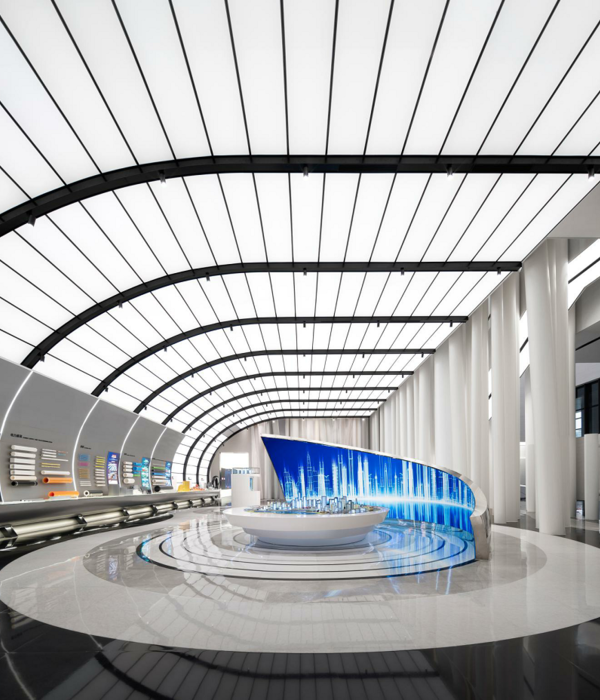
洽谈区顶面,呈现出立体弧形的盒状,以灯带渲染着盒体的边缘,加之线条化结构,将个性化的光影轨迹融入空间,蔓延出一种未来意境
The top surface of the negotiation area presents a three-dimensional arc box, with the light strip rendering the edge of the box body, and the linear structure integrates the personalized light and shadow track into the space, spreading out a future artistic conception
项目地址:浙江-嘉兴-东芝中央空调展示中心
建筑面积:200
设计风格:现代极简
硬装设计
:
周笙笙建筑装饰设计
主要材料:涂料、水磨石瓷砖、线性灯、植物造景等
THANKS
公司地址:长沙东塘潇湘红影文创园3-206
手机 /tel:15388051772
:长沙设计师
周笙笙
周笙笙全案实景 | 卓伯根(ZURBRÜGGEN)·1900项目中国区总部楼盘
周笙笙全案设计 | J.Z(橘子)时尚买手店
{{item.text_origin}}

