- 项目名称:略味法式甜品店
- 项目面积:室内220㎡,室外80㎡
- 设计公司:绘意明成
- 设计师:吴立成
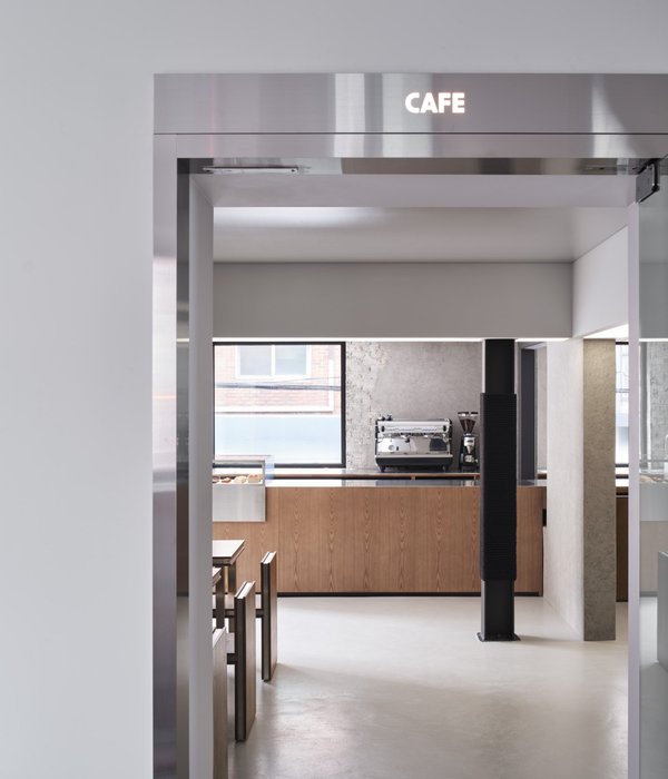
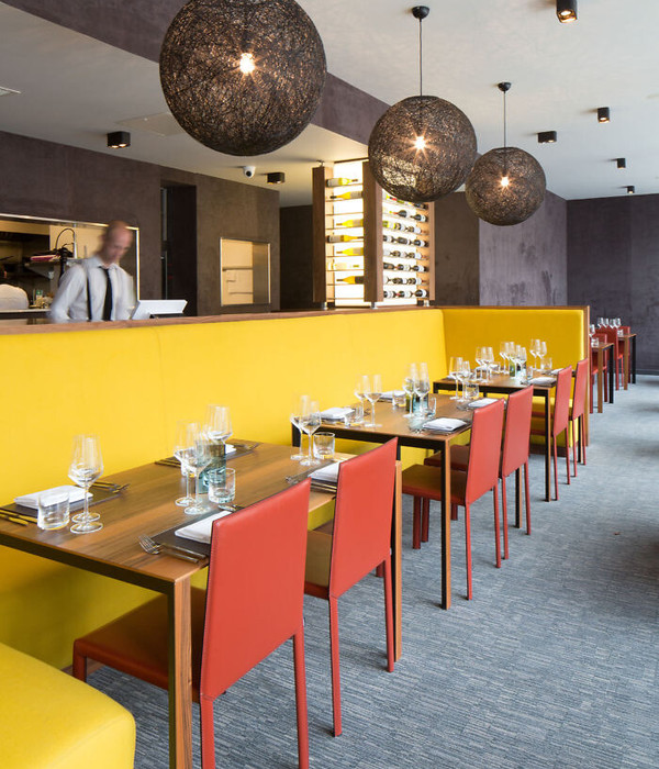
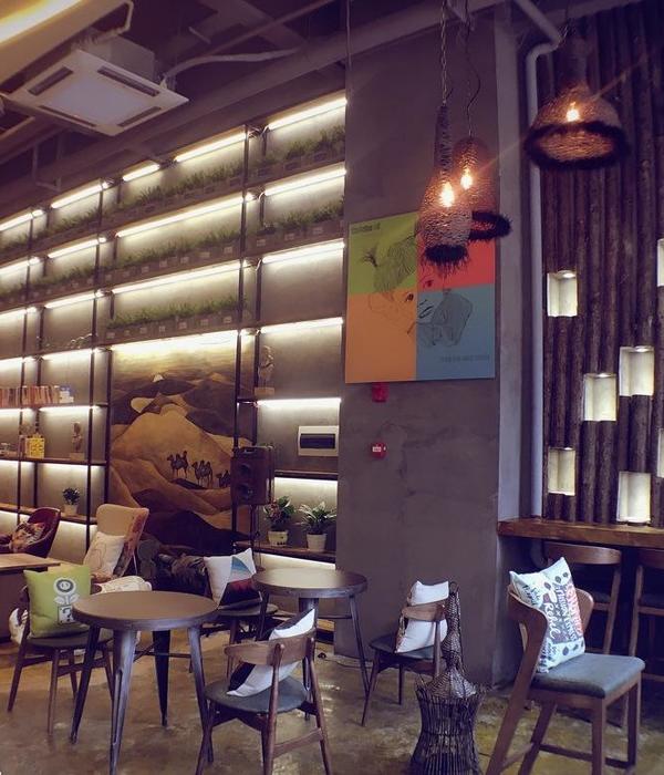
这是一个有关餐饮的空间,挑逗的是食客们的味蕾。通过不同颜色物料的点缀与渲染,将视觉元素尽情抒发,制造了一个兼顾了古典、时尚、潮流的富有创意性的空间。这家略味法式甜品店经过空间设计师精心的创造,便开始拥有了欧洲文艺复兴时期的感觉,视觉与味觉通感,带给食客一场不同寻常的有关甜品的舌尖盛宴。
This is a space for food and beverage, teasing with diners’ taste buds. With the embellishment and rendering of different colors and materials, the visual effects burst out: it creates a space that combines the features of classics, fashion and trend altogether. This Le Régal French dessert shop has been carefully designed and endowed with a temperament of the European Renaissance period. Its visual and sensuous sensation brings diners an unusual feast of sweets.
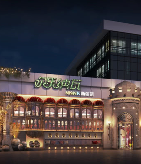
门口,那紫色的薰衣草,在悄悄叙说一份婉约,带着香草的气息,在嗅觉和视觉的双重引导下逐渐打开食客的味觉神经,吸引客人迫不及待想来品尝这一抹香甜。
The purple lavender at the entrance quietly shows its grace. As it spreads its fragrance, the guests’ sense of smell and vision are stimulated, luring them to taste this sweetness.
The specially designed copper flower box is the iconic decoration of the dessert shop. On the golden box, there is a unique LOGO, well-trimmed green tree ball, which matches well with the box. inadvertently, a French romantic scene and a cosy outdoor space is so created.
特意重新冲印成黑白的文艺复兴时期大师的画作,画面的感觉被重新塑造,而画框也用了黑色,恰到好处的跟甜品店整体的黑融为一体。加上整体的色调和感觉,设计师化繁为简,用很少的元素,就表达了这样一个有欧洲文艺复兴时期感觉的甜品店空间,从而富有古典美及时代韵味。
Art works from the Renaissance are re-printed in black and white, presenting a totally different artistic feeling. Meanwhile, as the frame is also black, which echoes well with the overall tone of the shop. Considering the hue and sense of the shop as a whole, the designer simplified the decorations with only a few elements, turning it into a dessert shop with a sense of European Renaissance, the classical beauty and contemporary charm.
提到甜品店,大家的第一印象莫过于是白色、绿色、黄色等色调构成的清新明朗、抑或是文艺小资范的空间,而设计师吴立成却反其道而行之,大面积使用了与常规甜品店不着调的相对沉重的黑色、金色、薄荷绿、深咖色。
When it comes to dessert shops, our first impression is usually either a fresh and bright space decorated with a tinge of white, green and yellow, or an artistic and romantic area. However, designer Wu did in an opposite way –widely applying the relatively dark colors, such as black, gold, mint green and dark brown, to the shop, which is not a common attempt to do with normal dessert shops.
这几个颜色组合起来很香。黑色的运用,显得神秘,它消除了人的部份方向感,让顾客专注于这个由空间和美食组成的具有浪漫气息的场景和氛围中。在这个设计中,大片的黑能散发甜到溢出来的饱满。金色给人一种富有高贵质感的香味,而薄荷绿自带浓浓的香草气息,而深咖色的使用,则犹如激发了浓郁的咖啡香。设计师这样说。
"These colors are too light to be used together. The choice of black color makes it look more mysterious, eliminating customers’ sense of direction partly and allowing them to focus on this romantic scene and atmosphere made up of well-designed space and delicacies.
In this design, the large piece of black can fulfill the sweetness in the dessert; the golden gives a scent of noble texture; the mint green comes with a rich aroma of vanilla; while the use of dark brown brings about a rich flavor of coffee," said the designer.
深受传统文化影响的设计师,在给整个甜品店设计时喜欢运用一些古典元素,但他喜欢的,是改良后的古典元素。这样既传承了传统的设计元素,又能让这种美让更多的现代人所喜爱和接受,让人如同在新旧文明间穿越。而所有的设计兼顾了古典、时尚以及潮流,从而终成经典。
Deeply influenced by traditional culture, the designer prefers to apply some classical elements in the dessert shop design; yet, what he likes is the improved ones. In this way, not only the traditional elements could be kept, but also the beauty can be appreciated and accepted by more modern people as people can experience both old and new civilizations. In a word, all the designs of the shop include elements of classics, fashion and trends; that is what makes it last long.
项目名称 | 略味法式甜品店
Project Name | Le Régal French Dessert
项目地点 | 陕西 西安
Project Location | Xi’an,Shanxi
项目面积 | 室内 220㎡,室外 80
Project Area | Indoor 220 sqm, Outdoor 80 sqm
设计公司 | 绘意明成
Designer Office | HUI YI MING CHENG
设计师 | 吴立成
Designer | wulicheng
摄影师 | 吴立成
Photographer | wulicheng
绘意明成
Le Régal French Dessert
图纸呈现
创作手稿
平面图
绘意明成
Le Régal French Dessert
公司介绍
吴立成
绘意明成,专注于餐饮,酒店,会所,建筑等公共空间设计,以及跨界艺术创作。
HYMC specialize in public space design, such as restaurant, hotel, and club, and crossover creative art works.
供稿 / 绘意明成
{{item.text_origin}}

