巴黎香榭丽舍大道老佛爷旗舰店 | Art Deco 与时尚的完美融合
老佛爷百货香榭丽舍大道旗舰店位于一座修建于1932年的Art Deco风格的银行大楼内。这一精心设计的“零售实验室”汇聚了世界领先的时装、餐饮和生活方式品牌,同时与周围的城市环境形成连接。
Located on the iconic Avenue des Champs-Élysées, the historic Art Deco bank building from 1932 is uncovered and celebrated to create a carefully curated retail laboratory for world’s leading fashion, food and lifestyle brands to come together with each other and the surrounding city.
▼商场外观,exterior view

占地6800平方米的老佛爷百货概念店于2019年春季正式向公众开放,吸引了当地和全球的购物者走进这座重新焕发光彩的Art Deco建筑。作为著名的香榭丽舍大道上面积最大的商店,四层高的宽敞空间结合了旧时的优雅与现代的时尚感,将为公众带来一系列经典和新潮的品牌以及各种各样的活动和体验。
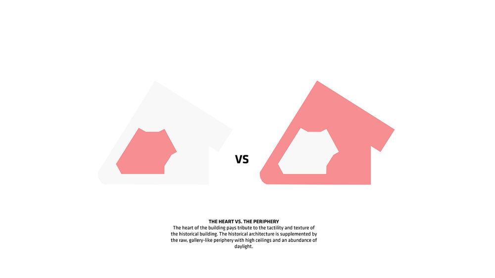
▼核心与外围:Art Deco建筑的温暖核心与新门店的现代化设计形成碰撞。THE HEART VS. THE PERIPHERY: The warm and historic heart of the 1932 Art Deco bank building meets the fresh and contemporary periphery of the new Galeries Lafaeytte Champs Elysees

The 6,800m2 Galeries Lafayette concept store officially opened its doors to the public in Spring 2019, welcoming local and global shoppers into the restored Art Deco gem. The generous four-story environment is the largest store on the famed Parisian boulevard and combines old world elegance with modern chic, hosting established and emerging brands, experiences and events.
▼重新焕发光彩的Art Deco建筑,the restored Art Deco gem
设计充分尊重了历史建筑的触感和肌理。在游览商场的过程中,顾客将不断邂逅建筑中以现代方式重新被诠释的珍贵材料与精美细节。漫步在画廊般的空间周围,如同穿越一系列尺度亲切的建筑元素,并从中收获各具特色的购物体验。
▼核心与外围:建筑历史悠久的内部空间与画廊般的围合结构形成和谐的关系,高高的天花板带来充足的光照。THE HEART VS. THE PERIPHERY: The heart of the building pays tribute to the tactility and texture of the historical building. The historical architecture is supplemented by the raw, gallery-like periphery with high ceilings and an abundance of daylight

Our design pays tribute to the tactility and texture of the historical building. Throughout the store, visitors encounter precious materials and refined details from the past that are reinterpreted and deployed in a contemporary way. Walking around the lofty gallery-like space feels as moving through a composition of architectural elements that operate at the scale of furniture and create defined experiential shopping zones.
▼中庭空间,atrium
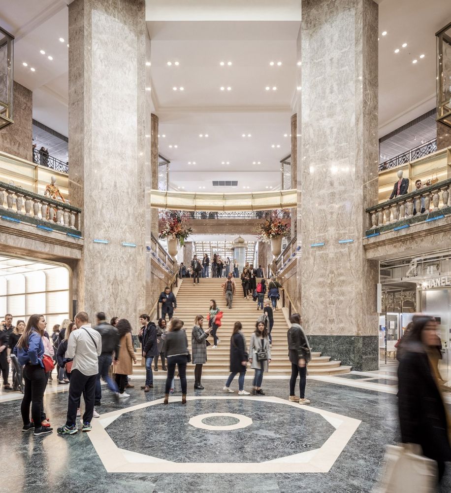
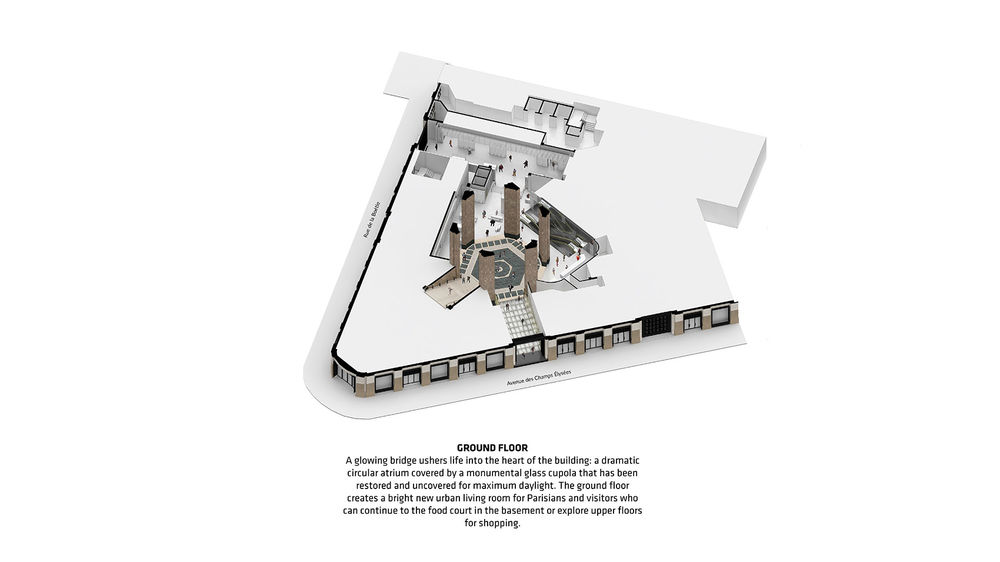
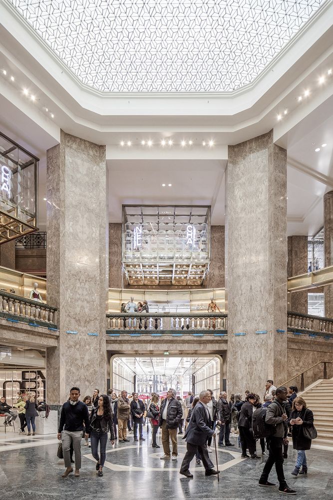
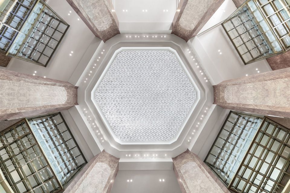
顾客们可以从街道层的内向式入口进入大楼。一座发光的桥将人们带往建筑的中心:一座富有戏剧性的、由巨大玻璃圆顶覆盖的圆形中庭,在经过修复之后可以带来最大化的光照。
▼首层空间,ground floor
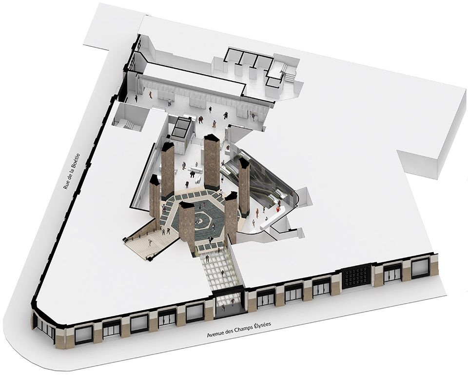
Shoppers are invited into the building through an inverse canopy on the street level. A glowing bridge ushers life into the heart of the building: a dramatic circular atrium covered by a monumental glass cupola that has been restored and uncovered for maximum daylight.
▼内向式入口走廊,the inverse canopy

▼圆形中庭,the circular atrium
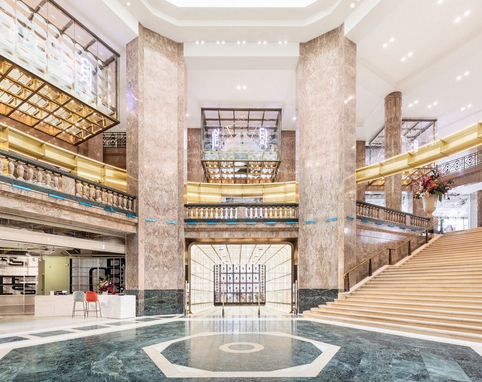
▼巨大玻璃圆顶带来最大化的光照,the monumental glass cupola has been restored and uncovered for maximum daylight
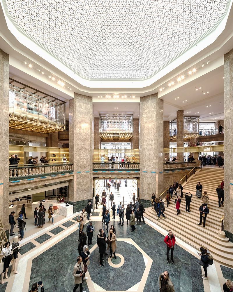
▼天窗细部,skylight
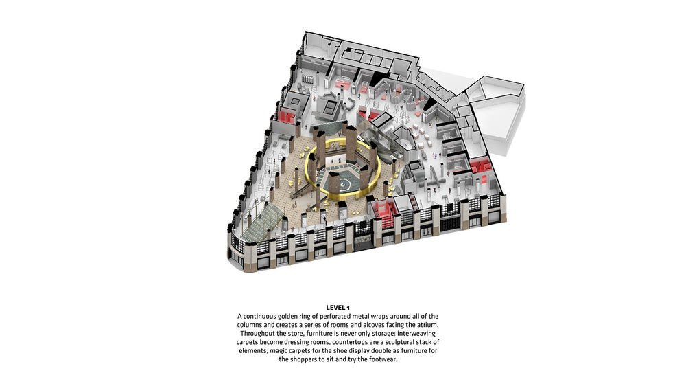
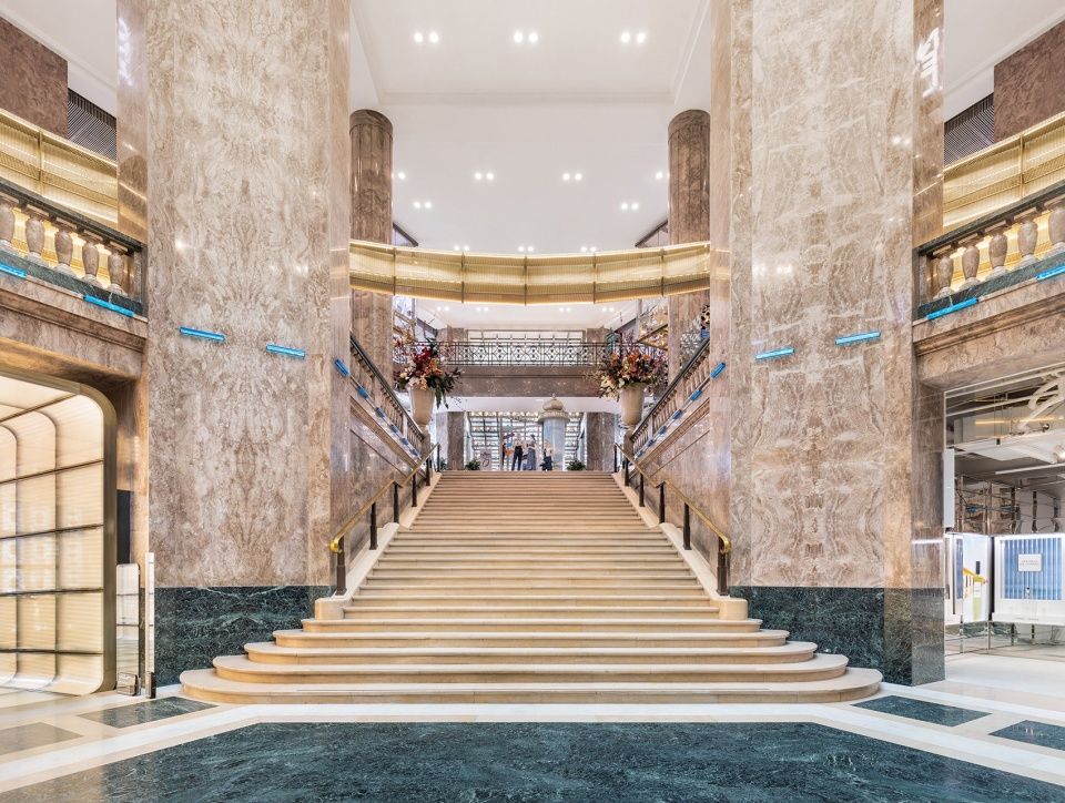
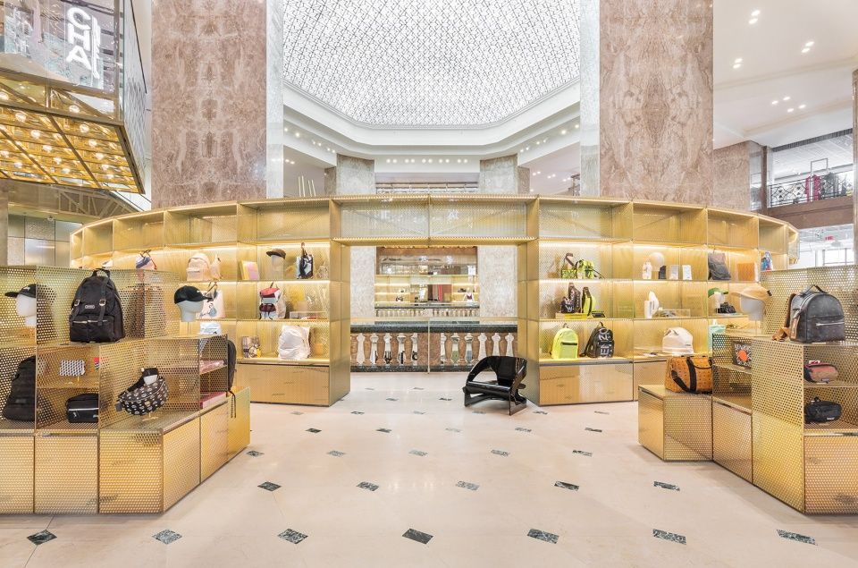
整个商场在首层空间充分打开,为品牌宣传、时装秀和其他特殊活动提供了明亮的聚集场地。在活动期间,宏伟的楼梯也可作为观众区域。在平时,楼梯将顾客引向二层的多功能空间,这里主要用于展示创意新兴品牌,同时还提供丹宁布实验室、珠宝展示空间以及限量版运动鞋和科技产品展示空间。由穿孔金属板构成的金色圆环将所有的立柱围绕起来,创造出一个连续的面向中庭的嵌入式展示空间。
▼二层空间,first floor

The entire store unfolds itself on the ground floor and creates a bright new urban living room for brand activations, fashion shows and other special events. A grand staircase, which doubles as an auditorium during events, takes visitors to the mixed-use space on the first floor which features creative and emerging brands, as well as a denim lab, jewelry display, limited edition sneakers and tech products. A continuous golden ring of perforated metal wraps around all of the columns and creates a series of rooms and alcoves facing the atrium.
▼由穿孔金属板构成的金色圆环将所有的立柱围绕起来,a continuous golden ring of perforated metal wraps around all of the columns
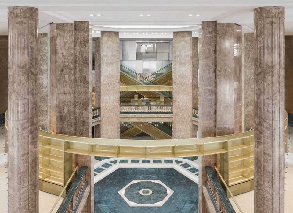
▼圆环围绕着中庭构成展示空间,the ring creates a series of rooms and alcoves facing the atrium
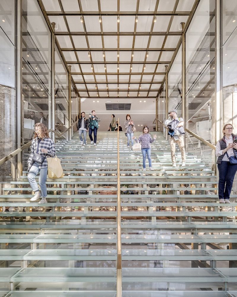
顾客们可以从商场一层直接看到上方楼层的空间,这能够吸引他们去探索不同的空间和活动。楼梯采用了温暖的金属饰面和与中庭配色相呼应的条带状玻璃。
From the ground floor, visitors are immediately able to see the upper levels enticing them to explore the different destinations and activities. The escalators are finished in warm metal and a ribbon of glass in the same material palette as the central atrium.
▼楼梯,staircase

▼金属饰面和条带状玻璃,the metal furnishing and a ribbon of glass
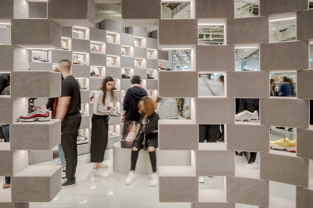
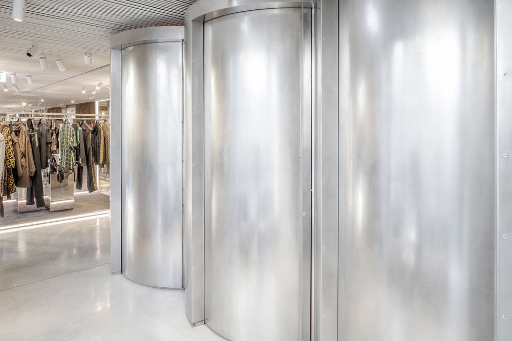
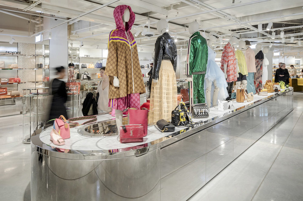
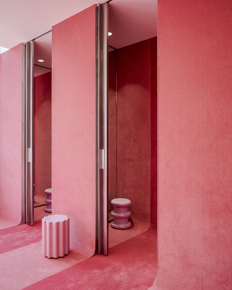
探索商店和不同楼层的体验就像是参观一场精心设计的展览,家居元素早已超越了存储物品的功能:地毯被做成了更衣室;展示台面同时也是雕塑作品;鞋子被展示在一张张“魔毯”上——它们同时也可用作试鞋时的座位。
Exploring the store and its different levels feels like a carefully curated environment where furniture is never only storage: interweaving carpets become dressing rooms, countertops are a sculptural stack of elements, magic carpets for the shoe display double as furniture for the shoppers to sit and try the footwear.
▼试衣间, dressing rooms

▼探索商店和不同楼层的体验就像是参观一场精心设计的展览,exploring the store and its different levels feels like a carefully curated environment where furniture is never only storage
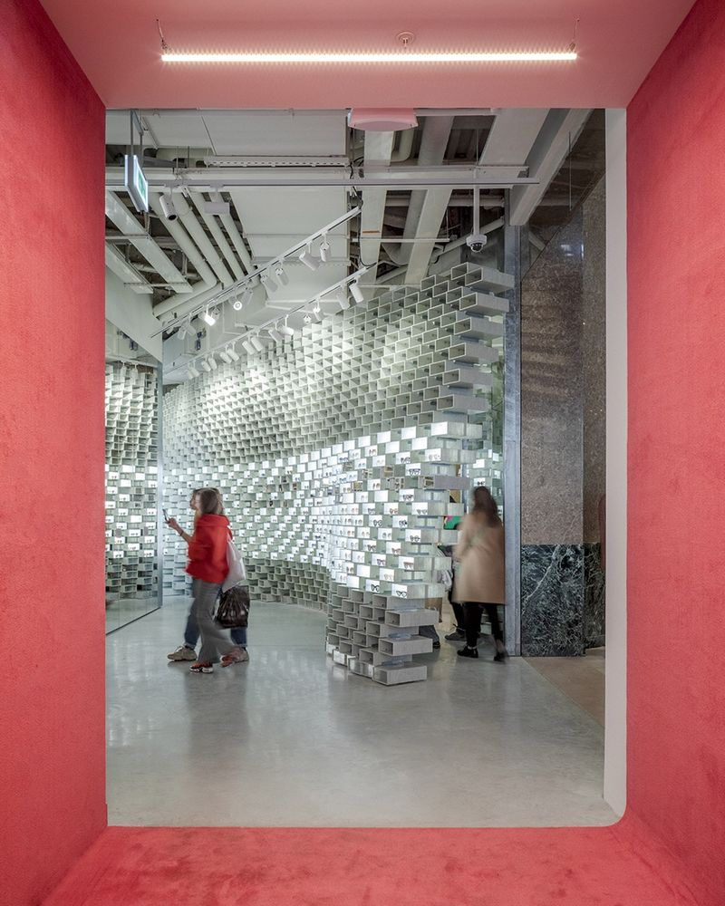

▼珠宝展示区,jewelry display

▼运动鞋被展示在一张张“魔毯”上,magic carpets for the shoe display

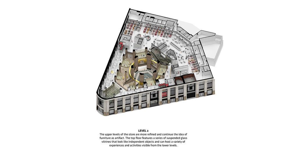
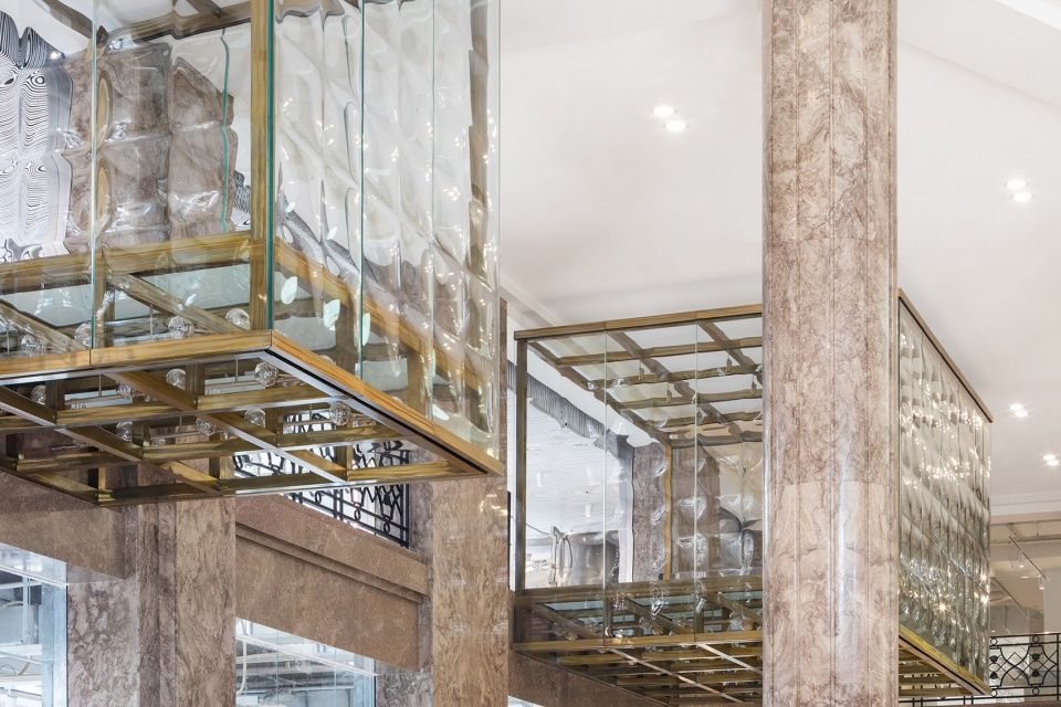
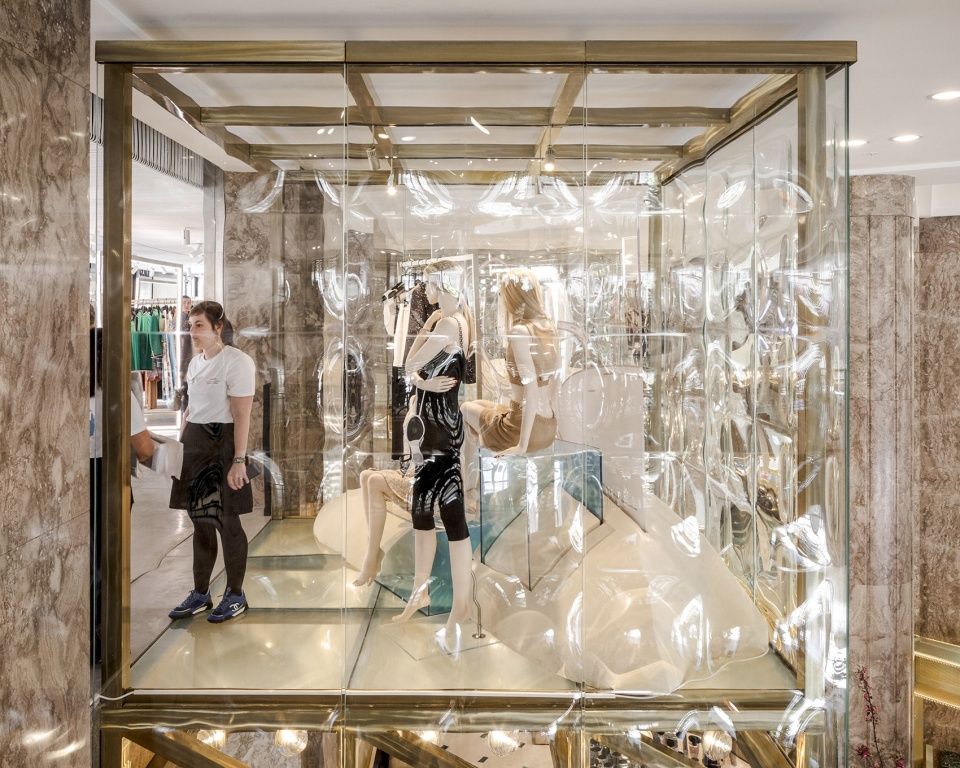
顶部的几个楼层更为精致,延续了将家具视为工艺品的理念。顶层空间设有一系列悬浮的玻璃橱窗,看上去如同是独立的艺术品,可以承载不同类型的活动,并且可以直接从底下的楼层望见。
▼三层空间,second floor
The upper levels of the store are more refined and continue the idea of furniture as artifact. The top floor features a series of suspended glass vitrines that look like independent objects and can host a variety of experiences and activities visible from the lower levels.
▼悬浮的玻璃橱窗犹如独立的艺术品,a series of suspended glass vitrines look like independent objects

▼橱窗细部,detailed view
三层的Oursin餐厅为顾客提供了用餐和欣赏城市美景的空间。二层的Citron咖啡厅也是放松身心的好去处。餐厅和咖啡厅均是由法国时装设计师Simon Porte Jacquemus设计并由Caviar Kaspia餐饮公司运营。与此同时,商场的地下层是一座巴黎美食广场,包含各式各样的杂货店和饮食店,并分为“甜味”和“咸味”两个部分。此外还有大量的吧台围绕在热闹的共享餐桌旁边。
On the second floor, shoppers can dine in the Oursin restaurant while enjoying views of the city or relax at the Citron coffee lounge on the 1st floor, both designed by French fashion designer Simon Porte Jacquemus and operated by Caviar Kaspia. Meanwhile, the entire basement floor is a Parisian food court, where groceries and eateries are divided into sweet and savory sections and where massive counters are arranged around welcoming shared tables.
▼休闲咖啡厅,coffee lounge
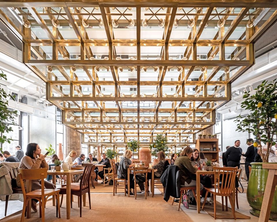
▼咖啡厅由法国时装设计师Simon Porte Jacquemus设计,the coffee lounge is designed by French fashion designer Simon Porte Jacquemus
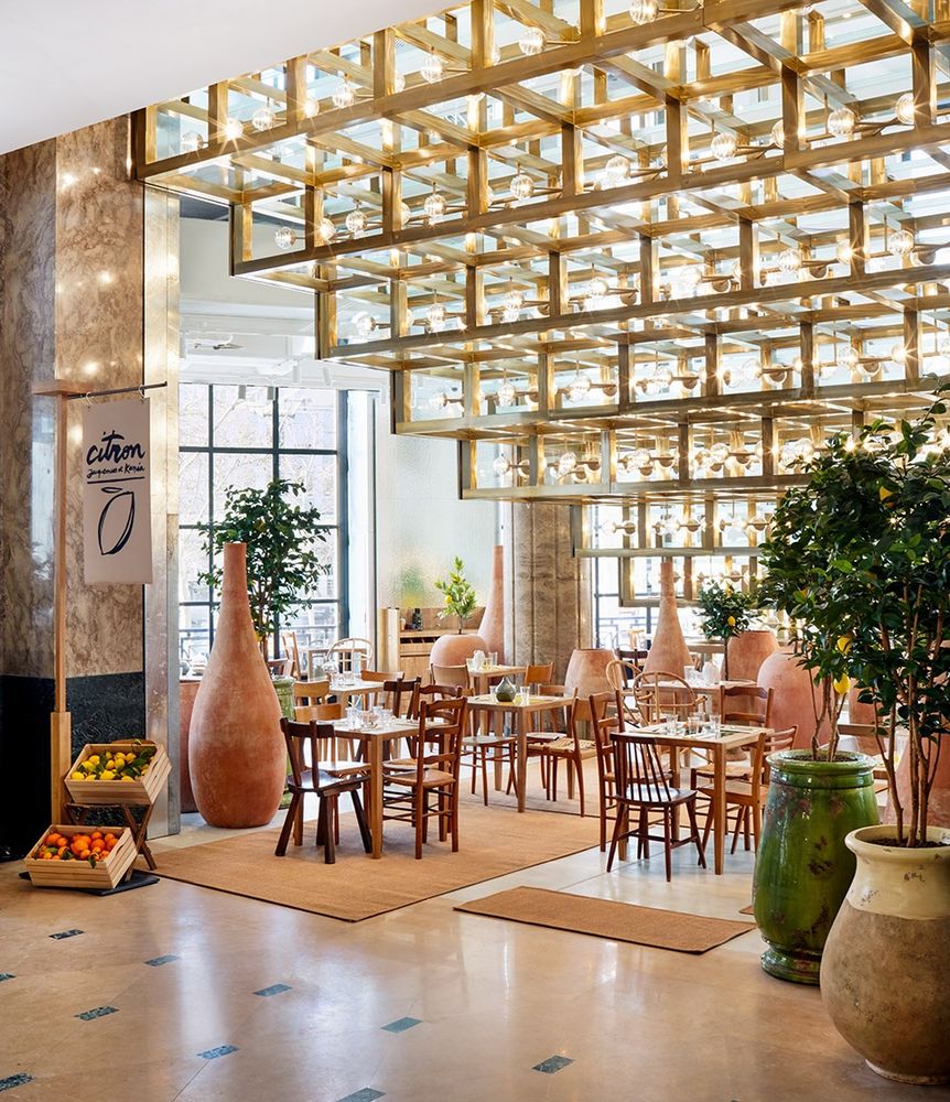
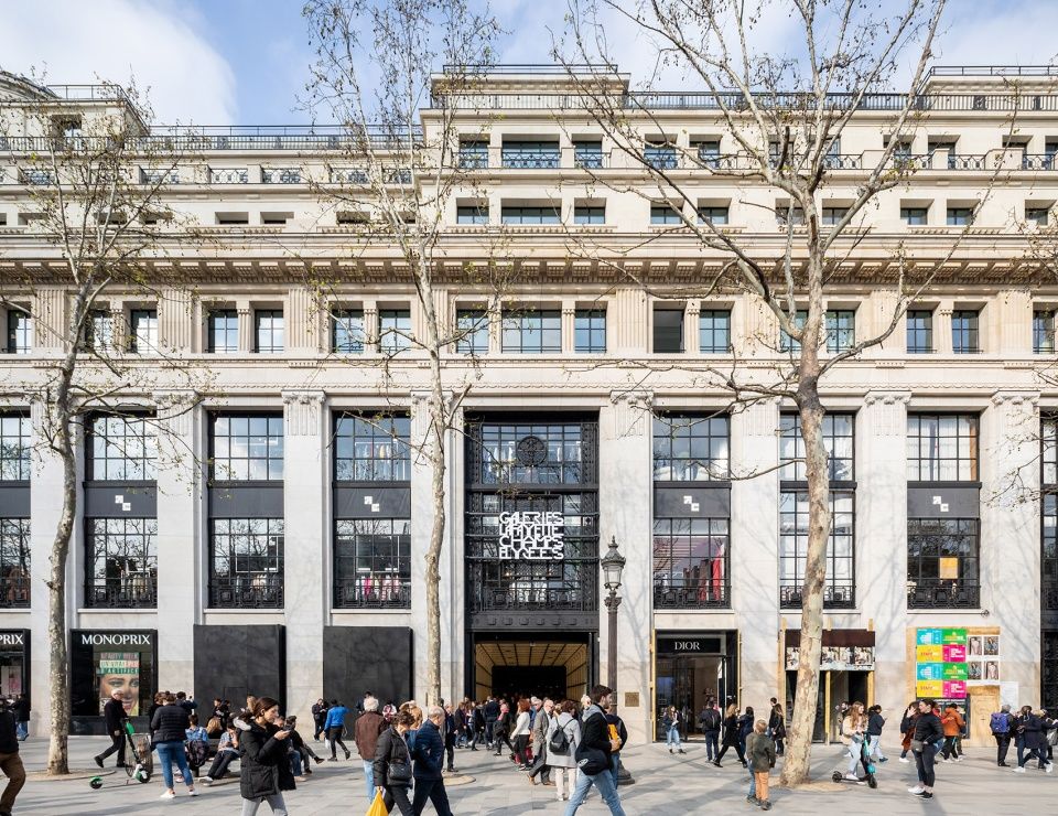
▼临街立面,street view
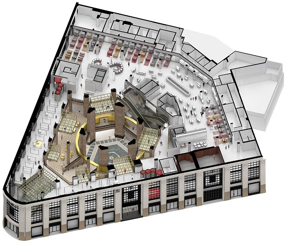
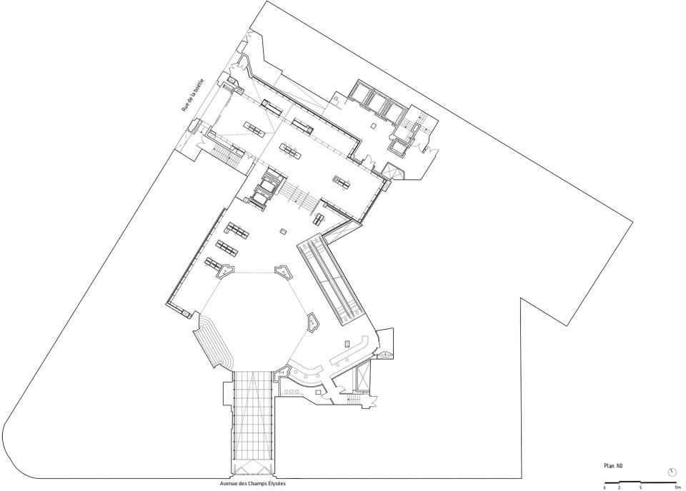
▼首层平面图,ground floor plan
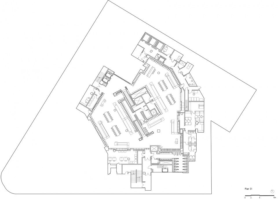
▼二层平面图,first floor plan

▼三层平面图,second floor plan

▼地下一层平面图,basement floor plan
▼立面图,elevation


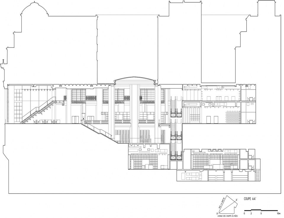
▼剖面图AA’,section AA’
▼剖面图BB’,section BB’

PROJECT DATA Name: GALERIES LAFAYETTE FLAGSHIP ON CHAMPS-ÉLYSÉES Code: GLCE Date: 28/03/2019 Program: Commercial Status: Completed Size in ㎡: 6800 Project type: Competition Client: Groupe Galeries Lafayette Collaborators: SRA Architectes (Local Architect), SETEC (MEP), AR-C (Structural Engineer), SNAIK (Lighting Designer), Theater Project (Acoustic Consultants), Cabinet Vanguard (Cost Consultants, Arch Specs), BIG Interiors (Interior Design) Location Text: Paris, France Location: (48.8704642,2.306304800000021) PROJECT TEAM Partners-in-Charge: Bjarke Ingels, Jakob Sand Project Managers: Karim Muallem, Gabrielle Nadeau Project Leaders: Karim Muallem, Gabrielle Nadeau, Xavier Delanoue (architecture), Francesca Portesine, Pauline Lavie-Luong (furniture) Team: Agla Sigridur Egilsdottir, Alvaro Garcia, Amro Abdelsalam, Anis Souissi, Anna Juzak, Aurelie Frolet, Catalina Rivera, Christian Lopez, Clementine Huck, Dimitrie Grigorescu, Emily Pickett, Emine Halefoglu, Enea Michelesio, Ethan Duffey, Étienne Duval, Filip Milovanovic, Francisco Javier Sarria Salazar, Gerhard Pfeiler, Hugo Yun Tong Soo, Hye-Min Cha, Jakob Lange, Janie Green, Joanna M. Lesna, José Carlos de Silva, Katarzyna Swiderska, Laurent de Carnière, Lucas Stein, Lucian Racovitan, Malgorzata Mutkowska, Marie Lancon, Miguel Rebelo, Monika Dauksaite, Paula Domka, Philip Rufus Knauf, Quentin Blasing, Rahul Girish, Ramona Montecillo, Raphael Ciriani, Sergi Sauras i Collado, Stefano Zugno, Taylor Fulton, Terrence Chew, Thomas Sebastian Krall, Thomas Smith, Tomas Karl Ramstrand, Tracy Sodder, Yesul Cho


