Yael Perry 打造迷宫公寓 | 镜面设计扩大空间感
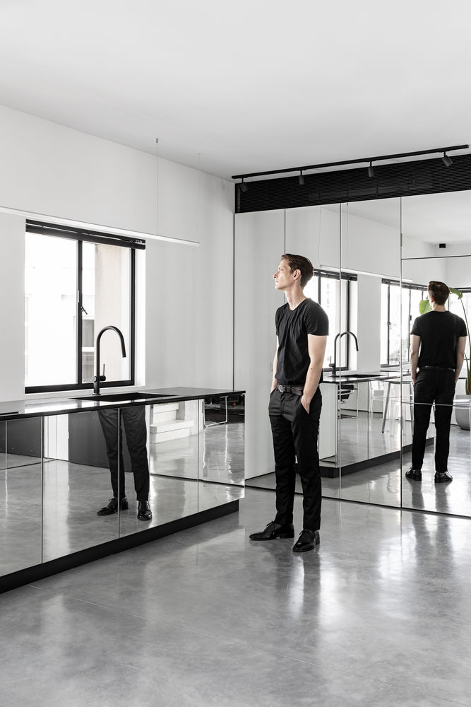
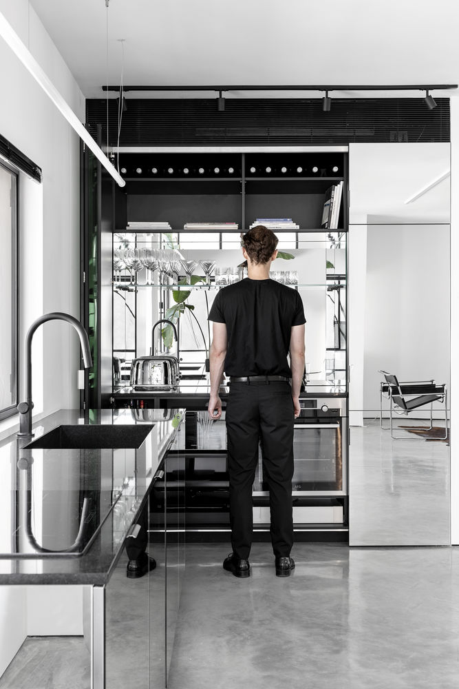
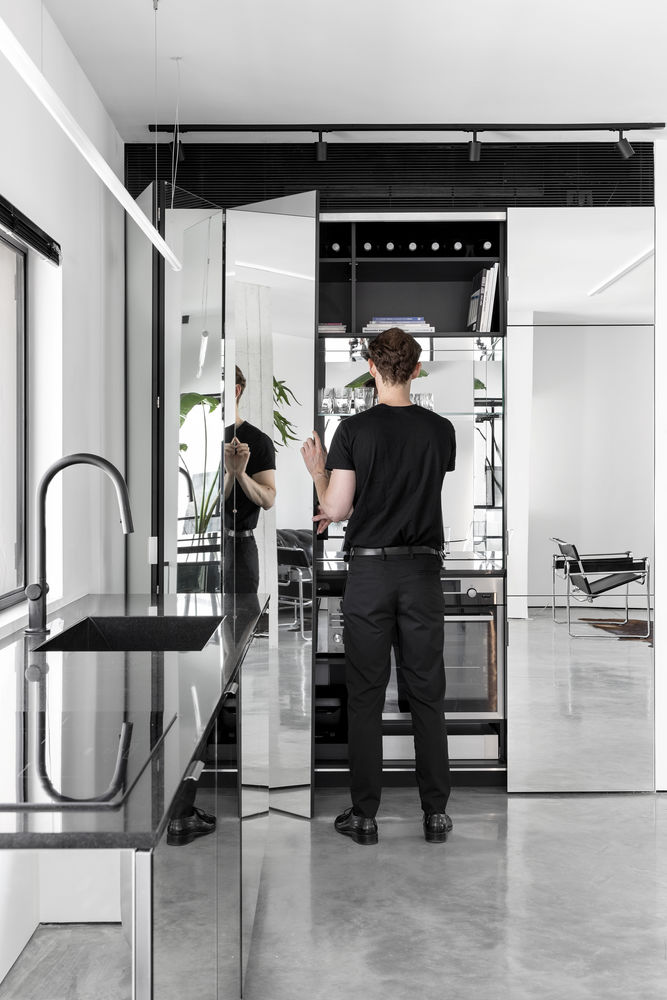
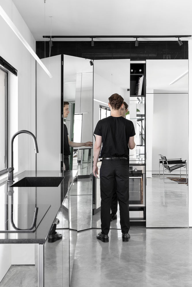
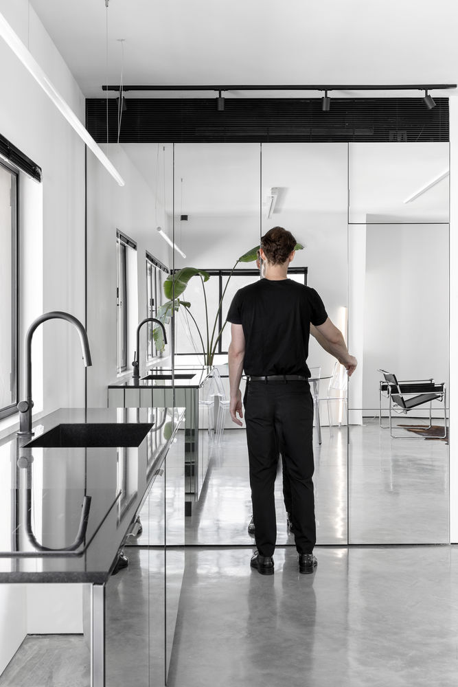
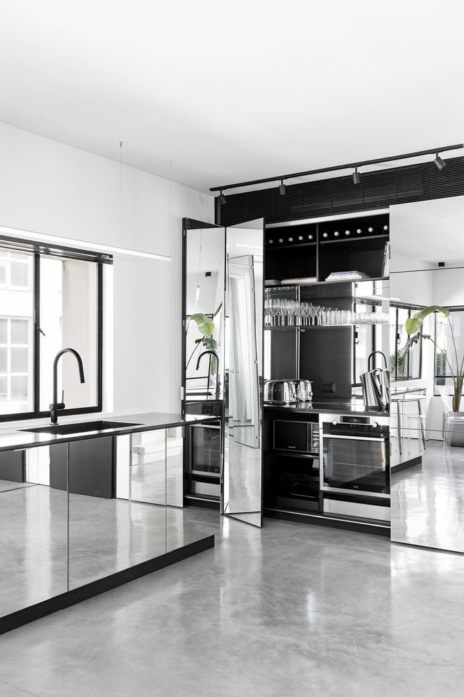
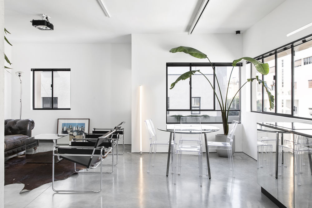
Mirror surfaces are used to reflect natural light and create the illusion of larger spaces in this small duplex in the heart of Tel Aviv, renovated by Interior Designer Yael perry.
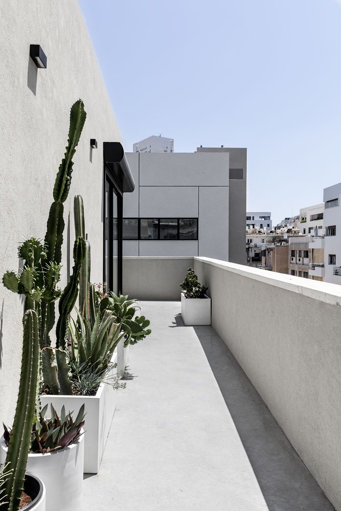
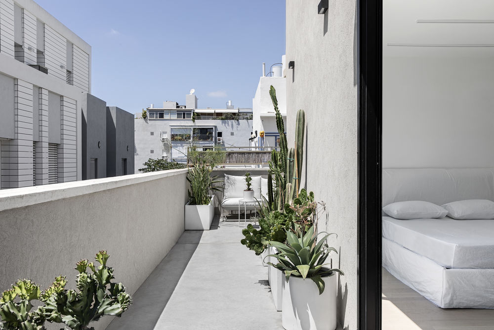
The owner of this 62 sqm (+30 sqm balcony) Duplex wished to create a modern stylish getaway for himself in the heart of Tel Aviv.
Interior Designer Yael Perry was chosen for the project.
Perry had previous experience with refurbishing and modernizing small complicated living spaces, but this project presents a whole new set of challenges.
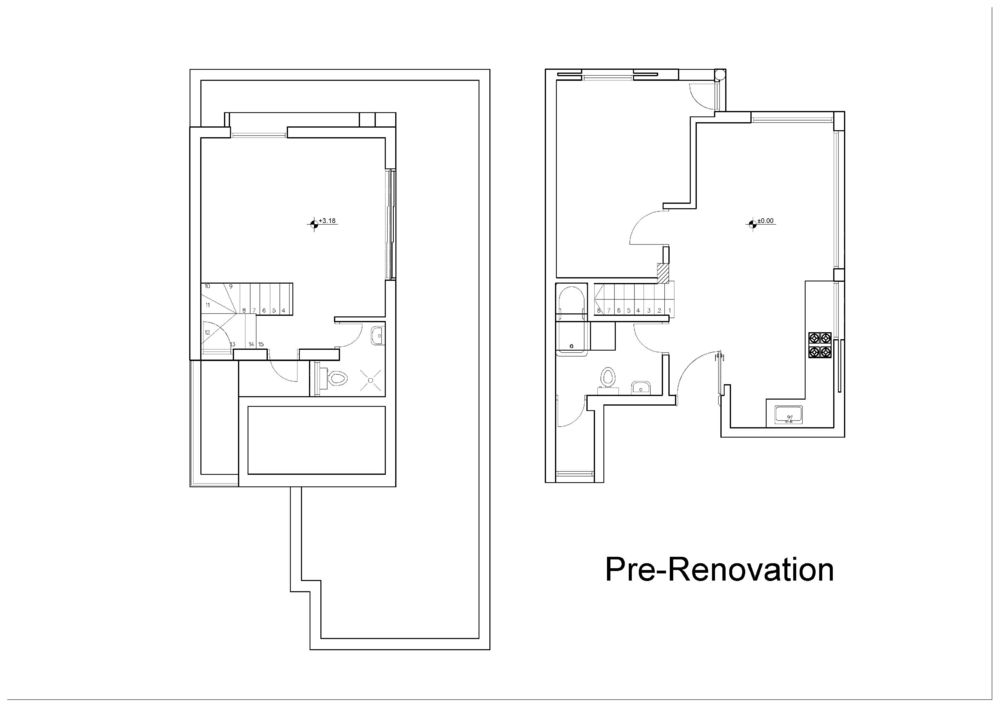
The duplex, originally divided into small spaces that couldn’t match the customer needs.
The duplex has a limited floor plan of just over 62 square meters (~30 square meters on each floor), but it features a generous number of openings that flood the interior with natural light.
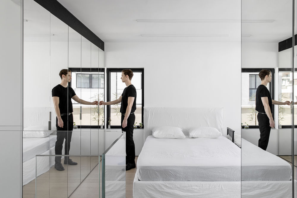
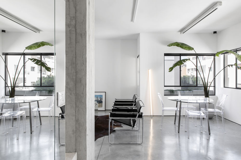
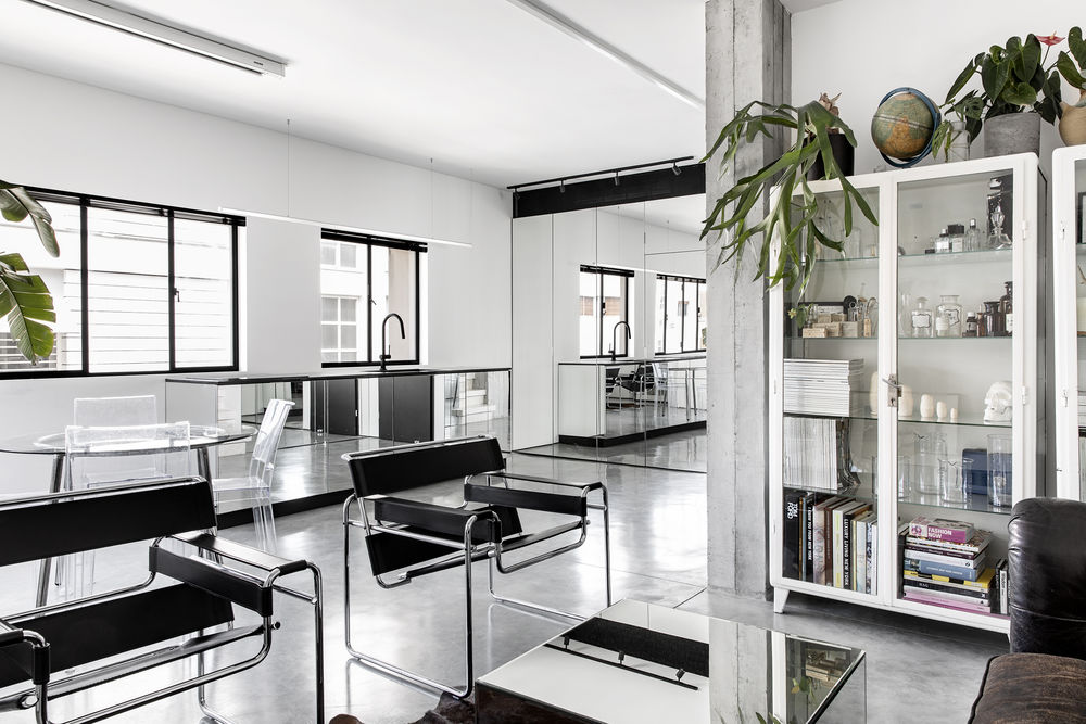
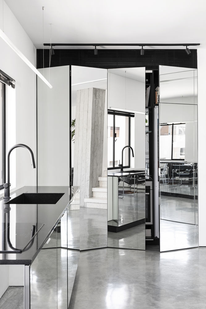
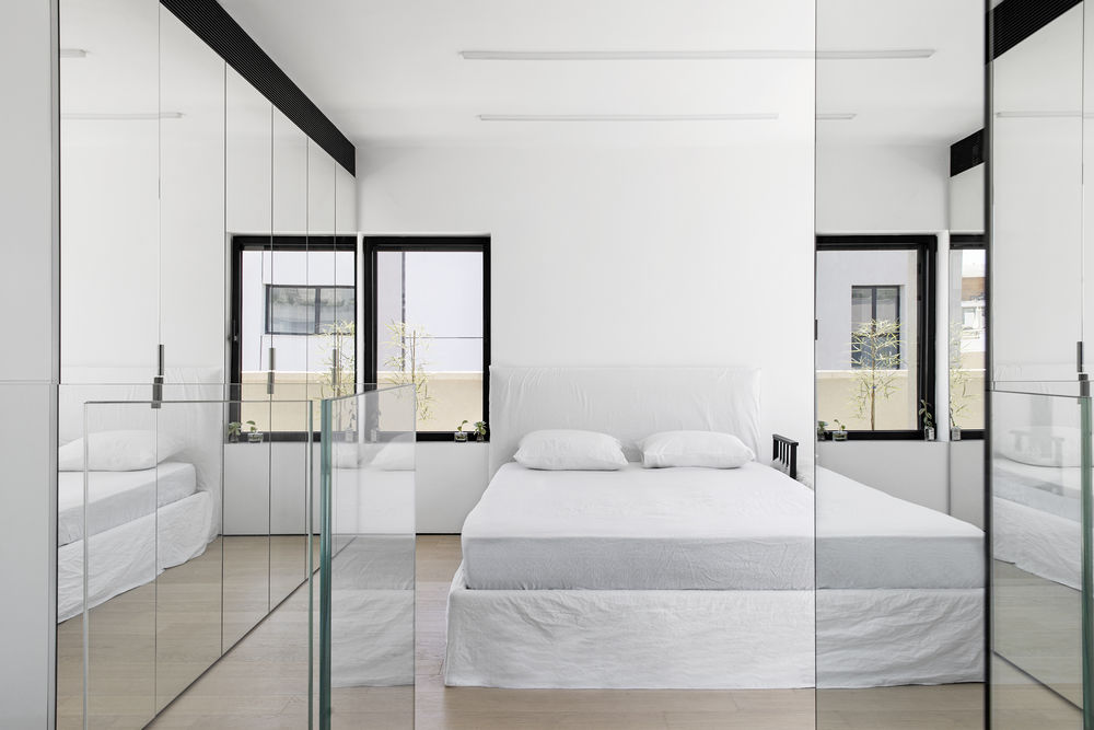
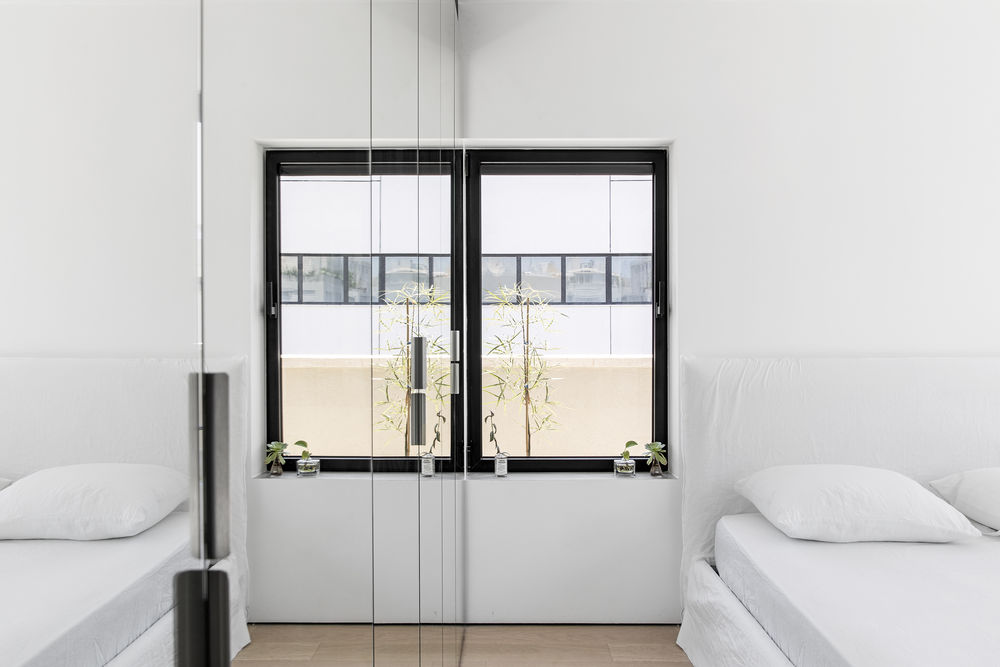
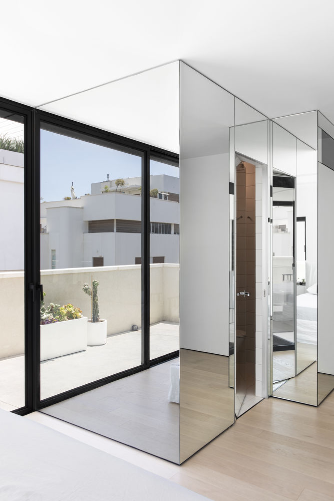
To emphasise these openings, Perry framed them with black belgian style windows & placed an array of mirrors around the flat's interior. Most of the interior walls, sections, storage spaces & kitchen were covered with mirrors to increase the presence of these openings & create the illusion of larger & double spaces.
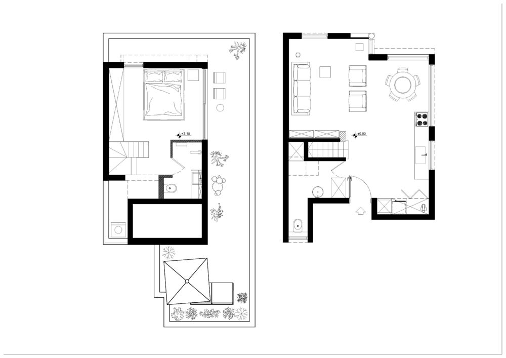
Perry created various alternative plans for the interior. The first attempted to create a separate space for the living room & a space for the dining area & kitchen while the others included an open plan for the kitchen & living room.
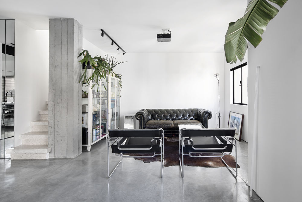
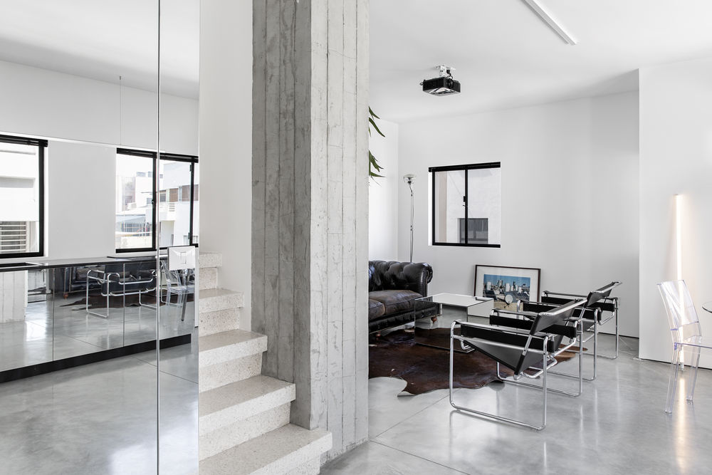
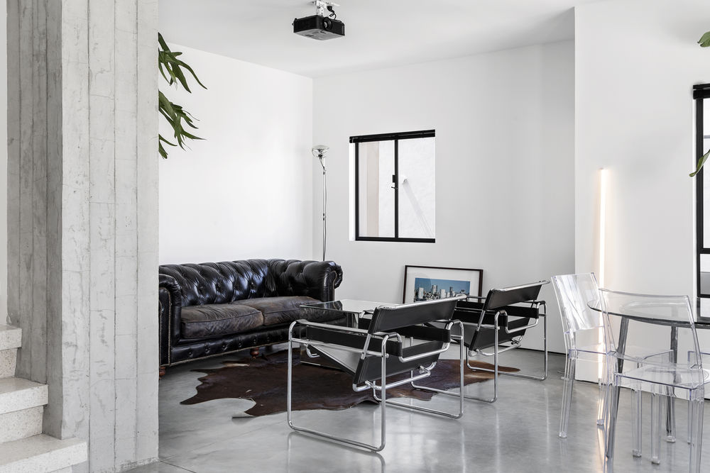
The apartment's previous plan featured a segregated layout with public spaces on the main floor being divided by a massive concrete & terrazzo staircase which were preserved during the renovation process.
We chose the first plan, separating the kitchen from the living space.
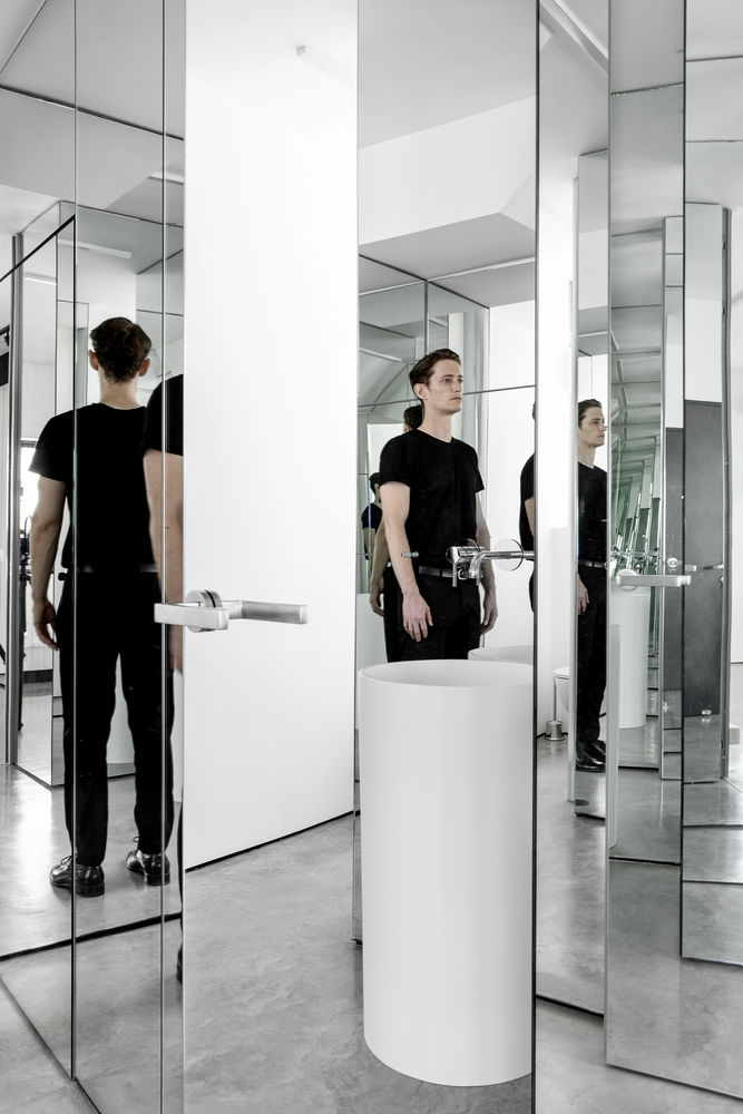
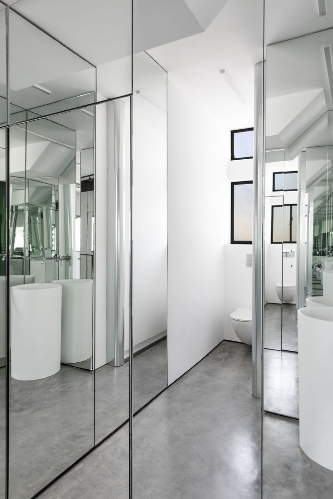
The guest bathroom was located in a square space next to the entrance on the main floor. part of it is under the staircase, where we created a hidden storage space.
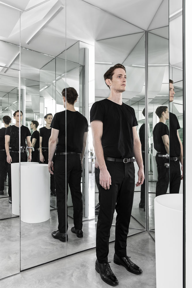
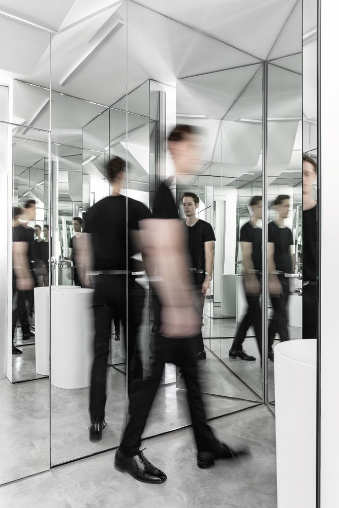
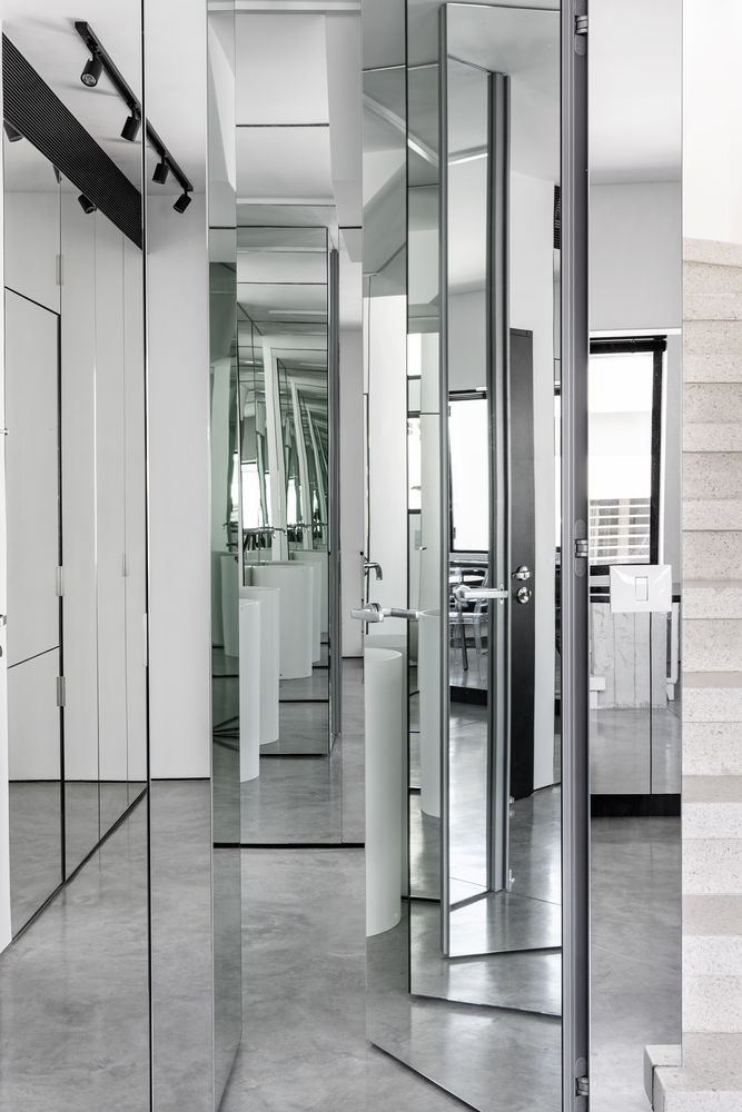
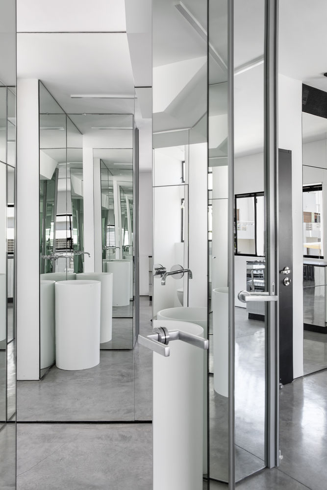
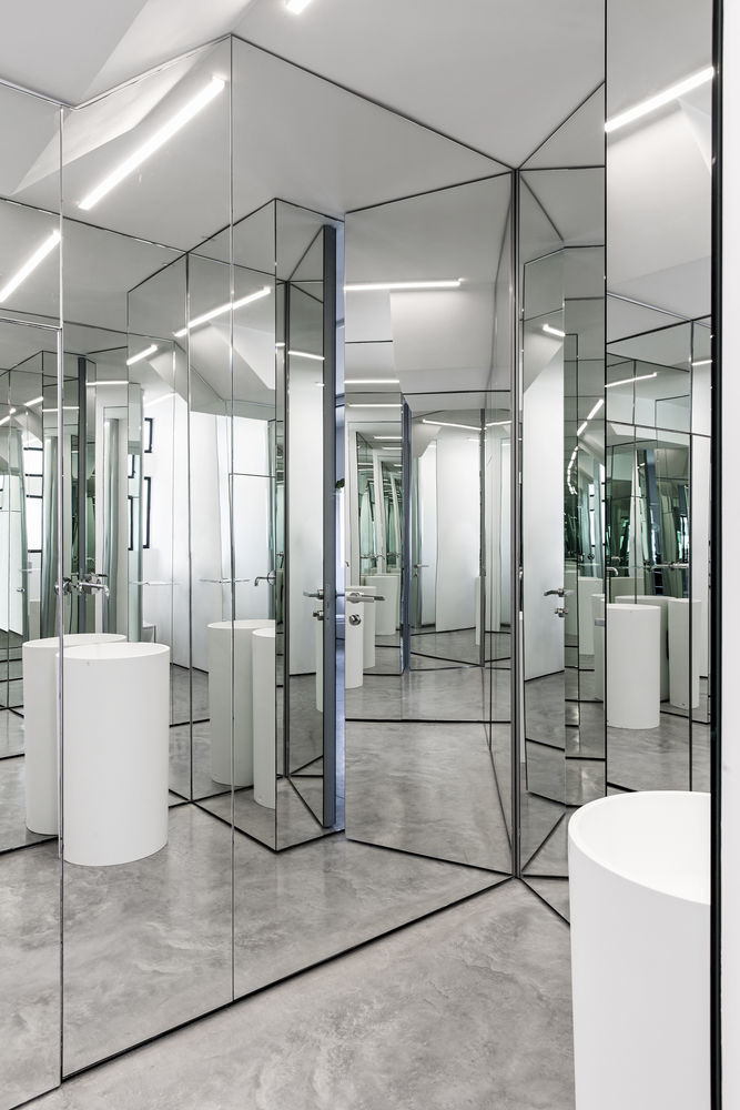
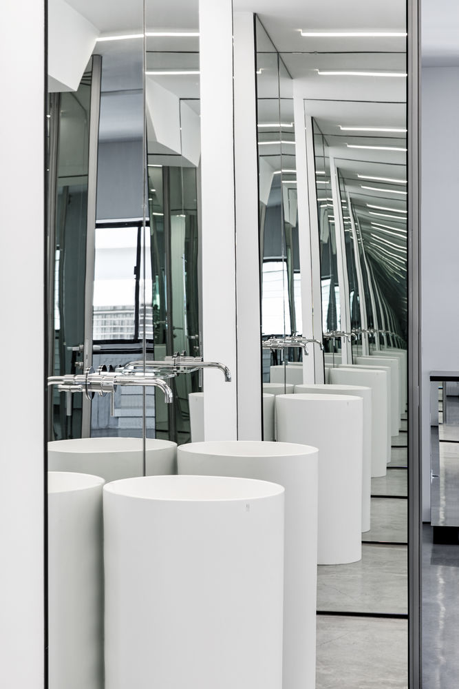
Perry planned the guest bathroom as a mirror maze. Next to the entrance, a mirrored door leads to the guest bathroom. All walls (in & out the bathroom) & a hidden storage space were covered with mirrors. It provides a surprise, a unique experience of reflections & disorientation in the space.
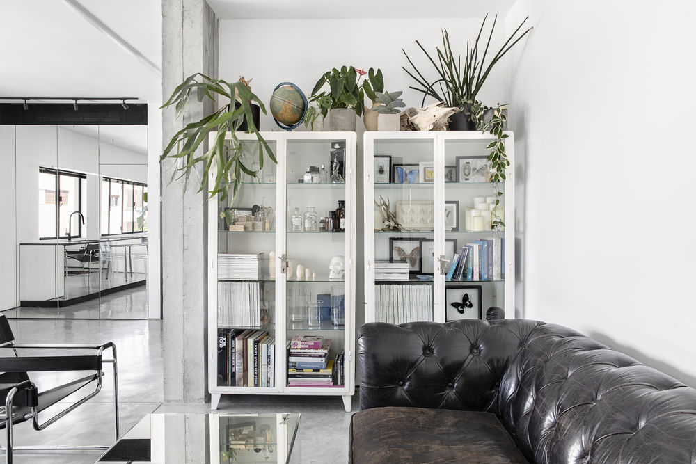
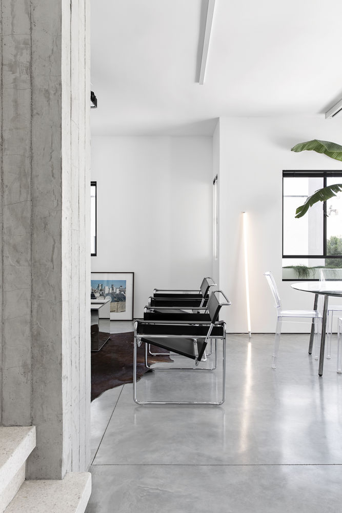
The material palette on the main floor is direct and bare including concrete, mirrored surfaces, glass & leather furniture that suits the customer style.
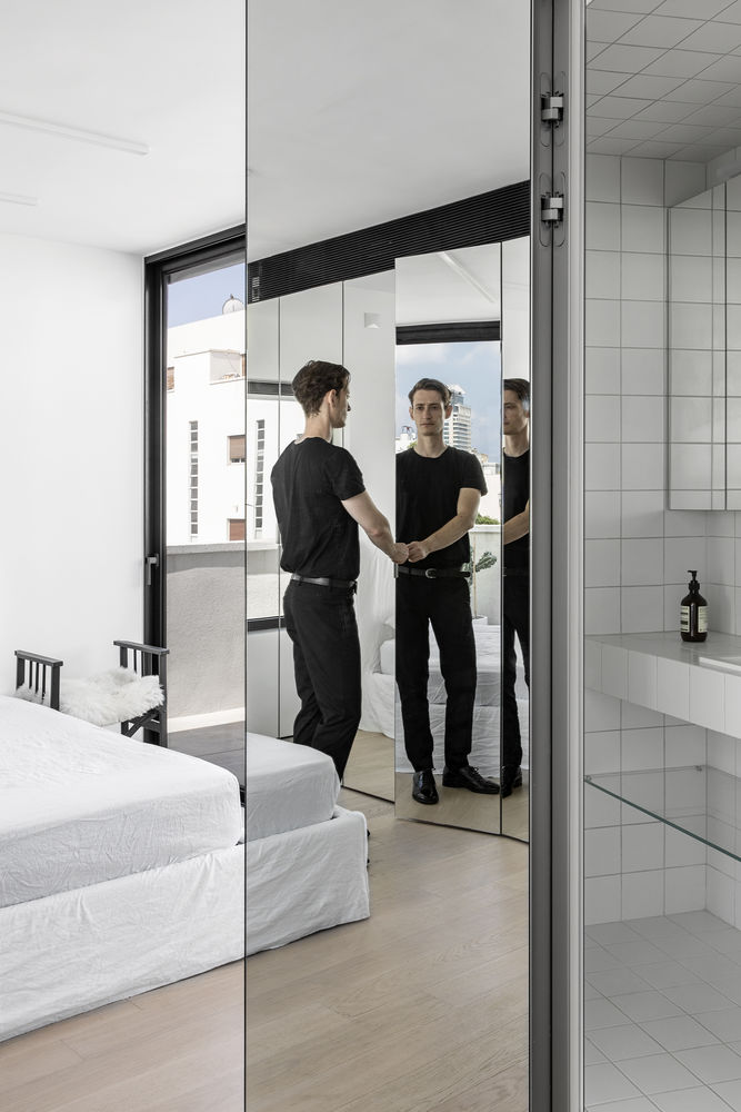
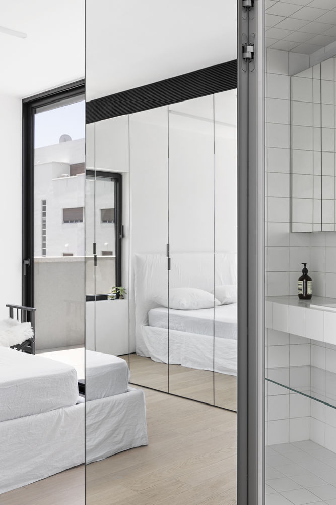
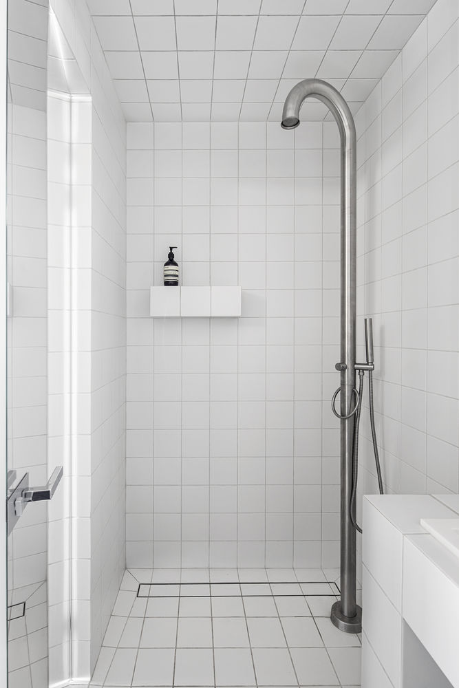
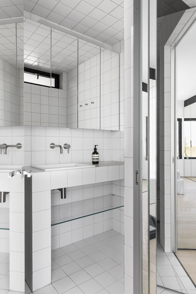
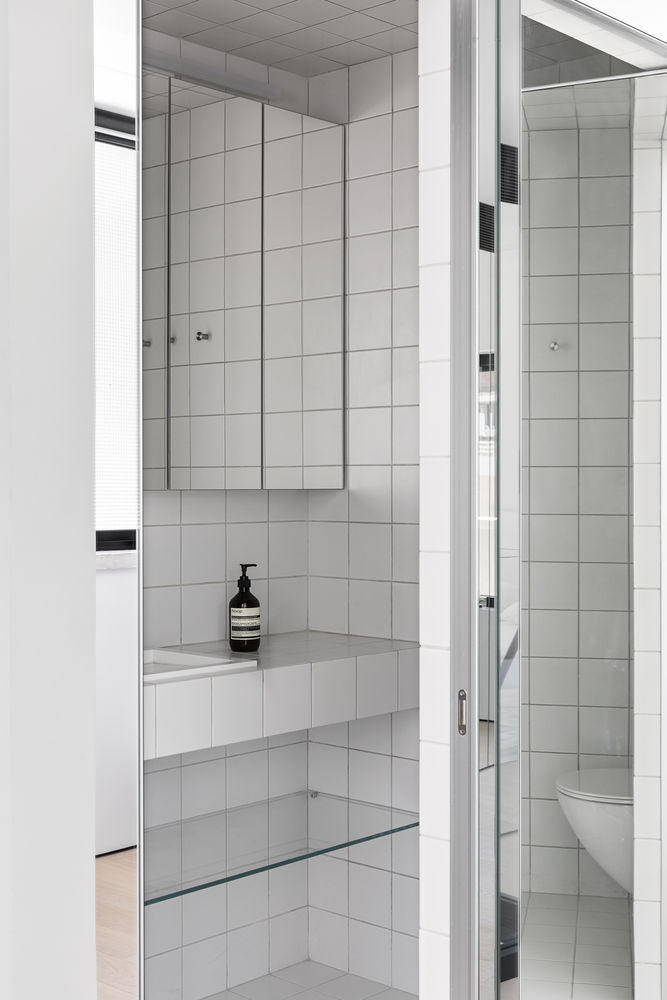
On the upper floor, in the sleeping & private areas, we used softer materials such as wood, linen, mirrored surfaces & white tiles in the master bathroom.
The upper floor was planned for the private & sleeping area. The tiny bathroom was extended & the shower was separated from the toilet unlike it was originally, where the shower and toilet were on the same square meter. The floor was extended between the bathroom and the staircase by casting a new concrete floor to create a comfortable pass and entrance to the sleeping area and the roof terrace.
The master bathroom exterior walls were covered with mirrors as well as the wardrobe to increase the presence of the high openings that lead to the terrace & create the illusion of larger & double spaces.
