非常感谢
Meili & Peter
Appreciation towards
Meili & Peter
for providing the following description:
位于意大利米兰的Helvetia Italy总部设计中,建筑师并不希望在复杂多层次的城市中找到统一语境,而是探寻和弦中的变奏。
In the urban planning intervention for the new headquarters of Helvetia Italy, we did not look for a unifying answer in the unclear, multilayered fabric of the existing city, but instead followed—in the tracks of Milanese maestros such as Luigi Caccia Dominioni—heterogeneous, polyphonic strategies of expression.
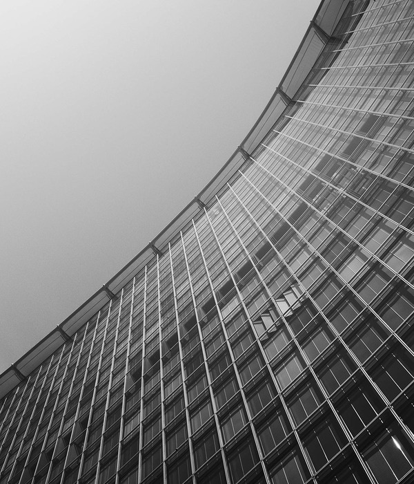
建筑为板楼,一半表皮是玻璃幕墙,另外一半表皮是开放的长廊。这两个完全不同的表面各自面朝的环境,找到活力与平静的最佳协同点,将城市环境的异质性诚实的通过表皮表达,并碰撞在一起,最终获得了与以往传统建筑有所区分的内涵。
The given property turned a visible face toward Via G.B. Cassinis, one of the multilane arterial axes connecting the center of Milan to the new service quarter San Donato. However, the existing tower-shaped structures, whose mirrored glass façades betray the boom phase in which they were constructed, leave only a very narrow gap open to the major axis and prevent the development of an actual front façade. The design first
finds its theme in the relationship between this gap and the calm, rear-facing courtyard. A wedge-like body shifts forcibly past the existing structures and ends with the gesture of an enormous cantilever over the entrance to Via Cassinis. From there, two very different side façades point into the depths of the grounds. Not the minimal front face, but instead, these longitudinal façades form a visible face from the movement along the major axis. The design-based intervention works with the longitudinal façades leading into the depths in a correspondence with the geometric constriction: on the one hand, through extension and great proximity to the reflecting skins of the existing structures, and on the other hand, through ruptures in a building shell that powerfully rejuvenates itself sculpturally. The heterogeneity of the urban context is mirrored in the Janus face of the two main façades, which no longer have much in common with a traditional, divergent formulation of street façade and back façade.
与正立面浮雕般的玻璃幕墙相对比,背立面的阳台及其垂直绿化装饰物让人过目难忘。一对对显著的盘旋金属管固定在栏杆外侧,他们跨层而立,错落有致,形成外表皮上的特别韵律。绿色的植物盘旋而上,完成这个人为性外立面的最后一步。
The new horizontal, relief-adorned view into the court forms a spatial background—similar to a stage view—that refers to the main entry through the suggestion of a sideward movement. In an almost contrary way, the south façade is shaped by a balcony stretching nearly end-to-end. The horizontality of the viewing field is gripped by the endless movement of traffic on the Tangenziale in the expanse of the Po basin. Green, vertical hanging plants provide an interruption at the forefront of this panorama. In part light-permeable, formed from a mixture of evergreens and colored plants, this artificial nature follows the tradition of Milan roof gardens, with a type of hanging carpet.
2004–2009
Location: Milan (I)
Competition: 2004
Project: 2004–2007
Realization: 2007–2009
Client: Helvetia Assicurazioni, Milan (I)
Meili, Peter Architekten: Marcel Meili, Markus Peter
Bernd Habersang, Dan Schürch
Andreas Alber, Thaeba Ayubi, Nazario Branca, Dominik Fiederling, Alice Hucker, Gunter Klix, Ricarda Metelmann, Ilona Schneider
Engineers: Grignolio Muttoni Partner, Lugano
Façade design: Emmer Pfenninger Partner, Münchenstein
Landscape architecture: Vogt Landschaftsarchitekten, Zurich
Light design: Licht Kunst Licht, Bonn (D)
MORE:
Meili & Peter
,更多请至:
{{item.text_origin}}

