点击蓝字“知行Design中华优秀作品第一发布平台!
在「中国文化必修课」中,余秋雨先生对文化下了一个极其简练的定义。在不断翻新的居住空间设计中,所表现出的文化面貌,正是我们每次在体验一个空间中,反复揣摩的内容,展现了何种精神价值,通过生活方式又如何表现为居住者的个性特征,是设计师们的追问。
In "compulsory course of Chinese culture", Mr. Yu qiuyu gives a very concise definition of culture. In the constantly refurbished design of living space, the cultural appearance displayed is exactly what we repeatedly try to figure out each time we experience a space, what kind of spiritual value is displayed, and how to show the personality characteristics of residents through the way of life, which is the follow-up question of designers.
图| 售楼处
20多年来,当代中国居住样式从简约到各种异域风情轮番上演,再经过东方情调又回归到形式洗练和品质升级的原点。从哲学层面上说,已经是螺旋后的上升,到了新的境界。
Come for more than 20 years, contemporary China lives a style to all sorts of different region amorous feelings to be staged in turn from contracted, return to the origin that forms wash lian and quality upgrade again through Oriental emotional appeal. Philosophically speaking, it has been a spiral to a new level.
图| 样板间
样板房 Show Flat
在厦门融信样板间设计中,设计师在设计理性回归方面,以自己的实践上做出创新尝试。用室内建筑的概念去把握空间的对位关系,布局开敞,开放式的餐厨与客厅融为一体,宽敞别致又灵活多变。游走在流转的动线,都经过精心计算,理性之美隐约可见。
In the sample room design of xiamen rongxin, the designer makes innovative attempts on his own practice in the design of rational regression. Use the concept of interior building to master the counterpoint relation of the space, layout opens open, open eat hutch and sitting room an organic whole, capacious and chic and agile and changeful. Wandering in the moving line of the circulation, all carefully calculated, the beauty of reason faintly visible.
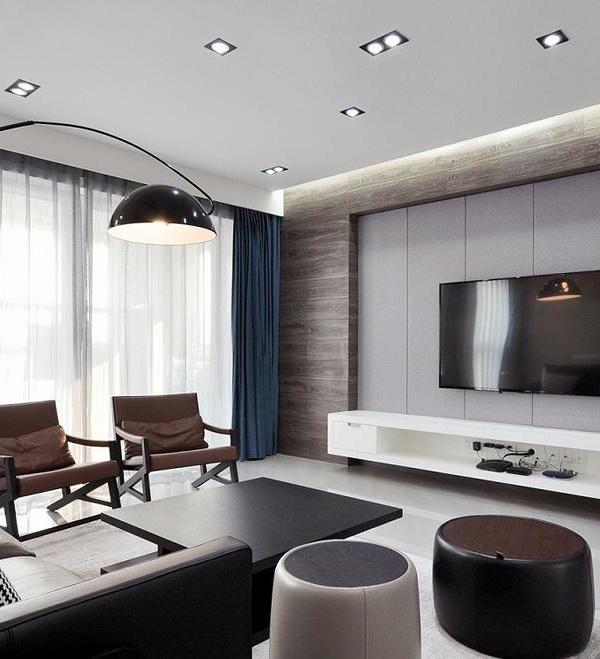
黑白灰色调转换,如同素描打底,不张扬却提供了最恰当的背景衬托。电视墙呈现柜子的方式,嵌入各种构件,展示架、电视和地柜,都以体块为元素注入其中,竖向以切分的方式进行长短句样的分割,充满节奏顿挫。
Black and white gray tone conversion, like a sketch base, not publicity but provides the most appropriate background foil. The TV wall shows the way of cabinet, embedding various components, display rack, TV and floor cabinet, all of which are injected with the elements of the block, vertical segmentation of long and short sentences in the way of segmentation, full of rhythm and rhythm.
灰色的丰富尽显,石材、木饰墙面和地毯以各自肌理和质感,调和出的色阶差异,深浅交织,构成设计上的细节。古铜茶几用淡彩的方式融入,品质从视觉的重量感中一目了然,验证着实其腹,强其骨,硬铮铮的内敛之美。
The richness of the gray fully shows, stone, wood decoration of the wall and carpet with their own texture and texture, harmonizing the color level difference, depth interweave, constitute the design details. Gu tong tea table is blended in with the way of weak colour, quality is clear at a glance in the weight feeling from the vision, verify really its abdomen, strong its bone, the beauty of the collect inside hard clang.
照明设计尽量藏源,藏匿灯具身姿,留下融融暖光,关心着空间饰物的细节。现代设计的基本面是欧几里得控制的,体块以立方体和各种弧线造型形成凝练的形式,让人过目不忘。Lighting design as far as possible to hide the source, hide the appearance of lamps and lanterns, leaving warm light, care about the details of space accessories. The fundamentals of modern design are controlled by Euclid, and the volume forms a compact form with cubes and various arcs, which is memorable.
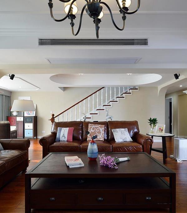
从20年前的简约设计,到今天的洗练国际风,思想上的变化并不大,但是在配饰的细节的密度上,完全不可同日而语。陈设,物器内在的精神价值,让一个时代人的生活,倒影出自己的时代,体面而时尚,自尊且自足。
From the contracted design of 20 years ago, to today’s wash lian international wind, the change on the idea is not big, but on the density of the detail that deserves to act the role of, cannot be compared completely. The inner spiritual value of furnishings and objects makes people’s life reflect their own times, decent and fashionable, self-respect and self-sufficiency.
餐厅设计里的折纸装饰画,形式层层递进的阵列变化,一如百年前包豪斯的先辈们的单纯形式探索,纯粹到极致就是美,而形式感也可以是美学产生力。
The origami decoration painting in the restaurant design is an array of progressive changes in form layer by layer, just like the pure form exploration of the predecessors of Bauhaus a hundred years ago. The pure extreme is beauty, and the sense of form can also be an aesthetic force.
地下一层是房间的隐秘所在,紧连着车库入口。挂画、条凳和球形坐墩,从横竖方向上贯通视觉的连接关系,稳重的灰色调,以欲扬先抑的方式,为室内留出遐想空间。
The underground level is the secret place of the room, which is adjacent to the garage entrance. Hang a picture, bench and ball to sit pier, the connection relation that connects through the vision on horizontal and vertical direction, sedate gray attune, with the means that desire to give a head start, daydream space for indoor put apart.
家庭厅是生活的另一个面,首层的正襟危坐,这里则是烂漫散谈。各种曲线的增加,让空间圆润起来,毫无违和感地切入方正的格局中。挑空的格局,闪现出腾挪的气场,联系不同楼层,共同构成当代气派。
Family hall is the other side of life, the first floor of the upright, here is romantic talk. Of all sorts of curve increase, let a space fruity rise, cut into the pattern of founder without offending feeling ground. The pattern of the empty air, flashing out the air field, connecting different floors, constitute a contemporary style.
同样的黑白灰格局中,金属材质冶金退火处理后,溢出多余的犀利而葆其辉光。细腻勾勒,以各种手法轻拢慢捻抹复挑,不断尝试变化收边的层次感。
The same black and white gray pattern, metal material after metallurgical annealing treatment, overflow excess sharp and keep its glow. Delicate draw the outline of, with all sorts of gimmick light approach slow twist wipe pick, try to change to receive the administrative levels feeling of edge ceaselessly.
从平面上的圆,变化到体块上的球的组合,最终获得了茶几、沙发的形式,各种关联草蛇灰线隐约其中,最终由地毯,环成一个区域。
From the circle on the plane, change to the combination of the ball on the block, finally obtain the form of tea table, sofa, all kinds of related grass snake gray line vaguely among them, finally from the carpet, ring into an area.
艺术的融入,让平常的家具开启波澜,有的自我闪耀,有的深藏功名。在融信样板间中的存在方式,自然是后一种。王培永先生的艺术品以灰色基调潜入其中,极简到只有一株草,在诺大空间中,自我沉醉。
The integration of art, let the ordinary furniture open waves, some self shine, some hidden achievements. The mode of existence between rongxin samples is naturally the latter. Mr. Wang peiyong’s artwork sneaks in with gray tone, extremely simple to only have a plant grass, in nuo big space, self-intoxication.
面对夹层空间层高低的挑战,设计团队运用大面积的镜面墙,拉伸空间尺寸,植入的健身空间对家居生活,做了有益的功能补缺。
Facing the challenge of high and low level of the mezzanine space, the design team used a large area of mirror wall, stretched the space size, and implanted fitness space to make up for the deficiency of home life.
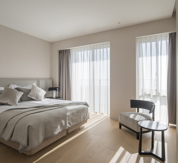
主卧套房是精致家居的典范,弱化空间对比,只留下表皮穿插其间。白色肌理墙面划出休息空间,灰色墙板则是「灰空间」,在飘窗与睡眠区中间隔出空隙感。The master bedroom suite is a fine example of home furnishings, weakening the spatial contrast and leaving only the skin interspersed. Metope of white flesh texture lays off rest space, gray wallboard is "gray space", in wave window and morpheus area space space feels.
植入铁艺框架收纳区和洗浴空间,直线条凝练了爽利硬挺的精致。背光灯将前景物体勾勒成轮廓,拉伸了进深关系。若干年来,我们改变了居住习惯,原本不在意的附属区域也变得重要,文明的水准在常被遗忘的角落体现。
Implanted iron frame storage area and bath space, straight line concise crisp and stiff delicate. Backlights outline foreground objects and stretch depth relationships. Over the years, we have changed our living habits, and attached areas that used to be neglected have become important, and the standard of civilization is reflected in the often forgotten corners.
In the visual relation that neutralizes, children room is not infantile, use the cadence with big space close, only in local ornament gives gout full place. Nordic colors provide a warm care, as children grow more will know, the real aesthetic condensation in the invisible subtlety, rather than the colorful in the small.
淡彩素描可以总结空间的基本调,黑白分明不含糊的同时又让灰色包容。壁饰上以速写笔锋利传递干练,家私摆件则温和可人,让艺术归艺术,生活归生活,两者并行不悖。
Light color sketch can summarize the basic tone of the space, black and white is not ambiguous while letting gray contain again. On the mural act the role ofing with the sketch pen sharp delivery ability, the furniture decoration is gentle but the person, lets the art return the art, the life return the life, two go hand in hand not to go against each other.
今天的样板间,已经不是某个具体风格可以界定的。现代主义的精神价值内化于心,成为大家遵守的「中道」,而效果上,更多的是场景的调度,通过差异化的设定,细腻的炫彩,精心的调配打造氛围感,人们沉浸其中,确认自在的本体,诗意地栖居。
Today’s model room, is not a specific style can be defined. The spiritual value of modernism is internalized in the heart and becomes the "middle way" that everyone abided by. In effect, it is more about the scheduling of scenes. Through the setting of differentiation, exquisite dazzling color, and careful deployment, the sense of atmosphere is created, and people are immersed in it, confirming the comfortable ontology and living poetically.
平面图纸
一层平面图
二层平面图
夹层平面图
负一层平面图
项目名称:融信·厦门世纪洋房样板间
项目面积:274㎡
特别支持:融信(中国)第一事业部
项目地址:厦门
软装设计:元禾大千
硬装单位:深圳丹健环境艺术设计有限公司
摄影师:鲁哈哈
Project name: rongxin xiamen century house model room
Project area: 274㎡
Special support: rongxin (China) first business division
Project address: xiamen
Soft outfit design: yuan he daqian
Hard installation unit: shenzhen danjian environmental art design co., LTD
Photographer: lu ha ha
知停.而行
不断探索|不断进步
原我们的分享可以帮助您
知行编辑|版权归原作者
{{item.text_origin}}


