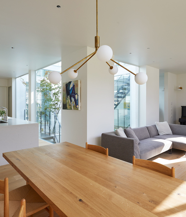
During the 1950s, architect Roland Roessner was teaching at the University of Texas and designing some of Austin’s most daring modern structures. One of his more memorable houses, the Balcones Residence, is perched above a long, sloping hillside and notable for its prominently cantilevered concrete balcony. Located along Balcones Drive, the property backs up to Camp Mabry, an 85-acre historic military installation established in 1892. New owners purchased the home from the original owners, and though previously unacquainted with the period, delved into all things mid-century modern. They hired Clayton & Little to assist with a deliberate and sensitive renovation of this Austin treasure.
Roessner designed this modest home with clean lines, simple forms and used humble and affordable materials. The desire to enlarge the original 1,773-square-foot house became apparent early on. Preserving the original character of the site, and maintaining the prominence of the historic structure was of most importance. The addition of office and utility to the north and guest rooms to the south were purposefully set back from the original house and are minimally discernible from the street. The complete renovation totals 2,680 square feet and includes a 1 bedroom, 1-1/2 bathroom main house and a 2 bedroom, 1 bathroom guest casita.
Extensive work went into protecting, salvaging and reusing as much of the original material as possible. Where existing brick walls needed to be removed, each brick was carefully salvaged, cleaned, kept for reuse and strategically placed in existing walls where repairs were necessary. New brick was matched to original. Many of the original light fixtures were saved and reused (exterior examples include the bullet-shaped fixture at the guest casita and the tall sconce at the entry to the courtyard). The iconic cantilevered balcony and railing on the front of the home were restored along with the original dry-stacked limestone wall below. To accommodate a heritage live oak, the roof eave overhang was notched. The exterior envelope was fully retrofitted, which included new insulation for the roof and walls as well as new, double-glazed windows. Photovoltaic panels were added above the carport and atop the guest casita behind the carport. A new landscaped walkway brings guests to the house from the street.
The original entry featured an open-air approach to the front door. The renovation enclosed this space to create a formal entry hall and to allow for more room to receive guests. The west brick wall, originally an exterior wall, now functions as an accent wall that divides this space from the living room. An inset piece of mahogany fills the recess at the location of the original wall with the front door, opening into the hallway. The ceiling height of the hall was raised as part of the renovation, and all HVAC ducting was relocated to the roof.
Inside, the original, open floor plan was preserved, though the connection between the kitchen and living was opened up to enhance spatial flow. Originally a large mahogany-wrapped central element broke up the kitchen and living room. This built-in was removed but inspired the new mahogany paneled walls used throughout the house. The removal of this load-bearing element required a new steel beam to be inserted in line with the rafters, and a new column to be set within the existing double-wythe brick wall on the west side of the dining room. Necessary updates included removal of asbestos tile throughout, installation of cork flooring in dry areas and tile in wet areas. New LED lights were found to match original.
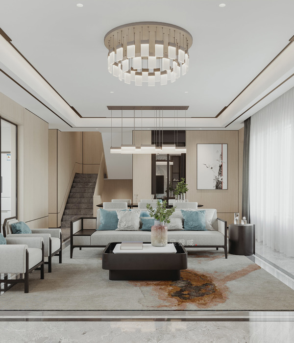
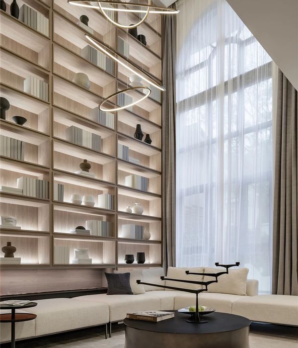
The design team discovered that Roessner’s original plans called for clerestory windows in the family room and on the south wall in the living room. They had been cut from the project due to cost, so these windows were re-instated during the remodel to realize the original vision and improve daylighting in both areas. In the family room the concrete hearth mimics the design of the iconic, cantilevered front balcony. The sliding cabinet doors were crafted to change the functionality from library to entertainment center. New sliding pocket doors with pocket covers designed to conceal the pockets when doors are open, were built to accommodate the new ceiling height. The original mid-century Herman Miller sofa and coffee table were restored, reupholstered and reused.
The kitchen, virtually unchanged since it was built, required significant changes to address contemporary needs. The most noticeable change was opening the kitchen to the adjacent living spaces, creating a new bar, and upgrading countertops with honed quartzite. Vestiges that remain from the original design include the wood wrap that defines the space, as well as a small, sliding glass pass-thru between the kitchen and dining room. In the dining room, the slant-front drawer design was original to the house but due to the extent of construction it was unrealistic to salvage the cabinets. The same layout was reproduced in the new mahogany cabinets to keep the original design. The insides of these cabinets were then able to be customized to the new owners’ needs.
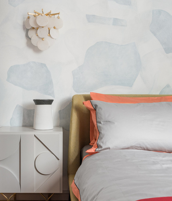
Originally a two-bedroom house, the bedrooms were combined as part of the renovation to create a single master suite. One side of the new bedroom is wrapped in warm mahogany, while the other has an expansive window opening up to the private courtyard and pool. Custom-cut mahogany return air grilles were crafted to align with the grain of the paneling, and the bed frame was custom-fit around the owners’ motorized bed. Period-appropriate Nelson sconces were paired at the bedsides.
Connected to the main house by a covered walk, the guest casita holds two bedrooms, one bathroom and a small bar area. The simple design and period-appropriate decorative lighting fixtures make this a comfortable and private retreat for the owners’ children and their growing families.
Project Team:
Architecture: Clayton & Little
General Contractor – Burnish & Plumb
Structural Engineer – Duffy Engineering
Interior Design – Mark Ashby Design
MEP Engineer – NA – Design Build
Landscape Architect – Word + Carr Design Group
Kitchen Design – Kitchens for Cooks (retired)
Photography - Nick Simonite
Status Completed works
Type Single-family residence
{{item.text_origin}}


