上海繁华地段中的“幻想秘密花园”——Tori.s 甜品店设计
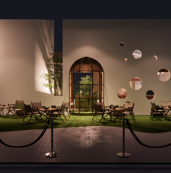
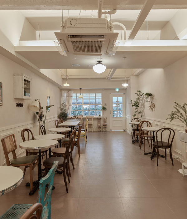
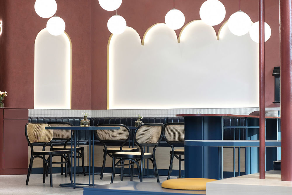
Tori.s甜品店位于凯德LUONE一层,地段繁华,人流密集。在如此商业成熟节奏快的地段,我们更想做一下“慢”下来的甜品店。整个项目环境两面采光,一面是商场内部衔接动线,在有限的空间里,划分多个区块,我们将整个空间打造成一个“充满幻想的秘密花园”,模糊室内与室外的界限感。
▼项目概览,overview © 云眠工作室
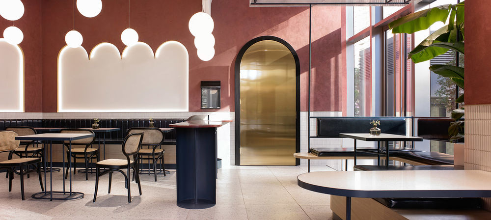
Tori.s dessert shop is located on the LUONE floor of Cade, the location is bustling, crowded. In such a fast-paced commercial location, we would like to make a “slow down” dessert shop. The whole project environment on both sides of the lighting, one side of the mall is connected to the moving line, in the limited space, divided into multiple blocks, we will make the whole space into a “fantasy secret garden “, blur the sense of indoor and outdoor boundaries.
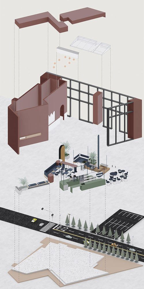
▼轴测图,axonometric drawing © Ni DESIGN涅十设计
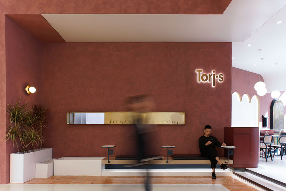
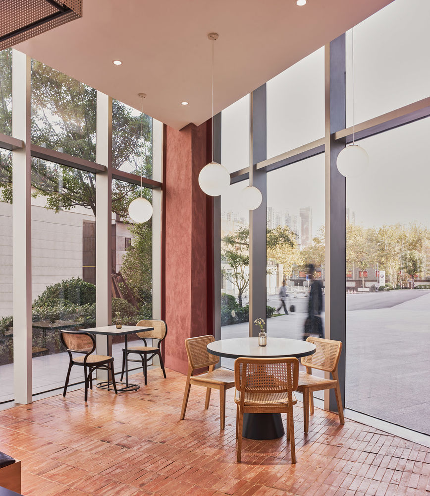
商场入口处,我们没有设置包围空间墙体或者玻璃门,用做旧红砖铺设这个区域,一是希望营造入口的花园感,二是使得空间上对外有个延续,让空间看起来更开阔。
the entrance to the mall, we don’t have a wall or glass door to surround the space. We use it as an old red brick to lay the area.
▼入口空间,the entrance space © 云眠工作室
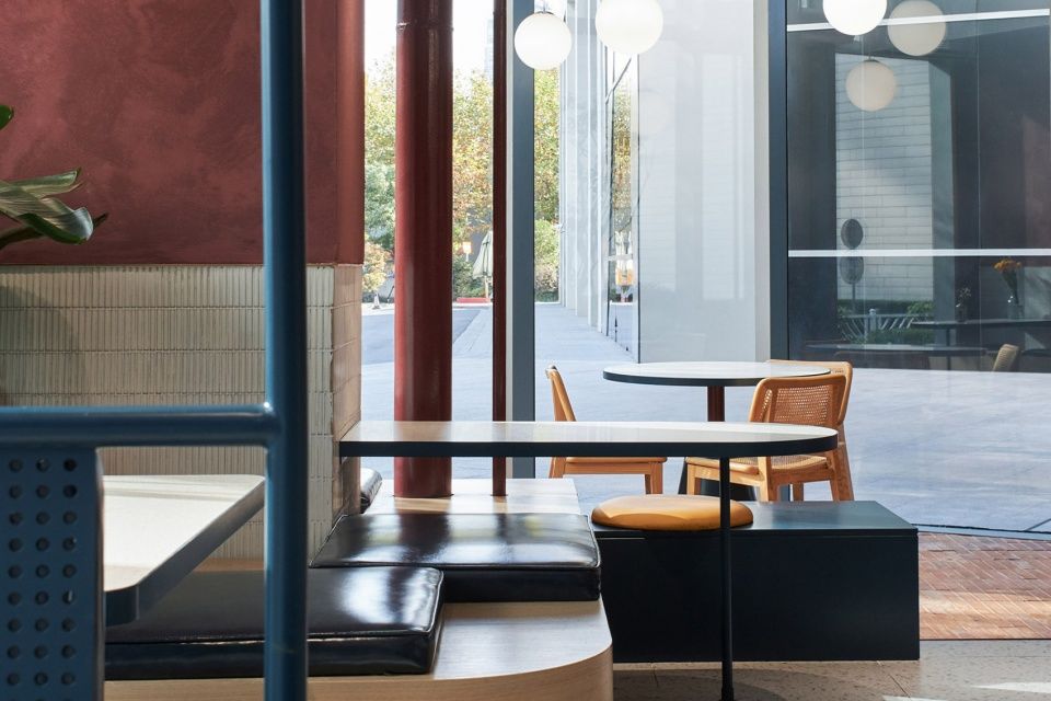
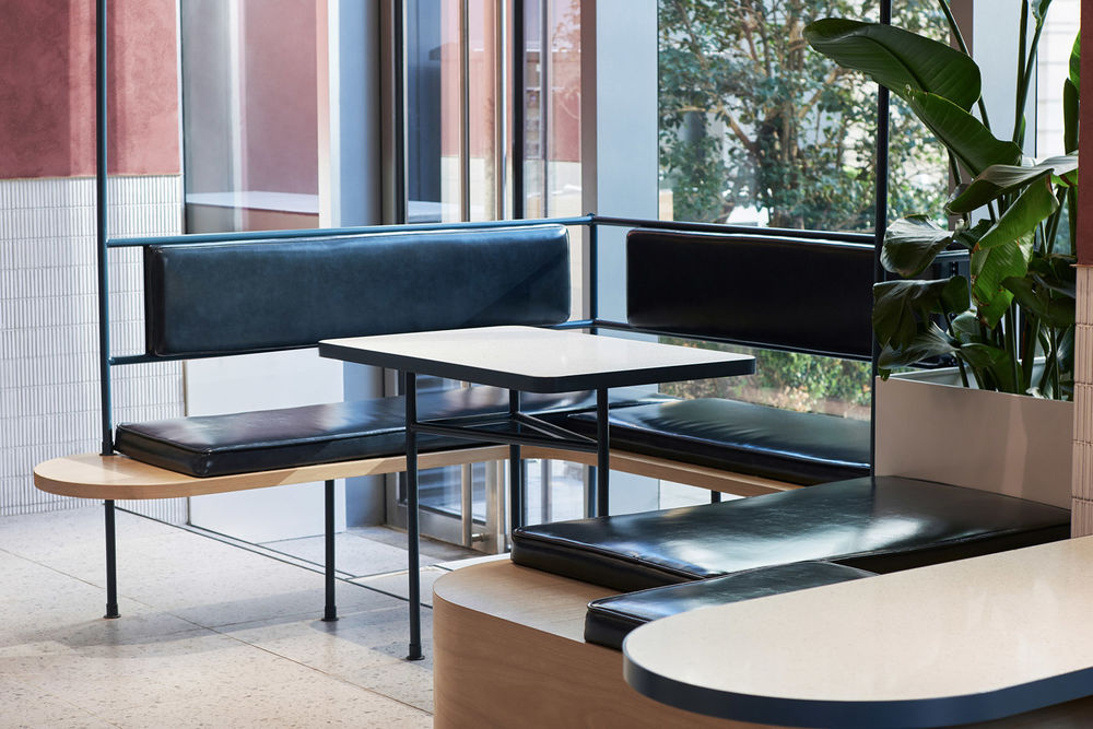
靠近玻璃幕墙的区域我们设置为卡座区域,在轻盈的冲孔顶棚下,不规则的台阶和花盆堆砌在一起,更像是户外的花园卡座区。
the area near the glass curtain wall we set up the card seat area, under the light punching ceiling, irregular steps and flowerpots are stacked together, more like the outdoor garden card seat area.
▼卡座区域,booth area © 云眠工作室
▼不规则的台阶和花盆堆砌在一起,the irregular steps and flowerpots were piled together © 云眠工作室

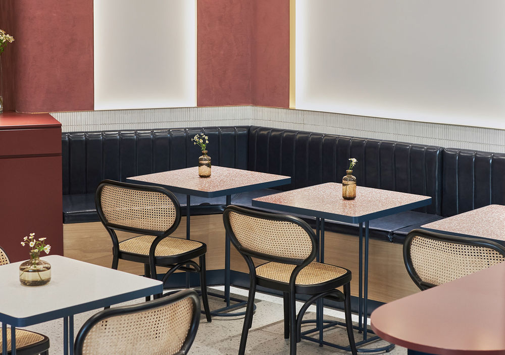
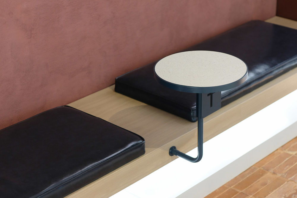
▼座位细节,seats detail © 云眠工作室
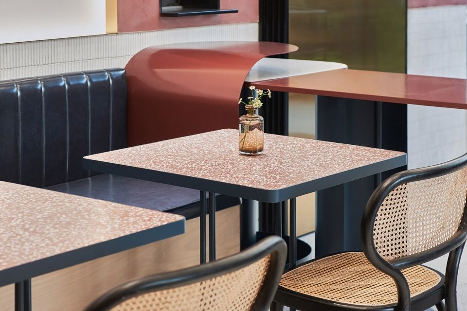
商场另一处入口由外墙进入,我们用同样的地面材质,划分区域,营造户外感。 the other entrance to the mall, we use the same floor material to divide the area and create an outdoor feeling.
▼用同样的地面材质营造户外感,using the same floor material to create an outdoor feel © 云眠工作室
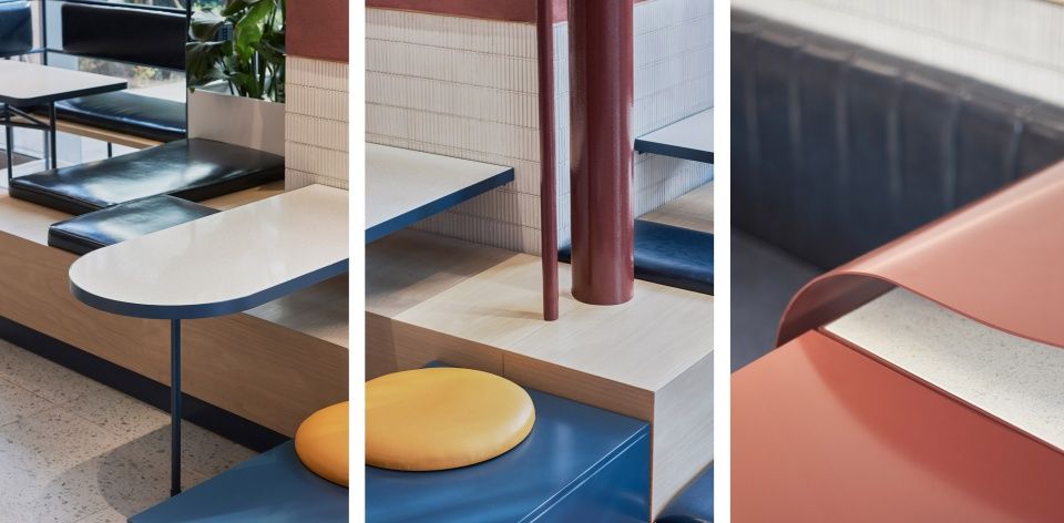
▼细节,details © 云眠工作室
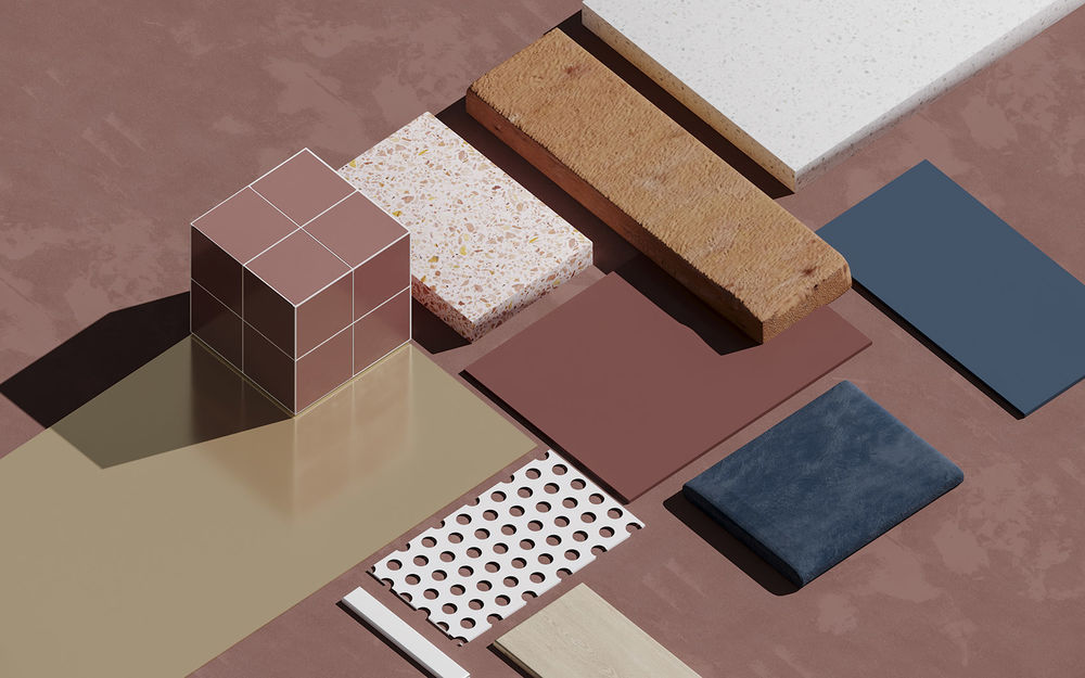
▼材料分析,material analysis © Ni DESIGN涅十设计
▼项目平面,plan © Ni DESIGN涅十设计

Project Name:TORI.S Design Studio: NI DESIGN Telephone:18801799552 Completion year: 2019.10 Chief Designer: NIE QI, ZHAO RUI CHAO Project Location:YAN RUN Project Area: 110㎡ Photo Credits:YUUUUNSTUDIO Main Materials: Metal,Baking,Paint for aluminum sheet,Cement


