波兰 YETI 总部——创新塑料建筑的室内设计
The plot where the building stood in Kryspinów is located near Krakow (Poland) in the vicinity of the A4 motorway.
The nearby buildings are for services or production: stonemason, gas station, trucks service station, home appliances warehouse, and the highway protection area - a wasteland.
The main profile of the YETI company - Advertising Agency is a precision machining forall kinds of advertising materials including plastics, the production of a small series of advertising materials and designing and construction of various size prototypes of gadgets and products for the advertising industry.
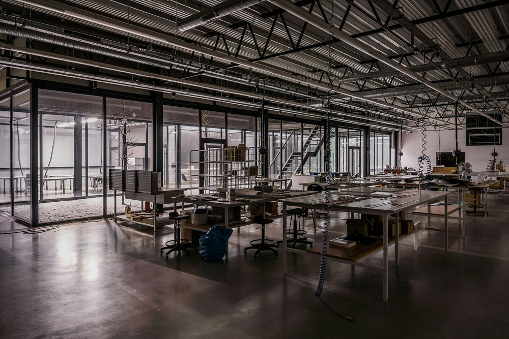
The investor’s requirement was to design a headquarters as a mix used hall –office and the production in an original form and easily identifiable with the profile of the company.
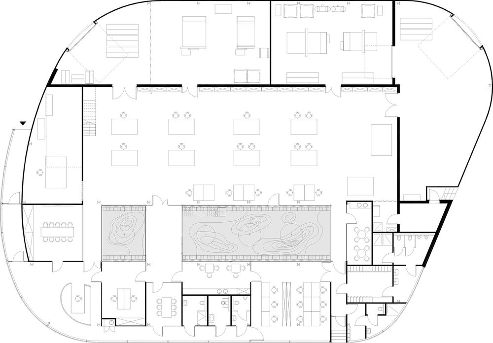
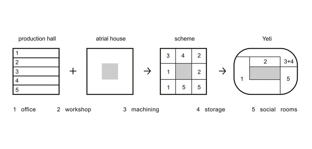
The architectural idea was to design a single-storey hall building, deviating the plan features and facade aesthetics of the archetype of the hall - a large building with a monotonous plan, spoiling the landscape, an unattractive interior — visually uninteresting.
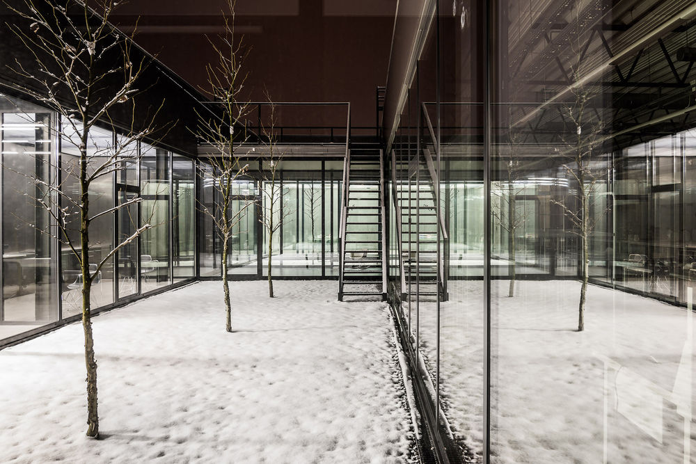
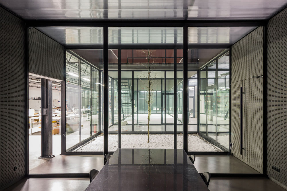
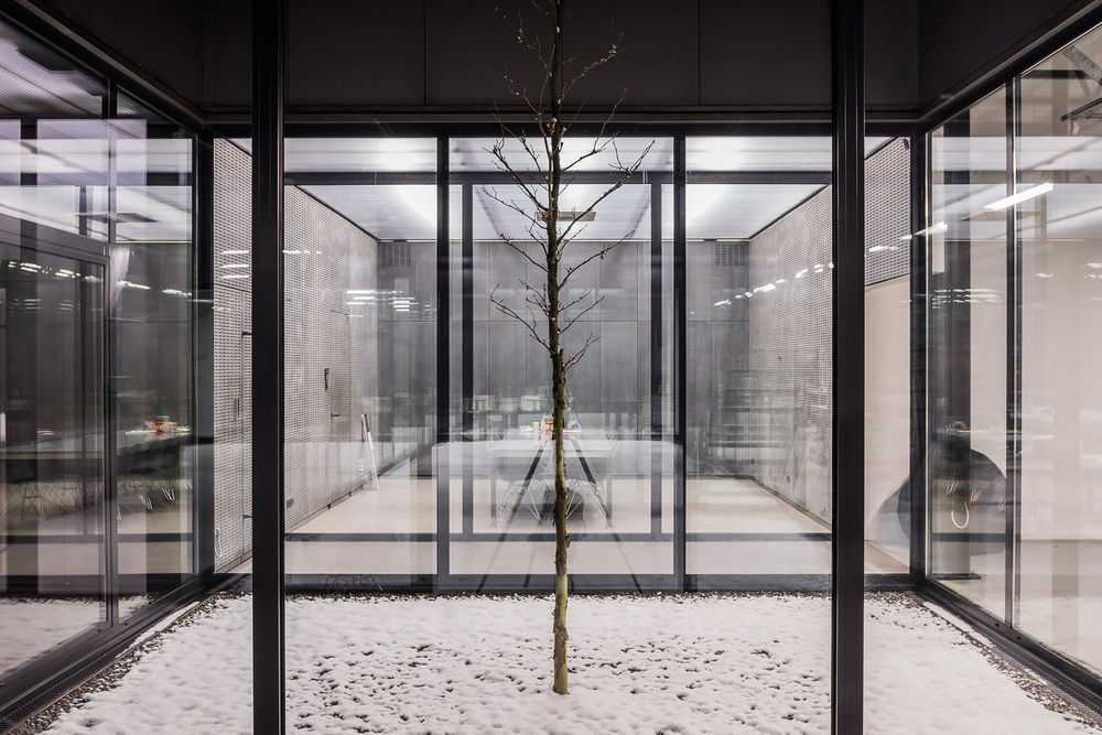
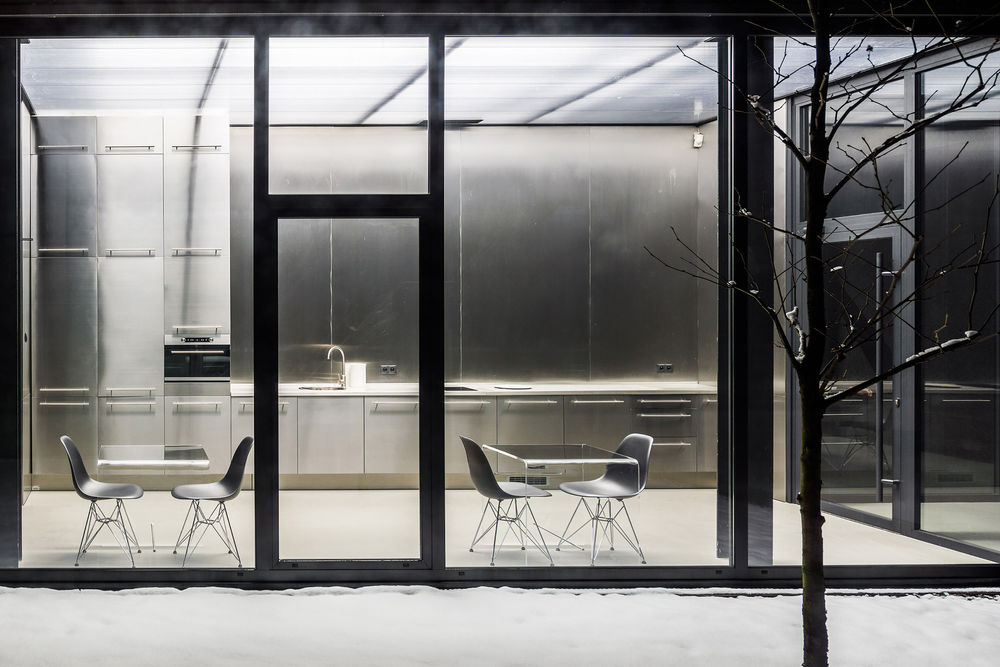
So we decided to combine the two archetypes of the building plan - the atrial house and the hall by entering the atrium (patio) in the structure of the hall and designing a building program around it, thus improving the user experience by natural illumination of the offices, meeting rooms, assembly hall and social facilities.
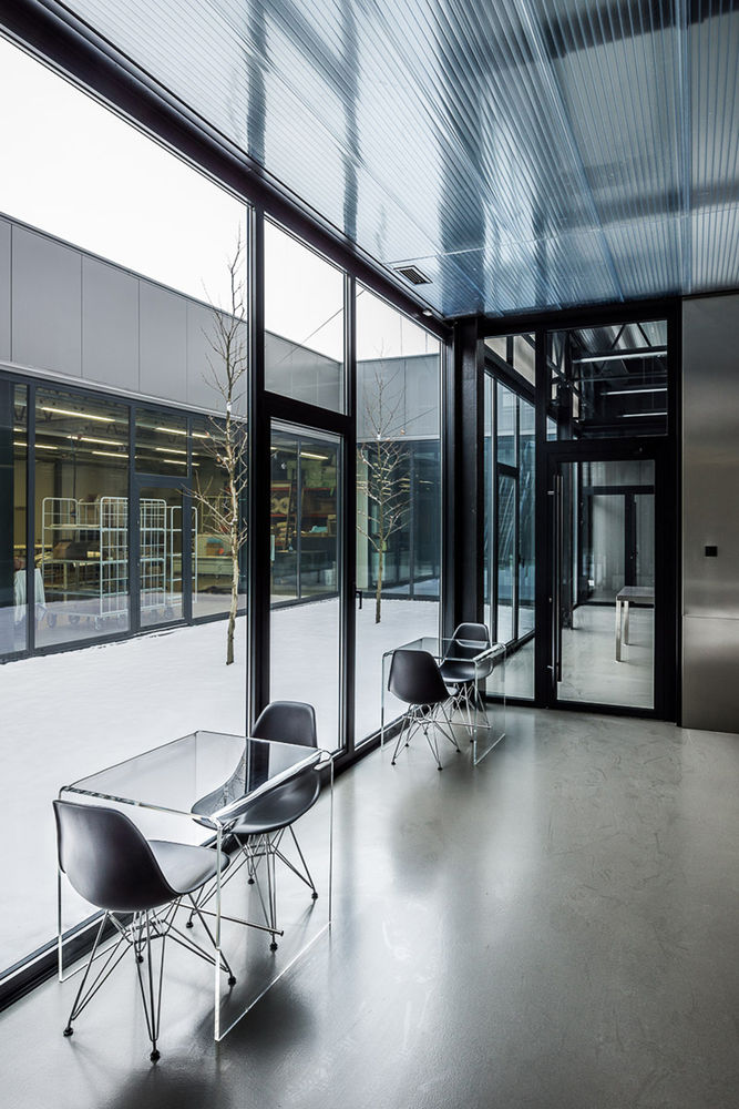
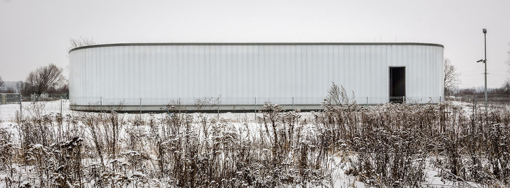
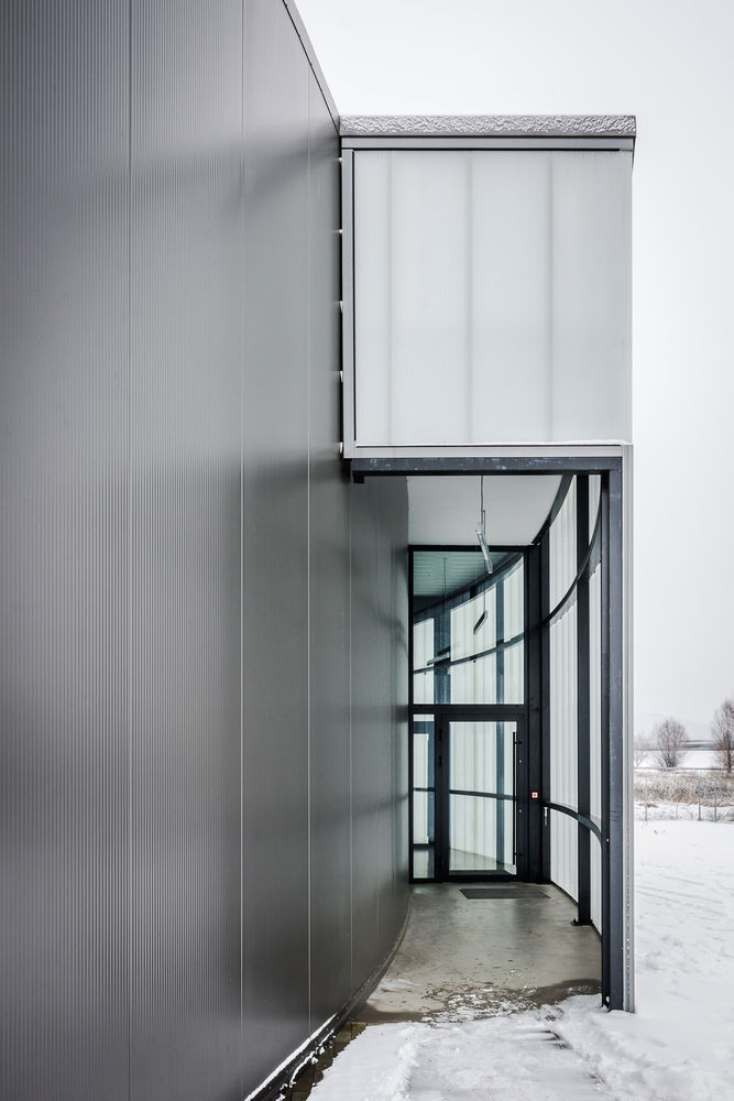
The investor is known in the industry for high quality products and precision plastic processing. It was enough of an argument to use plastic for the vast majority of the building facade as a material identifying the company. The facades are made of multi-layered polycarbonate panels and insulated panels.
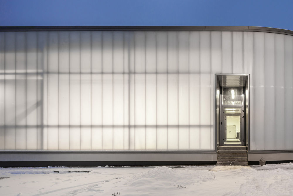
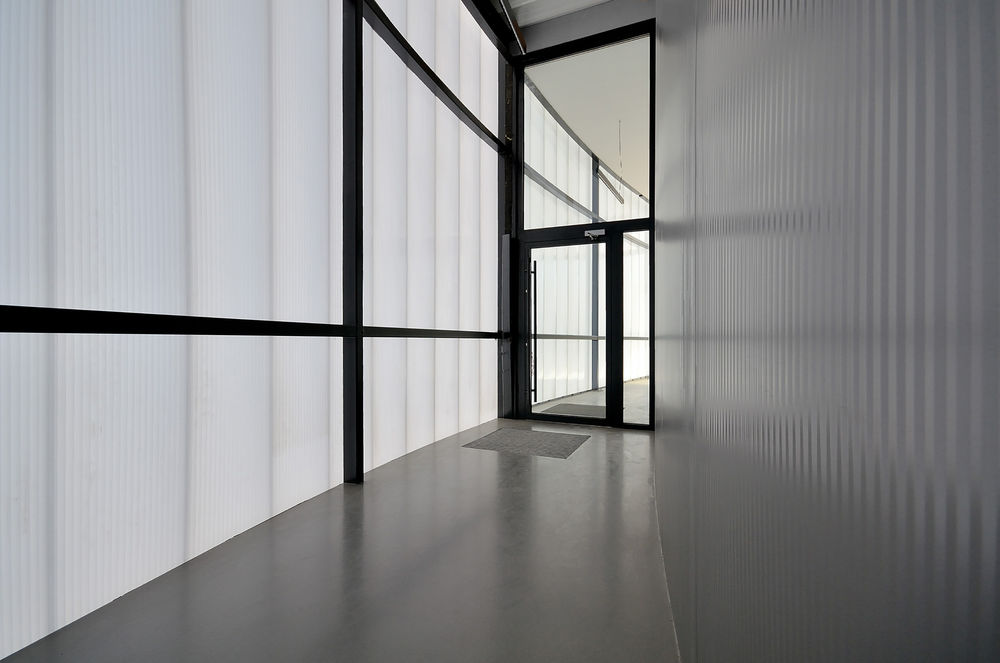
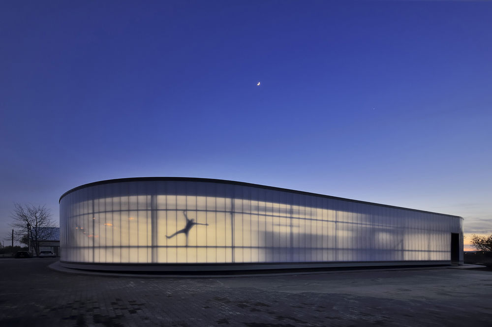
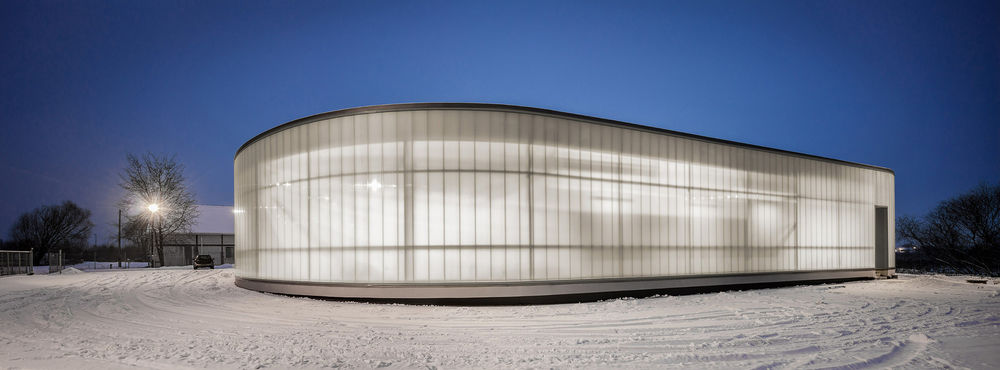
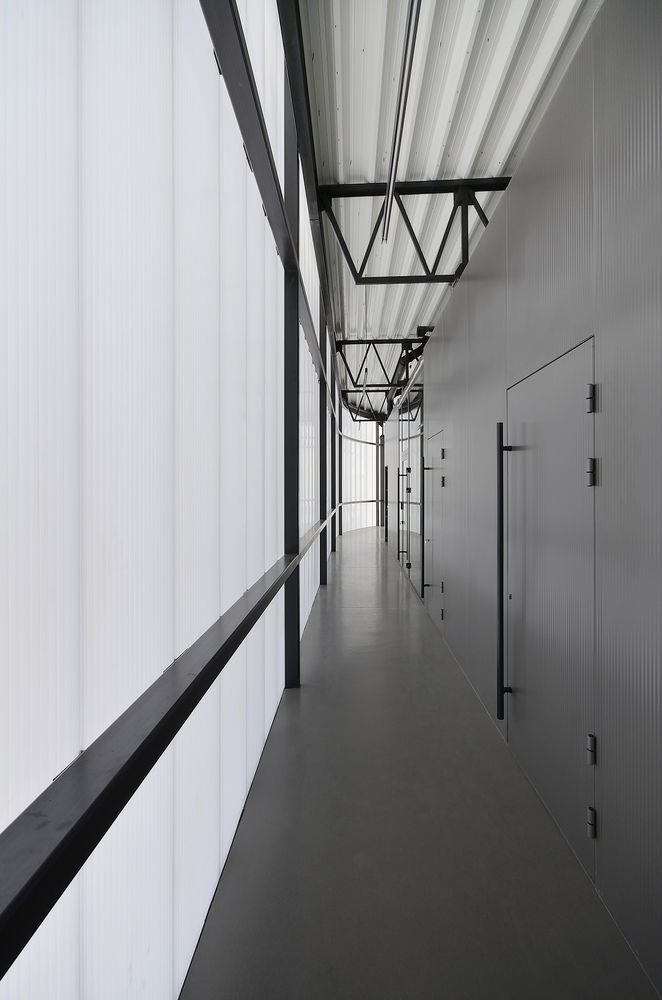
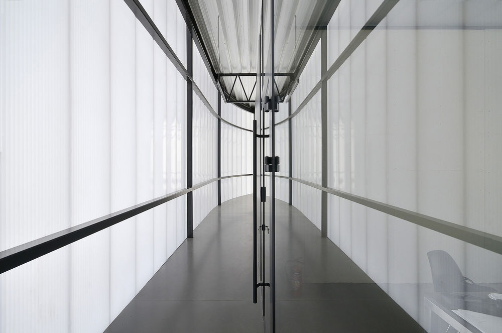
The translucent plastic facade faces the A4 motorway, which makes it possible to easily identify the position of the company and clearly highlights its profile especially in the evening and at night.

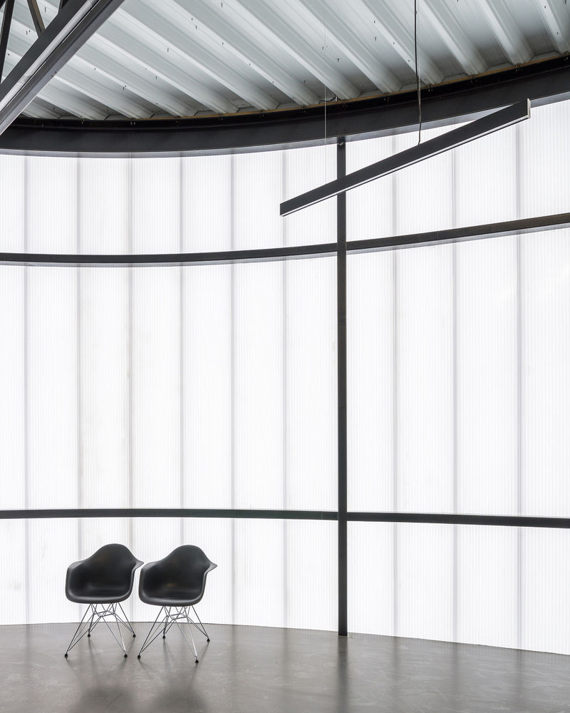
The parchment-like elevation at dusk and at night makes it possible to see the inner life of the building. The elevation is not dead - it works, it changes. A hall is not a lifeless tin block. The organic form of the building is an architectural negation of the rectangular shapes of the halls. A hall without vertical edges in the landscape is read as smaller. This form is less aggressive both for the landscape and for the eye.

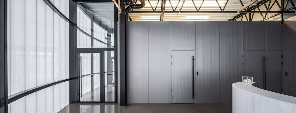
The usage of typical industrial construction materials such as polycarbonate or insulated panels and using them as the materials forming both the exterior and interior of the building was aimed at showing the creative possibilities of these materials. The facade insulated panels forming an oval elevation penetrates inside of the building and breaks several times in its plan forming the interior of building. Multi-layered polycarbonate panel is the dominant material in the interior walls and offices ceilings. These treatments aim to make a strong connection between the building interior, its facade and the outer form.
