Studio Mohenjodaro completed a space to combat the common fear of the dentist office at Dr. Sindhuja’s Dental Clinic in Punjab, India.
The intrinsic link between spaces and the feelings they evoke takes on a new meaning when over time, certain spaces start being recognised by the emotions they inspire. The most common example would be a Dentist’s Clinic. The feeling associated with visiting the dentist is almost always that of fear.
When Studio Mohenjodaro took on the project of designing the interiors for Dr. Sindhuja’s Dental Clinic, located in Mohali, they also took on the challenge of redefining the emotions inspired by the space. Minimal, pristine and clean, the design for the clinic interiors required an approach that would not only enhance a sense of calm, but also keep intact the ‘clinical’ quality of the space for the patients to feel re-assured yet comfortable.
Another important aspect of the design brief was dictated by the Dentist herself; the architect(s) wanted to incorporate the architecture of the hills within the scope of the interiors as a reference to the Dentist’s hometown. This led to a unique and inspired solution.
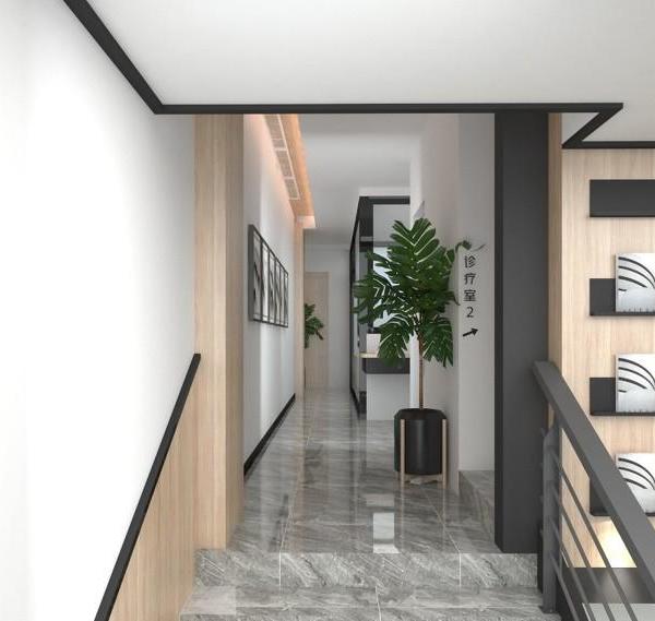
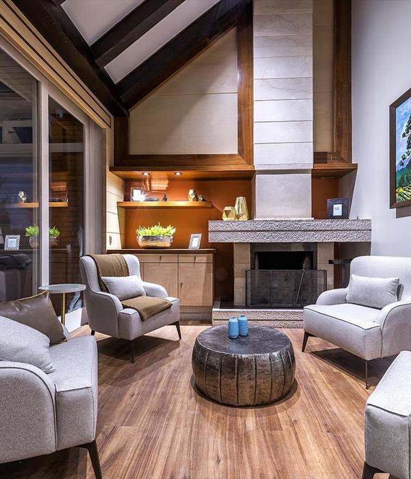
The team at Studio Mohenjodaro incorporated a sloping roof ceiling in the interiors supported by the characteristic wooden truss. Though not structural, the wooden truss added a strong character to the space, bringing together the various minimal elements of the interiors. Where the rest of the space was designed in functional white and grey, the wooden truss added warmth to it, allowing the patients to relax and feel comfortable. The architects also introduced planters and small landscaped niches within the space to add another distinguishing element to the design.
The layout for the clinic is essentially the combination of two primary zones interspersed with smaller functional spaces in-between. The entrance and waiting area to the front forms the first zone and the Operatory towards the rear with three dental chairs, forms the second. In-between these two zones, is the Doctor’s Cabin furnished in teak veneer with beige stone table tops. A Pantry and Sterilization Area towards the rear end of the Clinic, is largely obstructed from the visitor’s eye.
Brick clad walls form the main feature of the Reception and Waiting area, while the bright turquoise furniture contrasts against the muted grey flooring. The Operatory intentionally uses white to evoke a sense of serenity and tranquillity. The furniture is custom-built to complement the visuals of the spatial design, while intuitive lighting design highlights the various elements that bring a quality of whole-ness to the overall design.
The idea was to create a space that would break away from the norms of conventionality to create something not only unique, but humane.
Architect: Studio Mohenjodaro Design Team: Tarunpreet Singh Bhatia, Akshay Agarwal, Parul Bhutani Photography: Purnesh Dev Nikhanj
10 Images | expand images for additional detail
{{item.text_origin}}


