Architect:superstudiob.
Location:Porto Alegre, RS, Brazil
Project Year:2019
Category:Offices
The project for the new headquarters of the Multicommunica- tion Agency e21, presents a particularity: our close relationship with the client needs program, since we had already designed the previous headquarters and developed a long study of flows and the organization chart, that in the year of 2011, which facilitated and greatly expedited the design process. Known for being a company that seeks every day to make the brand of its customers more relevant, it was very important that this should also be expressed in the identity of the architectural project.
@MarceloDonadussi
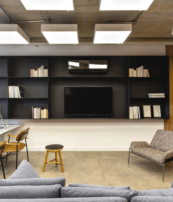
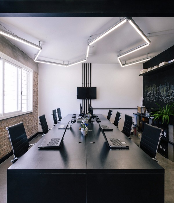
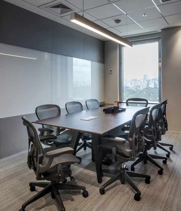
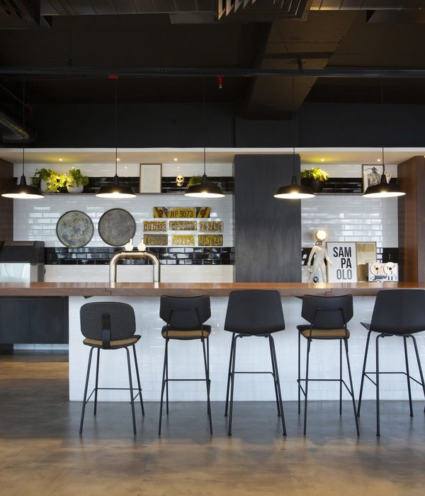
The request centered around the need for a flexible and stimulating space, encompassing more meeting rooms, a differentiated meeting room (called a strategy room) beyond, of course, specific areas such as production and administration. We subverted the obvious logic of the pool table and installed an PUB in the center of the project. There, the main characteristic is the multifunctionality, since they can happen from small chats until a general meeting with all the collaborators.
@MarceloDonadussi
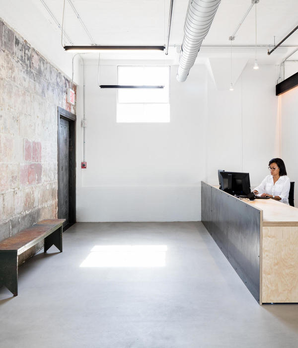
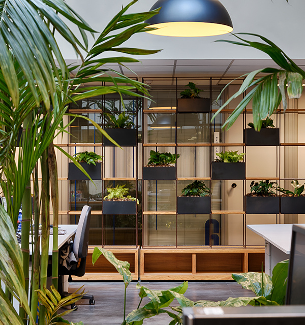
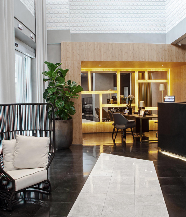
Some items from the old project make room for the new project. Among them the reception, an all natural wooden box with a timeless design and one of the great references of the old project, the showcase furniture that exposes the current and future prizes won by the company. The workstations are new and have a structure system with metallic base and wooden tops.
@MarceloDonadussi
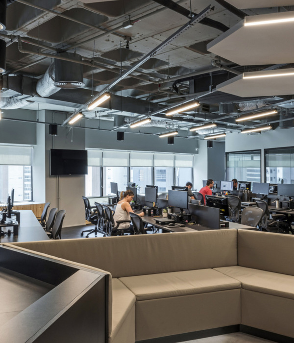
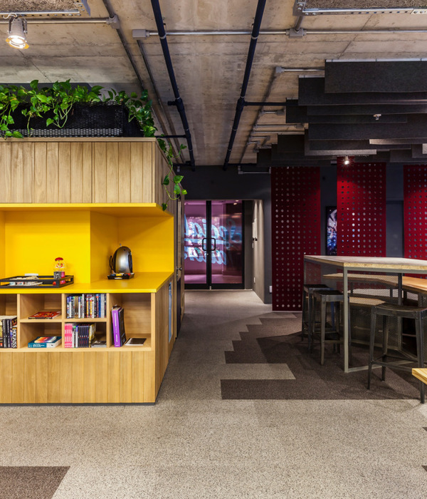
In addition, an on-site survey revealed that the peculiar structural system could indeed make the environment unique and 'non-corporate'. It was found that there was an existing void of 0.80 m above the ceiling, which concealed an extremely well executed slab. However, it was suggested that the entirely unexpected nature of this structural arrangement could indeed provide the missing ingredient to provide the industrial character we sought for this space and which has been gaining increasing prominence in architecture especially in creative spaces.
@MarceloDonadussi
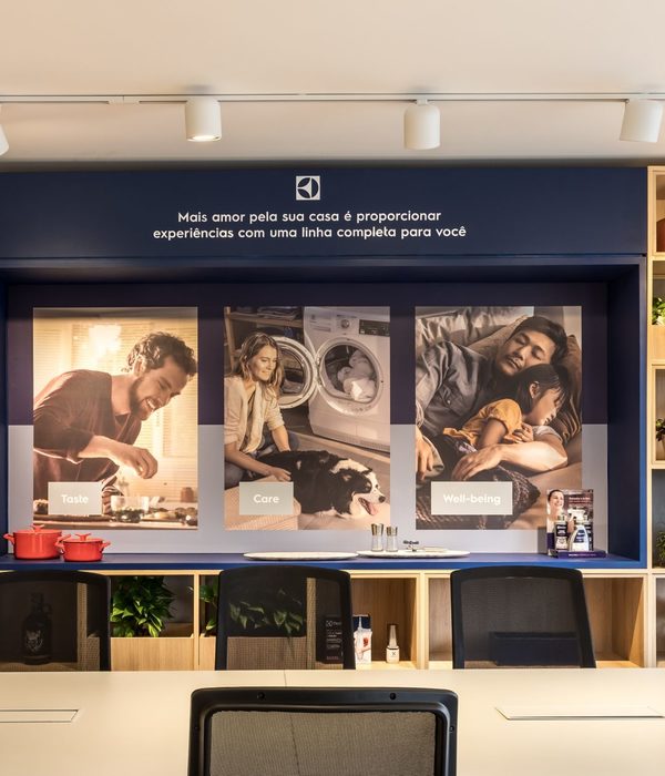
The use of demolition bricks create the highlighted foreground, which will serve as panel for screens, framed awards and plaques, memories of different times. The choice of the colors Gray silver and Gray Graphite demarcate the other environments.
@MarceloDonadussi
The porcelanato floor in the concrete color dialogs with the apparent slab and suffers break only in the area of the PUB and Strategies Room that received a porcelain floor with color and texture of wood. The choice of the floor was made due to the intense traffic of people.
@MarceloDonadussi
The choice of bathroom flooring makes a walk through French metro stations.
Highlight for the toilet director with ceramics in gray and the ceiling and walls painted yellow.
@MarceloDonadussi
The sectorized layout is reinforced through elements that define plans and consequently these configure the spaces.
@MarceloDonadussi
With the purpose of creating different paths without losing spaces with excessive circulations, the project tried to produce a mesh in which all the annexed functionalities could be organized.
@MarceloDonadussi
This concept was developed to provide a journey between private and public space in the case of employees x customers and suppliers.
@MarceloDonadussi
A new lighting system was also installed, to explore the visual interest not only of the existing structure, but to highlight the plans that were wanted to highlight and create a functional and cozy space.
@MarceloDonadussi
This was solved through the electrical installation and data, all hidden under the slab, using apparent electro-blades.
Caption
Caption
▼项目更多图片
{{item.text_origin}}

