Architect:Fokkema & Partners Architecten B.V.
Location:Amsterdam, Netherlands
Project Year:2020
Category:Offices
365 Capital is an independent private equity firm working together with ambitious entrepreneurs and management teams to maximise the potential of their businesses. Fokkema & Partners made an interior design that optimally supports their desired way of working. It instigates collaboration and maximises the potential of the building interior while underlining the team effort it takes to generate long term value for clients.
Bram Vreugdenhil
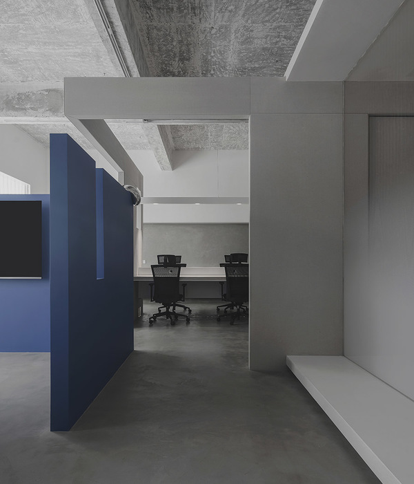
To establish their company, the young private equity firm 365 Capital moved into a building from the 1960s at a prominent location in Amsterdam. While the building itself has a modest appearance and relatively low ceiling height, the interior sets out to take advantage of the bold column structure and ample daylight entry. The suspended ceiling has been removed. The exposed concrete at the top of the columns is left in sight, showcasing the rigid original building structure and the intervention to re-interpret its qualities.
Bram Vreugdenhil
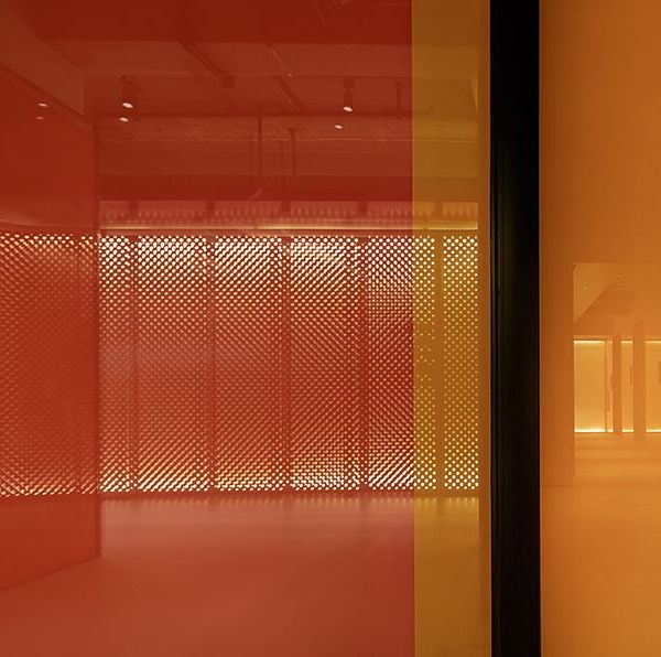
By complementing the free-flowing space with a warm and natural interior, the design maximises the building potential. The design is rich in texture to underline a variety of spatial experiences. It runs uninterrupted from the entrance and homely kitchen to the open workspace with desks for the complete team. The open workspace enables the optimal exchange of knowledge and opportunities to learn from each other.
Bram Vreugdenhil
A series of wooden cabinets are placed around the building core, converting it into a warm, functional hub. It includes a hidden bar, printers, prize cabinet, coat storage and the door to the restrooms. Acoustic measures like the perforated corten steel casing of the sofa, the workplace furniture and the acoustic ceiling provide the necessary comfort. Meeting rooms offer space for private conversations, focus and meetings. The board room has a round table to make sure everyone at the table can equally speak.
Bram Vreugdenhil
The work environment with its natural materials, lots of green and robust detailing stays away from a standard office. This gave way to choose something other than a white desk to complement the design. Ypsilon, a new range of furniture with an array of materialisation options was selected. It was customised to underline the slightly raw, homely atmosphere and rhythmically structure the work zone for both concentration and collaboration.
Bram Vreugdenhil
Ypsilon was designed by FOKLAb, for VepaDrentea. It is a flexible new system that optimally supports standing and seated work. Load-bearing flanges double as acoustic separations while keeping the floors free.
Bram Vreugdenhil
Bram Vreugdenhil
Material Used :
The design of the workstation starts at the base: a vertical axes and double feet together form its “Y-legs” while an acoustic flange subtly integrates the technique between two height adjustable desks. The workstations can be connected infinitely and completely customized with a wide selection of materials. Production of the system will be based on the WELL guidelines to ensure compatibility with the latest standards and creating a place where you feel good.
▼项目更多图片
{{item.text_origin}}

