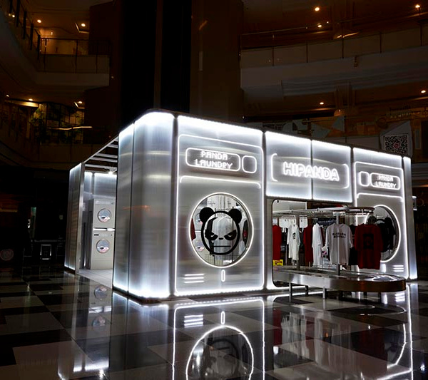
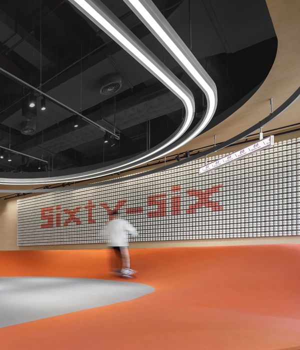
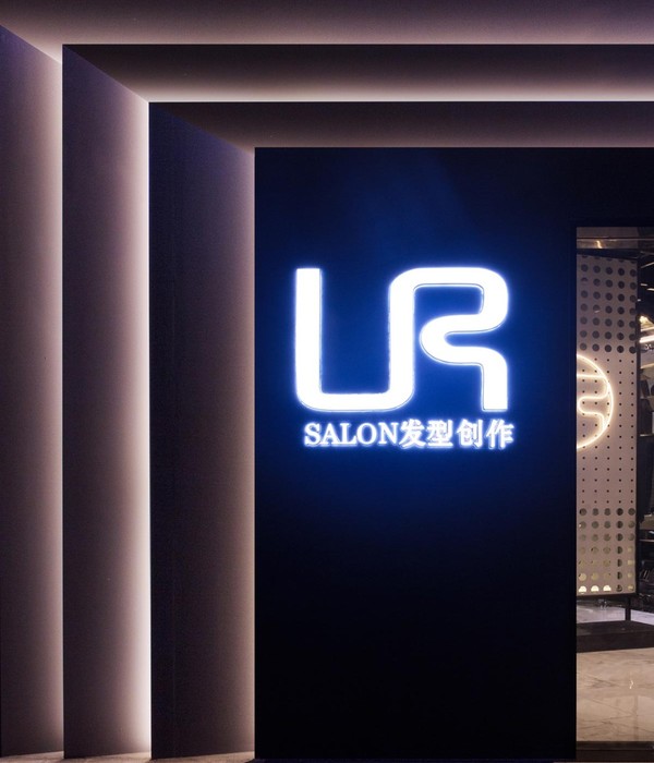
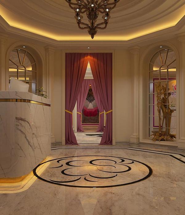
国内知名品牌新定位,新商务。甲方需求:老品牌,商务风格,打破常规,希望设计师给出合理意见和设计,因此本案诞生。
设计思路:
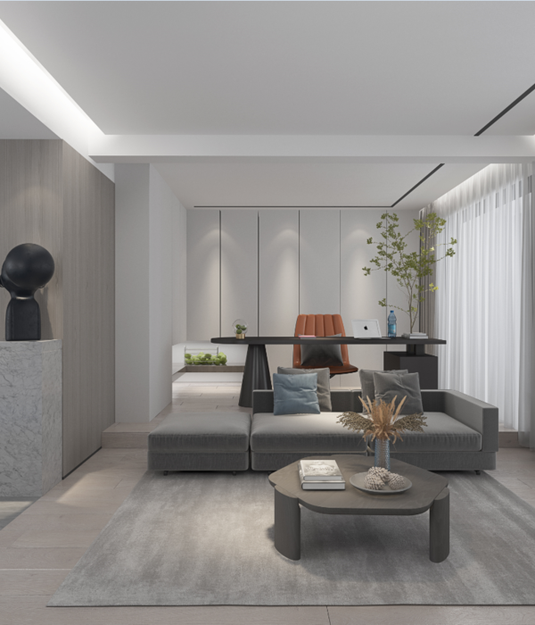
保留商务中规中矩的特点,但是在布局上废了很大的时间,由于原始平面非中规中矩,所以在空间里加入后现代造型来弥补空间的不足,颜色配比采用黑色的沉稳,深蓝的成熟稳重,白色过度,和品牌色的点缀,现代光条增加现代感,厚重而不失轻柔。
New positioning of domestic well-known brands and new business. Party A needs: old brand, business style, break the convention, hope that the designer give reasonable advice and design, so the case was born.
Design ideas:
Retain the characteristics of business rules and regulations, but waste a lot of time in layout. Because the original plane is not rules and regulations, post-modern modelling is added to make up for the lack of space. The color ratio uses black calm, dark blue mature and steady, white excessive, and brand color embellishment, modern light bar increases. Modernity, heavy but soft.
{{item.text_origin}}

