架构师提供的文本描述。奥斯汀建在松树街和波尔克街的一家汽车专卖店的工地上,设计成适合时尚的工业区,其中有一家百年老牡蛎酒吧和一家吸引潮人和老顾客的新学校理发店。它的白色和玻璃立面让阳光和城市景观;内部,建筑师埃德蒙兹李介绍了加州有机现代主义的建筑理念,编织了一个精心反应的室内设计贯穿整个项目的建筑骨架。
Text description provided by the architects. Built on the site of a one-time auto-body shop at Pine and Polk streets, The Austin is designed to fit into its trendy industrial neighborhood, which features a century-old oyster bar and a new-school barbershop that draw hipsters and old-timers alike. Its white-clad and glass façade lets in sunlight and city views; inside, architects Edmonds + Lee introduced the architectural idea of California Organic Modernism, weaving a carefully responsive interior design throughout the project’s architectural bones.
Text description provided by the architects. Built on the site of a one-time auto-body shop at Pine and Polk streets, The Austin is designed to fit into its trendy industrial neighborhood, which features a century-old oyster bar and a new-school barbershop that draw hipsters and old-timers alike. Its white-clad and glass façade lets in sunlight and city views; inside, architects Edmonds + Lee introduced the architectural idea of California Organic Modernism, weaving a carefully responsive interior design throughout the project’s architectural bones.
© Matthew Millman
(马修·米尔曼)
The lobby/ lounge is designed as a space to work and relax, with comfortable seating, music, and a front desk that has a concierge, takes lunch deliveries, and keeps beverages on tap. The space is saturated with rich, enveloping gold tones, accented by slim planks of white oak slats arranged in a quick staccato that disappear into the ceiling, the graceful move enhanced by the gentle glow of cove lighting. Decorative metal surrounding the fireplace brings to mind the automotive history of this particular city parcel, and also reflects the colors of the room back onto itself. The public areas are punctuated by ethereal moments interjected into the everyday: the mail room features cove lighting used to frame the striking matte black mailboxes that follow the walls like a ribbon, the keyholes transformed against that backdrop into a graphic element all their own. Anchored by a soaring soft white ceiling and the subtle texture of oak plank floors, it’s both decadent and minimal, bringing a warmth of tone and design to modernism.
The lobby/ lounge is designed as a space to work and relax, with comfortable seating, music, and a front desk that has a concierge, takes lunch deliveries, and keeps beverages on tap. The space is saturated with rich, enveloping gold tones, accented by slim planks of white oak slats arranged in a quick staccato that disappear into the ceiling, the graceful move enhanced by the gentle glow of cove lighting. Decorative metal surrounding the fireplace brings to mind the automotive history of this particular city parcel, and also reflects the colors of the room back onto itself. The public areas are punctuated by ethereal moments interjected into the everyday: the mail room features cove lighting used to frame the striking matte black mailboxes that follow the walls like a ribbon, the keyholes transformed against that backdrop into a graphic element all their own. Anchored by a soaring soft white ceiling and the subtle texture of oak plank floors, it’s both decadent and minimal, bringing a warmth of tone and design to modernism.
© Matthew Millman
(马修·米尔曼)
住宅提供了一个优雅和舒适的对比大胆的公共领域,开放与明亮的色彩调色板和广阔,引人入胜的看法。这栋建筑中的100套住宅采用开放式设计,厨房用于娱乐,浴室则带有漂浮的浮华。构成室内结构支撑的重混凝土柱在房屋中也起到视觉和空间两方面的作用,在规划中暗示着分隔,同时把所有的焦点都画在刚刚经过的广阔的城市景观上。这里有一个温暖、中性的调色板,让灯光在全天扫遍整个房间时占据舞台的中心位置。
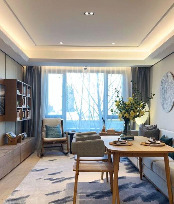
The residences offer a graceful and cozy counterpoint to the bold public areas, opening up with a bright color palette and expansive, arresting views. The 100 residences in the building feature an open-plan design, with kitchens made for entertaining and bathrooms with floating vanities. The heavy concrete columns that make up the interior structural support also act as both a visual and spatial element in the homes, hinting at separations in program while drawing all the focus to the expansive city views just past them. A warm, neutral palette here lets the light take center stage as it sweeps across the room throughout the day.
The residences offer a graceful and cozy counterpoint to the bold public areas, opening up with a bright color palette and expansive, arresting views. The 100 residences in the building feature an open-plan design, with kitchens made for entertaining and bathrooms with floating vanities. The heavy concrete columns that make up the interior structural support also act as both a visual and spatial element in the homes, hinting at separations in program while drawing all the focus to the expansive city views just past them. A warm, neutral palette here lets the light take center stage as it sweeps across the room throughout the day.
© Matthew Millman
(马修·米尔曼)
{{item.text_origin}}

