Architects:HUB
Area :1850 m²
Year :2017
Photographs :Jeroen Verrecht
Manufacturers : AutoDesk, Adobe, Ploegsteert, VeboAutoDesk
Design Team : Van Roey nv, Bureau Bouwtechniek, ABT, RCR, Daidalos Peutz
Clients : Vlaamse Gemeenschapscommissie
City : Bruselas
Country : Belgium
A house with many inhabitants. A collaborative project between VGC, ADO Icarus and the City of Brussels includes public programme with a podium, local service centre, community center and a library. These public functions are traditionally arranged adjacent to one another around a public space – e.g. a square – each with its own front door and its own interpretation of the transition from public to private space, from openness to seclusion, depending on the specific context of each function.
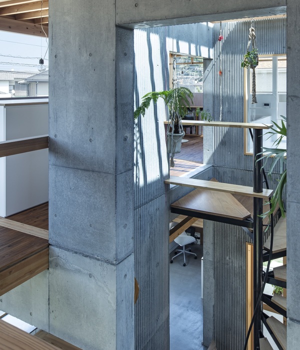
However, due to the combined nature of the required programme, the available surface area and the existing urban layout, a compact “stacking” of the various programme components was required.
A central foyer adopts the role of the public square, inserted between the public character of the adjacent street and the seclusion of the interior space, while at the same time providing a clear and readable address for each individual programme at street level, all of which are visible at a single glance from the foyer.
The building merges harmoniously with its surrounds by adopting the same scale and dimensions as the neighbouring residential buildings. By detaching itself from them, however, it retains its autonomy and reinforces its public character. Both the diversity and coherence of the programme is manifest in the volumetrics and rhythm of the façade, which is composed of building blocks referring to each individual programme cluster, each with its own characteristic pattern of windows.
The façades nevertheless express a certain versatility and equality without being entirely identical. The façades facing the street and public garden have a more pronounced - almost ornamental - character, while those adjacent to the neighbouring private gardens to the left and right are more reserved. This diversity is achieved within the same material pallet, by subtle variations in the proportions and detailing. As a result, both the kernel and the shell of the ‘Peter and Paul’ centre represent a fusion of the communal feel of a village square with the intimacy of a private home.
▼项目更多图片
{{item.text_origin}}

