This Jaffa-Tel-Aviv gem was previously home to one of Israel’s most prominent political and cultural critics & journalist.
The home was fitting for such a man: wood laden and jam-packed with floor to high-celling book-cases. Soulful, yet weighty and dark.
So not to lose the spirit of the house, designers Sara Roffman & Danna Colin focused on adding to, or subtracting from the existing framework to create a functional and calm urban escape.
Subtracting half of the massive book- cases throughout the apartment, de- cluttered and opened the entry, living space & master bedroom.
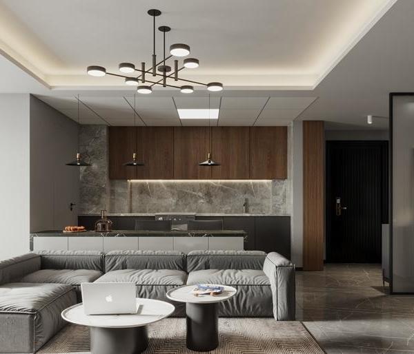
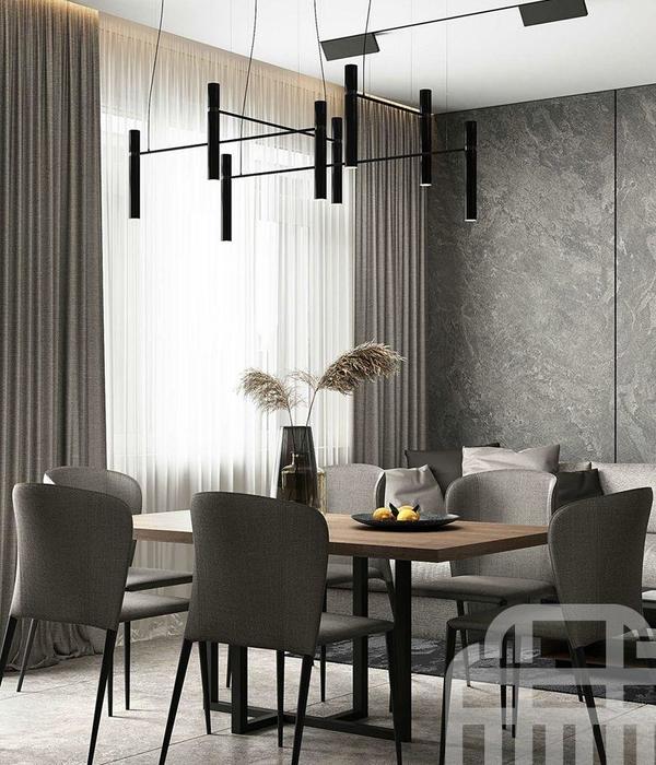
Natural light was harnessed, using a color palette ranging from white on the refurbished wood flooring, to a gradient of blues rising on to the remaining bookcases and a range of grays in the open kitchen and dining area. Thus, the natural light flowing through the space creates a tonal play on all the surfaces tying in the new and existing elements.
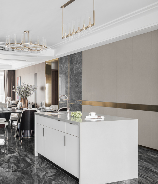
The existing kitchen, fit with custom-built pieces, provides a comfortable space for high function use; and the added bar seating makes meal preparation into a familial occasion.
Once dark and weighty, the Master bedroom enveloped in floor to ceiling storage, maximizes space while adding elegant texture.
A metallic pink- lattice curtain- wall serves as a partial divide, allowing for a small study area, while adding whimsical color detail.
And the Mediterranean blue master bathroom, floored with “Tel-Avivian” concrete graphic tiles, embodies the spirit of the home. Rich with eclectic history, modern and airy.
Connecting the entire apartment is a romantic urban terrace, ushering in the sea breeze and providing a magnificent view of the growing city. Staying true to its past, the original wood structure was refurbished and it too was fit with traditional local tiles. Like the rest of the home - respectfully winking at its history, and breathing in new life for the new owners.
Product Description: The Gluska concrete tiles used in this project are an iconic mark of Tel Aviv’s 1920’s and 30’s architecture, which is when this residence building was built. The graphics chosen are classic in their geometry, yet still modern. Which was very much in line with the concept of this project.
{{item.text_origin}}


