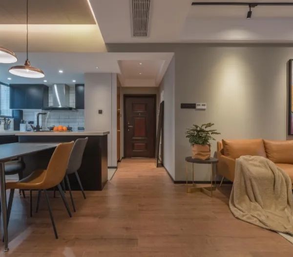
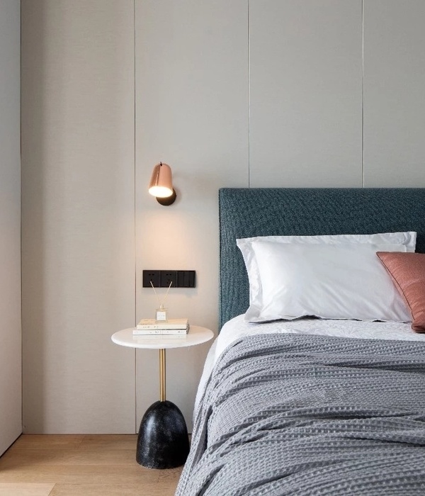
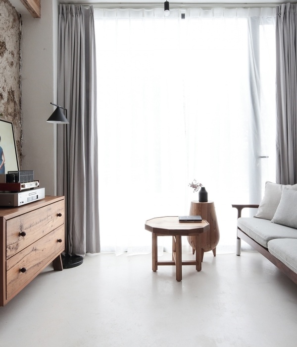
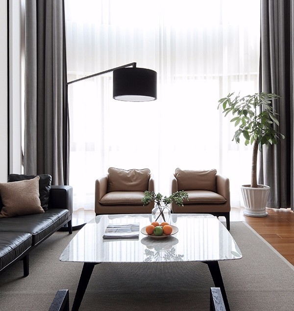
The owners are a married couple, (they just celebrated their two year wedding anniversary!) both named Chris. The couple are avid travelers, with Paris being high up on our list of best-loved destinations (a huge design influence for their NYC apartment). They also love Hawaii and were married on the North Shore of Kauai in 2018 surrounded by 30 of their closest friends and family.
Chris A and Chris P were still looking for their new space when we first met over coffee. We started work immediately after they closed on the new acquired space, which was dated feeling a bit 1995. The apartment was in great condition; it just didn’t reflect the new owners whatsoever.
PARIS! Chris A wanted something like old Paris - the charm, the class, the forever chic style. He HAD to have a glass/metal divider somewhere - which we incorporated into the kitchen. He also wanted lots of brass and painted moldings. The entire apartment is about 800 square feet. The crown in the living room is original as is the herringbone wood floor - which we sanded to its natural finish before giving it its final varnish coat. The chair rail and decorative moldings were added as was the ceiling medallion. All the wall sconces and pendants were an addition too. The reclaimed beams in the kitchen were installed as was the plastered vent hood and marble looking ledge in the bathroom.
With finishes throughout the space we focused on things very textural and organic - a velvet sectional, reclaimed wood beams, leather pendants, slate flooring, zellige tile, a marble fireplace, hand applied plaster, steel dividers, brass, and marble. We wanted the space to be timeless, classic - a throwback to old Paris but with a crisp and modern edge of New York.
In regards to furnishings, the word we worked around was simplicity. With all the built-in detail around the apartment the furniture and accessories were mostly kept simple. The eye candy is the marble, moldings, fireplace - we didn’t want the furniture and accessories to interfere. Everything is a contrast to one another: light and dark, smooth and textured, modern and old, ornate and simple. We fit a lot in the space. I saw it's potential during the first walkthrough of the layout and how much could fit but it was a risk in such a small space. With the help of AutoCAD and a lot of drawn elevations we made sure that what I envisioned could in fact fit - it did, but it was risky to put so much into one space. Without filling the space to its capacity it would not have as much depth, character, and function.
We wrapped up at the end of February 2020. Chris and Chris were delighted with the finished space and couldn’t believe the transformation that took place. After they moved in I kept getting photos via text messages of them enjoying and living in the space - which could not make me happier. It is a beautiful while also functional home.
Sources:
KITCHEN:
cabinets | cliq studio
leather pendants | barnaby lane
sconces | cedar moss
cabinet hardware | brass optimum
LIVING ROOM:
sectional | rh
area rug | custom
pendant over dining table | lambert + fils
dining table | meadow blu
custom banquette | stitchroom - out of NY
dining chairs | france and sons
mantel | mantelcraft
black wall sconces | triple seven home lighting
swing arm sconce | circa lighting
pillows on sectional + banquette | etsy
BATHROOM:
vanity | custom
black tiles | cle tile
plumbing fixtures | astra walker
项目完工照片:
平面与结构图:
待补充……
效果与概念图:
待补充……
设计师:Crystal Sinclair Designs
坐落:New York / United States / 2020
语言:English
阅读原文
{{item.text_origin}}

