孟买 Doki Doki 概念店 | 旧冰厂的时尚新生
Architects:The Architecture Story
Area:1250 m²
Year:2023
Photographs:Suryan // Dang
Civil Works:LTBT
Principal Architect: Deepak Jawahar
Interior Designer: Justine De Penning
Design Team: Kirubhakaran. C, Aswin Karthick, Abhijit Haridas, Amrutha Iyer, Devendra Jadhav, Eesha Pethe
Mural Painting Works: Narayanan Kadam
City: Mumbai
Country: India
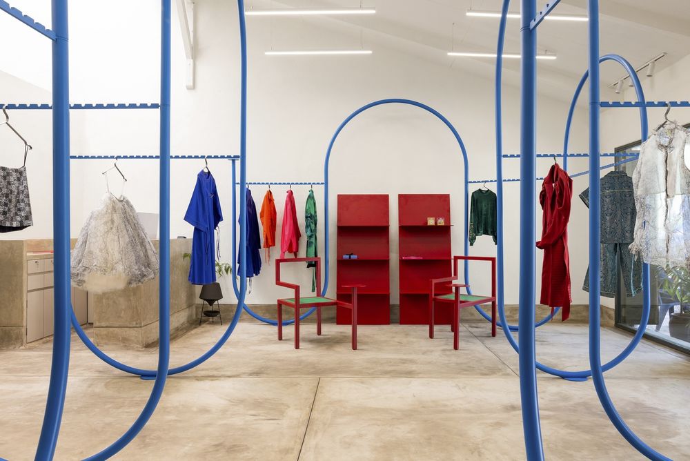
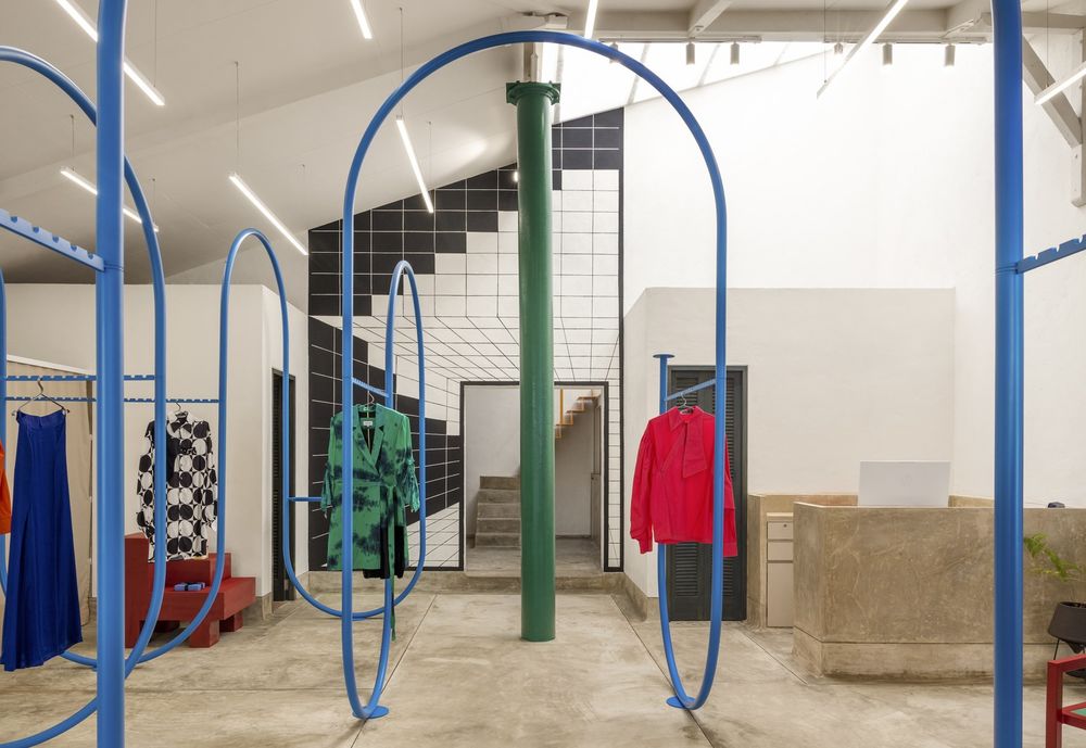
Situated on Calicut Street in the Ballard Estate neighborhood of South Mumbai, this site was previously an abandoned ice factory that served as a storage facility for ice produced a few doors down. During our initial site visit, we discovered a raw warehouse space that offered numerous possibilities for intervention. It was crucial for us to maintain the warehouse's integrity, including its pitched roof and wooden beams. Fortunately, we had a client who was passionate about design and open to taking risks, allowing us to create a flexible, modular system that respected the warehouse's history.
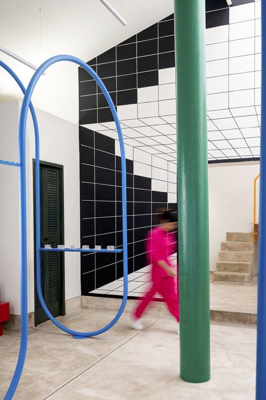
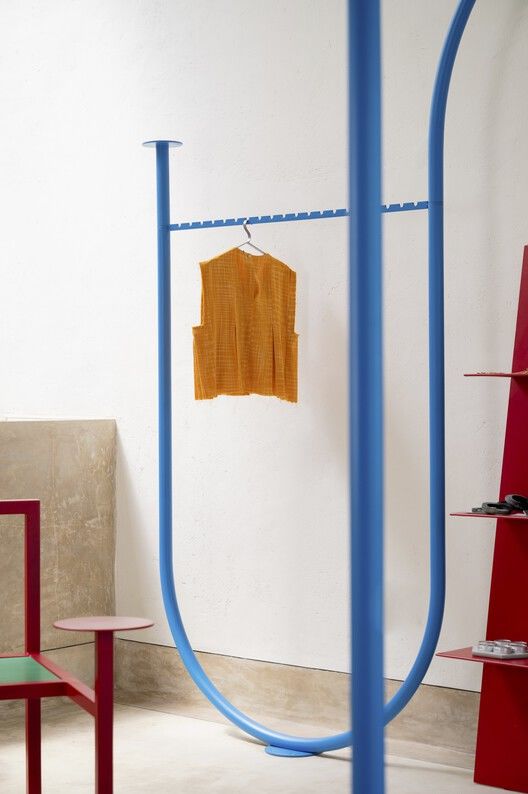
The Doki Doki experience unfolds behind a three-toned striped façade mural designed by TAS and painted by local sign painter, Narayan Kadam. The mural serves as a device to break away from the busy bylane and introduce a new visual rhythm. Upon entering the space, visitors are greeted by a large installation of metal arches, which serve as a centerpiece that combines function and experience. The second mural on the wall between the primary retail space and the gallery space is also custom designed by TAS and explores the grid as a device that expands the visual rhythm of the exterior mural to the interior space.

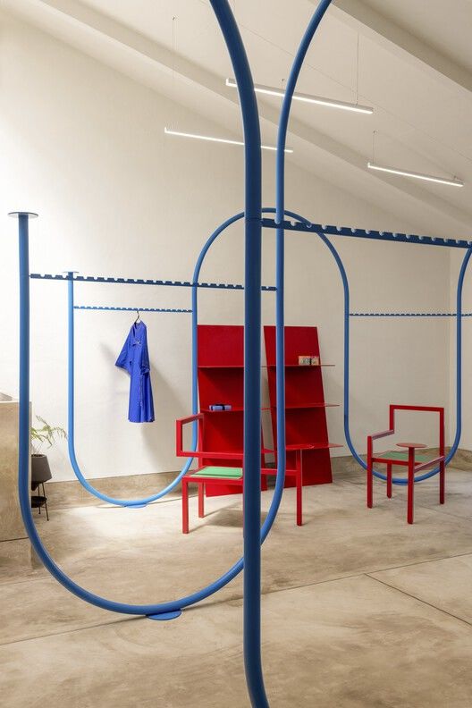
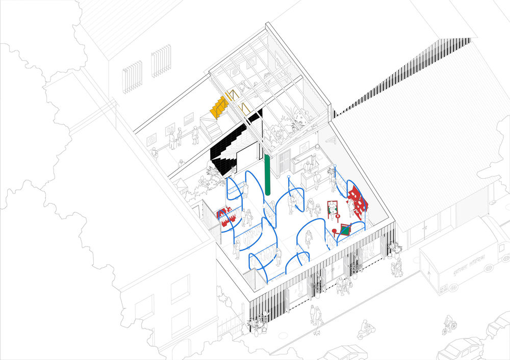
Rather than a conventional retail layout where clothing racks are placed against the walls and circulation takes place in a predictable linear manner, we created a flexible modular system. This sustainable design methodology enables the system to be reconfigured in different arrangements and easily transported to other locations if necessary. The arches within the space serve both as a passageway and a display rack for garments and objects, and the continuous loop spatial strategy encourages visitors to weave through the space.
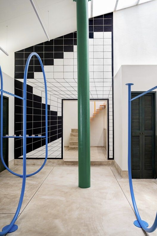

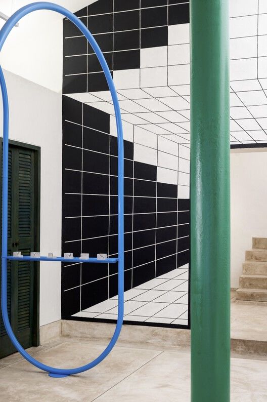
All the loose furniture pieces in the store were custom designed by TAS with a geometric logic of solid right angles inspired by Rietveld's chair, creating a contrast to the fluid arches. For this project, we explored the line as a starting point for our research, considering how a simple line can translate into space and morph into many forms. We have been exploring furniture over the last five years and see our products as an extension of our spatial practice.
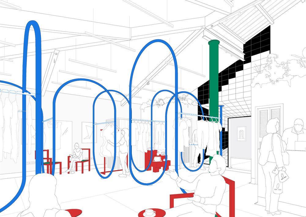
The color palette was carefully chosen to complement the eclectic mix of young designers represented in the store. The combination of the metal framework, hand-cast IPS flooring, and wall texture allows for an interplay between two very distinct material approaches.
