Architects:Paradox
Area :255 m²
Year :2022
Photographs :Tomasz Zakrzewski
Manufacturers : PREFA, Aluprof S.A., Jadar, MEVACO GmbHPREFA
Lead Architects :Szymon Borczyk & Dawid Marszolik
Structure Engineers :Studio RF 14 Krzysztof Fiedor
Interior Designers :musk kolektyw
Cooperation : Sergiusz Waluda-Rozmus, Marta Kempska, Adrianna Białończyk
City : Tychy
Country : Poland
Designing building at small corner plot in the vicinity of the existing housing development was a real challenge for us. In the context of business, its great advantage are good exposure to the surroundings and close proximity to a very popular leisure resort, which is located at Lake Paprocany in Tychy.
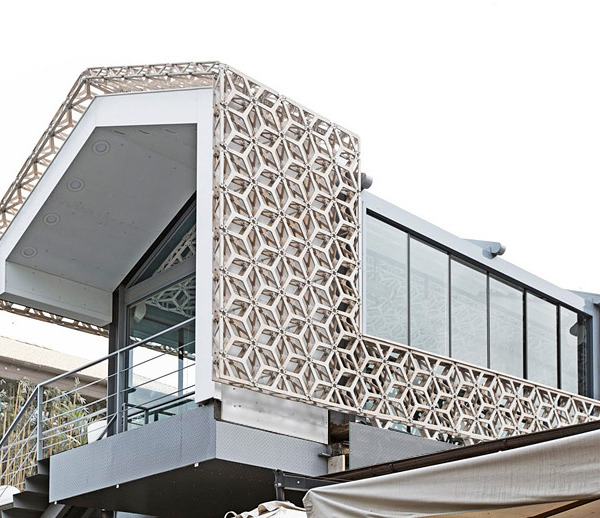
We agreed that the context of the environment and good exhibition are the two most important issues that we must skillfully combine to make the best possible use of the existing place. We looked at the surrounding single-family houses with various shapes and roofs, as well as different facades. We have created a concept where the entire sales, production and office functions are located in two solids that are referring to the surrounding buildings. An additional solution that has distinguished this project so much is a simple base solid finished with black and expanded mesh, on which we have placed two "houses". The separation of the building particular parts is reflected in the division into individual functions. In contrast to the unusual, varied shape of the whole and its apparent complexity, we focused on uniform, but high-quality finishing materials. We acted consistently and covered each solid in its entirety, taking care to minimize the detail and hiding all secondary elements, and even some windows. The materials and textures of the facades and roofs, and all the colors, refer to the existing space, as well as to the owner corporate colors.
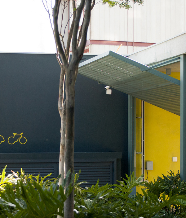
We opened the building in the corner at the intersection of two streets, in the direction from which visitors will have the best view to the newly created service. We cut a uniform, characteristic black expanded metal facade in the corner, creating a panoramic opening and clear mark to enter the premises. The remaining places are tightly covered with a net, from behind which only the outlines of the elements and accompanying devices are slightly visible, and we focused all the client's attention in one place - the entrance zone.
When designing building site surroundings, we wanted to leave it open, but also a freely arranged space that dynamically changes with the rhythm of the cafe's functioning throughout the day and the whole year. We wanted the composition of round cutouts in the floor to diversify the space without creating barriers due to its small size.
The Lodowato project is a response to the uncompromising combination of many seemingly impossible to combine design issues: the idea, investor's requirements, functionality as well as composition with space.
▼项目更多图片
{{item.text_origin}}

