Architects:OE Arkitektura, Sara Elizagarte
Area :75 m²
Year :2022
Photographs :Biderbost Photo
Manufacturers : &Tradition, Ikea, Leds-C4, Ondarreta, Cocinas Mydo , Miguel Fernández-Galiano, Silestone, T+2 Sofás, Takt Cph&Tradition
Arquitectos Responsables : Sara Elizagarte, Oihane Eguren
Constructora : Azkoan
Mueble Central : Carpintería Bogan
City : Vitoria-Gasteiz
Country : Spain
@media (max-width: 767px) { :root { --mobile-product-width: calc((100vw - 92px) / 2); } .loading-products-container { grid-template-columns: repeat(auto-fill, var(--mobile-product-width)) !important; } .product-placeholder__image { height: var(--mobile-product-width) !important; width: var(--mobile-product-width) !important; } }
Located in the centre of Vitoria, OLG5O is a former dental clinic converted into a home for a couple. The shape, the terrace and the luminosity were key when it came to developing this functional home that avoids a conventional refurbishment. The original state of the flat was none other than what one might expect from a clinic: a corridor and many partitions that were demolished to leave an open-plan space. A space that posed quite a challenge because, although a rectangular floor plan is very grateful when it comes to distribution, all the rooms had to be housed, avoiding new partitions and thus making the most of all the light that came in.
After the confinement, the owners had it clear, they wanted a house with an outdoor area, so the distribution was made facing the terrace, as if it were the sea. Hence, the common areas where most of the living space was, had to be a continuation of the exterior, while the other half of the house was occupied by the two bedrooms and the two bathrooms.
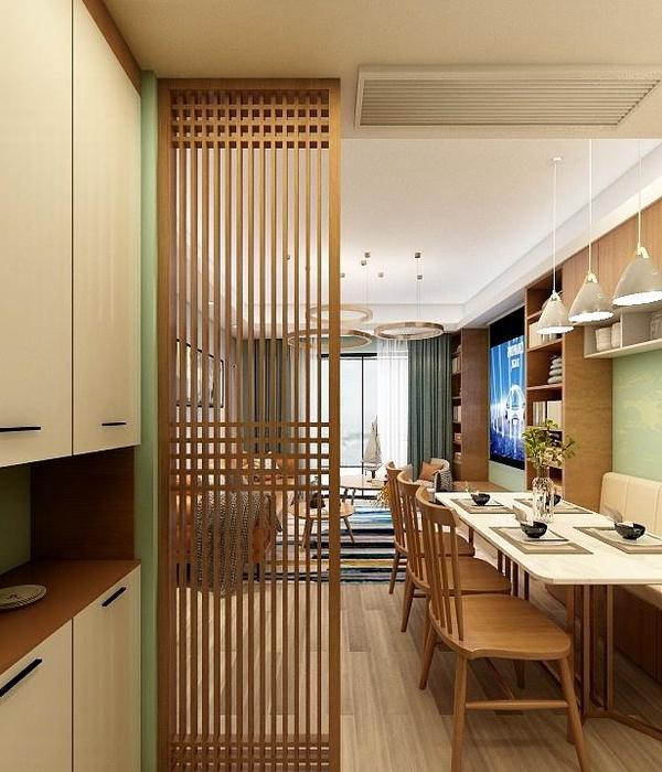
Housing circulation is intuitive and practical, but far from a typical renovation. We achieved this thanks to a carefully studied floor plan that allowed all the areas to fit together and to the choice of elements that help them to do so. A good example of this is the central wooden piece of furniture, which both separates spaces and gives continuity to the home. It is a multifunctional piece of furniture as in the same element we have a separator, wardrobe, coat rack, shelf and passageway; as well as housing a concealed door. It was one of the first ideas when designing the project; it was necessary to provide permeability to the entrance hall of the house, avoiding finding a wall as soon as you open the door of the house.
Following the code of the central unit, the kitchen was designed as another element of the central space, as it would always be in view. It is designed to be as cosy as a living room, but without neglecting the fact that all the elements must be organised so that this space is practical for day-to-day use. The materials were chosen taking into account the open space we had in the central area. Hence, the floor was continuous, in a grey micro-cement that avoids cuts in a space where partitions are avoided. In the same way, we made the most of the light coming in from the terrace by painting the ceilings and walls in white, with tiling in the same colour on the kitchen wall. As a counterpoint to the cold appearance of the white floor and walls, the furniture is made of beech wood. Top-quality, made-to-measure elements made of natural leaf provide a touch of warmth worthy of a home.
The colour palette is none other than a continuation of the functional and atypical discourse we are looking for. We played with colour shots that worked well with each other, avoiding turning the house into an amalgam of colours. Hence the dark ensemble of the dining room watched over by the photography of Miguel Fernández-Galiano, halfway between the earthy textiles of the living room and the green spotlight of the kitchen. The choice of furniture is also part of the particularity of this project, where pieces by designers such as Fabricius & Kastholm coexist with furniture by Takt CPH or local Basque manufacturer, Ondarreta.
The guest bathroom, although a closed room, is in constant connection with the living room, as it is accessed through the central wooden element. This is the reason why we tried to seek this continuation by unifying materials and colours, with both the walls and the worktop being made of grey stoneware that continues through the melamine of the cupboard.
The touch of colour is provided unmistakably by the pink countertop washbasin. All this choice of materials and colours is also represented in the bedroom with en suite bathroom. Although the room in these areas was going to be smaller, they had to enjoy the same harmony as the rest of the areas, so we played with a palette of colours both on the walls and in the furniture to make this space a haven of peace and relaxation. In addition, distributing this bathroom was a whole process due to a pillar that made us discard several options until we found the ideal one in terms of usability and aesthetics. This led to a small space, but where all the openings were taken advantage of, a good example being the towel cupboard located inside the shower. The fact of having so many nooks and crannies meant that the tiling had to be done with special care, matching each tile with each niche and partition. Designing and executing this space was a process of fitting the pieces together, where the confidence and daring of the owners was the key to achieving a cosy, timeless home of the highest quality.
▼项目更多图片
{{item.text_origin}}

