Interior Designers:Atelier TAO+C
Area :190 m²
Year :2017
Photographs :Shengliang Su
Manufacturers : Fritz Hansen, Duravit, Cassina, Donbracht, HäckerFritz Hansen
Interior Renovation Construction :Shanghai Tianci Building Decoration Co.Ltd, Jinfang Wang
Structure Engineer : Fa'an Yi
Structural Reinforcement Construction : Weigong Jiang
Collaborators : J&CO design
Design Team : Tao Liu, Chunyan Cai, Weilu Wang, Shengding Liu, Lihui Han, Qianjuan Wang
City : Shanghai
Country : China
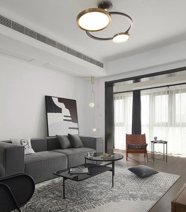
Lane house (or Li long) is a unique residential typology of Shanghai. The urban fabric of the city was once densely constituted of such kind, now only a handful remained. Located in Shanghai French concession area, the project was to remodel such a 1930s’ lane house with a courtyard to accommodate three bedrooms with independent restrooms and facilities meeting the users’ daily needs.
With respect to the original site, the design team dealt with a discreet surgical approach, cutting a slim opening in the center of house, reminds one of the typical narrow light shaft in those small southern traditional houses. Carefully preserving and exposing parts of the wooden structure, balancing the relation between old and new. The project evokes a sense of southern Chinese vernacular dwelling with modern architectural language.
The site is a three-story house supported by the wooden trusses and brick bearing walls which is common during the 30s. The house was divided into two bays, the rooms were narrow and deep. The east side bay had been split into two compartments, the back was occupied by the staircase and the adjacent small rooms which had been dissected into four levels, one can only enter through the semi-platform on the stairs. Therefore, the back rooms are half a level above the frontal rooms, which is a typical trait of a lane house. Our main focus stands upon how to revive this extremely stuffed yet not properly lit old house, and connect the split levels.
Instead of adding more space, the architects took an opposite approach- cutting a slim opening from ground floor to roof between the split and the main floors in the middle of the east side bay. The 4:1 aspect ratio reminds one of the typical narrow light shaft in those small southern traditional houses. Enclosed with transparent and translucent glass, Sunlight shed into the interior space at the center with a gentle touch.
With the move of sunlight, the glass box glows from bright to dim; The light shaft formed the inner concentricity of the house. On first floor, a bridge penetrates through it and goes into the previously walled attic room, forming a dialogue with the main space. On second floor, the bedroom in the attic looks into the restroom across the light shaft where a few steps linking the two rooms.
The height of the shaft vertically synthesizes the three floors, and the depth of it redistributes the forms of space horizontally. By implanting such a light shaft, allows the celebration of air and light and also interweaves the split floors, enriches the spatial experience of domesticity.
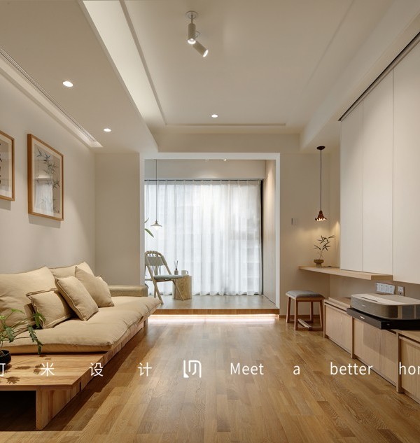
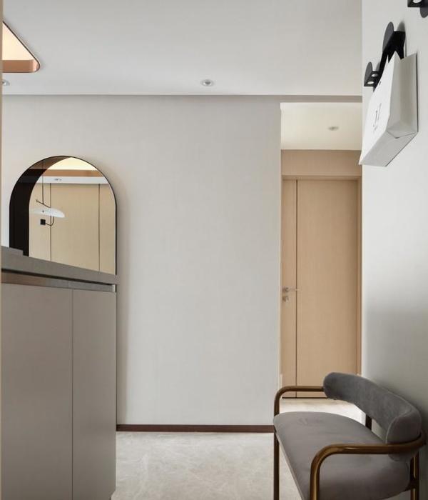
The architects employed the material in the interior with restraint. Intentionally preserving and exposing parts of the wooden structure, the designers united the new and old through a series of structural reinforcement. A continuous use of wooden plank wrapped up the entire house from the top attic to the ground floor, following the tortuous thread along the staircase; the planks were transfigured into chests and walls, and the lead spread on the first floor dining room, extending into the yard. The palette of oak and white gives the home a tranquil tone.
▼项目更多图片
{{item.text_origin}}

