The house as we call “FARM HOUSE” is not really a Farm house in its literal sense. It’s a house for a retired couple who spent most part of their working days in the heart of Bangalore city. They wanted move out of the hustle and bustle into a quieter locality. This plot was in a gated community near Electronic-city which is the hub of all major IT giants. The minimum plot size was 10,000 sq.ft , with a lot of coffee plantation and eucalyptus trees around. The greenery, serenity of this gated community and the quietness made us name this house as the “Farm House”.
The residence was conceptualized as an amalgamation of the serenity of the site and the client’s requirement of a simple and a low maintenance house. We did not want to block the view of the surrounding at the same time we had to give some kind of privacy to the inhabitants. Looking out to the house from the street, the front reveals two prominent cubes with two layers, one layer with opening and the other layer comprising of louvers. Where the opening gives the view of the outside from inside, the louvers give the required privacy.
The client’s requirement was quite unique. They wanted a big house when they have their daughters and grandchildren who live abroad coming to stay with them during holidays while a small one when it’s just the two of them. We divided the house in two parts, the active part and passive part. The active part has the absolutely essential areas like the bedrooms, kitchen and utility. We kept the Master Bed Room and a guest room next to each other opening on to a small family room. Right next to it is the dry kitchen and the wet kitchen with the utility. This part of the house is the active part.
The other extension was the bigger dining and a formal double height living which formed passive part. These two parts are separated by a single door. The closure of this door would mean the closure of the passive part of the house. The idea here for the client was to reduce the areas that needed to be cleaned daily. They would close this for most part of the year when it’s just the two of them. They also had a requirement for handicap access to the main entry, which made us give the entry ramp on the Eastern side of the main gate. A large court was created at the East side of the plot. This court was enveloped by the living room on one side and the dining on the other. The larger dining room and the living room open on to this same court which is tactfully tucked in to give privacy from the road in front. The upper floor balcony which is accessible from the family also overlooks this garden. A large hard-scaped deck precedes the luscious green expanse of the lawn.
The Master Bedroom has a mezzanine which doubles up as working place for the man of the house while the lady can enjoy her afternoon nap or even read a book at the lower lever, each without disturbing the other still being together in a single space. This way, the couple have visual connect between each of them, while giving them the required privacy. The master bathroom has an outdoor shower area and also a foot spa along with the regular indoor bathroom. The walls around the outdoor shower area are cladded with yellow sandstone, which is one of the few coloured gems of the entire house, where the palette is mostly muted.
The cantilevered wooden steps take one to the first floor which has a bigger family room and a bed room. There is one cozy reading corner on the first floor with a window looking on to the front road. The large sliding doors open on to this deck which then leads one to the lawn. Louvered grill and gate gave this space enough privacy from the road. The key feature involves giving large openings which are thoughtfully placed in the double height living and the master bedroom so as to get best view of the view of the green surroundings. This invariably integrates with the elevation treatment. The facade with just white and grey from the concrete texture as the prominent colors with bits of brown from the louvers comes across as elegant and modest, eliminating the sense of intimidation. The key was to get the right kind of concrete finish which set the tone for both the interiors and exterior of the house
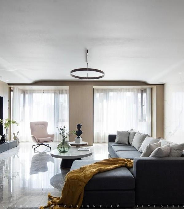
The interior of the house features a simple palette of black, white, shades of natural wood and concrete finish. The straight and minimal lines of the massing are in line with the simple straightforward interiors. Wooden steps cantilevering from the concrete textured wall, along with the SS cables instead of the handrail in the dining area make the space feel light and spacious. The long skylight spanning over the entire stretch of the steps, adds to the lighting of the steps creating interesting patterns on the adjacent concrete finish wall. The client’s eclectic collection of old furniture that was used by the them for many years were re-polished to suit the tone of the rest of the house. Looking back, the project’s key hold was in understanding the client’s taste and requirement. The client’s aversion for opulence helped us to set the palette and texture for the entire house. The house is a distant retreat at the edge of the city with a civilized garden within a larger wilderness.
{{item.text_origin}}

