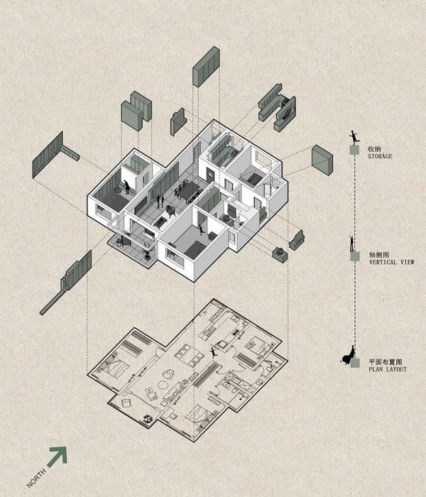
The 73 m2 apartment is located in a 19th-century building in the city center of Ljubljana. The original larger apartment was in the past divided into two units, as can be seen from the shortened corridor, which is usually quite long in these sort of apartments. The concept of circulating through the corridor that leads into each room and then being able to pass from room to room, was thus considerably weakened.
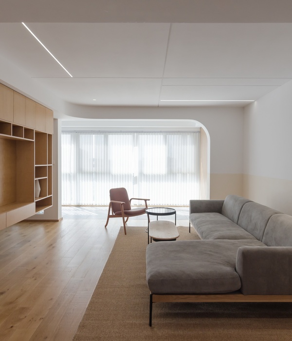
The new project envisioned the connection of two rooms into one larger living room, and one of the rooms was divided into two smaller spaces and a connection with the entrance part. Already in its existing state, part of the corridor was intended for the bathroom, the position of which we have maintained. In order to design the bathroom as elegantly as possible and deal with the varying geometry of the space, which is full of cut corners, niches, we decided on a unifying colour of both the tiles and the cabinets (green) up to 2,10 m high and leveled the space with cabinets that hide the water heater and other necessary bathroom items.
The shower was placed partly inside the opening in the wall, where there used to be a passage from the hallway to one of the rooms. And above the straight green line, all the original geometry of this space unfolds in white plaster, which in juxtaposition with the minimalism below is no longer disturbing. The utility room is divided by a mirrored wall that reflects the light coming from the opposite part of the apartment and makes the entire space seem bigger. By opening the door of this mirrored wall, interesting views appear, as reflections are forming through different angles.
As it is a corner apartment, the structure of the building is designed so that part of the load-bearing wall is directed towards this corner. This angled wall is quite a strong element, so we wanted to emphasize it by designing oblique furniture at the same angle. The bright yellow stepped chest of drawers, for which we drew inspiration from Casa Malaparte of Capri, is positioned opposite the angled wall, and together with the round dining table, they form a kind of circular way through the apartment, which hints at the circulation that would otherwise take place in similar apartments of the previous century.
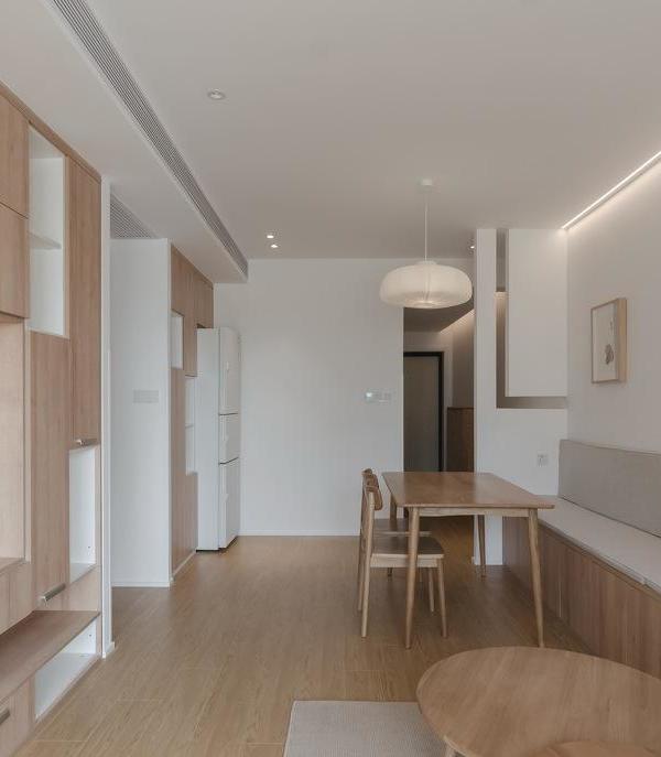
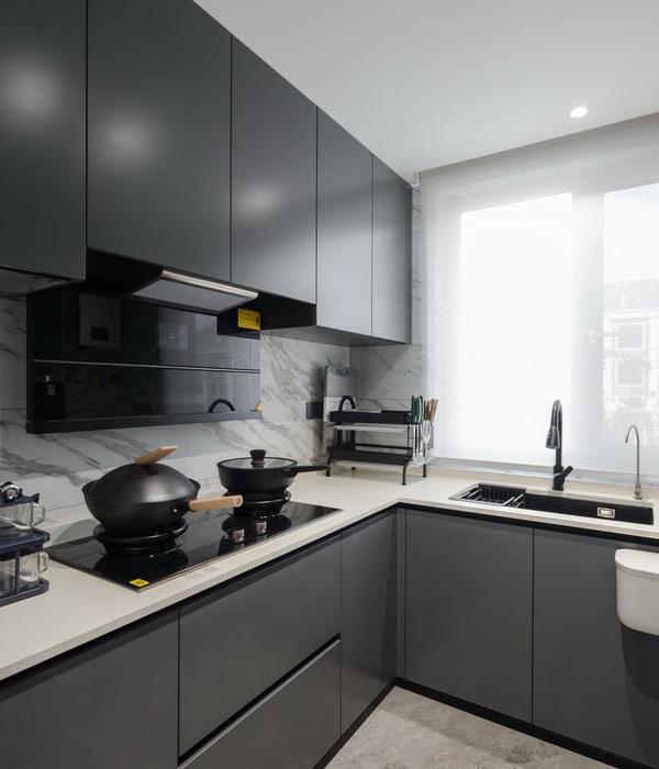
There is also a kitchen cabinet cut at the same angle, adjacent to the hall. This works positively in two ways - the kitchen ends at the same angle on both sides and allows a nicer connection to the entrance hall.
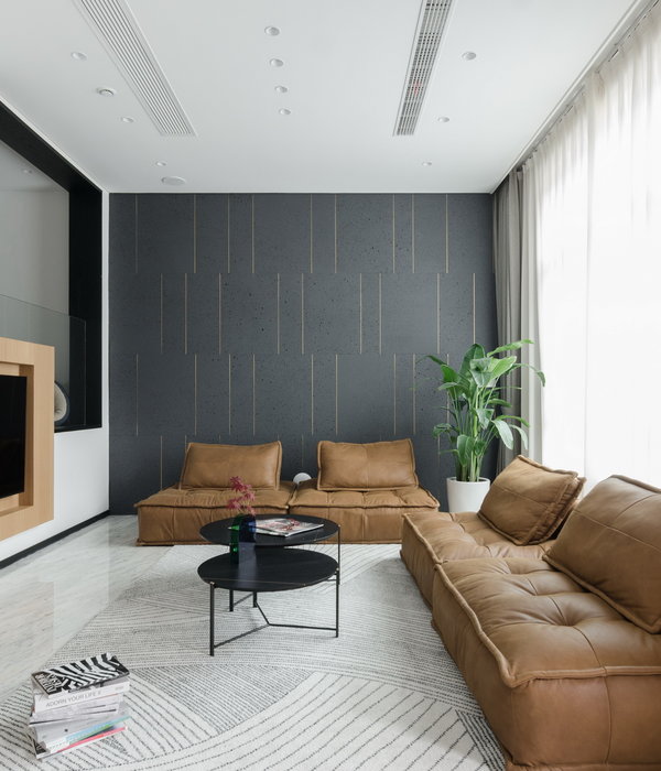
In addition to the functional layout of the rooms, a lot of attention was put on the choice of materials and colours with which we wanted to express our clients' youth and playfulness and at the same time a touch of sophistication. Custom-designed furniture is combined with vintage Italian pieces from approx. 1980s (Enzo mari, Achille Castiglioni, Ettore Sottsass, Vico Magistretti ...).
{{item.text_origin}}

