JE ME SPACE DESIGN
2020
在此项目前,双方已建有良好合作基础。我们为客户设计过第一个展厅(现代风格),该展厅经营一年有余,适逢隔壁铺位转让,考虑到长远布局,客户又拿下了新的展厅,找到我们继续合作,齐心创造高段位的品牌体验认知以及共融·共生的空间理念。
In this regard, both sides have established a good foundation for cooperation. We have designed the first exhibition hall (modern style) for customers, which has been in operation for more than a year, just in time for the transfer of the shop next door. Considering the long-term layout, the customer won the new exhibition hall, and found us to continue our cooperation, creating the brand experience cognition of high level and the space concept of harmony · symbiosis.
新展厅风格迥然,“如何让两个空间和谐共融”是亟待解决的头号难题。两个独立的空间,是继续保持独立性,还是打通塑造整体性?通过对管理成本及整体效果的研究,我们选择了打通空间,联结出和谐共融又有新展厅风格的全新力作。
The style of the new exhibition hall is very different. "How to make two Spaces harmonious and harmonious" is the number one problem to be solved urgently. Two independent space, is to continue to maintain independence, or get through to shape integrity? Through the study of management cost and overall effect, we choose to open up the space, connect the harmony and harmony of the new exhibition hall style of a new masterpiece.
让两种风格共存,我们采用以下方式:➊ 统一色相饱和度,新展厅选用饱和度低的颜色,醒目而不突兀
➋ 空间手法,延续构成手法,做得更极致
➌ 空间叠加,增加过渡空间,自然过渡与互动
To make the two styles coexist, we adopt the following approach:Unified color, the new exhibition hall to choose low saturation color
;The spatial approach, the continuation of the composition of the approach, do more beautiful
;Transition space, increase the transition space, called gray space
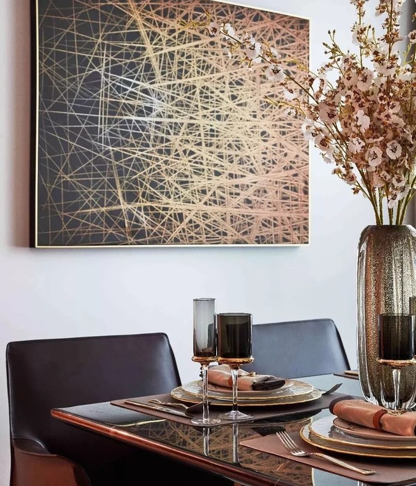
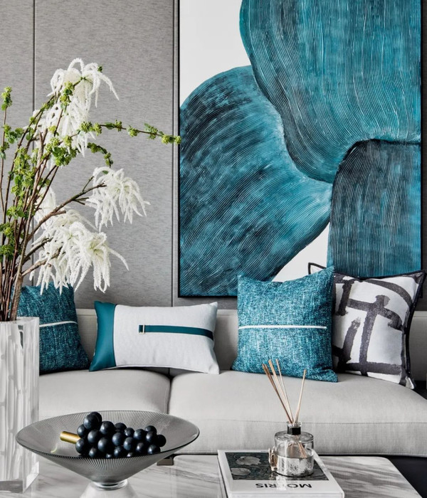
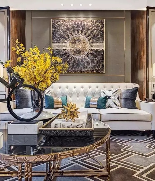
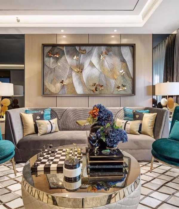
小面积蓝巧嵌黄中,让故事的明线与伏笔都清晰起来。惹眼的黄,因为蓝色的沉淀而变得更缱绻温柔,背后的木元素也与前景的色彩融为一体。由线到面的交错变化,带来的是视觉上的错落参差,也形成了空间内巧妙的格局。
Small area of blue artful embedded in yellow, let the story of the bright line and foreshador are clear. The eye-catching yellow becomes more tender due to the precipitation of blue, and the wood elements behind are also integrated with the foreground colors. From the line to the surface of the alternating change, is the visual patchwork, also formed a clever pattern in the space.
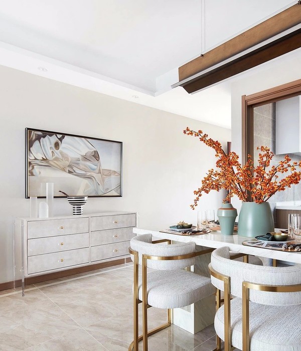
转个身,就能看到一个充满理性质感的厨房。木原本的色泽,构建起一个温润的世界,在这里,就连呼吸都是轻松畅快的。厨房不再是手忙脚乱的战场,低调的配色与简单的光感,让人把注意力完全集中在美食上。享受美食,乐于当下,才是生活的真谛。
Turn around and you’ll see a kitchen full of rationality. The original color of wood builds a warm and moist world, where even breathing is relaxed and carefree. The kitchen is no longer a battleground, low-key color matching and simple sense of light, let a person focus on the food. To enjoy food and be happy in the moment is the essence of life.
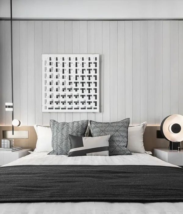
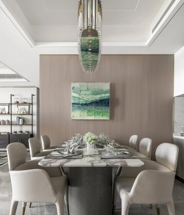
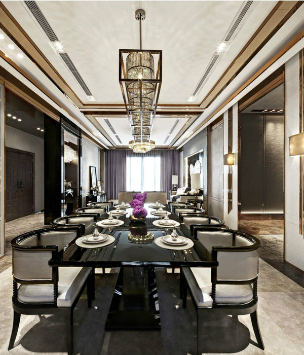
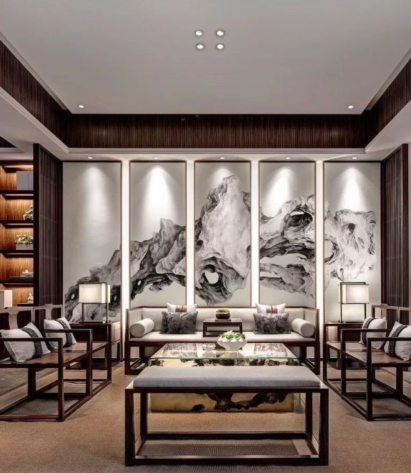
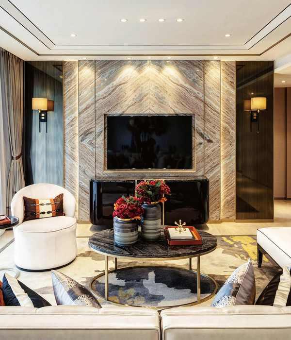
新展厅颜色以鲜艳色为主,有生机活力,但是低饱和度呼应第一个展厅;现代造型上增加线条、层次,利用层高考虑纵向立面和穿透动线,脱离单一动线,双动线展示更直观。展示区共分为8个空间,分别前入户、过道展示、厨房、客厅、书房、衣帽间、洽谈区与休闲区。
The colors of the new exhibition hall are bright and vibrant, but the low saturation echoes the first exhibition hall. In modern modeling, lines and layers are added, and the vertical facade and penetrating lines are taken into account by the use of storey height, so that the display of double moving lines is more intuitive without single moving line. The exhibition area is divided into 8 Spaces, including front entrance, aisle display, kitchen, living room, study, cloakroom, negotiation area and leisure area.
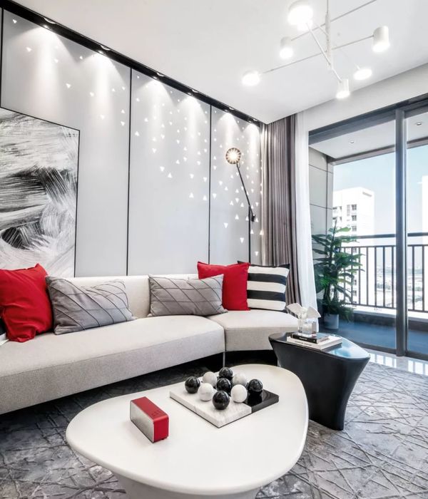
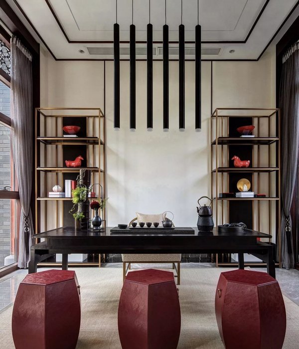
一种沉默的灰调,让所有的颜色都放弃了争奇斗艳,转而向着一种“相互成全”的境界而存在。在入眼可见的色彩中,最令人记挂的还是那一道红。它覆盖在凹凸有致的立体面上,把明暗交织的光影表达得更加传神。彩色线条,似乎也改变着空间的形状,颇有情谊。
A silent grey tone, so that all the colors have given up the struggle for beauty, but toward a "mutual perfection" state of existence. In the visible color, the most memorable or that a red. It covers the concave and convex surface of the three-dimensional, the interwoven light and shadow more vivid expression. Color line, also seem to change the shape of the space, quite friendship.
这是一个用色彩搭建起来的体验区,色彩、镂空与光影,一个个视觉构成串联起来,在此处形成神秘又充满惊喜的空间体验。每种颜色,都有着自己的定义与内涵,有主有次,但是缺一不可。
This is an experience area built with color. Color, hollowness and light and shadow form a series of visual elements, forming a mysterious and surprising space experience here. Each color has its own definition and connotation, has the Lord has time, but is indispensable.
视线在书房这块区域变得明亮起来,那一层由色彩带来的暧昧朦胧,被大面积的白色所拨散开来。造景区,凸显材料本身的天然色彩。于是,人为的感性,与自然的理性,在空间里交锋,构成了真实动人的景致。
The line of sight becomes bright rise in this area in the study, that one layer brings by colour ambiguous and hazy, by the white place of large area dials spread out. Make scenic spot, highlight the natural color of the material itself. Then, artificial sensibility, with natural reason, battle in the space, constituted real and moving scene.
“隔窗见美人”,是中国传统文化中千金难求的美妙意境。从一个小小的视角中,去看一个美丽的大世界,该是何等的奇崛风流。于是展厅中有意无意地通过高低参差、前后偏差,创造出了一个又一个“小窗”,让人可以窥见更多美景,意境,就在无限的悬念中产生。
"See beauty through the window" is a beautiful artistic conception that is hard to find in traditional Chinese culture. From a small Angle of view, to see a beautiful big world, it is how strange and romantic. Therefore, the exhibition hall intentionally or unintentionally creates one after another "small Windows" through the difference between high and low and the deviation between the front and the back, so that people can have a glimpse of more beautiful scenery and artistic conception, which is generated in the infinite suspense.
项目信息Project information
项目地址丨Project Address:苏州
项目面积丨Project Area:270㎡
设计公司丨Design Company:杰ME空间设计
主案设计丨Main Case Design:朱从昊
设计执行丨Design Implementation:宋子豪
文案撰写丨Document writing:修合文化
平面图Plan
设计师
Designer
往期回顾
万花筒之美 | 空间里的心动
“杰 ME”
JE ME SPACE DESIGN
杰出始于品质经典源于传承
地址:苏州市工业园区56文创园c#104
{{item.text_origin}}

