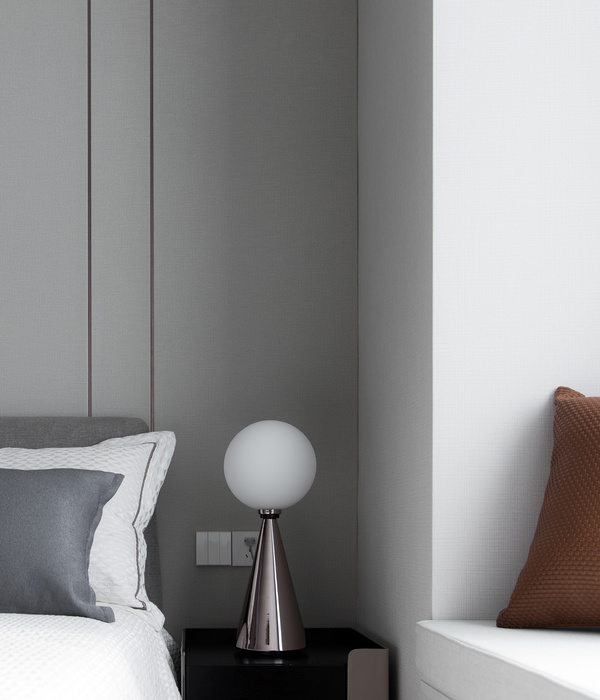
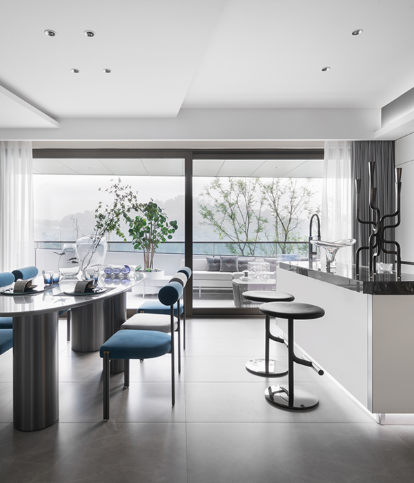
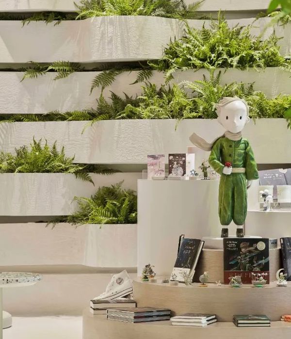
As soon as we opened the door, we were greeted by a narrow, dark space with a long corridor running through the whole house giving access to five rooms: a bathroom, a large bedroom, a small bedroom, a kitchen and a living-dining room. We found an anodyne architecture with an evident spatial poverty in which the owner, despite having lived there for more than 10 years, told us that he had not got used to it and conveyed his desire to give character, brightness and warmth to his home.
Based on the 70 m2 of the house and the owner's requirements, we proposed 3 areas that flowed between them and that could be used as a single space or as three independent ones, depending on their needs: bedroom-bathroom, multipurpose room and kitchen-dining-living room.
The 3 in 1 house is achieved by knocking down some partition walls and perforating others, giving rise to an ambiguous, infinite and illuminated corridor at all times. This corridor will sometimes be a passageway and at other times, if the user feels like changing the openings of the rooms, it can form part of one of them. It is precisely the non-corridor that is the backbone of the free organisation of the rooms and the route between them, distancing us from the narrow and infinite corridor that had no other function than that of being a route.
This versatility of the corridor gives so much power to the intervention that we can understand the house as a large space, a long corridor that expands and contracts or as three independent spaces, which gives it total flexibility of routes.
In order to give it a more marked aesthetic air and to give light, brightness and character to the intervention, three colours were chosen as the driving force behind both the organisation and the use of the project.
Prior to the refurbishment, the dwelling was, following a resource used by its owner to reduce the grey colour of the windows, painted in grey in its entirety and, together with the matt greyish beige floor and the wooden joinery in light tones, the image it offered was far from being luminous; in fact, quite the opposite.
As a counter strategy, by means of a composition of 3 colours that helped to organise a single space subdivided into three, we assigned each of the colours to the elements according to the intention in each of the spaces, thus giving clues as to the uses and functions of each of them.
Thus, in the project, the use of colour becomes the most important aspect of the intervention with the purpose of finding for the owner a home in which to place all his belongings comfortably and to receive friends and family in a house that is more akin to him than it was before.
{{item.text_origin}}

