葡萄牙餐厅扩建,融入自然景观的现代设计
Architect:Nelson Resende Arquitecto
Location:Carregal do Sul, Ovar, Portugal; | ;
Project Year:2016
Category:Restaurants
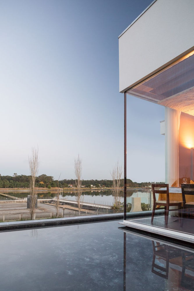
The building, built on a plot of land with a visual display of great interest to the Est, having the Ria de Aveiro located there, also takes advantage of the sun exposure mainly to the public areas on this side, and destining to the west the service and internal areas.
During its life period, the building was constantly being transformed and there have been regular works of conservation and in some cases even alteration, without any guiding design and strategy in the whole process, allowing some lack of coherence and quality In the works carried out so far.
In this sense, the intervention gives some dignity to the whole, enlarging some areas, improving the facade and introducing a certain balance throughout the work, canceling, as far as possible, some of the less positive aspects that have gradually gained greater presence.
The main building, which was initially built with three separate commercial spaces, was eventually merged into a single commercial space, destined for a restaurant, although the structural constraints of the building never ceased to feel more or less permanently.
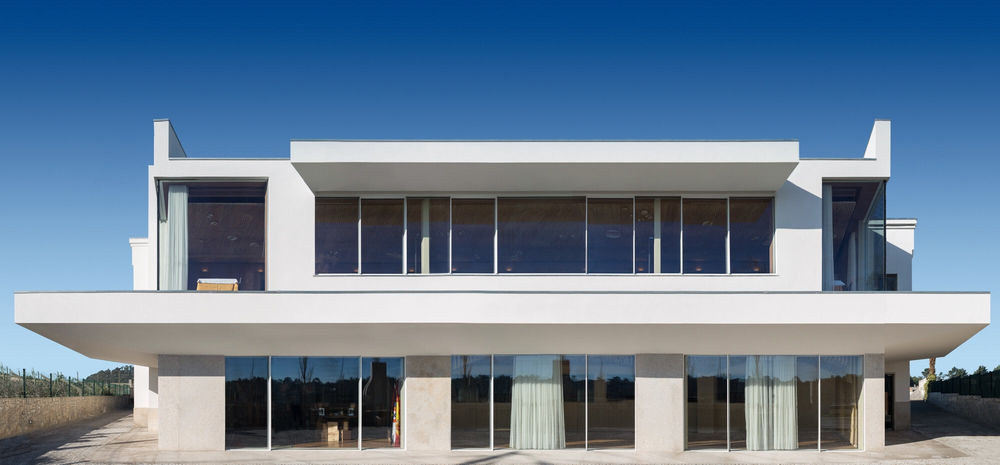
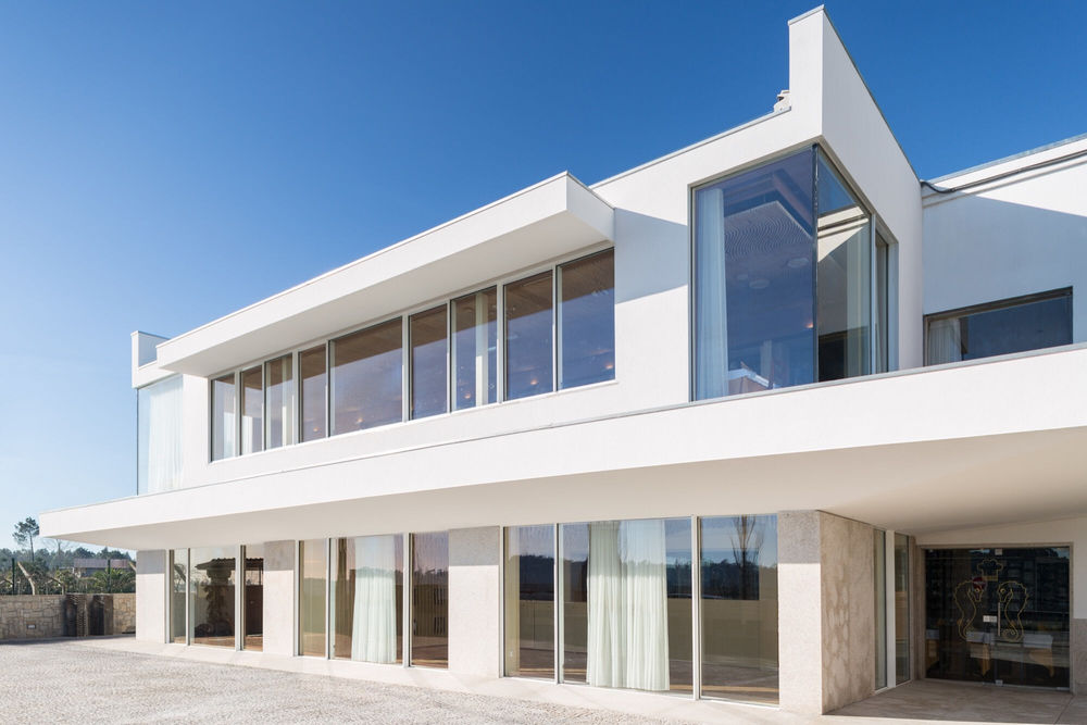
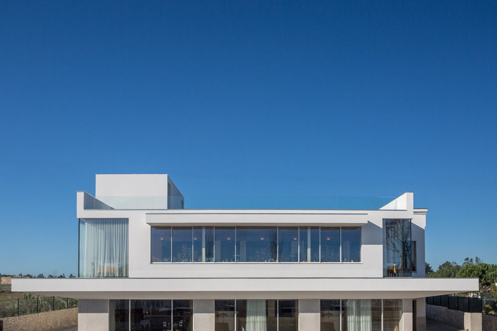
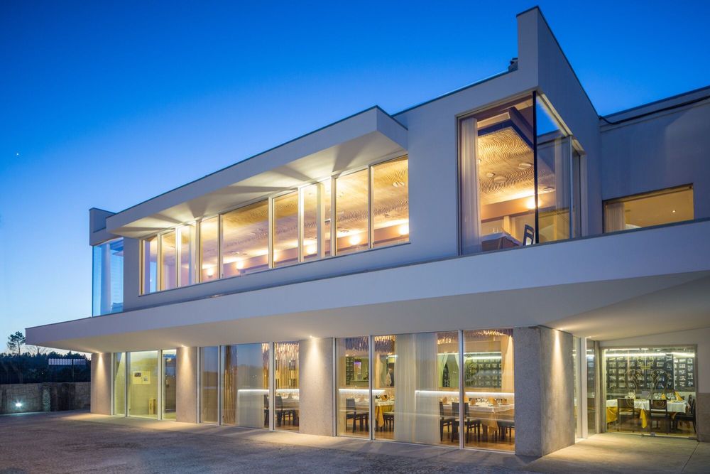
The alteration and extension of the restaurant aims to take over the redesign of the main elevation considering that this is closely related to the main dining rooms as well as the reception space.
Although, the intervention tries to reduce the imposition of the existing structural constraints and create a fusion that allows that despite the new intervention in the elevation and the frontal area of the building, which results in the enlargement of the dining rooms, do not miss the original character of the building, do not assume, also, formal disruptions.
The idea of intervention is therefore mediated by a contemporary image, coherent with the new construction, but which is aligned with the pre-existence, avoiding a certain duality that would result from a more imposing intervention, less conscious and attentive to the building.
The idea of enlargement also results in the desire to introduce a more proporcioned and communicating elevation with the exterior, in the sense in which it seeks to nullify a certain idea of a single sum of solutions that the building has been gaining, more or less naturally, in the last two decades.
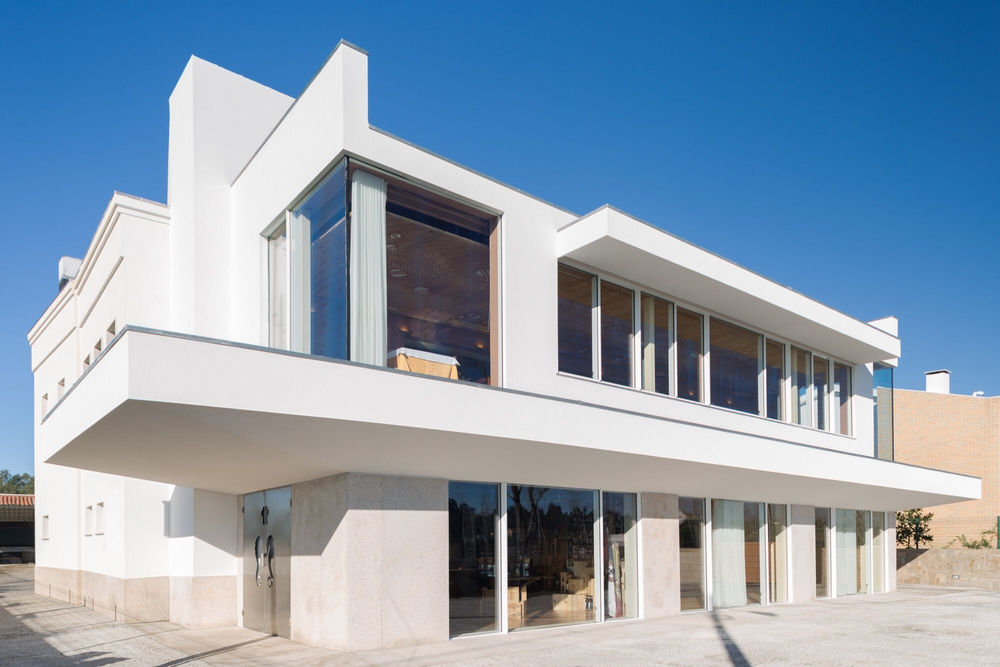
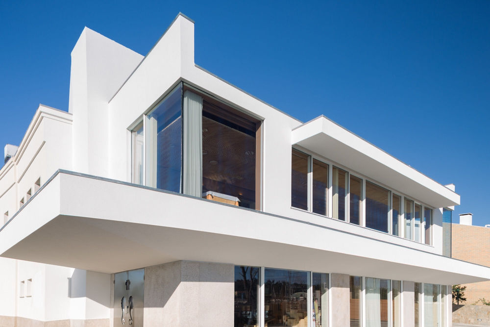
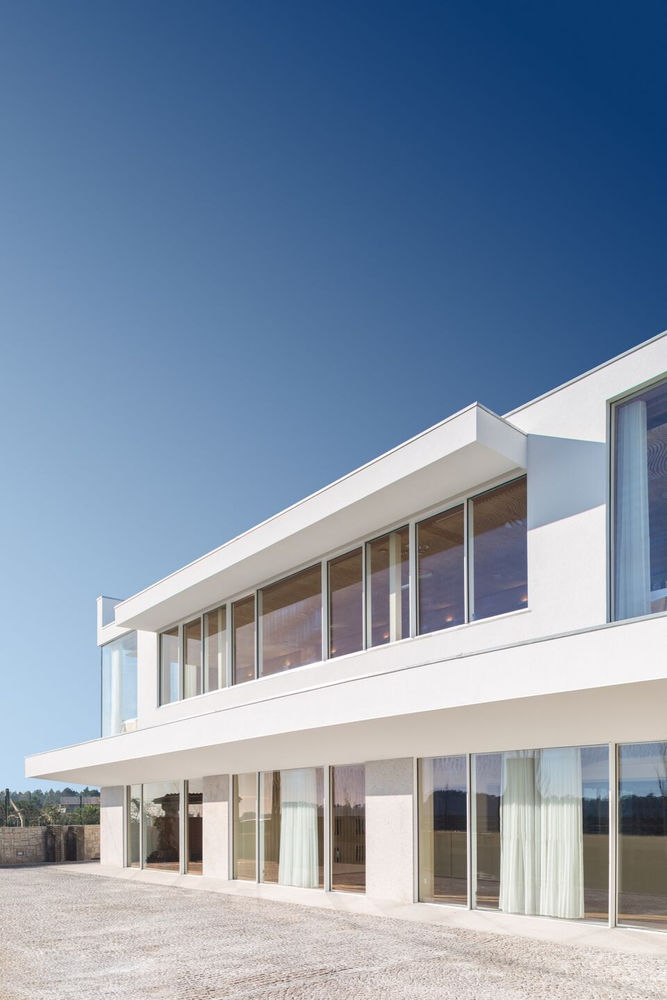
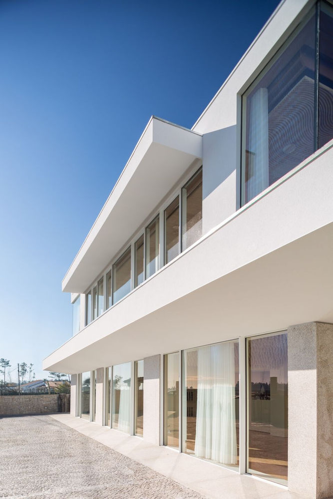
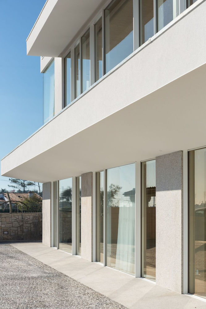
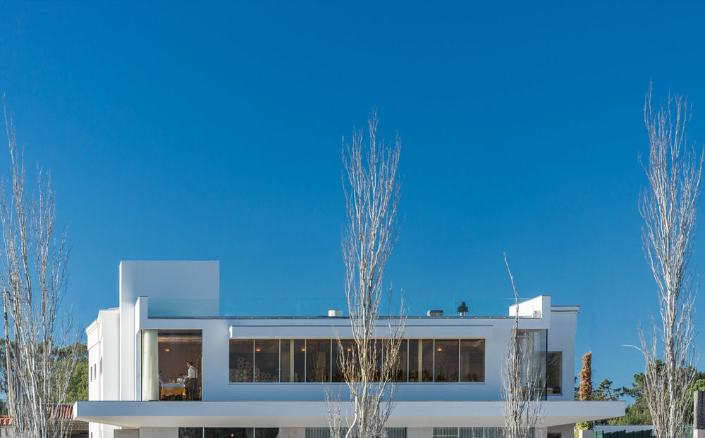
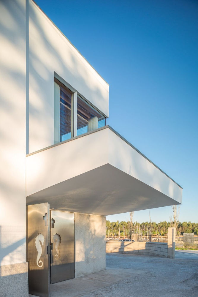
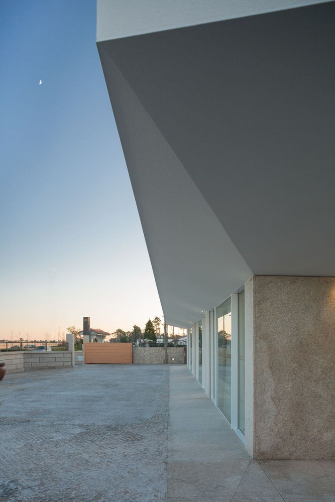
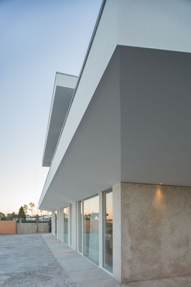
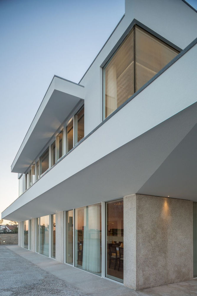
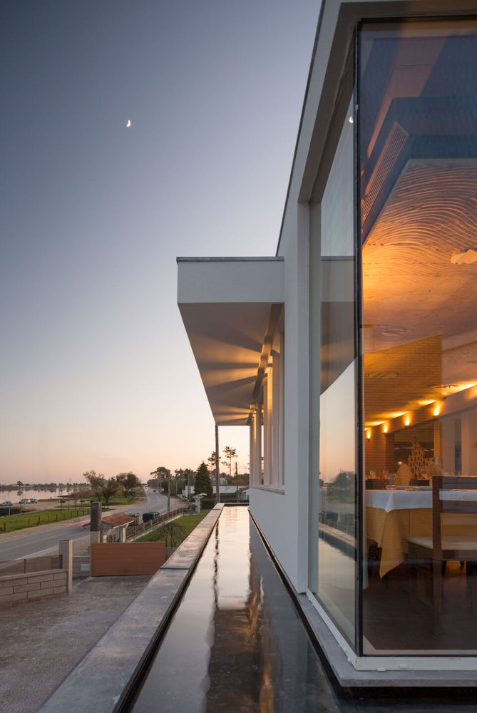
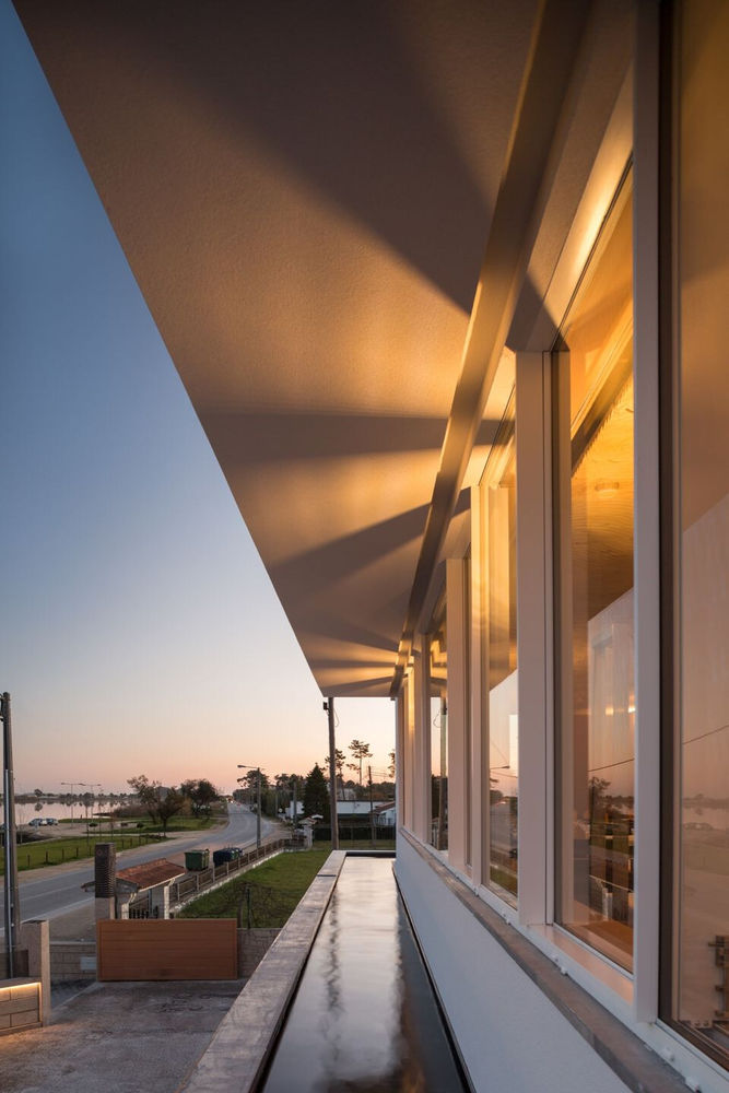
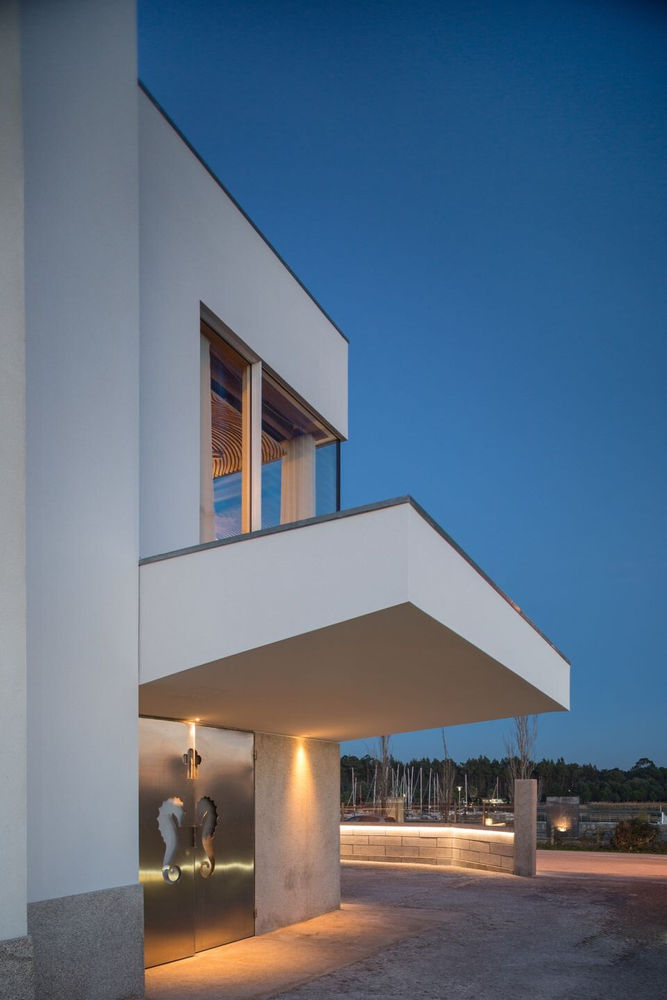
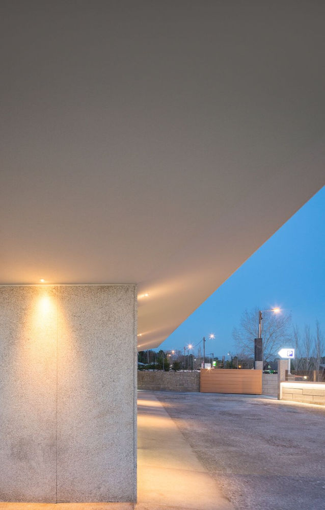
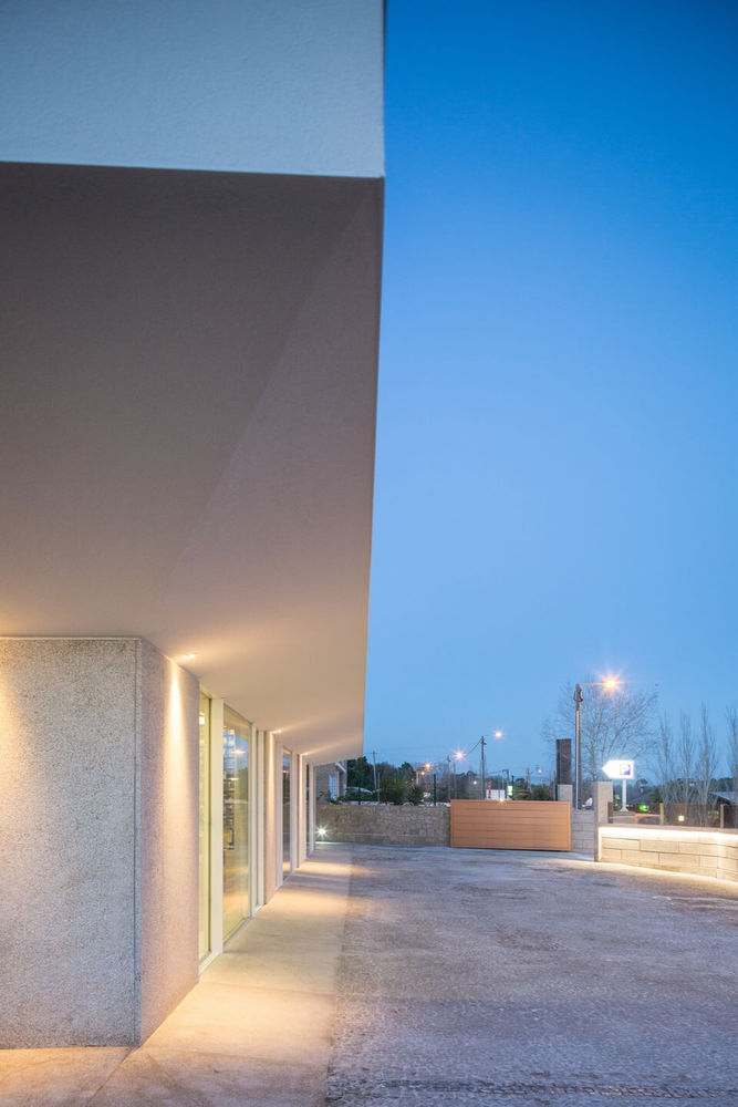
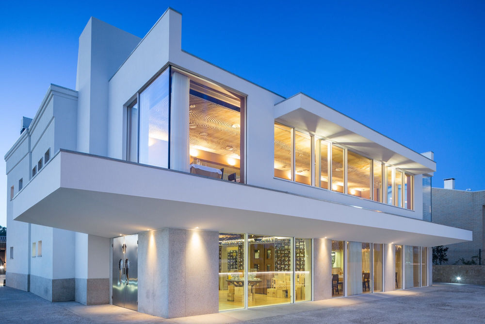
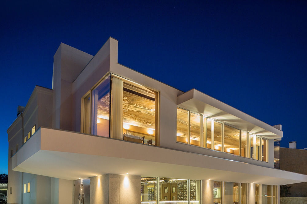
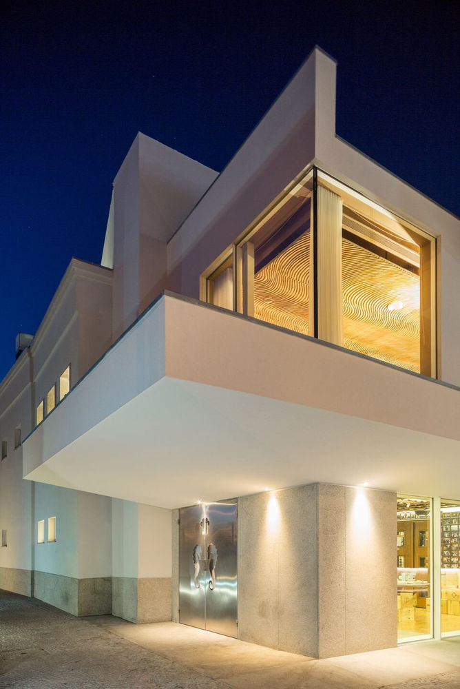
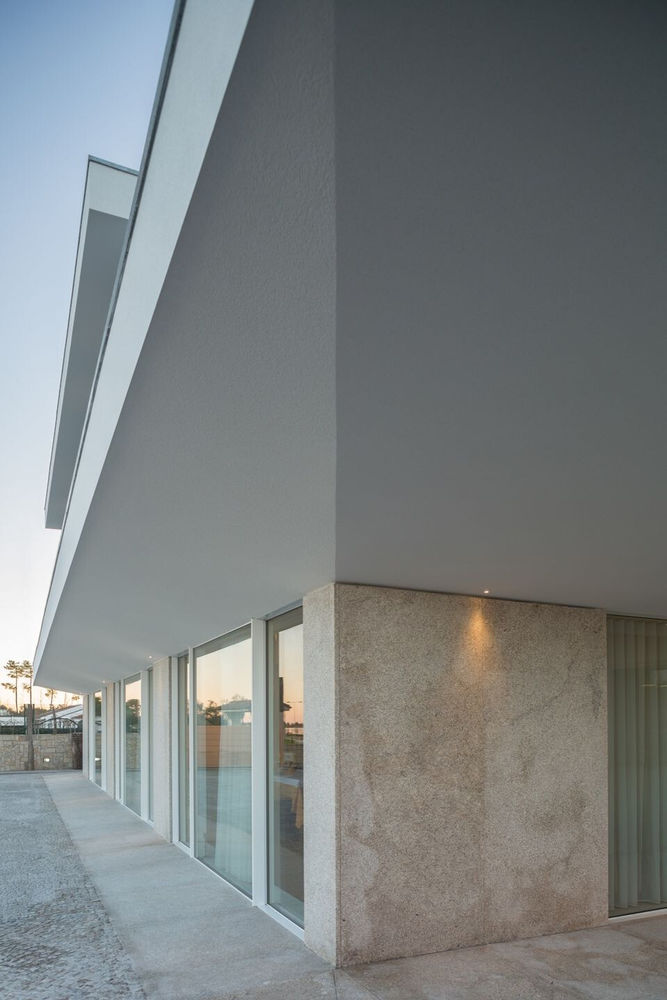
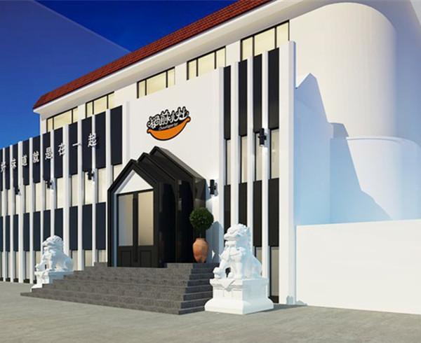
The huge outer blade that frames the lower floor also allows a solution to the scale of the building, avoiding a too sterile and dehumanized elevation, as well as preventing it from presenting itself with a monumental character - the introduction of a rhythm dictated by the Intermittence between the granite panels and the external sliding window frames not only maintains the material characteristics of the existing building but also through reinterpretation in the way they are used, allows for an accentuation of the design idea with minimal resources.
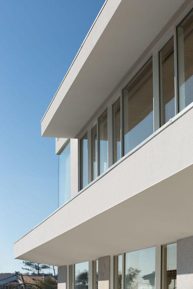
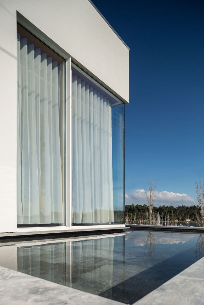
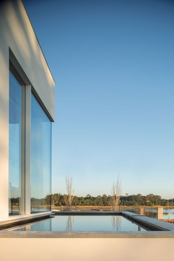
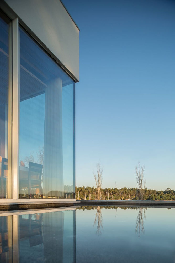
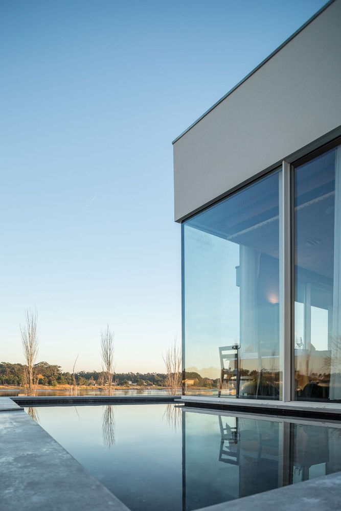
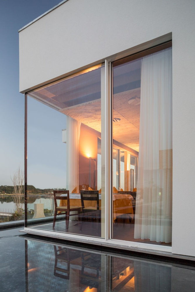
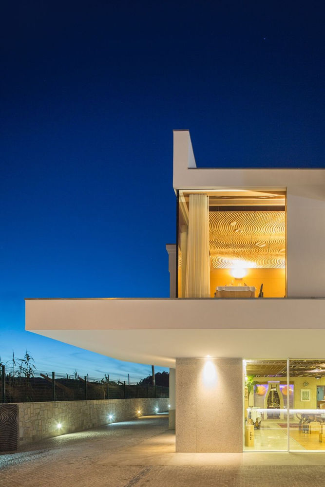
As far as the upper floor is concerned, despite the fact that it remains in the same vertical alignment of the lower volume, the existence of the blade ends up breaking the possible continuity of the vertical planes, as well as, through the introduction of a mirror of water in this element, also allows to create a notion of continuity between the outside area of the main dining room and the Ria of Aveiro, located a few meters away.
This idea of allowing that the volume that translates the higher level appear in water also gives a feeling of lightness that reduces the gravity of the created mass of volume, as it frees it from the ground floor and relates it more to the infinite - materially, the maintenance of the white plaster in this volume also accentuates this same idea of lightness.
As for the interior spaces, the intervention focused only on the spaces created, allowing its relationship with the pre-existence to be solved in functional terms, but at the same time, its materialization translated a certain autonomy that could dictate guidelines for futures interventions in the remaining interior spaces.
The lower floor room maintains a more expressive design, through the use of strings that emphasize the temperature and the formal involvement that the space causes, in a more direct relation with the elements, including the outside space itself.
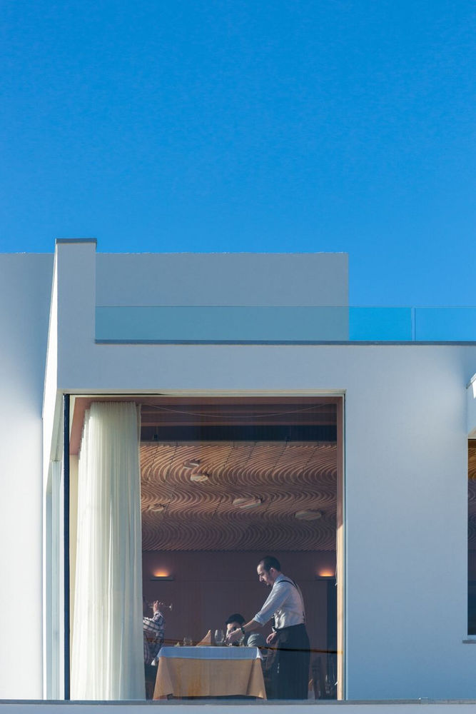
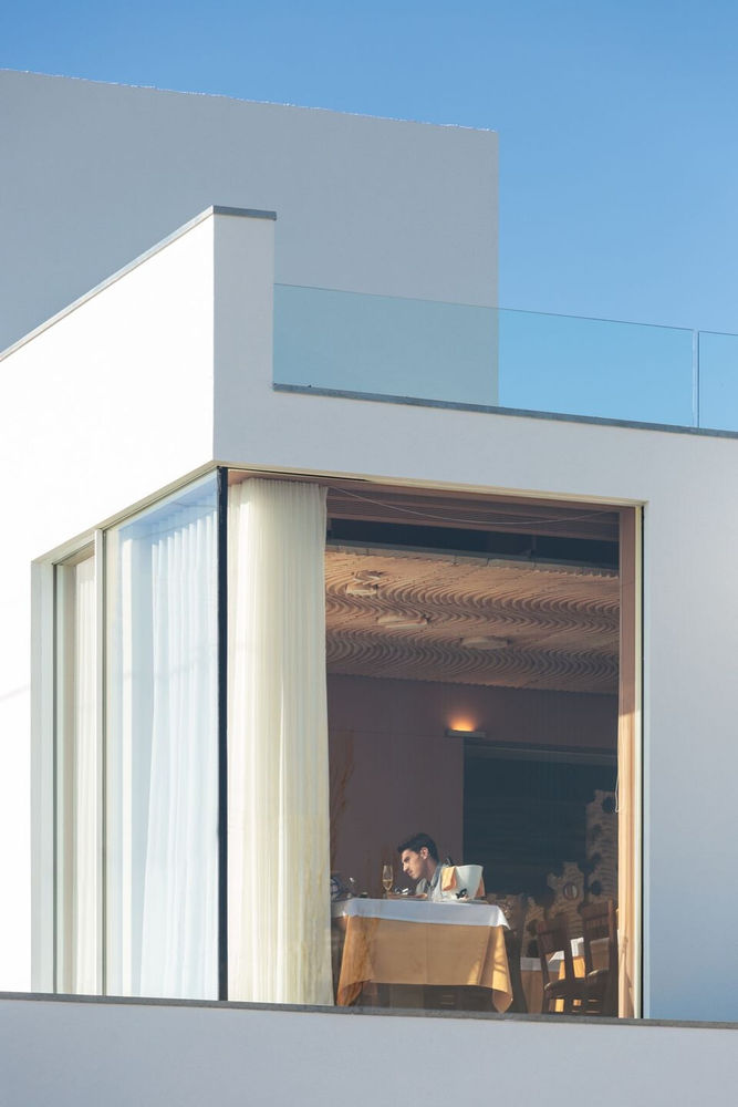
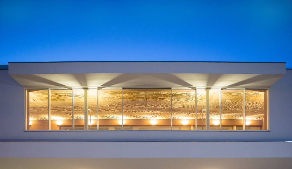
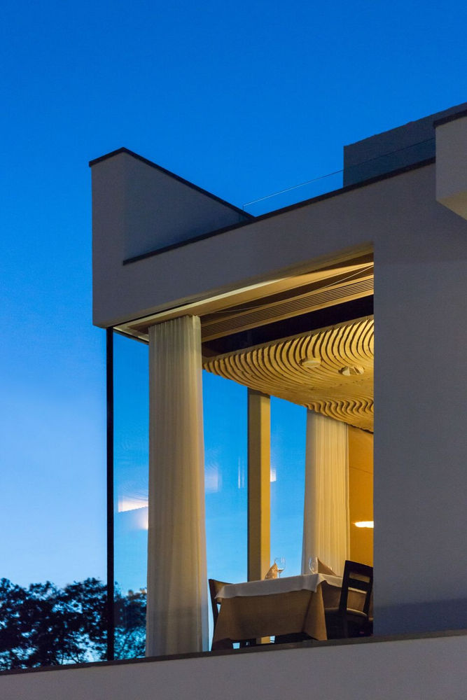
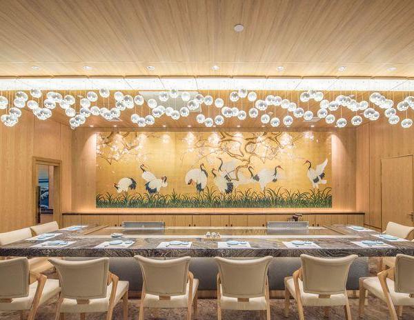
In what concerns to the dining room on the upper floor, given the frank visual relationship it establishes with the surroundings, namely to the Ria, it is possible to maintain a more refined space, optimizing the efforts in order to allow the ceiling, a visual element for those who access or pass through the restaurant, can be seen/read as a fifth elevation, and a wooden sculptural element has been introduced, which keeps the registered temperature in the various interior spaces, as emphasize, by its drawing, a parallelism with the undulating landscape created by the water.
It was also created an interior access to the second level of the building, with the aim of taking advantage of the terrace for seasonal use - given the landscape that characterizes the surrounding, it will certainly be a crowded space, accentuating this desire to enable communication with the outside, either visually or even physically.
▼项目更多图片
