点击蓝字“知行 Design
中华优秀作品第一发布平台!
留白设计|| 时尚优雅 白鹭湾
留白设计
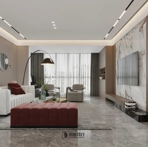
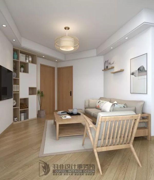
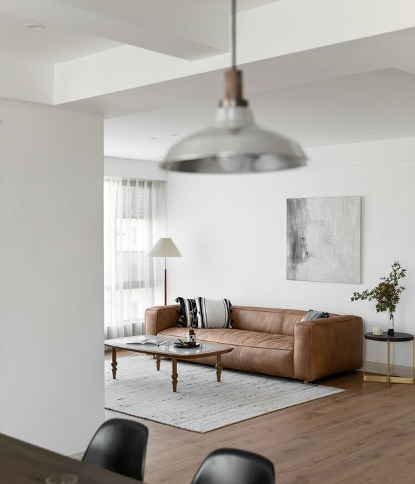
我们消减色彩的错综交织,保留灰与白单纯二元色逻辑是本案设计特点。根据业主提出的色调偏好,少了五颜六色的扰乱,更专注于物的轮廓、质地,以及光影能形塑的立体感。
We reduce the intricacies of color, to retain the grey and white simple binary color logic is the design characteristics of this case. According to the color preference proposed by the owner, less colorful disturbance, more focus on the outline, texture of the object, as well as the three-dimensional sense of light and shadow can shape.
我们在黑白世界寻找灰阶地带,不同阶段的灰度交替使用能使复杂内心冷静下来,感受到暂别嘈杂社会的一份宁静和归属感。
We look for grey terraces in the black and white world. The alternating use of different stages of gray can calm down the complex heart and make us feel a sense of tranquility and belonging from the noisy society.
视觉空间上,我们更换了客厅原有门窗,保留了最少的分割与框架,将户外花园完美映入眼帘,利用玻璃的穿透性制造空间的延伸感。
In terms of visual space, we replaced the original doors and Windows of the living room, keeping the minimum division and frame, perfectly greeted the outdoor garden, and made use of the penetration of glass to create a sense of extension of space.
我们悬浮客厅背景,串联客餐轴线,让室内行径自由流动两侧平面,搭配阳光的倾洒,围绕中心背景铺展开来,十分具有空间节奏感。
We float the background of the living room, connect the axis of the guest meal, let the indoor path flow freely on both sides of the plane, with the pouring of sunlight, spread out around the central background, very with a sense of space rhythm.
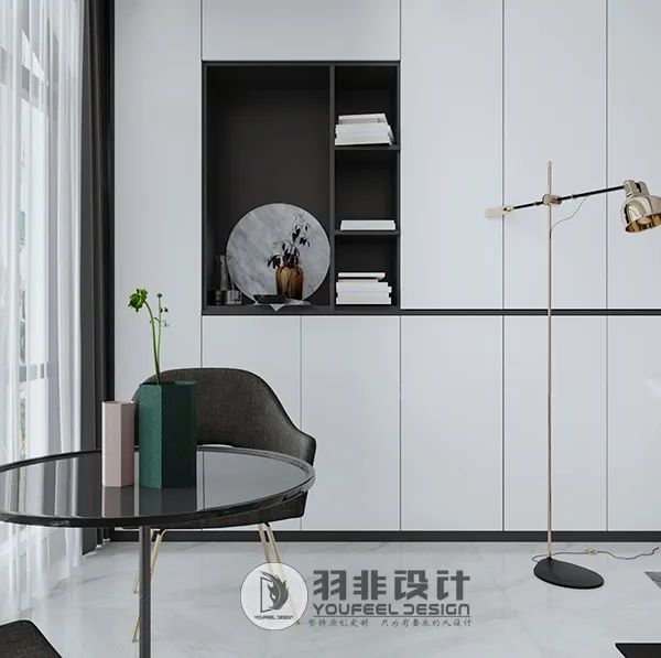
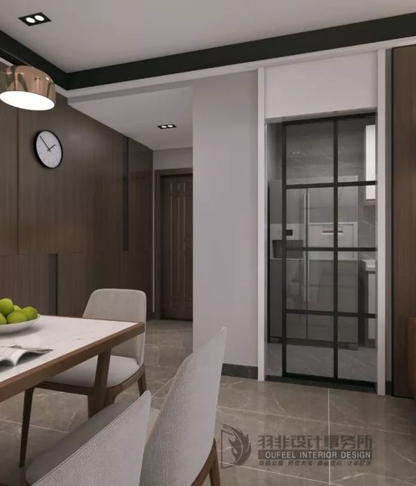
在我们看来,硬装的沉静并不会限制带有色彩的装饰,绘画和大理石餐台使室内焕然一新,仿佛充满了新鲜的空气。
From our point of view, the quiet of hard clothes does not limit the decoration with color, painting and marble dining table freshen up the interior, as if filled with fresh air.
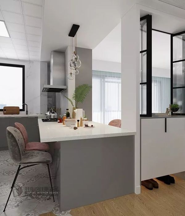
为了给厨房提供一定程度的隐私,又能与公共空间不失联系,故在中岛设置“L”型玻璃隔断,以帮助隐藏那些有时不可避免的混乱和杂乱。
In order to provide a degree of privacy to the kitchen without loss of connection to the public space, an "L" shaped glass partition was installed in nakashima to help hide the sometimes inevitable chaos and clutter.
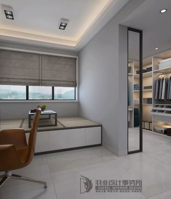
推开进户一侧的暗门,则是一层书房,沉浸式单色相能使复杂的轮廓安静下来,令阅读者仿佛置身在一个没有声响的世界里。
Open the secret door on the side of the door, and there is a study on the first floor. The immersion monochrome phase can make the complex outline quiet, so that the reader seems to be in a silent world.
拾级而下的地下空间,由于层高的限制,空间顶面采用波纹镜面质感,解决了空间压抑的缺点,模糊了空间的界限。
Due to the limitation of the height of the underground space, the top surface of the space adopts corrugated mirror texture, which solves the shortcoming of the space repression and blesses the boundary of the space.
地下室的内部所有元素都在体积、颜色、纹理和材料以及工业风装饰物品的饱满度之间达到了精确的平衡。
All elements of the interior of the basement are finely balanced between volume, color, texture and material, and the fullness of industrial decor.
拾级而上的二层私人空间,将干区纳入过道,镜柜的使用不仅增加收纳区,也在视觉上丰富了空间的层次。
On the second floor of the private space, the dry area is brought into the corridor. The use of mirror cabinets not only increases the storage area, but also visually enhances the level of the space.
卧室注重功能和空间的协调性,没有多余重复的造型,充满了阳光和呼吸的感觉。一切沉寂简单的格调只有简约与明了。
The bedroom pays attention to the harmonious sex of function and space, without redundant and repetitive modelling, was full of the feeling of sunshine and breath. All silent and simple style only contracted with clear.
平面图/floor plan
△一层平面图/Ground floor plan
△二层平面图/Floor plan
△负一层平面图/Negative floor plan
项目名称:白鹭湾
Project name: Egret Bay
项目地点:舟山·临城
Project location: Zhoushan · Lincheng
项目面积:260
Project area: 260
设计单位:留白设计
Design unit: Blank design
软装设计:留夏艺术
Soft decoration design: Summer art
项目摄影:吴昌乐
Photography: Wu Changle
全案团队:曹霖 薛汉杰 余东 王增伟 李文娅 顾佳明 翁迪 史恒溢 陈玮
Case team: Cao Lin, Xue Hanjie, Yu Dong, Wang Zengwei, Li Wenya, Gu Jiaming, Weng Di, Shi Hengyi, Chen Wei
内容策划 /Presented 策划 Producer:知行排版 Editor:Tan 校对 Proof:Tan 图片版权 Copyright:原作者知停而行
{{item.text_origin}}

