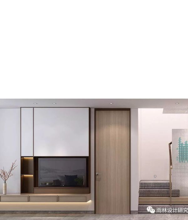
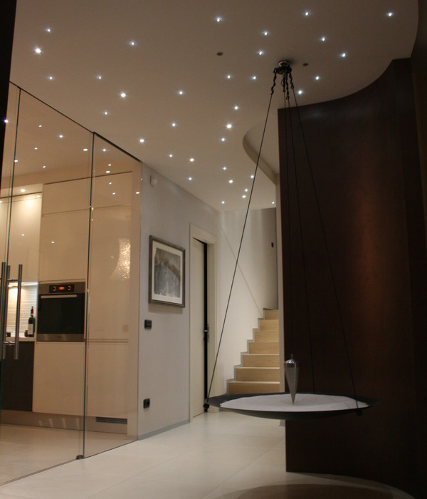
- 项目名称:富力湾300㎡现代简约
- 项目地址:富力湾
- 项目面积:300㎡
- 风格趋势:现代简约
- 主案设计师:张帝
- 软装设计师:杨闵涵
“
项目地址 · 富力湾
Project Address
项目面积 · 300㎡
Project Area
风格趋势 · 现代简约
Style Trend
主案设计师 · 张帝
Main Case Designer
软装设计师 · 杨闵涵
Interior Decoration Designer
“设计”的导语
在本案中,设计师更多的着重于功能区域的多种串联,尽量拓宽视野延伸场域的通透和延伸,反向舒展情绪的沉淀,找到静美和精雅两处的平衡。
In this case, the designer focuses more on the series of functional areas, broadens the permeability and extension of the field of vision as far as possible, inversely stretches the precipitation of emotions, and finds the balance between quiet beauty and fine elegance.
轻松写意的风格更能为空间赋予生活的舒适和向往,往往用低调的配色和简单的线条勾勒轮廓就够了,剩下的交给时间去书写“家”的故事~
The relaxed style is more comfortable and yearning for life in the space, often with low-key color matching and simple lines outlining the outline is enough, and the rest is handed over to the time to write the story of "home" ~
客 厅
LIVING ROOM
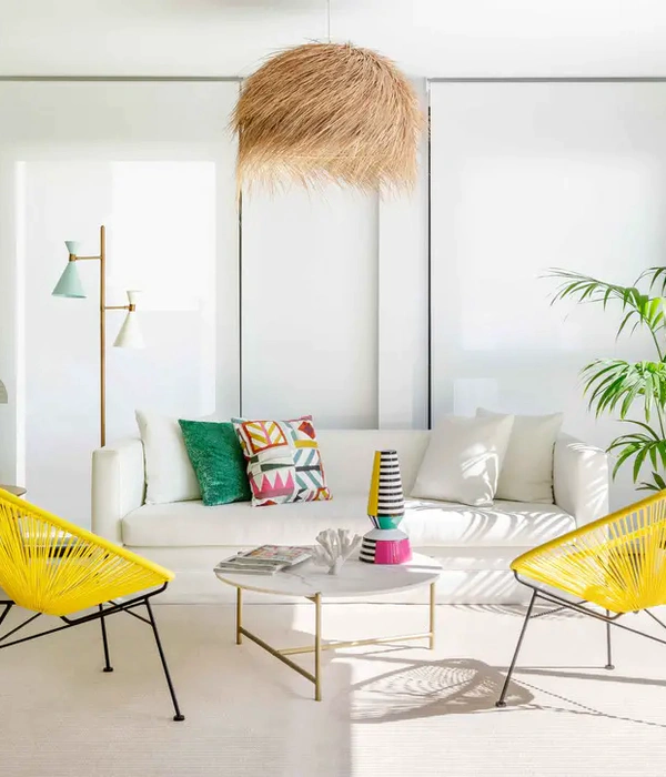
燕麦色、灰调构成这个空间静美的主调,简单的家居用品更注重实用和舒适营造整个空间轻松舒适的氛围感。
Oat color and gray tone constitute the main tone of the quiet beauty of this space, and simple household items pay more attention to practical and comfortable to create a relaxed and comfortable atmosphere of the whole space.
明暗的空间过渡会让形体、线条感更加鲜明,同时又能有一种“慢时光”的质朴
客厅一角留出来做儿童的娱乐区域,去陪伴、见证孩子的成长,不错过珍贵的每一帧
餐厨区域
DINING & KITCHEN AREA
半开放式的厨房加上餐区和西厨的划分,不仅仅便于使用更能满足多样的互动、社交、操作……
The semi-open kitchen, plus the division of the dining area and the western kitchen, is not only easy to use, but also to meet a variety of interaction, social interaction, operation...
主卧室
MASTER BEDROOM
主卧室沿用灰调搭配低饱和的色调,简单勾画线条边界,慵懒和松弛奠定主调。
The master bedroom follows a grey tone with low saturation tones, simply delineating line boundaries and setting the tone with languor and relaxation.
衣帽间各种尺寸的收纳、柜子、台面组合满足生活上的多种需要,充足的采光以及景观视野也能带来舒享的更多表达。
次卧室
SECONDARY BEDROOM
空间中上下两分的墙板对于空间纵享拉伸更有对比,浅色留白的顶面无形中延展光的表达。
The upper and lower wall panels in the space are more contrasted for the longitudinal stretching of the space, and the light-colored white top surface invisibly extends the expression of light.
卧室
BEDROOM
对比其他的卧室空间在墙面上又换了另外一种表达,不对称的应用有效的抹除僵硬感配合深浅色调的应用,享受这一刻的舒适。
Compared with other bedroom Spaces, the wall has another expression, the asymmetric application effectively erases the stiffness and the application of dark and light colors, and enjoy the comfort of this moment.
楼梯间
STAIRCASE
楼梯是复式结构自带的雕塑美化,不仅仅轴承空间动线本身也是形体从光影画笔下留下精美塑形。
The staircase is the sculpture beautification of the duplex structure, not only the bearing space moving line itself, but also the shape left from the light and shadow brush.
{{item.text_origin}}

