Madreamiga公司希望为客户提供创新体验,因此提出了在各个层面进行改革的建议。其中之一也许是最明显的,则与形象有关。Madreamiga的新面貌必须有一个与革新相匹配的架构,为此,DIIR研究提出了三项战略。
The desire to offer its clients an innovative experience, has led Madreamiga to propose a transformation that acts at all levels. One of them - perhaps the most obvious - has to do with image. The new face of Madreamiga must propose an architecture to match this renewal and, for this, DIIR study proposes three strategies.
首先要对新的理念和品牌形象进行详尽的分析。公司所面临的360度转变,提出了一种影响其整个数字形象,即网络、社交网络等的美学,因此也必须在物理空间中体现出来。我们使用了大量的色调材料,以营造一种能够再现品牌在网络社区中传播的氛围。
The process begins with an exhaustive analysis of the new philosophy and brand identity. The 360º turn to which the firm is subjected, proposes an aesthetic that affects its entire digital image (web, social networks...) and therefore must also be palpable in the physical space. We work with an infinite number of palettes of materials to achieve an atmosphere capable of reproducing what the brand transmits in the online community.
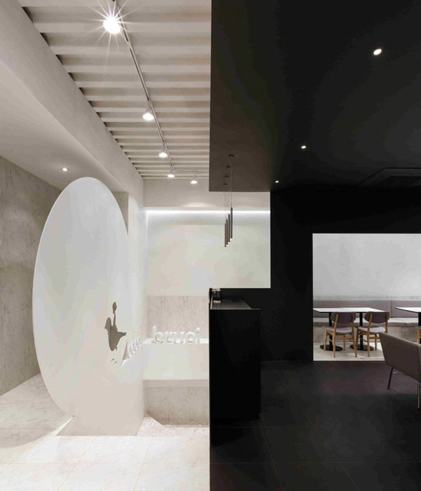
设计的重点是简洁的线条、中性的色调和高贵的材料。其座右铭是:重新诠释传统面包店的温馨。预切割的MDF板在10x10模块中填充空间,由于其精湛的工艺,给人一种手工制作的感觉。细腻的灰泥覆盖着墙壁和天花板,其质地与面团和面粉有关。最后,统一的钢材起到了展示底座的作用。它的中性特征增强了产品,使其成为主角。
The focus is on the design of clean lines, neutral tones and noble materials. Its motto: to reinterpret the warmth of traditional bakeries. The pre-cut MDF board in 10x10 modules fills the space and gives a handcrafted look thanks to its exquisite workmanship. The fine mortar covers walls and ceilings, and its texture relates to the dough and flour. Finally, the uniformity of the steel functions as a display base. Its neutral character enhances the product, which becomes the protagonist.
要将一个物理概念推广到众多空间,就需要提出一个简单易复制的系统。它由四个装置组成:立面(1),作为第一个过滤器,始终追求最大的开放性。面包陈列架(2)是公共空间和工作室之间的中间隔。在两者之间,中性陈列柜(3)和杂货陈列柜(4)完成了一般产品的展示。这些元素的特点定义了空间,并适应了每个商店的形态。
The desire to extrapolate a physical concept to numerous spaces involves proposing a system whose simplicity makes it easy to replicate. This is composed of four devices: the façade (1), which acts as a first filter and always seeks maximum openness. The bread display shelf (2) acts as an interstice between the public space and the workshop. In between, the neutral display case (3) and the grocery display case (4) complete the general product showcase. The characterization of these elements defines the space and adapts to the morphology of each store.
Interiors:EstudioDIIR
Photos:DavidZarzoso
{{item.text_origin}}

