Designer: SpaceInvader
Location:Manchester,, UK
Project Year: 2021Category:Offices
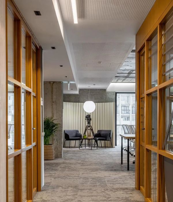
Leading Manchester interiors agency SpaceInvader has transformed the look of one of the city’s landmark developments at One Piccadilly Gardens for client LGIM Real Assets (Legal & General). The well-known building, originally designed by architects Allies and Morrison and developed in 2003 by Argent, faces onto the Gardens with high-impact red-brick frontage. The building is comprised of retail on the ground floor and office space above and was sold to Europa Capital in 2011 before being purchased by Legal & General in 2014. The brief to SpaceInvader for the new interiors of the six-storey, Grade A office building was to transform its look and feel into a more inviting, dynamic space that promoted a sense of welcome, wellbeing, flexibility and collaboration, via a scheme that would match the building fabric in terms of character and presence.
All images by Jill Tate
‘The transformation forms part of a bid to bring more life and love to this part of the city’, SpaceInvader Founder John Williams commented, ‘helping to ignite a more vibrant surrounding area with a café culture feel. Legal & General took the decision to invest in the building in order to make a mark and help elevate the overall Piccadilly area.’Existing Interior
The entrance to the office building is located on a cut-through that sees a lot of through-traffic but offered no real sense of arrival. Existing views through to the interior were rather dull and grey, resulting in an overall unwelcoming feel. Once inside, an existing, huge-scale reception desk functioned more as a barrier than a welcoming element, discouraging people from doing anything but passing straight on through the speedgates, in spite of a few additional arrangements of loose furniture serving as waiting areas. The double height diagonal void through the ground and first floors of the building was also not utilised to its best advantage.
Caption
‘There was a great opportunity here’ John Williams added, ‘to turn the personality of the offer around, working with rather than against the building. A new interior that was properly integrated with the building’s stature, location and material palette was called for, to make the most of the great corner location and views out. This was evidently a well-established building with real potential for change.’SpaceInvader were commissioned by Legal & General for the concept stage of the project and then novated across to commercial interior design, build and delivery specialist ADT Workplace for the construction delivery stage. The scheme’s project managers were Paragon. The full scope of interior design works covered the entrance, reception and atrium areas, a new upper basement bike store with adjacent changing rooms and shower space, the building’s lift core and circulation areas and a refreshed design for the non-tenanted office spaces on the third and fourth floors. SpaceInvader also designed the scheme’s wayfinding.
All images by Jill Tate
Design Concept
At the heart of SpaceInvader’s concept was the idea of creating a new community culture for One Piccadilly Gardens, featuring a series of attractive spaces for people to sit, relax, meet and collaborate. The mix of people coming in and using these areas is diverse, including tenants, their clients, prospective tenants and other visitors. The new design sought to create moments for pause and reflection as well as places for catching up and ad hoc encounters. Alluding to the site’s rich history, the design also needed to be timeless, with a non-exclusive appeal catering to a wide user and age-range demographic.
The design language looked right back to the site’s interesting history in the 18th century, when the gardens were little more than a wasteland on the edge of the city. Known as the ’daub holes’, the area was home to a wet pit and ponds, from which clay for the construction of wattle and daub walls was extracted.
‘We were inspired both by the terracotta colour of clay and the outer red building façade when it came to creating the design palette’, Regina Cheng, Senior Interior Designer at SpaceInvader, commented, ‘although, as it’s such a strong colour, the terracotta was to be used for highlights only. We also looked at the origins of the word Piccadilly, which comes from a seventeenth-century frilled curved collar known as a piccadill. Roger Baker, a tailor who became rich making piccadills, lived in the area. The origin of the word is thought to be the Spanish ‘picadillo’, meaning pierced or punctured. Subtle references to this in the form of curves and punctures, especially using light, also formed part of our design language.’Design Walkthrough
All images by Jill Tate
Entrance
The main challenge for the redesign of the entrance area was that it was quite hidden. How could a stronger sense of arrival be created, befitting a landmark space, without changing the external façade in any way?
‘We re-thought the entrance as a ‘puncture’ within the passageway, changing its hidden nature and making it stand out by the creation of a new, hanging biophilic and light installation above the entrance, set within a rectilinear LED light, which extends the full breadth of the passageway and is clearly visible from either direction of approach’ Regina Cheng explained. ‘We then added a new round ‘bus stop’ signage, using the development’s existing ONE logo, where all branding previously had related only to neighbouring retail and hospitality offers. We also increased the presence of the glass-front manifestation. Clear views through now ensure a new era of transparency for the interior, celebrating rather than concealing its existence.’Reception
SpaceInvader sought to create cohesion in the new reception design through a statement interior making good use of existing structure. The double-height reception space was completely re-arranged, with a new, smaller, bespoke reception desk with anodised brass details and a grey marble-finish front positioned to the side of the space, where it sits neatly in an existing alcove beneath a perimeter bulkhead, following the angles of the building and freeing up space. The reception top is dressed with a Lee Broom table lamp, linking to other feature pendant lights in the space.
The strong and dramatic finishes in the reception play on ideas of light and dark, as well as the idea of piercing and puncturing, with black-stained timber wall cladding and strong inset pops of terracotta. The terracotta colouring features in both the loose furniture and in the curved and straight banquette seating areas, as well as in the vertical ribbed upholstery in the stand-out curved nook section.
New rear timber wall panelling behind reception features concealed LED lighting that continues up into the ceiling and, to the left-side, petrified moss panels, which link both to the external planting and the new ‘Garden Pavilion’ in the atrium space above. Security staff have been allocated their own office space for the first time too, with secure storage and CCTV facilities now located to the rear of reception.
A timber wall with the development’s ONE logo sits to the right of reception, with an inset media screen for landlord messaging and building information. The anodised brass framework of the reception desk continues here as an inset line within the cladding before the wall cedes into the first seating area, a striking curved nook with loose chestnut leather Gubi Masculo chairs, terracotta-coloured banquette upholstery and rounded terracotta wall ribs, forming an inviting space where people will want to come and interact. A Lee Broom Lens Flair Pendant Light hangs over the space, with two further identical pendants in the seating area to the right, whilst the main reception area features four large-scale light fittings, the Flamingo Pendant.
by Vibia
All images by Jill Tate
Existing speedgates were retained, serving the desired direction of movement. The design of the seating booth to their left was created to be in a perfect line with them to ensure their position looks considered and framed. Above the speedgates is further timber panelling and elegant, fluted glass balustrading. The timber panelling is also scored vertically, with a strong vertical emphasis linking this to the glass and the ribs of the curved seating nook.
To the right of the timber-clad reception space is a magazine rack and display shelving for waiting guests, integrated into the joinery, plus a further area of terracotta-coloured soft booth seating. Instead of terracotta wall cladding however, this inset space features a terracotta ceiling panel, with the off-white wall space playing host to three artworks, featuring circles in a nod to the scheme’s identity and in colour tones that work with the scheme.
The flooring is a grey marble-finish tile which continues into the lift lobby area beyond the speedgates. The neutral colour works alongside the red tones in the scheme, ensuring a classic and timeless feel. The feature panelling also wraps round the wall on the left-hand side along the tunnel route that leads up to the atrium.
All images by Jill Tate
Lift Lobby
The language within the lift lobby continues on from reception, but with a more restrained, classic feel. As well as feature dark panelling, an inset brass band pulls the eye through the space and up towards the atrium and the first floor. Natural light floods into this space from the atrium above and reflects off the light flooring, carrying it on further back towards the reception.
The ceiling was painted here to emphasise the existing, central linear lighting that leads visitors through the space, with bespoke wall panels containing further concealed lighting at their base. The new wayfinding scheme includes a single large-letter or number in anodised brass set into a black-stained timber panel for each storey, located directly opposite the lift. Existing doors facing into the lobby were wrapped in new black vinyl, whilst the lift fronts were also sprayed black to tie in.
Atrium and Garden Pavilion
The stair to the first floor has an interim level, leading to toilets (with disabled toilets to the rear of the ground floor corridor beneath). A dark marble tile is used to clad the stairs, with LED lighting inset into the balustrade to lead the eye upwards.
The atrium features a brand new feature area – a centrally-located, square-box garden pavilion – with plenty of breathing space around it to maintain the privacy of first-floor tenants.
‘This was a key area for our new scheme’, John Williams of SpaceInvader commented. ‘We saw the potential here to turn the focus inwards and create a real statement space that would serve all the building’s inhabitants, not just the company whose offices were located directly adjacent.’Placing a pavilion within the atrium space makes a once-barren space habitable and invites tenants and visitors to use a space situated in the lightest part of the building for informal meetings or collaboration. The new pavilion is made of framed structure clad in black-stained timber, set within the building’s light-well. Planting along the back wall ensures the first floor’s tenant (a bank) remains private, whilst generous hanging planting creates the feeling of an outdoor space. As well as introducing more integrated biophilia, the atrium represents an area of retreat, with the planting surround helping with users’ physical and mental wellbeing and also providing a natural acoustic element. Under each floor slab of the building above are ventilation grills and panelling, originally in old-fashioned timber and newly sprayed black to make sure the upper floors tie in with the new scheme.
All images by Jill Tate
The pavilion’s interior was designed with a more flexible type of upholstered seating, allowing tenants to work individually or as groups by splitting/grouping tables, with further loose lounge seating so it can act as a breakout space or quick catch-up setting. Vertical slats incorporate acoustic panels to reduce reverberation. Terracotta is used for the booth upholstery, whilst the greens in the lounge area work with the planting. A coffee point is located to the left. The carpet here also helps with the acoustics and is in a light grey to tie in with the scheme’s predominant flooring, with an added grey vinyl apron around the coffee point.
The pavilion features two levels of lighting. First, fan-shaped circular Buzzispace acoustic lights which represent another ‘lace collar’ reference, whilst above the pavilion, a feature light is made of simple hoops on different levels (by StudioTech), tying in with the entrance area lighting. The stair features a black version of the marble finish as a highlight before the floor returns to the grey marble finish.
All images by Jill Tate
Bike Store, Showers and Toilets - Upper Basement
The upper basement space now incorporates a bike store, showers and changing facilities, as well as laundry and drying facilities for those who work within the building.
‘This area has quite a high-end feel so it doesn’t feel like a basement space’ Regina Cheng explained, ‘and is more like a hotel spa facility with a towel service for the showers. The look and feel here needed to be more minimal, so that it was related to the main scheme but with more muted tones. The colour scheme here features sand for warmth alongside grey stone, slatted to continue the design language of verticality.’
All images by Jill Tate
Bold and contrasting wayfinding stands out against the light concrete finish. The bike store is key for the space, giving those that cycle to work a safe place for their bike and equipment. The space also includes a new laundry / drying room for cyclists and new staff room with dining table and sofa.
Third and Fourth Floors
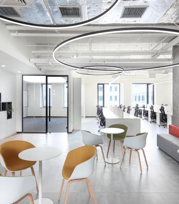
SpaceInvader stripped out the 3rd and half the 4th floor and put in new raised access flooring. The overall directive was to leave scope for Cat B tenants to have a say on floor finishes, whilst creating enough features to boost the Cat A design. Cat A finishes included removing an existing grid ceiling and painting the new largely-exposed ceiling dark grey with new rafts to break up the uniformity, with all ventilation either integrated into the rafts or relocated to the core and perimeter, concealed within a bulkhead detail. This leaves a cleaner soffit with exposed conduits for lighting. The entrance areas by the atrium feature an open triangular ceiling system by SAS. Suspended linear lights were integrated into the ceiling, whilst the central band features recessed spotlights and linear lights.
Rob Codling, Fund Manager, LGIM Real Assets commented ‘Through long-term investment, we remain proactive in delivering the optimum environment for our occupiers. LGIM Real Assets has made a significant investment in One Piccadilly Gardens (OPG) – in which SpaceInvader has played a pivotal role. The transformation of the property will not only improve our occupiers’ experience, but, more widely, assist in our drive to be landlord of choice. Aligning with Legal & General’s ongoing ESG agenda, all works undertaken at OPG have the highest ESG credentials, ensuring the building remains fit for the future.’
▼项目更多图片
{{item.text_origin}}

