Multiple space-saving solutions combined with a light and warm material palette define the spaciousness of this tiny Amsterdam loft by Studio Canisius and Eline Degenaar. The efficient layout and various visual tricks make the apartment feel bigger than the 50 m2 it actually is. With the use of 1:1 mockups, we investigated how small footprint living can still feel spacious.
Located in a former social housing block in the Spaarndammerbuurt, an area famous for its 'Amsterdamse School' architecture, the apartment was in need of an update in order to fulfill the living needs of the young architects themselves. The apartment consisted of a 40 m2 living space and a 10 m2 storage in the attic which was accessible through a common staircase.
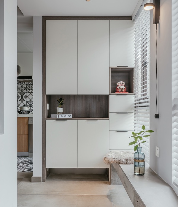
The outdated floorplan contained a small closed kitchen and a tiny bathroom from the time when residents washed in the nearby bathhouse. An important intervention has been to connect the storage to the apartment by means of an internal staircase, changing the storage into the bedroom. The storage space is moved to the heart of the apartment in a floor-to-ceiling wall of oak veneer cabinets.
These cabinets, in which the stairs are integrated, define the open connection between the living and dining and function as a room dividing element. Open shelves are located on either end of the wall, with objects on display that give character to the spaces. In the new floorplan, an open kitchen is created by integrating the kitchen in the dining room, thereby freeing up space for a study. In line with the expectations that partly working from home will become the "new normal," it was important to design a comfortable space for this.
By means of a sliding door, space can be closed off from the rest of the house. The boiler, washing machine, and cleaning supplies are tucked away in another story-high wall of cabinets, creating a quiet place to work. To increase the size of the bathroom, a unique intervention was performed where parts of the bathroom and kitchen are intertwined.
Wasting no valuable space in the corner of the L-shaped kitchen, the bathroom is expanded in this zone and locates the shower. Seen from the kitchen, the shower is concealed in another floor-to-ceiling oak-veneer wall of kitchen cupboards. Before building in real life 1:1 paper models were built to investigate very precisely whether a spatial estimate on a drawing would turn out well in real life.
What is the minimum distance required to walk past the toilet in the shower? And what is the minimum distance to enter the kitchen past a dining chair that has been pushed back? This study helped to literally feel what still felt pleasant spatially. With this design, strategy spaciousness is created in a city where living space is becoming increasingly scarce. Tiny Loft is a blueprint for generous living conditions on a small footprint.
{{item.text_origin}}

