Hatvan 多功能体育馆 | 动态静止的室内设计
将思想与线条组装为一个系统——或者完全相反:被内部的推力“击碎”,然后凭借自身的引力凝聚在一起?无论选择哪一种方案,它们都已经通过由Marcel Ferencz和György Détári设计的这座建筑展现在我们眼前,就像是从一个过程中捕捉到的瞬间。
Thoughts and lines assembled into a system – or quite the opposite: disintegrated structure bursted by inner impulses, that is held together by its own gravity? Either solution we choose, the new Hatvan Handball Hall designed by Architects Marcel Ferencz and György Détári is standing in front of us as a moment captured during a course of a process.
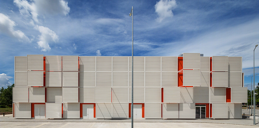
▼建筑外观,exterior view ©Tamás Bujnovszky
如果我们从城市的空间和时间尺度去理解和诠释这座建筑,那么它的概念将会变得清晰起来。该项目的开发计划始于2012年:一座全新的体育场馆,坐落在Óhatvan和Újhatvan之间的工业棕地上,同时起到连接城市新旧区域的作用。
The concept of the building becomes clear if we read and interpret it in the space and timescale of the city. Thinking about development of a new sport venue and its role in the industrial brownfield between Óhatvan and Újhatvan – between the old and new district of the city – began in 2012.
▼坐落在工业棕地上的体育场馆,a new sport venue located on an industrial brownfield ©Tamás Bujnovszky
该项目是该区域首席建筑师Frigyes Philipp提出的设计任务之一。作为建筑设计方,Napur Architect事务所还被委托为整个棕地区域制定整体规划方案。他们提出建立一个棋盘式的矩阵,并使其容纳文化、商业、绿地、休闲和运动场馆等一系列多功能的区块。这是一项长期且复杂的策略,涉及到基础设施、城市化和城市设计等问题,并且要在两个城区之间创造一个新的区域,将城市的新旧两个部分连接起来。
手球馆是设计团队最先设计的项目,作为构建大型城市系统的一个出发点。经过理论性的空间构思之后,建筑团队转向了一个新的目标,即营造一种“动态的静止”(dynamic still)。场馆的设计方案必须合理且可行,其附近坐落着几座具有百年历史的工业建筑,因此新的场馆将带着某种与当代工业建筑类似的特质,为既有建筑赋予一个新的历史层级。
As an assignment by Frigyes Philipp – the Principal Architect in Charge of the Region – the designers of Napur Architect were commissioned to create a Masterplan for the whole brownfield area, in they framed the area into a chessboard-like matrix of cultural-, commercial-, green-, leisure and sport functional blocks. This was a long-term and complex strategy dealing with infrastructural, urbanistic, and civic design problems, outlining a new zone between the two districts, that is not anymore dividing, but connecting the two – old and new – parts of the city.
Part of this large new urban system as an element the Architects designed the Handball Hall first. After its concept in the theoretical space the view of the Architects turned to a vision of a building what manifested itself as a „dynamic still”. In Hatvan solutions had to be rational and feasible. In its neighbourhood standing hundred-year-old industrial buildings, next to those the new sport venue planted as a new layer with features of contemporary industrial architecture.
▼建筑立面,building facade ©Tamás Bujnovszky
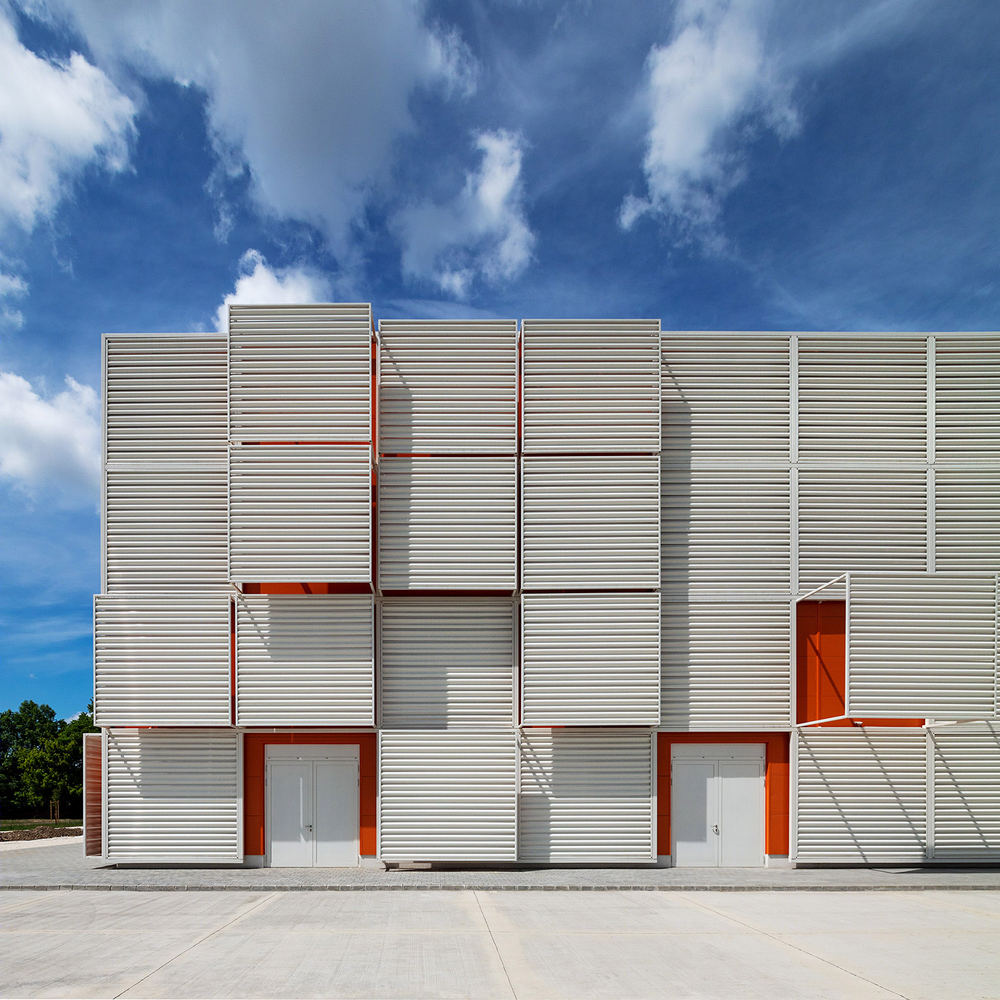
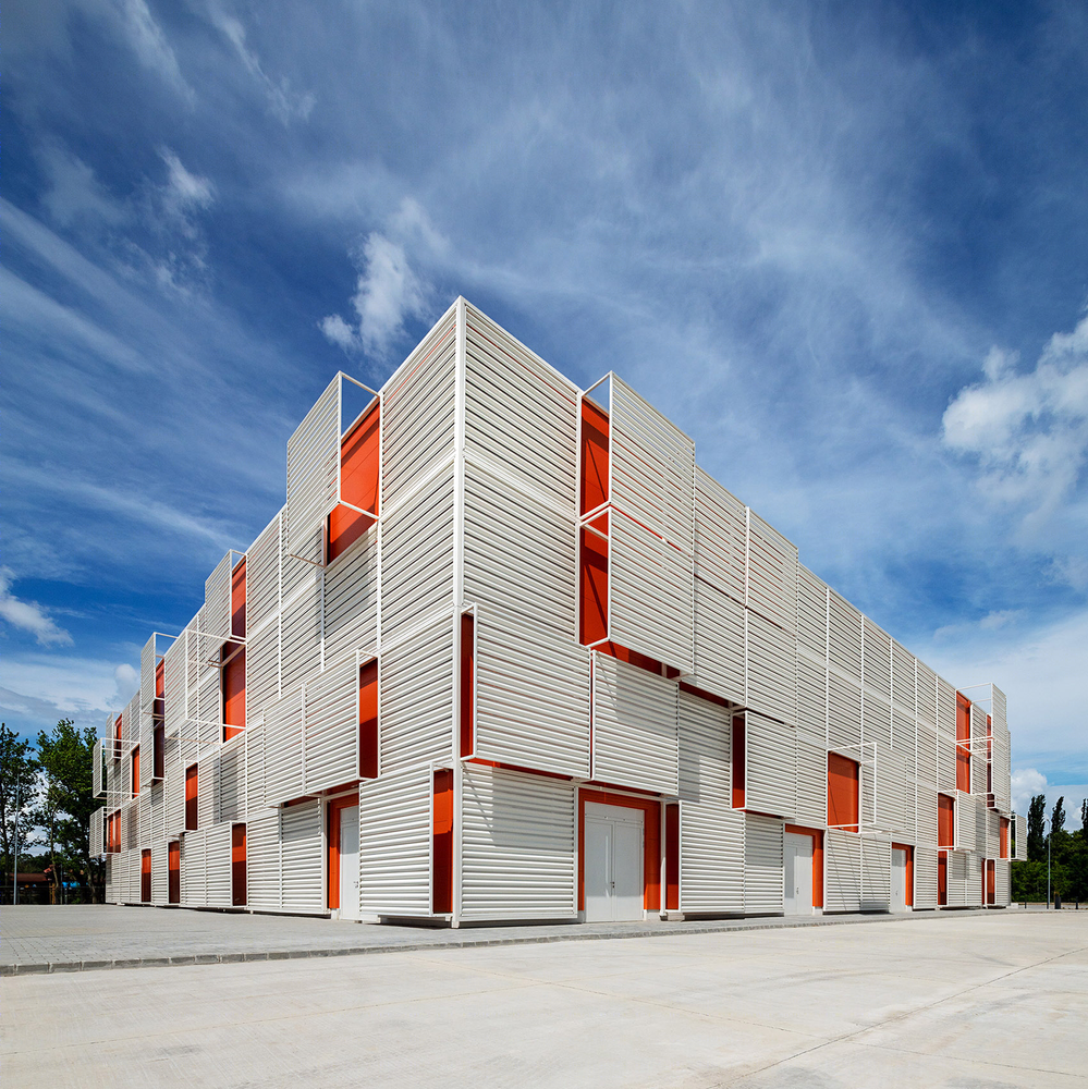
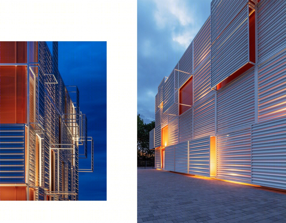
双层立面旨在缓解城市环境与建筑工业特征之间形成的紧迫感。建筑的隔热墙与基础结构框架共同构成了一个简洁的体量。门窗以功能为基准,拥有简单且高效的施工和操作方法。明艳的橙红色代表了运动本身的热烈和体育竞赛所激发的能量。次级立面是由空心钢框架组成的网络,其外部遮挡着一层波纹板,作为“错位”摆放的屏墙,如像素一般或疏或密地排列,定义出简洁立方体的范围和边界。在这两层立面之间设置着由相同元素构成的遮阳系统,同时起到强调入口的作用。
▼立面局部,facade detailed view ©Tamás Bujnovszky
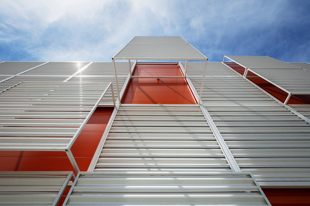
The double layer of the façade meant to ease the tension between the urban situation and the industrial character of the building. The thermal shell and the primary structural frame of the building is presented as a simple hall. Its openings are following the functions, its construction and operation is simple and efficient. Its bright red colour is representing the fire of movement, energy of competitions and sport events. The secondary layer is serving as contrast, the network of hollow section frames. It is holding the corrugated sheet panels in front of itself as off-the-plane displaced shields, those rarefy and densify like pixels, pushing the limits and boundaries of the simple cube. In between the same elements are serving as shades and to emphasise entrances.
▼建筑的隔热墙与基础结构框架共同构成了一个简洁的体量 ©Tamás Bujnovszky the thermal shell and the primary structural frame of the building is presented as a simple hall
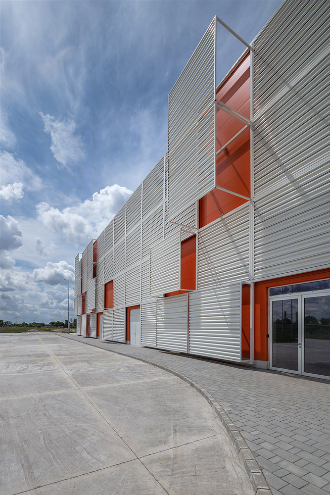
▼次级立面是由空心钢框架组成的网络,其外部遮挡着一层波纹板 ©Tamás Bujnovszky the secondary layer is the network of hollow section frames, holding the corrugated sheet panels in front of itself as off-the-plane displaced shields
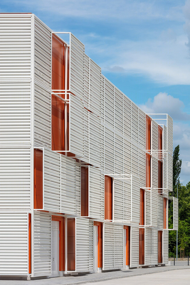
▼立面细节,detailed view ©Tamás Bujnovszky

▼户外休息空间,outdoor seating area ©Tamás Bujnovszky
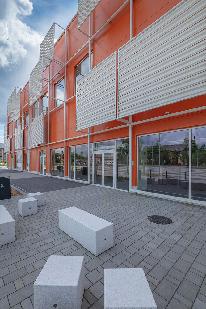
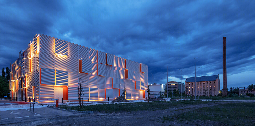
外墙的白色代表着完美与可能性,同时也象征着纯洁、干净和公平的竞赛。到了晚上,立面之间的空隙将发出振奋人心的明亮光线,犹如在地壳板块的裂缝中熊熊灼烧的熔岩。而对于那些乘着火车、飞驰在位于城市东西轴线的大桥上的人来说,建筑发出的光亮此时便如家一般温暖:它成为了一个参照点,一座被用于塑造城市身份的地标。
▼夜晚,立面之间的空隙将发出振奋人心的明亮光线 ©Tamás Bujnovszky when lit at night, the building is glowing through the slits of its armour
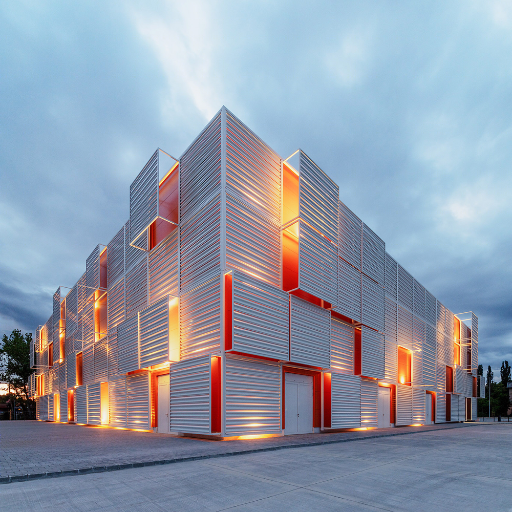
Their colour is white: the colour of perfection and possibilities, but it can be a reminder to pure, clean, and fair game. Their spatial dislocation can become particularly exciting when lit at night, the building is glowing through the slits of its armour, as the lava is glowing through the cracks of tectonic plates. To those who can see the building from the window, travelling on the train flying through the bridge laying on the east-west axis of the city, this means the warm light of home: a reference point, a landmark what is built into the identity of the city.
▼夜间立面,facade night view ©Tamás Bujnovszky
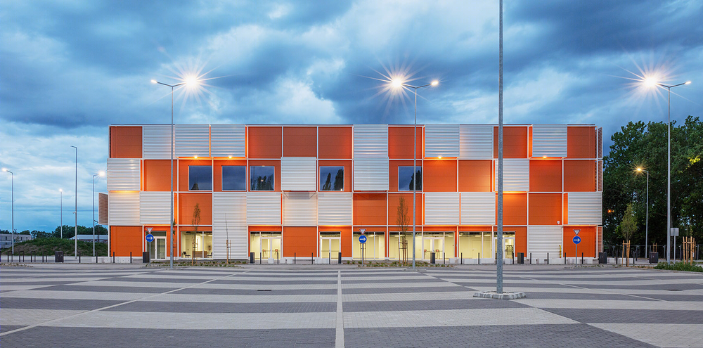
▼细节,detailed view ©Tamás Bujnovszky
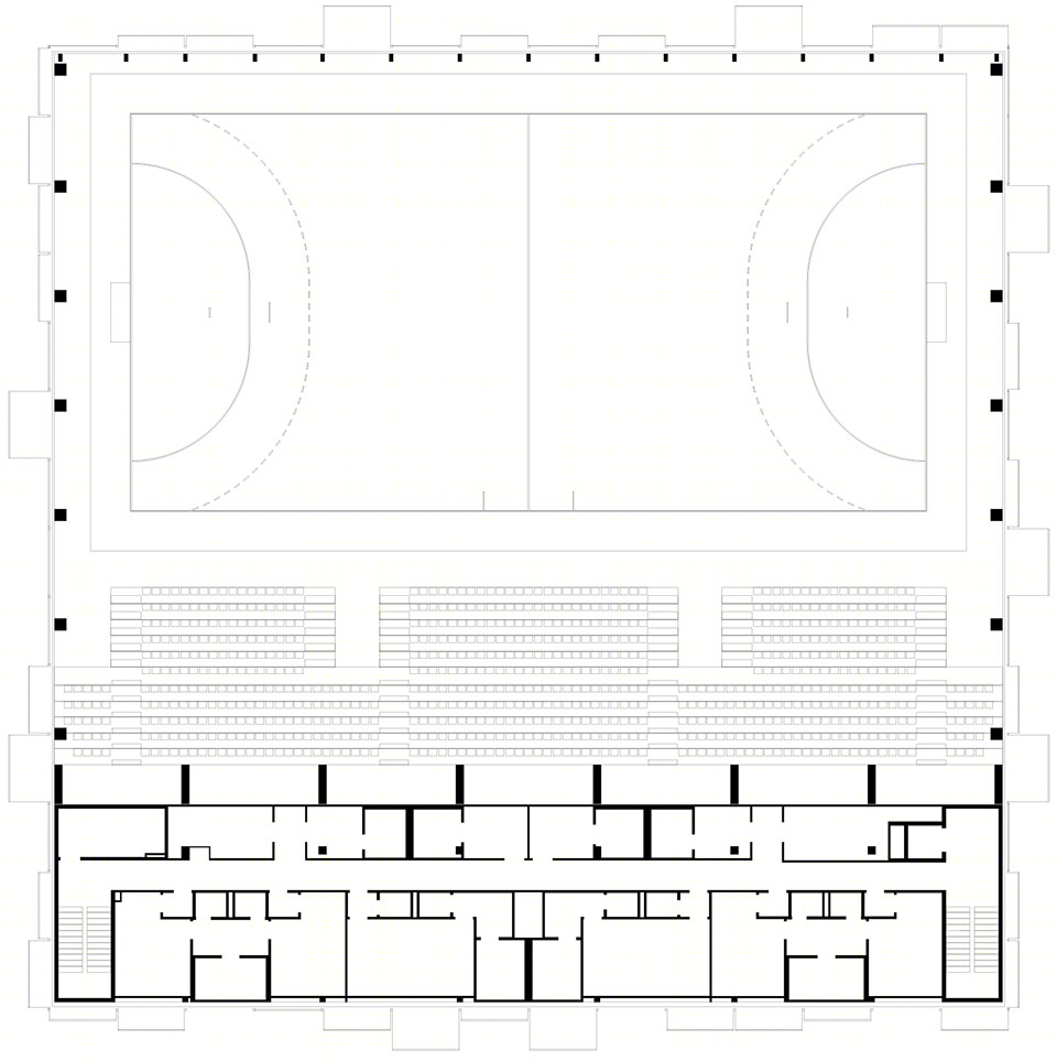
在设计过程中,建筑团队遵循的是一种简单且实用的方法。来访者首先将进入一个宽阔的中庭,这里配备了基本的接待设施和垂直交通空间。建筑的服务功能被设置在上方的三个大型体块当中,而在这些体块的另一边则是场馆大厅的附属看台,并通过两条侧廊道实现不同单元间的连接。
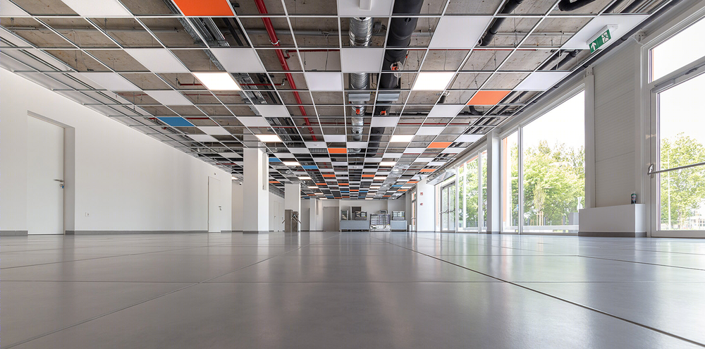
虽然建筑拥有一个严格的布局,但室内空间依然延续了与外墙相似的跃动感。在悬浮于中庭上空的天花板上,方形元素以白色、红色和蓝色交替出现,其中穿插着发光的单元,使人联想到蒙德里安的设计语言。与外墙一样,室内的板块也并未构成一个不透明的整体表面:二级钢结构在强调彩色板块的同时,还将顶部的机械装置暴露出来,使内部结构呈现出与建筑外部“盔甲”相似的透明感觉。
▼中庭空间,the atrium ©Tamás Bujnovszky
During the design process of the plan the Architects followed a simple and functional formula. The visitor is welcomed by a wide atrium, with the essential infrastructure of hospitality and vertical movement. The service functions of the building are placed on the upper levels in three large blocks. On the other side of their masses they are gathering the attached stands of the venue hall as well, leaving two aisleways for movement between sectors.
While the layout of the building is strictly organised, the playfulness of the external envelope is continued in the interior easing up the simple character of the hall. On the suspended ceiling of the atrium the rectangular structure is repeated with white, red, blue, and glowing fields – as a Mondrian-quote. Just as the externals, the internal panels are not assembled into one opaque surface, even the secondary steel structure of suspension is marking the plane of the ceiling, between the coloured panels the mechanical fittings are appearing naked: the internal structure is just as transparent as the armature of the external envelope.
▼走廊,corridor ©Tamás Bujnovszky

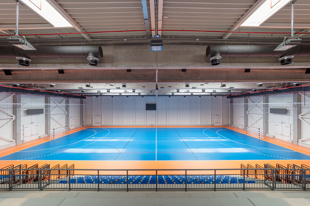
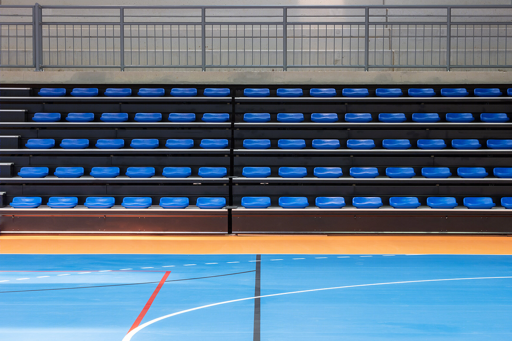
中庭的蓝色元素再次出现于赛场区域。白色与橙色的组合呼应了显著的外墙,而混凝土的中立感则通过红色与蓝色的对比而凸显出来。
The blue colour in the atrium is reappearing on the field of play. The white-orange pair of colours what is outside in the green surroundings quite noticeable, inside is returning reorganized, as the neutrality of the concrete is revitalized by the contrast of red and blue.
▼赛场,the play field ©Tamás Bujnovszky

对于之前问题的讨论仍在继续:最初的整体规划能否实现?还是说,这座场馆将是这一宏大愿景的唯一体现,而环境的重置将遵循另外一条道路?无论何种情况,在设计这座建筑时所应用到的理论和解决方案都将一直作为现实而存留。
从总体上看,从城市尺度概念贯穿到室内设计细节的棋盘式矩阵布局,以及在历史背景中不断更新的创意层级,它们都将为观众带来几乎不可重新构建营造的独特体验。可以肯定的是,如果是让Hatvan手球馆的设计师们来打手球比赛,那么球将永远不会静止地呆在球场中圈。
The question is still open about whether the masterplan will be realised, or the sport venue will remain the only manifestation of the grandiose vision and the rearrangement of the environment will follow an alternative path? Either way the theory and its solutions applied through the design of the building will remain actual anyway.
In conclusion the chessboard-like matrix arrangement moving through from the urban scale concept down to interior design details, the ever-new layers of ideas in historical setup could give a unique experience for the visitors what is rarely re-constructable.
One thing we can be sure of: if it is up to the designers of the Hatvan Handball Hall, the ball will never remain still in the centre circle.
▼平面图,plans ©Napur Architect
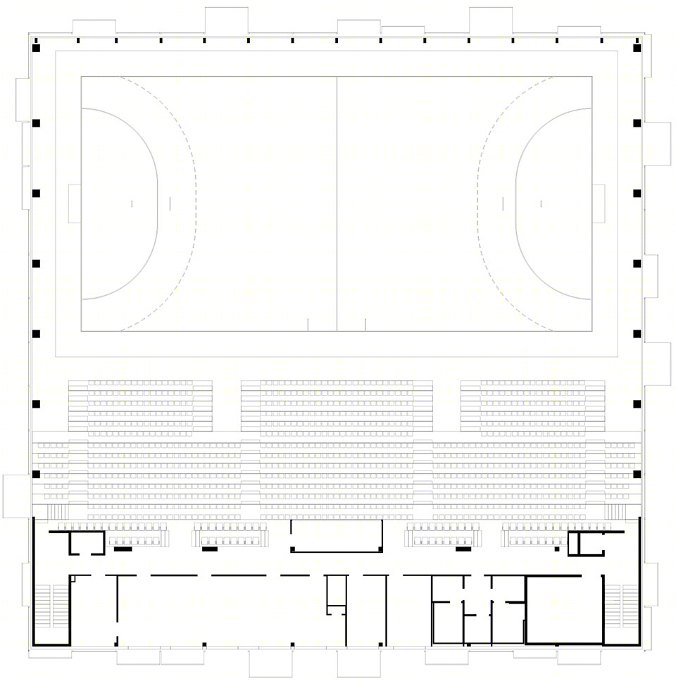

▼剖面图,section ©Napur Architect




![Accessible environment and overhaul [Brochure] Accessible environment and overhaul [Brochure]](https://public.ff.cn/Uploads/Case/Img/2024-06-15/kcEmqYWWfzEyHsWjqpDAMYIhU.png-ff_s_1_600_700)
