Designed to evoke “tropical low-key” Brutalism, the Workers of Art office embraces an open plan with structured yet organically placed workstations that promote interactions and collaboration in harmony with the studio’s philosophy.
Workers of Art designed a space for their offices to reflect the commitment to their craft in Kochi, India.
Tucked away in a quite side street in kochi, Kerala is The Second home. The team agreed very early on that the key was to not be an office but a “second home” where they spent most of their time in —working, sharing, collaborating, growing. The limited material pallet which consisted of Cement concrete, High density fibreboard and matte PVD coated Mild steel rods which were all chosen for its versatility, makes their appearance in various forms and functions throughout the space. Micro cementing was used for flooring, to fill in the cracks in the old existing tiling by introducing a Clever play of Subtle graphics derived from the visual identity of the studio. Occupying the backdrop of the atelier space, the peg board wall is a dynamic surface of constant change and adaptation as the studio starts to grow and evolve. The potential to create an ideal microclimate within was leveraged to its maximum, with techniques to enable cross ventilation and air circulation which resulted in maintaining a relatively cool temperature within. The space consists of experimental lighting for light testing, grow lights as supplementary light for indoor plants , as well as architectural task lighting that doubles up as supports for the plant vines. Blackout curtain in the break out space in the studio lets the space to be converted into a lighting experimentation room, as well as allow enough privacy for lounging. The studio space is planned favouring views towards the foliage integrated into the workstations, ensuring uninterrupted views and scenes of life and growth.
Over a 100 potted tropical local species of plants have been installed along the eastern side of the office, along which the workstations are arranged shared by members. The tables are units, measuring 240 cm by 120cm made of ferrocement and finished in a cement oxide finish, meander through the shared workspace and are intended to encourage members to collaborate. We wanted to maintain that inherited idea of one single open space.The design of the table gives members their own area of private space to focus on their work whilst keeping a sense of community.
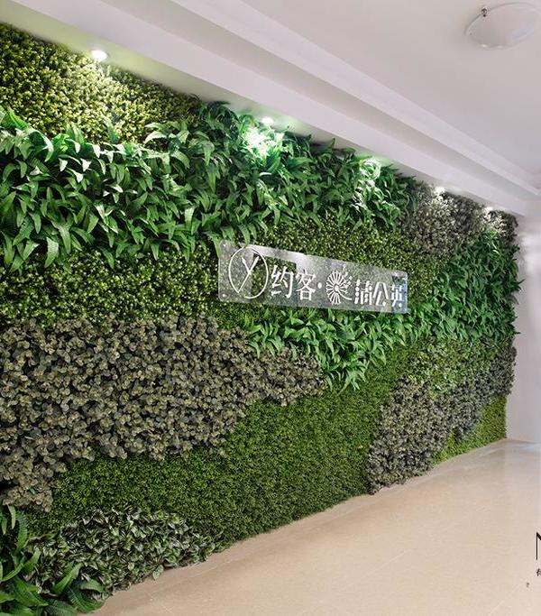
The overall floor plan is divided into two distinct areas, creating one zone for working and another for socialising. We understand that in modern work environment , the demarcation between work and life is breaking down. Greenery is a big part of the design of the office. It is not simply an aesthetic addition, but the greenery is integrated in such a way that it completely transforms and enhances the work experience of the people inside. How can plants become protagonists of the workspace you ask. We creatively integrate them in favour of the well-being of the members, to give privacy, elevate the moods by having something that is growing and thriving in front, creating a personal relationship with the surroundings and at the same time provides better quality of air. They also help to absorb and cancel out the natural sound of a workday.
The limited material pallet which consisted of Cement concrete, High density fibreboard , and Mild steel which were all chosen for its versatility, makes their appearance in various forms and functions throughout the spaces. HDF ; used as peg boards, lockers, sample drawers and a few table tops, finished with just a top coat helps add warmth to the space.
The creative direction of the project was driven by all these sensibilities— A concrete landscape within, solid and stable yet subjected to growth and adaptation by the changes in the foliage and lighting creating different moods that appeals to different functions, making it dynamic, inviting and inhabitable. Each space is considered keeping in mind the scope for experimentation, constant learning and collaboration.
Design: Workers of Art
Photography: Ishita Sitwala
11 Images | expand for additional detail
{{item.text_origin}}

