The label’s former art director Daniele Misso mixes art and fashion within a subtle grid inspired by influential Italian architecture practice, Superstudio.
Key Features
Located beneath its head office at Spuistraat 168, Filling Pieces’ latest flagship intends to be a nearby community hub where fans of the brand can convene. As such, the interior design employs the same approach to materials and colour as those that have come before. A modern and monochrome interior is punctuated by eye-catching furnishings, vivid wall treatments and a material palette of stainless steel, mirror and concrete with juxtaposing effect. It’s a concept that feels familiar to the brand’s Satellite Store in Amsterdam’s historic Canal District, which makes sense as both have been designed by its former Art Director Daniele Misso.
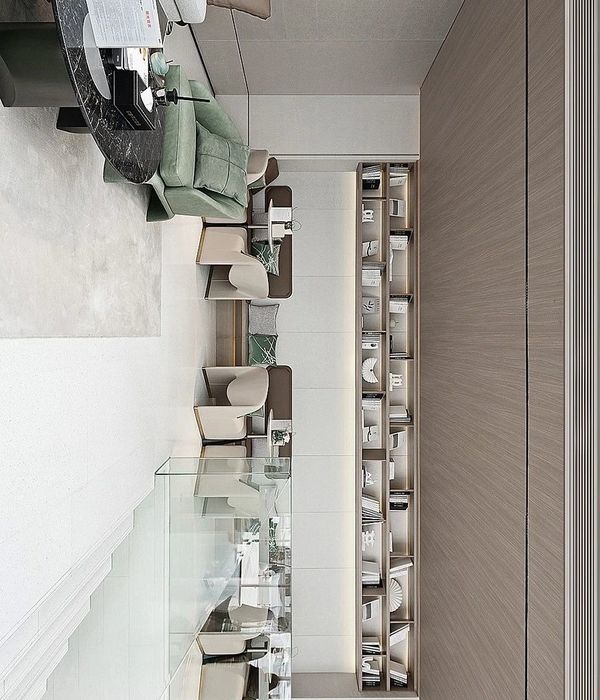
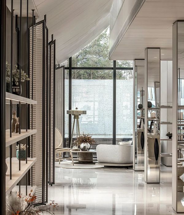
Inspired by the Italian Superstudio movement of the late 60s, the store is designed using a system of grids that act as a guideline for incorporating strategically placed features and structures. At the back of the store, a lounge area and fitting rooms are cocooned in a sheltered assembly to create a more intimate experience. Meanwhile, on the open retail floor seating areas are held within the parameters of other spatial elements, a rug for example or a mix of art installations and product displays. The result is a network of sculptural elements intertwined with the Filling Pieces collections that provides a more relaxed, social setting for the brand’s community.
Frame’s Take
‘With our Flagship Store we are reshaping the conventional notion of the retail experience by translating our brand values into a space, and turning it into a hub where we can bring like minded people together,’ explains Filling Pieces founder Guillaume Philibert. It certainly guarantees visitors a worthwhile brick-and-mortar experience by enticing them with an attractive space to gather. A few more chairs wouldn’t go amiss but then again, Misso’s minimalist, gallery-like approach is the draw here. Mixing art with fashion to create an atmosphere that goes beyond its commercial endeavours, shoppers can interact with the brand in more ways than one. The store is no longer a point of sale but a place where people can immerse themselves, and following the guidelines of the stylishly simple Filling Pieces aesthetic, the interior design concept certainly offers that.
Designed by Daniele Misso
Photography by Ewout Huibers
{{item.text_origin}}

